😠
@siracusa Honestly this is the first big icon change I really like 😅
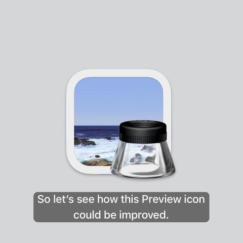
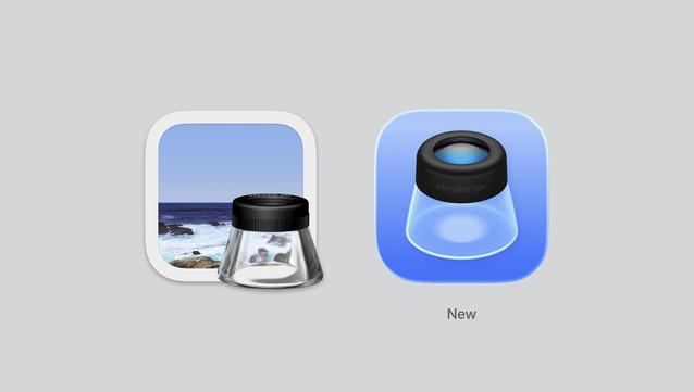
The iconography is clear and distinct, and the "glassification" doesn't ruin it too much, ironically, since the old one has literal glass in it.
That said, I bet what I like is just the conceptual simplification, and a version that shows just the loupe but in "Sequoia-style” would be even sharper and clearer.
@siracusa If improve means fit in the style.
Sadly it really isn't an improvement other than platform consistency across devices.
Wondering what the backpedaling will look like over the next few years. I mean, they always course correct. I'm still angry that they made tint color per app a thing vs. leaving apps the power to use colors in icons as they fit.
@siracusa the one place where we had liquid glass before.
It died to become the entire UI. Long live the Preview loupe.
@siracusa In isolation I don’t hate it, but without a photograph as part of the scene it’s not so obvious that the object is a loupe. I could imagine someone thinking it’s a light fixture or carafe, for example.
Of course these days I bet a dwindling number of people even know what a loupe is. It probably means nothing to the majority of people who grew up with digital photography. May as well be an icon of a floppy disk.
@siracusa Oh shit, that’s a loupe in the original icon?
I thought it was some weird USB stick pointing 3D-style towards the user. I could never figure out WHY, and frankly, I was too busy trying to get shit done using the app to even care to look at it even closer.
I suppose that proves that it doesn’t matter what an app’s icon is, as long as it’s heavily differentiated from the others. I could always find Preview in the Dock, even if I had no idea what was in the icon.

¡¡Down with the tyranny of the squircle!!


