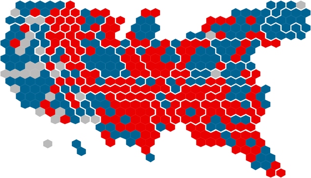
These two maps are a good example how data visualization influences our perception. Same election, same results, but one shows the winning party by area, one by population density. (Map Credits: Karim Douïeb, Jetpack.ai)

Edit: This is not based on the midterms this week. I wanted to point out the difference in visualization. It was originally done in 2019

@mistakenotmy Indeed, never forget, maps need careful interpretation.
@mistakenotmy I’ve always found the U.S. population density map fascinating because the population abruptly dwindles at the midpoint. Like people got to the Mississippi River and said, nope, I’m not crossing that.
@Michele the mid-western plains (the dust bowl) were historically hard to settle on, same with the Rockys of course. And trade (sea ports) had a huge influence on population distribution.

@mistakenotmy @Michele it’s also to do with the rain shadow of the Rockies and the big deserts 🏜 ⛰ 🏔

https://www.youtube.com/watch?v=wwJABxjcvUc

Why 80% of Americans Live East of This Line

YouTube
@Michele @mistakenotmy Or, they tried to cross the river and failed. 🤷🏼‍♂️

@mistakenotmy

The visualisation by county is deeply misleading

@mistakenotmy I love this - It always seems so dismal during election cycles to see the media throw up the rural red counties.
@mistakenotmy I've always thought the left map is misleading, it's lazy of media sites to use it (or biased, if it's a deliberate choice to skew perceptions).
@cazdoespolitics I don't think it's deliberate in most cases (though it has been used by a not-to-be-named former president to strengthen his "point").
@mistakenotmy Maps are inherently political, choices in representing information involve making decisions about what to prioritise. In this case, whether to represent the US in ways that the population recognise, but compromise on the size of political party influence, or to emphasise political size over recognisability. The reasoning for that choice is absolutely linked to intent. The former creates the perception of republican power, the latter democrat power.
@mistakenotmy This is another way of representing the same information, this time by seats, an effort to make a choice that represents reality without bias towards one or the other. The choices that are made in what maps are used carry implicit messages about those making the choice.
@cazdoespolitics @mistakenotmy The first map implies overwhelming red power, while the second shows a much closer balance that you have to parse carefully to understand its nuance. That close balance, sometimes red winning, sometimes blue, is the reality we live in, so I think it is the better choice. But it’s also harder to absorb at a glance, which may be why it’s not used by broadcasters.
@mistakenotmy It's that time of the election cycle again 😀
@mistakenotmy And the reason that we say the one on the left is misleading is, of course, that "land doesn't vote."
@mistakenotmy I use those maps and the Nobody Lives Here map when I teach.
@KathleenFuller @mistakenotmy Now let’s see and overlay of your map with either/both the political maps.
@meltedcheese @mistakenotmy
Here's another way of looking at population. This is the 2016 election.
@mistakenotmy
Seems to be more blue than red in the second picture.
@mistakenotmy Thanks for sharing this eye-opening map comparison. Now, how about a map or chart of US #Senate members, showing not just party affiliation but also the number of people that each one actually represents? Then, on to a world map of historical (but still #climate wrecking) GHG emissions, adjusted by population?
@V_olivaceus @mistakenotmy You could place two circles on each state to represent their senators, color coded by party. The size of each circle could show how many constituents they represent. Should be eye-popping!
@mistakenotmy Absolutely amazing. Thanks.
@mistakenotmy The vast white area represents roughly 40 Republican senators.
@mistakenotmy indeed. Land doesn’t vote, people do.
@mistakenotmy Which election is this? Noting that Maricopa is red so we're somewhere pre-2020 I think?
@mistakenotmy great example of the use and abuse of infographics to tell the story that you want rather than striving to represent reality accurately!

@mistakenotmy

how current are those maps?... 2020?

@tdwllms1 yes 2020
@mistakenotmy
Thanks,
I'll be curious to see the map from this midterm... ..
@tdwllms1 @mistakenotmy I think the graphic shows the 2016 presidential election. One spot that makes it easy to compare is the Phoenix metro, in the center of AZ, which was red in 2016 and blue in 2020. You can see a detailed comparison of the two elections here — https://data.rgj.com/presidential-election-results-compare-2016-2020/
Reno Presidential Election Results Comparison

How much has the map changed from when Republican Donald Trump defeated Democrat Hillary Clinton in 2016? With results updating every hour, this interactive U.S. map holds the answer. Click on the counties below to see how Trump and Joe Biden's 2020 performance compares with the 2016 vote.

Reno Gazette-Journal
@bhorst @mistakenotmy
definitely different... thanks...
@mistakenotmy this appears to be an article about the same maps / maker. Interesting read. https://www.fastcompany.com/90572489/u-s-election-maps-are-wildly-misleading-so-this-designer-fixed-them
@bellmyb yes, Karim Douïeb has done some great works about this.
@mistakenotmy should do another one of “electoral power density”, i.e. population density multiplied by the amount each vote contributes to an election. presumably the square states would look a hella lot redder for senate elections
@mistakenotmy remarkable how presentation of data can change one’s perception of reality.
@mistakenotmy Then there are the cases where someone simply crops the vertical scale of a line plot, so a small change looks huge.
@mistakenotmy I like how the NY Times puts each congressional district as the same size block.
@mistakenotmy acreage has always seemed like a weird metric for how people think to me, if there are no people dwelling in the acreage ... but we are a continental country, and if we're are going to have a coherent republic we need to work within institutional constraints to knit these constituencies closer to a center point
@mistakenotmy thank you for@putting this out there. It makes so much more sense. The country is not majority Republican. I have to think ideologically it’s middle of the road at the very least - but more inclined to think more liberal, social justice oriented. I live in Texas so it’s my only salve to a very jacked up political existence. People LOVE to vote against their self interest here. Corruption is rampant.
@mistakenotmy Similar issues in England, with the Tories being more popular in rural areas.
@mistakenotmy Looking at that vast expanse of red in the middle of the country--which is lightly populated by humans--I realize that if wildlife were allowed to vote it would look very different.
@mistakenotmy I wish I could remember her name but she gave a very good explanation with regard to rural populations and their interaction w the government. Historically rural areas interaction w gov comes in the form of regulation vs big city populations have more positive interactions via public transportation, smog regulations ect
Probably an over simplification & not doing justice to her full explanation but it made sense when i heard it
@mistakenotmy a much better way to illustrate how PEOPLE vote, not land! Thanks for sharing, love some good data viz.

@mistakenotmy

And isn't it funny how the media always uses divisive images like the one on the left when reporting. It's all about getting the emotional knee-jerk reaction from people.

@mistakenotmy happens every election cycle. People think a big red splash in Wyoming somehow translates to billions of GOP votes.
@mistakenotmy about 30 years ago I read an excellent book, How to Lie With Maps, by Mark Monmonier, which covers the many ways maps can distort data through the methods by which they are presented. The book really sharpened my critical thinking skills when it came to map reading. The book is in its third edition, and is available from Amazon here: https://www.amazon.com/How-Maps-Third-Mark-Monmonier/dp/022643592X/ref=nodl_?dplnkId=2e6c6ad5-811d-4446-ab7c-7a17165e3669
@mistakenotmy except now blue areas look like tumors 😅
@mistakenotmy Do you happen to have a link to these maps?
@markhenick
The original tweet from Karim Douïeb and a link to his data points are here:
https://twitter.com/karim_douieb/status/1181695687005745153
Karim Douïeb on Twitter

“Challenge accepted! Here is a transition between surface area of US counties and their associated population. This arguably provides a much more accurate reading of the situation. @observablehq notebook: https://t.co/wdfMeV5hO4 #HowChartsLie #DataViz #d3js”

Twitter
Try to impeach this? Challenge accepted!

Dependencies

Observable
@mistakenotmy so interesting. I wish American media would at least show both. Most of the red on the usual map is uninhabited!

@mistakenotmy

Loving County, Texas has 64 people.

Los Angeles County has 10 million people.

Some people act like they're equivalent, because they're both counties.

@mistakenotmy Sou h red on the rural part of our country. I'm in KC, MO, a blue county, but most of our state is rural, agricultural, with the Ozarks in the bottom half. I don't know ow how we'll ever truly reach them.
@mistakenotmy I have always wanted these maps!
@mistakenotmy Great example. #AreaCharts reinforce multiple #CognitiveBias and innate errors of human #inference. #DataVis people who are educated in #psychology know this, therefore such charts are likely to serve deliberate manipulation.
@mistakenotmy The media knows better. So why do they do this? I think it means they’ve picked the Red side.