Pitch Deck Presentation Design Template for Adobe InDesign That Actually Works Under Pressure
I downloaded this pitch deck presentation design template on a Tuesday afternoon with no particular agenda—just curiosity. Two hours later, I was still inside the InDesign file, swapping out placeholder content and running through the interactive PDF export. That doesn’t happen with most templates. Usually I’m done in fifteen minutes and mildly disappointed.
This strategic pitch deck presentation design template by RedGiant is an Adobe InDesign layout available on Adobe Stock. It’s formatted at 1920×1080 px, built around 22 predesigned slides, and it looks like something a good editorial studio would charge serious money to produce. I want to be specific about what works, what doesn’t, and whether it’s worth your time—because vague praise helps nobody.
You can download the template from Adobe StockPlease note that this template requires Adobe InDesign installed on your computer. Whether you use Mac or PC, the latest version is available on the Adobe Creative Cloud website—take a look here.
Download a pitch deck presentation design template as an Adobe InDesign layout, created by RedGiant. You can download the template from Adobe StockWhat Does a Pitch Deck Presentation Design Template Need to Do That Most Don’t?
A good pitch deck template solves three problems at once. First, it has to communicate hierarchy clearly—which information is primary, which supports it, and which is supplementary. Second, it has to stay visually coherent across 20-plus slides without becoming monotonous. Third, it has to get out of your way. The best templates are invisible. You stop thinking about the layout and start thinking about the content.
This template does all three. The editorial grid is tight and consistent, the typographic scale is decisive, and the visual system leaves enough room for your specific content to breathe. That balance is harder to achieve than it looks.
The Design Language: What I’d Call “Editorial Minimalism”
I use the term “editorial minimalism” to describe a specific design approach: layouts borrowed from high-end print publishing, applied to screen presentations. This template lives squarely in that territory. The typefaces are bold and structural. The black-and-white photography functions as texture, not decoration. The whitespace is deliberate and load-bearing.
This isn’t the sanitized minimalism of a generic business template. It has personality. The heavy sans-serif headlines—set at a scale that commands attention—give each slide a clear focal point. Moreover, the contrast between large type and small supporting text creates a natural reading sequence without relying on bullet points or hierarchical indentation.
For design-literate audiences, that distinction matters enormously.
Inside the File: 22 Pages Built for Real Pitch Scenarios
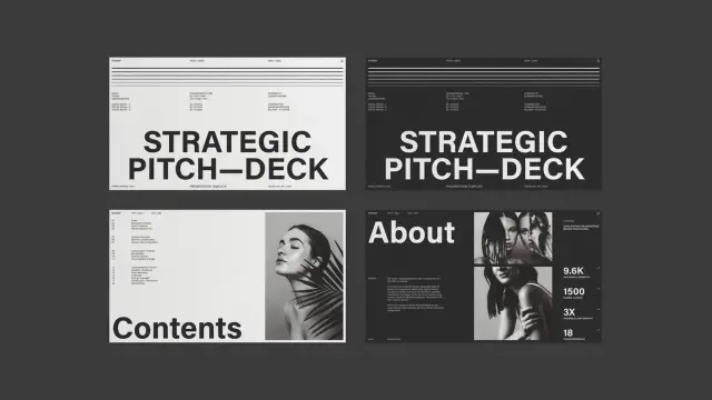
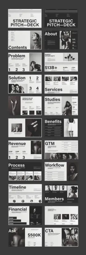
The template covers every standard section of a professional pitch deck. You get slides for cover, contents, about, problem, market opportunity, solution, services, case studies, benefits, revenue, go-to-market strategy, process, workflow, timeline, team members, financials, ask, and CTA. That’s a complete pitch narrative, structured in the order investors and clients actually expect.
What stands out is how each slide has been designed for its specific content function—not just reskinned versions of the same layout. The problem slide uses numbered callouts and data points. The market opportunity slide pairs a large dollar figure with percentage indicators. The team slide gives each member a portrait, name, and title in a clean grid. Additionally, the financial slide uses tiered pricing blocks that are both scannable and persuasive.
Every single element is a placeholder. Photos, text, numbers—all replaceable with your own assets directly in Adobe InDesign.
The 1920 × 1080 px Format: Why Screen-Native Matters
This template is formatted at 1920 × 1080 px—native widescreen resolution. That decision matters more than most people realize. Designing in print dimensions and then presenting on screen creates subtle alignment problems: margins feel off, type looks heavier than intended, and images lose clarity. A screen-native pitch deck presentation design template solves that before you ever open the file.
Furthermore, 16:9 formatting works cleanly in Zoom calls, full-screen presentations, and exported PDFs. The proportions stay consistent regardless of display size. When I tested the template on both a 27-inch monitor and a 13-inch laptop screen, every slide read clearly at both scales.
Testing the Template in Adobe InDesign: What I Actually Found
Opening the file in Adobe InDesign, the layer structure is clean and logical. Text frames are clearly labeled. Image placeholders use content-fit frames that accept new photography without requiring manual resizing. The paragraph styles are set up properly, so swapping placeholder text for real copy preserves the typographic hierarchy automatically.
I replaced placeholder content on six slides to test the editing experience. The process was fast. Because the template uses well-constructed InDesign paragraph styles, a simple style override pushed new text into the correct size, weight, and leading. Specifically, I noticed the headline frames allow for short, punchy text—which is exactly how effective slides should work.
Interactive Features in Adobe InDesign
One area I explored specifically was InDesign’s interactive capabilities. Adobe InDesign supports hyperlinks, buttons, page transitions, and animated object states—all exportable to interactive PDF or HTML. This template’s clean layer structure makes applying those features straightforward.
I added basic page transitions and a few button states to test compatibility. The layout held up without any frame conflicts or overlapping elements. For anyone presenting via an interactive PDF—which is increasingly common for investor decks sent ahead of meetings—this template is a strong foundation. The simplicity of the design means interactive elements enhance rather than compete with the visual system.
Notably, InDesign’s Object States panel works cleanly here because the template avoids the cluttered nesting that makes interactive features break in more complex files.
The Typography System: Structured for Persuasion
Typography in a pitch deck isn’t decorative—it’s structural. The type choices in this template reflect a clear understanding of that principle. Headlines are set large and bold, functioning as anchors for each slide’s argument. Supporting text is set at a size that’s readable but clearly subordinate. Numerical data—a key element in pitch decks—is presented at scales that make the figures land with impact.
I’d describe this as a persuasion-first type system. The hierarchy isn’t just about aesthetics. Rather, it sequences information so the reader’s eye moves from the most important claim to the supporting evidence in a single, uninterrupted path. That sequencing is what makes a slide convincing.
The type system also handles mixed-content slides well. On the GTM and workflow slides, text and data coexist without fighting for attention. That’s a specific design achievement worth noting.
Color Strategy: High Contrast, Zero Distraction
The template works primarily in black, white, and warm off-white tones. The photography follows a consistent monochromatic treatment—black-and-white images that feel editorial rather than corporate. This color restraint is strategic. It means your content, your numbers, and your narrative carry the weight of the presentation—not the background colors or decorative elements.
Additionally, a high-contrast palette exports cleanly to both screen and print. If you need a printed leave-behind after a pitch meeting, this template won’t lose anything in translation.
Who Should Use This Pitch Deck Presentation Design Template
Startups preparing seed or Series A fundraising decks will find the structure immediately useful. The problem-solution-market-ask narrative arc maps directly onto investor expectations. The template doesn’t require you to redesign the logic of your pitch—it reinforces it.
Creative agencies pitching to clients benefit from a different quality in this template: the visual confidence. A design agency presenting in a visually weak deck loses credibility before the first slide. This template signals professional seriousness in a way that generic presentation software themes simply can’t match.
Brand consultants, product teams, and marketing departments will also find value here. The services, workflow, and timeline slides translate well beyond pure startup pitching. Moreover, any situation where you need to communicate strategic thinking to a critical audience is a situation where this template earns its keep.
The Honest Limitations Worth Knowing
This template requires Adobe InDesign. That’s not a limitation for professional designers, but it’s a meaningful prerequisite for teams without design resources. You can’t open an InDesign file in PowerPoint or Keynote without a conversion step.
Also, the photography in the template is placeholder-only. The images used in the preview are not included with the download—they’re sourced separately. You’ll need your own photography or licensed stock images to fill the frames. For teams with strong visual assets, that’s no problem. For teams starting from scratch, it’s an additional production step to plan for.
That said, neither of these is a flaw in the template itself. They’re simply the nature of working in a professional design application with a professionally designed layout.
My Honest Take: What Makes This Template Different
I’ve reviewed a lot of pitch deck templates. Most fall into two camps: overly corporate designs that feel like they were made by committee or trend-chasing minimal layouts that look good in previews but collapse under real content. This template sits outside both camps.
The editorial minimalism approach gives it a visual identity that feels current without chasing a trend that will date in 18 months. Furthermore, the structural rigor of the 22-slide system means you’re not improvising the logic of your pitch—you’re populating a framework that someone who understands pitch narrative has already thought through carefully.
I’d use this template for a Series A deck, an agency credentials presentation, or a high-stakes client proposal. It reads as confident rather than flashy. In high-stakes environments, that’s exactly the register you want.
What I’d Change If I Could
The one addition I’d welcome is a slide variation for competitive landscape visualization—a comparison matrix or positioning quadrant. It’s a standard pitch deck element that most founders and strategists need, and it’s the only gap in an otherwise comprehensive system.
A few additional color variant pages—even just a dark-background option for select slides—would also expand creative flexibility. That said, these are feature requests, not criticisms. What’s here is solid.
Forward-Looking Prediction: The Editorial Pitch Deck Trend
Here’s a claim that I’ll make directly: the era of gradient-heavy, icon-cluttered pitch decks is ending. The audiences that matter most—experienced investors, senior creative directors, and strategic partners—have developed strong pattern recognition for templated visual noise. Increasingly, they reward restraint.
The editorial minimalism aesthetic this template embodies is gaining ground precisely because it treats the audience as sophisticated. No hand-holding visuals. No clip-art metaphors. Instead, clear information architecture, decisive typography, and photography that sets a tone rather than filling space.
I predict that by 2027, editorial-style pitch decks will be the dominant visual language for high-stakes presentations across fundraising, agency, and brand contexts. Templates built in this register now will age better than almost anything built in the current mainstream.
You can download the template from Adobe StockFrequently Asked Questions About This Pitch Deck Presentation Design Template
What software do I need to use this pitch deck presentation design template?
You need Adobe InDesign. The template is an InDesign layout file, which means you’ll also need an active Adobe Creative Cloud subscription that includes InDesign. The template is not compatible with PowerPoint, Keynote, or Google Slides without conversion.
How many slides does the template include?
The template includes 22 predesigned pages covering all core pitch deck sections: cover, contents, about, problem, market opportunity, solution, services, case studies, benefits, revenue, GTM strategy, process, workflow, timeline, team members, financials, ask, and CTA.
What size is the template formatted at?
The template is formatted at 1920 × 1080 px, which is native widescreen resolution. This makes it ideal for screen presentations, including fullscreen slideshows, Zoom presentations, and interactive PDF exports.
Are the photos included in the download?
No. The photos visible in the template preview are placeholder images only. They are not included in the download. You’ll need to source your own photography or license images separately to populate the image frames.
Can I add interactive features to this template?
Yes. Adobe InDesign supports hyperlinks, buttons, page transitions, and animated object states, all of which can be exported to interactive PDF or HTML. The clean layer structure of this template makes applying interactive features straightforward without frame conflicts.
Is this template suitable for startup fundraising pitches?
Yes. The 22-slide structure maps directly onto the standard investor pitch narrative: problem, market size, solution, business model, go-to-market, financials, and ask. The visual system projects professionalism and confidence, which is valuable in high-stakes fundraising contexts.
Where can I download this pitch deck presentation design template?
The template is available from Adobe Stock contributor RedGiant. You can find it through Adobe Stock directly or access it as part of an Adobe Stock subscription or individual asset purchase.
Can beginners use this InDesign pitch deck template?
The template is designed to be fully customizable, and basic content replacement—swapping text and images—requires only a working knowledge of InDesign. More advanced customization, such as adjusting paragraph styles or modifying the grid, benefits from intermediate InDesign experience. The clean file structure makes it more accessible than many comparable professional templates.
Browse WE AND THE COLOR’s templates category to find more design assets for different creative needs.
#design #graphicDesign #InDesignTemplate #PitchDeck #pitchDeckDesign #pitchDeckPresentation #PresentationDesign