Interior Design Portfolio Brochure Template: 26-Page InDesign Layout Built for Studio Pitches

Honestly, I’ve seen so many portfolio templates that look like they were designed for a generic business, then retrofitted for design studios. But this one wasn’t. Tom Sarraipo’s interior design portfolio brochure template for Adobe InDesign is one of the rare exceptions—a layout that feels like it was conceived specifically for the way interior designers present their work: through atmosphere, sequencing, and editorial restraint.

That distinction matters more than it sounds. An interior design portfolio brochure template isn’t just a container for your projects. It’s a positioning document. It signals how you think, how you edit, and how seriously you take craft. The template’s design language does a significant portion of that signaling before anyone reads a single line of copy.

Download the template from Adobe Stock

Please note that this template requires Adobe InDesign installed on your computer. Whether you use Mac or PC, the latest version is available on the Adobe Creative Cloud website—take a look here.

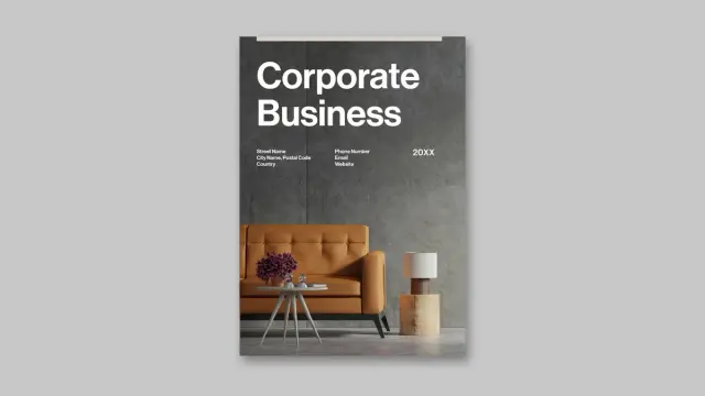
A customizable A4 interior design portfolio brochure template for Adobe InDesign by graphic designer Tom Sarraipo. Download the template from Adobe Stock

So let’s talk about what this interior design portfolio brochure template actually does—and why the structure behind it is worth studying even if you don’t end up using it.

What Makes a Professional Interior Design Portfolio Template Different from a Generic Brochure?

The honest answer: sequence logic. A generic brochure template optimizes for information density. A professional interior design portfolio brochure template optimizes for narrative momentum. Those are fundamentally different design problems.

Sarraipo’s layout solves the second problem. The 26-page structure isn’t arbitrary—it follows what I’d call a Studio Credibility Arc, a sequencing framework built into the page order that moves from identity to proof to invitation. You open with who the studio is, move through what it does and how it thinks, then land on evidence, and close with warmth.

That arc is standard in high-performing design agency collateral. But executing it in a customizable InDesign template is technically difficult because every placeholder must anticipate a range of content types. This template handles that tension well.

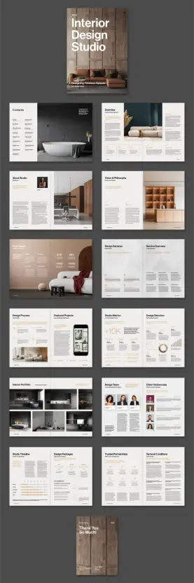
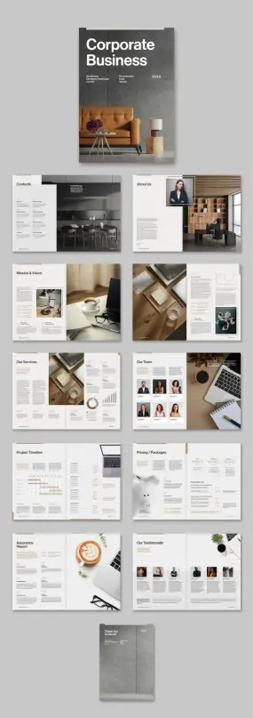
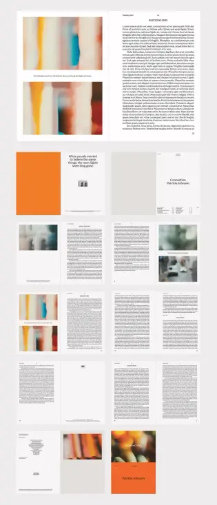
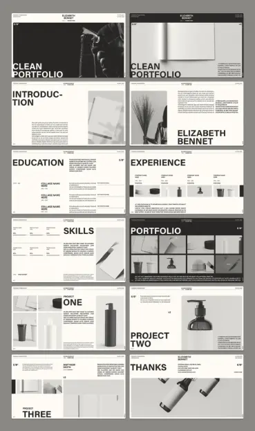
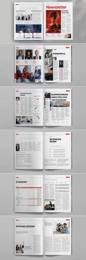
The 26-Page Structure and Why Every Section Earns Its Place

Twenty-six pages is a deliberate count. It’s enough to tell a complete studio story without forcing padding. The included sections cover contents, overview, studio introduction, vision and philosophy, core values, design services, service overview, design process, featured projects, studio metrics, design direction, interior portfolio, design team, client testimonials, studio timeline, design packages, trusted partnerships, terms and conditions, and a closing thank-you spread.

That’s not a random list. It’s a complete client engagement narrative. Notice what comes early: philosophy and values precede services. That’s intentional. In premium interior design, clients buy the perspective before they buy the service. Sarraipo’s sequencing reflects how sophisticated design pitches actually work.

The Studio Metrics spread deserves specific mention. Showing numbers—project counts, client satisfaction rates, team size—inside a beautifully structured layout converts abstract claims into legible proof. The template treats quantitative evidence as a design element, not an afterthought.

A Closer Look at the Visual Language of This Interior Design Brochure Layout

The template’s aesthetic belongs firmly to what I’d call Warm Functional Modernism—a visual register defined by neutral backgrounds, warm accent tones, clean sans-serif typography, and generous whitespace. It borrows from Scandinavian editorial design and high-end real estate marketing, but keeps the grid tight enough for the layout to read as professional rather than merely stylish.

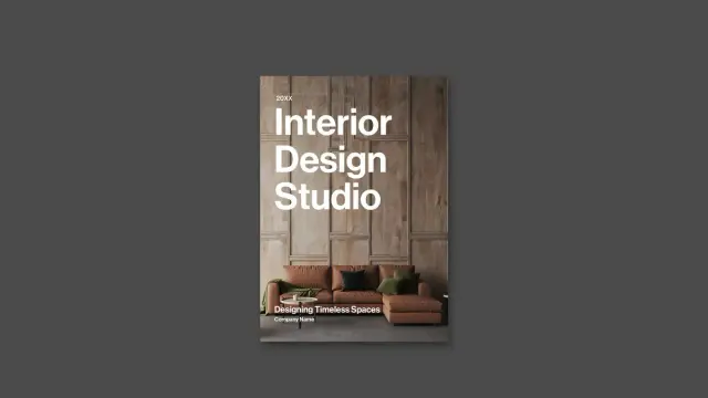
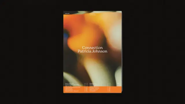
The cover anchors that language immediately. A large-format hero image dominates the page. The studio name sits in bold, oversized type. The tagline holds a secondary weight beneath. It’s a classic hierarchy, executed without unnecessary decoration. That restraint is the point—the cover says, “We let the work speak.”

Inside pages maintain tonal consistency through a recurring warm accent color—visible in subheads, rule lines, metric callouts, and icon elements. That single-color thread functions as what designers call a Chromatic Signature: a hue used sparingly enough that every instance feels intentional rather than decorative. It also creates visual memory across the spread sequence, which matters when a reader is flipping through a printed brochure.

Typography Hierarchy in the Template

The type system works in three clear scales. Display type handles section titles and large metric figures. Body type carries descriptive text and service descriptions. Caption type labels team photos, testimonial attributions, and timeline entries. Each scale has consistent spacing, and the relationships between them feel calibrated rather than arbitrary.

That calibration is harder to achieve in a template than in a bespoke design. It requires the designer to anticipate variance—longer studio names, shorter taglines, more or fewer services—while keeping the hierarchy intact. The layout handles this reasonably well because the InDesign paragraph styles can be edited without breaking the proportional relationships.

Interior Portfolio Pages: The Section That Does the Most Work

For an interior design portfolio brochure template, the portfolio spread is the critical test. Everything else builds credibility. This section delivers evidence.

The template uses a multi-image grid format for the portfolio pages. Multiple photos sit in a structured arrangement that allows both full-bleed drama and comparative sequencing. That dual function is important. A single full-bleed image communicates atmosphere. A grid communicates range. The layout offers both, which is the right editorial decision for a studio pitching a diverse residential or commercial portfolio.

The grid spacing maintains enough margin between images to prevent the visual noise that plagues over-packed portfolio layouts. Each photo cell reads as a considered editorial choice rather than a thumbnail dump. That’s the difference between a brochure that feels curated and one that feels comprehensive—and curated always wins in premium positioning.

Featured Projects vs. Interior Portfolio: Two Different Strategic Moves

The template separates Featured Projects from the full Interior Portfolio. This is a structurally smart decision. Featured Projects can highlight one or two signature commissions with extended detail—process notes, client brief references, outcome descriptions. The portfolio grid shows breadth. Together, they work as a Proof Layering System: depth first, range second.

Most interior design studios present their work the other way around—grid first, detail never. That approach works for social media but fails in a client pitch brochure. Sarraipo’s structure corrects that default by building depth into the template architecture itself.

Why CMYK Color Mode Matters for Printed Interior Design Collateral

This template uses CMYK color mode. If you’re printing physical brochures—and you should be, for high-value interior design pitches—that’s the correct setting. RGB files converted at the printer often produce color shifts that read as careless. CMYK documents produced in InDesign with proper color profiles go to press with accuracy.

For a luxury interior design practice, print quality is a brand signal. A brochure printed from a properly configured CMYK InDesign file lands differently than one converted from a screen-optimized RGB layout. Clients notice, even when they can’t articulate what they’re noticing. They feel it as a quality differential.

The A4 format is the standard choice for European and international studios. It fits standard print runs, works across most professional printers, and maintains a document feel that distinguishes it from oversized promotional formats. For studios targeting clients who appreciate precision, A4 is the right call.

Who Should Use This Interior Design Portfolio Brochure Template?

The template works best for established interior design studios, architecture practices with a residential portfolio, and independent designers transitioning from project-based work to studio positioning. It’s not designed for freelancers with three projects to show—the 26-page structure needs sufficient content to sustain the narrative arc.

Beyond active studios, the template works well for new businesses building their first formal pitch deck, for practices that have relied on digital portfolios and are now entering markets where physical collateral is expected, and for studios pitching to hospitality, commercial, or luxury residential clients who evaluate firms partly through the quality of their printed materials.

The customizable nature of the template in Adobe InDesign means the layout adapts without requiring an advanced design background. You need basic InDesign familiarity—paragraph styles, linked images, and master pages—but not specialist skills. That accessibility is a genuine feature, not a marketing claim.

Practical Customization: What You Actually Need to Change

Adobe InDesign templates of this quality typically require the same set of customizations. Replace the placeholder text with studio copy. Swap the preview images with your own photography. Adjust the accent color to match your brand. Update the font if you have a licensed brand typeface. Apply your logo to the cover, back cover, and running headers.

The template’s paragraph styles make text replacement straightforward. The image frames are set to proportional fitting, so replacing placeholder images doesn’t require manual rescaling. These are signs of a well-constructed template, not accidental conveniences.

One important note: the photos and design elements shown in the template preview are for display purposes only. They are not included in the downloaded file. You will need to supply your own photography—which is, of course, the only appropriate approach for a portfolio that represents your work.

Interior Design Brochure Templates vs. Custom Design: Making the Right Call

This is a question worth answering directly. Custom brochure design from a senior graphic designer runs anywhere from €1,500 to €5,000+ for a document of this complexity. A professionally designed InDesign template at a fraction of that cost gives you a production-ready layout with proven structure, consistent type hierarchy, and print-ready specifications.

The trade-off is differentiation. A custom design is unique to your studio. A template, no matter how well customized, begins from a shared foundation. For most interior design practices, that trade-off is favorable—the customization layer (your photography, your typography, your copy, your color) produces a document that looks entirely your own.

The studios that genuinely need custom design are those competing at a level where the brochure itself is expected to demonstrate bespoke capability—where a template origin would read as a contradiction. Most studios are not at that level, and even those that are often use templates for secondary collateral while reserving custom work for primary brand materials.

Design Frameworks Built Into This Template

Looking at the full page sequence, three editorial frameworks operate simultaneously. The first is the Studio Credibility Arc already mentioned—identity to proof to invitation. The second is what I’d call a Spatial-to-Statistical Oscillation: the layout alternates between image-heavy spreads that communicate atmosphere and text-metric spreads that communicate capability. That alternation maintains engagement through a 26-page document.

The third framework is a Trust Ladder: the sequence of social proof elements moves from studio values (self-reported) through client testimonials (third-party reported) through studio metrics (quantified) through partner logos (institutional endorsement). Each step on that ladder carries more weight than the last. By the time a prospective client reaches the terms and conditions page, they’ve encountered trust evidence at four distinct levels.

These frameworks aren’t labeled anywhere in the template. They’re baked into the structure. That’s good template design: the decisions are made so the user doesn’t have to make them.

How This Template Supports an Interior Design Portfolio for Hospitality and Commercial Clients

The Design Packages and Service Overview sections make this template particularly suited for studios with tiered offerings or multi-discipline service lines. Hospitality interior design pitches often require clear scope delineation—guest rooms, lobby, F&B, spa—and the service sections accommodate that kind of structured breakdown without requiring layout rework.

The Studio Timeline page is underused in most portfolio brochures but functions as a powerful credibility signal in hospitality and commercial pitches. Showing a studio’s evolution—key commissions, growth milestones, and team expansion—communicates stability. Large hospitality groups and commercial developers don’t want to work with studios that won’t exist in three years. The timeline page makes a quiet argument against that concern.

Client Testimonials and Team Pages: The Human Layer

The inclusion of both a Design Team page and a Client Testimonials page reflects a mature understanding of the interior design pitch process. In high-value residential and commercial commissions, clients are selecting people as much as portfolios. The team page personalizes the studio. The testimonials validate the experience of working with those people.

Together they function as a Relational Proof Pair—a presentation of the studio as a set of relationships, not just a body of completed work. That framing is increasingly important in a market where clients can access global studio portfolios online. What they can’t access online is evidence that working with a specific team is genuinely enjoyable. The template gives you the structure to make that case in print.

Adobe InDesign: Why It Remains the Right Tool for This Format

Adobe InDesign remains the industry standard for multi-page print documents. Its paragraph style system, master page architecture, and color management tools are built for exactly this use case. A 26-page CMYK document with multiple image frames, complex typography, and precise grid structures is straightforward in InDesign and genuinely difficult in any alternative tool.

For designers who use Adobe Creative Cloud, this template integrates naturally into an existing workflow. Photography retouched in Lightroom or Photoshop, graphics built in Illustrator, and layout assembled in InDesign—that’s a coherent production pipeline. The template supports it directly.

If you’re not yet a Creative Cloud subscriber, this template is a strong argument for the investment. The ability to produce client-ready print collateral at this quality level, with a professional template as a structural foundation, pays for a CC subscription many times over in a single client engagement.

Forward-Looking Prediction: Print Portfolio Collateral Is Gaining Value

Here’s a position worth putting on record. As digital portfolios become universal, physical print collateral is becoming a differentiator again. When every studio has a polished website, the studio that also arrives with a beautifully printed brochure signals seriousness, investment, and permanence.

This dynamic is most visible in luxury residential markets, high-end hospitality, and premium commercial real estate—exactly the sectors where interior design studios want to grow. In those sectors, physical materials are still expected at certain stages of the pitch process. The studios that maintain print capability are better positioned for those engagements.

Download the template from Adobe Stock

A well-structured interior design portfolio brochure template, customized with genuine studio photography and copy, is a durable asset. It doesn’t need to be updated for every pitch. It needs to tell the studio’s story accurately and beautifully and then get out of the way.

This template does that.

Frequently Asked Questions

What software do I need to use this interior design portfolio brochure template?

You need Adobe InDesign to open and edit this template. It is not compatible with Canva, Microsoft Word, or Google Slides. An active Adobe Creative Cloud subscription gives you access to the latest version of InDesign.

How many pages does this interior design brochure template include?

The template includes 26 predesigned, fully customizable pages. The page count covers all major sections of a complete studio presentation, from a cover and contents page through to a closing thank-you spread.

Is this template suitable for professional printing?

Yes. The template uses CMYK color mode and A4 format, both of which are standard specifications for professional offset and digital printing. You should export to PDF/X-1a or PDF/X-4 for print submission, depending on your printer’s requirements.

Are the photos included in the download?

No. The photos and design elements shown in the preview images are for display purposes only and are not included in the downloaded file. You need to replace the placeholder images with your own photography.

Who designed this interior design portfolio brochure template?

The template was designed by Tom Sarraipo, a graphic designer who specializes in professional InDesign layouts for creative industries.

Can I change the colors and fonts in this template?

Yes. Because the template is built in Adobe InDesign, you can edit paragraph styles, swatch colors, and font assignments across the entire document. Changing the accent color globally, for example, requires updating a single swatch in InDesign’s Swatches panel.

Is this template suitable for architecture studios as well as interior designers?

Yes. The section structure—featuring project portfolios, service descriptions, team pages, and client testimonials—applies equally well to architecture practices with a residential or commercial interior focus. The layout is flexible enough to accommodate architectural project photography and firm-specific copy without layout rework.

What is the difference between this template and a generic business brochure template?

This template is structured specifically around the narrative arc of a design studio presentation. It sequences identity, philosophy, services, proof, and social validation in an order that reflects how premium interior design clients evaluate a studio. Generic business brochure templates don’t account for that pitch logic, and the structural difference shows in how the final document reads.

Can I use this interior design portfolio brochure template for digital distribution as a PDF?

Yes. While the template is configured for print, you can also export it as a PDF for digital distribution. For screen-only use, you may want to convert the color profile to sRGB in the export settings to ensure accurate color rendering on monitors.

Where can I purchase this interior design portfolio brochure template?

The template is available through Adobe Stock, where it can be licensed for professional use. Adobe Creative Cloud subscribers with an All Apps plan may have template credits available as part of their subscription.

Don’t hesitate to find other premium design templates here at WE AND THE COLOR.

#AdobeInDesign #brochure #design #graphicDesign #portfolio #portfolioBrochureTemplate

Job Application Template Set for Adobe InDesign: Resume, Cover Letter, Portfolio & References in One Uniform Design

Seriously, most job seekers spend hours cobbling together documents that look like they came from three different decades. The resume borrows a template from one site, the cover letter is a reformatted Word file from 2018, and the references page is plain text with a different font. Hiring managers notice this immediately. Presentation is part of the application itself—and a fragmented one sends exactly the wrong signal.

This four-piece job application template set for Adobe InDesign solves that problem at the root. It delivers a fully unified, professionally designed layout covering every document a complete application requires: a resume, a cover letter, a portfolio page, and a references sheet. Everything shares the same visual language, the same typographic hierarchy, and the same clean structure. That coherence is not decorative—it communicates intentionality, which is something no recruiter misses.

Download the template from Adobe Stock

Please note that this template requires Adobe InDesign installed on your computer. Whether you use Mac or PC, the latest version is available on the Adobe Creative Cloud website—take a look here.

Download a full set of job application templates, including a resume, cover letter, portfolio, and references, as a uniform Adobe InDesign layout in US Letter and A4. Download the template from Adobe Stock

What Does a Complete Job Application Template Actually Include?

Most template packs sell you a resume and call it a day. This set takes a different approach. It treats the job application as a designed system, not a collection of individual files. Each of the four documents serves a distinct purpose, but together they form what designers might call a Application Identity System—a term worth defining clearly.

An Application Identity System is a coordinated set of job application documents that share a unified visual language, consistent typographic rules, and a coherent personal branding structure. The concept borrows from corporate identity design, where every customer touchpoint reinforces the same brand impression. Applied to job hunting, it ensures that every document a recruiter touches carries the same professional voice.

Here is what each document in this InDesign job application template set contributes:

The resume leads with a circular profile photo, contact details at the top, and a Quick Facts row featuring four key metrics—years of experience, companies, completed projects, and technical skills. Below that, clearly labeled sections cover education, experience, skills (with visual dot ratings), and interests. The layout is clean, scannable, and built for modern applicant tracking systems.

The cover letter mirrors the header design of the resume exactly. It uses a formal two-column recipient block (TO / FROM) with date, salutation, and structured body paragraphs. The visual consistency between the resume and the cover letter is immediate and deliberate.

The references sheet lists up to five professional references with name, title, company address, and full contact details. Each entry uses a consistent layout with subtle dividers. This document is frequently missing from applicant packages entirely—its inclusion signals thoroughness.

The portfolio page provides a structured layout for showcasing previous work with project images, captions, publication dates, and clickable URLs. For creatives especially, this page bridges the gap between listing experience and demonstrating it.

Why Visual Coherence Matters More Than You Think in a Job Application

Recruiters spend an average of six to seven seconds scanning a resume before deciding whether to read further. That statistic is widely cited—but what it misses is the effect of the cover letter, references, and portfolio pages that follow. Together, those documents accumulate into a first impression that compounds across multiple touchpoints.

A mismatched application package introduces cognitive friction. The recruiter has to reorient with each new document mentally. A coherent job application template set removes that friction entirely. The reader moves through the package fluidly because the design language stays constant.

This is what separates a professionally designed InDesign resume template from a generic DOCX download. Adobe InDesign gives designers precise control over typography, spacing, grid alignment, and color. The result is not just prettier—it is structurally more reliable and more consistent across print and digital output.

The CMYK Advantage: Designed for Professional Printing

This template set uses CMYK color mode throughout. That choice matters more than most people realize. RGB color values look accurate on screen but shift unpredictably when sent to a professional printer. CMYK color mode is the industry standard for print production, ensuring that the red accent tones and the precise gray values in this set reproduce exactly as intended—whether you print at home, at a print shop, or submit to a digital portfolio.

Furthermore, the template is available in both US Letter and A4 formats. If you are applying across markets—say, to a New York agency and a Berlin studio simultaneously—you can output the correct page size for each market without reformatting a single element.

InDesign Job Application Templates vs. AI-Generated Resumes: A Direct Comparison

AI resume builders have become popular for obvious reasons—speed, zero design skill required, and instant output. But speed is not the same as quality. The differences matter significantly, particularly for roles where design sensibility is part of the evaluation.

FeatureThis InDesign Template SetAI-Generated Resume ToolsVisual coherence across all documentsFully unified Application Identity SystemUsually resume only; no matching cover letter or referencesDesign customizationComplete—every element editable in InDesignLimited to pre-set templates with restricted editingTypography controlTypically, US Letter only or non-configurableMinimal; font choices locked or severely limitedColor modeCMYK—print-ready and professionally accurateRGB only; not suitable for professional print productionPage size optionsUS Letter and A4 includedRarely, most AI tools do not support portfolio layoutsPortfolio page includedYes—structured layout with image placeholdersRarely; most AI tools do not support portfolio layoutsReferences sheet includedYes—formatted for up to five referencesAlmost never includedProfile photo integrationCircular photo placeholder, easy image placementProfessional-grade, press-ready outputPrint production qualityProfessional-grade; press-ready outputScreen-optimized only; print results unpredictableLong-term reusabilityUpdate once, maintain for years across formatsOften tied to subscriptions or platform lock-in

The conclusion here is not that AI tools are useless. For quick applications to mid-tier roles, they serve a purpose. But for roles where your application itself is evaluated as creative output—design, architecture, marketing, editorial, branding—a professionally designed InDesign job application template is not optional. It is strategic.

How to Customize This Job Application Template Set in Adobe InDesign

One of the most common hesitations about InDesign templates is the assumption that you need advanced software skills to use them. This set is designed to remove that barrier. All text fields are clearly organized and straightforward to update. You replace the placeholder text with your own information, swap the profile photo, and adjust any color accents to match your personal brand.

The workflow follows what I call the Slot-and-Style Method: a customization approach where the structural design stays fixed while only personal content changes. This means you never touch the grid, the spacing, or the typographic hierarchy—elements that require real design experience to get right. You simply fill the slots. The style is already done for you.

Adding Your Own Photo and Personal Information

The circular profile photo placeholder uses InDesign’s standard image frame workflow. Click on the placeholder, use File > Place, and select your image. InDesign automatically crops it to fit the circular frame. Contact details, job title, and name fields sit directly below—all editable text frames. The process takes minutes, not hours.

Adapting the Skills and Quick Facts Sections

The Quick Facts row on the resume accepts any four metrics meaningful to your field. A graphic designer might use years of experience, number of clients, completed projects, and tools mastered. A software engineer might substitute repositories, languages, certifications, and team size. The dot-rating system in the Skills section works the same way—simply replace the software labels and adjust the filled dots to reflect your actual proficiency levels.

The Concept of Typographic Consistency in Job Application Design

Typography in this set follows a rigorous hierarchy. The candidate’s name uses a large, confident sans-serif weight. Section labels use a secondary weight with red accent markers—the small arrow icon before each label acts as a visual anchor, guiding the eye through the document. Body text sits in a readable size with comfortable leading.

This hierarchy defines what I call Recruitment Typography Hierarchy—a structured typographic system within a job application document that uses size, weight, color, and spacing to guide a recruiter’s eye toward the most decision-relevant information first. The candidate’s name and title should register within the first half-second of a glance. The red accent color in this set serves exactly that function, creating a subtle but persistent visual priority signal throughout all four documents.

Who Should Use This Job Application Template Set?

The obvious answer is designers. But this InDesign resume template works equally well for anyone who wants their application to reflect a higher level of professionalism. Architects, photographers, brand managers, marketing directors, editors, and creative consultants all operate in fields where how you present yourself carries weight comparable to what you present.

Beyond creatives, the template is valuable for anyone applying to senior or executive roles where the application package itself communicates readiness. A VP of Marketing submitting a mismatched, inconsistently formatted application package sends a quiet signal about their attention to detail. A coherent, professionally designed set sends the opposite message.

Additionally, the portfolio page makes this set particularly suited to freelancers and consultants building their client acquisition materials. A well-designed portfolio page paired with a matching cover letter and reference documents elevates a pitch package significantly above standard alternatives.

Practical Predictions: Where Professional Application Design Is Heading

The job market increasingly rewards personal branding that extends beyond LinkedIn profiles. As AI-generated resumes flood the market, hiring managers will develop a keener eye for originality and visual quality. The saturation of AI-produced documents will create a distinct premium for professionally designed application materials—exactly the kind this InDesign template set provides.

My prediction: within the next three years, visually coherent multi-document application packages will shift from differentiating detail to baseline expectation in competitive creative markets. The candidates who establish that standard now will benefit from being early rather than compliant.

Format, File Delivery, and Compatibility

The template set delivers as a downloadable Adobe InDesign file, ready to open and edit immediately. The CMYK color mode ensures accurate color reproduction across both digital display and physical print. Both US Letter and A4 page sizes are included, which addresses the most common formatting requirement for international job applications.

Download the template from Adobe Stock

This professional resume template for InDesign requires Adobe InDesign to edit. If you need a PDF output after customization, InDesign’s export workflow produces high-resolution, press-ready PDF files with one click. The resulting output is suitable for email submission, print, or digital portfolio presentation.

Frequently Asked Questions

What software do I need to use this job application template set?

You need Adobe InDesign. The template is delivered as a native .indd file, fully editable within InDesign. Adobe Creative Cloud subscribers have access to InDesign as part of their plan. There is no alternative software that will open and edit this file with full fidelity.

Can I use this InDesign resume template for printing?

Absolutely. The template uses CMYK color mode, which is the professional standard for print production. You can print at home, through a local print shop, or export a press-ready PDF for commercial printing. The colors will reproduce accurately across all standard print workflows.

Does this template work for both US Letter and A4 paper sizes?

Yes. The set includes both US Letter and A4 versions of all four documents. You can choose the format appropriate for your target market without reformatting any content.

How difficult is it to replace the placeholder photo with my own image?

It is straightforward. In InDesign, you click on the circular photo placeholder, go to File > Place, and select your image file. InDesign crops the photo to fit the circular frame automatically. No design experience is required for this step.

Is this template suitable for non-designers?

Yes, if you have a basic familiarity with Adobe InDesign. The Slot-and-Style Method this template follows means you only need to replace text and swap your photo. The structural design, spacing, and typography are already set and do not require modification.

How does a professionally designed application template compare to AI resume builders?

AI resume builders offer speed but sacrifice design quality, customization depth, and document completeness. This InDesign template set provides a unified four-document Application Identity System—resume, cover letter, portfolio, and references—with full CMYK print readiness and complete typographic control. For competitive roles in creative industries, that difference is decisive.

Can I customize the color scheme to match my personal brand?

Yes. All color elements in this InDesign job application template are fully editable. You can adjust the red accent color to any other tone using InDesign’s Swatches panel. Changing one global swatch updates the accent color consistently across all four documents simultaneously.

What makes a multi-document application package more effective than a resume alone?

A resume answers the question “What have you done?” A cover letter answers, “Why do you want this role?” A reference sheet answers, “Who can verify your work?” And a portfolio page answers, “What does your work actually look like?” Together, these four documents address every primary question a recruiter has. Submitting all four in a coherent visual system demonstrates thoroughness, professionalism, and design literacy simultaneously.

Browse WE AND THE COLOR’s Templates section for more.

#AdobeInDesign #AdobeStock #coverLetter #cv #InDesignTemplate #jobApplication #jobApplications #references #resume #resumeTemplate

Corporate Business Brochure Design Template for Adobe InDesign: 22 Pages, Print-Ready

Most business brochures fail before they’re even printed. The layout looks patched together. The hierarchy feels borrowed. Nothing holds the reader’s eye long enough to matter. Yet the companies that communicate best visually aren’t always the ones with the biggest budgets—they’re the ones with the right foundation. A well-designed corporate brochure template changes the entire starting position. You’re not building from a blank canvas; you’re refining from a point of real craft.

This corporate business brochure template by Adobe Stock contributor Tom Sarraipo is that kind of foundation. It’s 22 pages of structured, print-ready InDesign layout that covers every section a modern company presentation needs—from mission and vision to team profiles, service listings, project timelines, pricing packages, and client testimonials. Furthermore, it ships in CMYK color mode, making it ready for professional offset and digital printing without color surprises.

If you’re searching for a professional InDesign brochure template that actually communicates corporate authority while staying fully customizable, this is worth understanding in detail.

Download the template from Adobe Stock

Please note that this template requires Adobe InDesign installed on your computer. Whether you use Mac or PC, the latest version is available on the Adobe Creative Cloud website—take a look here.

Download a corporate business brochure design template as a customizable Adobe InDesign layout in A4, designed by Tom Sarraipo. Download the template from Adobe Stock

What Makes a Corporate Business Brochure Template Truly Professional?

That’s the question most designers stop asking too soon. A template isn’t professional simply because it looks clean. “Professional” means structurally sound—every page has a clear job, and the sequence of pages builds a coherent argument about the company. Sarraipo’s layout follows what I’d call a Narrative Architecture Model: each spread acts as a chapter, and together they build a persuasive company story from identity to evidence.

The cover sets the tone immediately. Bold sans-serif type in high contrast reads at a glance, while the editorial use of full-bleed photography grounds the design in physical credibility. This isn’t decorative minimalism for its own sake—it’s communicative restraint.

Moreover, the contents page does something many brochure templates skip entirely: it treats navigation as a design element. Section dividers, typographic hierarchy, and a structured grid make the spread feel like a quality publication rather than a company handout.

The 22-Page Structure: A Section-by-Section Overview

What separates a thoughtfully scoped brochure template from a generic one is section logic. Each of these 22 pages serves a specific rhetorical function in a corporate presentation:

Cover: Establishes brand tone and first impression. Heavy typographic contrast and full-bleed imagery. Table of Contents: Structured navigation layout with clear hierarchy. About Us: Team-facing portrait photography with editorial text columns. Mission & Vision: Two-page spread with text blocks and supporting imagery—ideal for value communication. Stats and Data Spread: Chart-formatted data visualization for key business metrics. Our Services: Multi-column services layout with supporting photography and percentage indicators. Our Team: Portrait-based grid with role typography—names, positions, brief bios. Project Timeline: Structured Gantt-style timeline layout with milestone entries. Pricing and Packages: Three-tier pricing comparison with feature bullets and clear CTAs. Assurance Report: Data-dense single-page layout for trust signals and compliance details. Our Testimonials: Client quote grid with portrait photos and source attribution. Thank You / Back Cover: Closing spread with contact and brand reinforcement.

Additionally, all text and images are placeholder-based. Consequently, you can drop in your own content without restructuring a single element.

Why CMYK Matters for Professional Business Brochure Design

Color mode is the most frequently overlooked technical detail in template selection—until the print job comes back wrong. RGB is a screen-based color model. Therefore, files built in RGB will produce unexpected color shifts when sent to a commercial printer using CMYK inks.

Sarraipo’s template is built natively in CMYK. That means the warm neutrals in the photography-integrated layouts, the clean whites in the data spreads, and the carefully chosen accent tones will all translate accurately to print. You’re not guessing; you’re working within the same color model your printer uses.

For businesses ordering professional print runs—whether for client pitches, trade shows, investor meetings, or partner presentations—CMYK-native InDesign templates reduce prepress rework substantially. This is not a minor technical footnote; it’s a significant practical advantage for anyone ordering offset printing in quantity.

The Design Language: Editorial Restraint as Corporate Communication

Tom Sarraipo’s visual language throughout this corporate brochure template is what designers describe as editorially restrained. That term deserves unpacking. Restraint in editorial design doesn’t mean sparse or cold—it means every visual decision earns its place.

The color palette is warm and neutral with strategic amber accents. The typographic system pairs a geometric sans-serif for headings with a legible serif or clean body face for body copy. The grid is strict, which paradoxically creates visual freedom—elements aren’t fighting each other for space.

Furthermore, the photography integration throughout the layout follows a Contextual Immersion Principle: images don’t function as decoration but as evidence. The About Us spread uses an in-context portrait—a professional in a designed office environment—rather than a posed headshot against a white background. The “Our Team” spread echoes this with candid-style professional portraiture. These choices communicate a specific brand personality: thoughtful, modern, and grounded.

The stats spread—one of the most challenging page types to design well—handles data visualization with typographic weight rather than chart complexity. Large percentage figures paired with simple bar indicators communicate data without requiring the reader to interpret complex visualizations. That’s a genuinely smart editorial decision.

How to Customize This Corporate InDesign Brochure Template

One of the strongest practical arguments for using an A4 InDesign brochure template like this one is the customization workflow. Adobe InDesign’s paragraph and character styles mean you can update fonts globally from a single panel. Master pages handle repeating elements—page numbers, footers, and section headers—without manual page-by-page edits.

Here’s how to approach customization efficiently:

Step 1—Replace placeholder images first. Use InDesign’s Place command (Cmd/Ctrl+D) to swap in your own photography. Because all image frames are pre-sized and masked, your images drop into an established composition immediately.

Step 2—Update color swatches. Open the Swatches panel and redefine the primary accent color to match your brand. All elements linked to that swatch update automatically across all 22 pages.

Step 3—Replace text content section by section. Start with the cover and work through in page order. Since all text blocks are placeholder copy, each text frame is already sized and styled for the amount of copy each section needs. Don’t overwrite. Match the placeholder’s approximate word count for best visual results.

Step 4—Export to PDF for print using the PDF/X-1a or PDF/X-4 preset. Both presets are designed for CMYK commercial printing and will embed all fonts and flatten transparency correctly.

Who Needs a 22-Page Corporate Business Brochure Template?

The obvious answer is corporations. But the actual range of use cases for a full-scope corporate brochure layout is broader than the label suggests.

Consulting firms, architecture studios, real estate agencies, financial advisory practices, and technology service companies all require presentation documents that do what this template does—communicate capability, credibility, and identity in a single designed object. Similarly, startups approaching investors need the same editorial authority that established corporations project. A well-structured InDesign company brochure template compresses the visual credibility gap considerably.

Marketing agencies producing materials for clients frequently use customizable brochure templates as billable starting points. Rather than building a 22-page layout from scratch, they adapt a proven grid and structure. The design time savings are significant, and the output quality is consistently high.

Additionally, nonprofit organizations preparing annual reports, capabilities statements, or donor presentations share the same structural needs as corporate entities. The sections in this template—team, mission, services, financials, testimonials—translate cleanly to the nonprofit context with minimal adaptation.

What the Corporate Brochure Template Gets Right About Business Communication

I’ve reviewed a significant number of business brochure templates, and the consistent failure mode is what I call visual noise syndrome: too many decorative elements competing with the content, no clear reading path, and section types that feel randomly sequenced. Sarraipo avoids all three.

The reading path through this template is deliberate. You enter through brand identity (cover, contents), move into company character (about us, mission and vision), then into capability proof (services, team, stats), followed by commercial terms (pricing, timeline), and close with trust signals (assurance, testimonials). That sequence mirrors an actual sales conversation. Therefore, this isn’t just good design—it’s persuasive architecture.

The “Thank You” back cover is a detail worth noting specifically. Many brochure templates leave the back cover as an afterthought. Here, it mirrors the front cover in weight and typographic consistency, treating the closing moment of the document as a considered communication rather than a production necessity. Small distinction; real impact.

InDesign Corporate Brochure Template vs. Starting From Scratch

There’s a recurring debate in design communities about whether using templates compromises creative originality. Frankly, it’s a false conflict. Templates don’t replace design thinking—they replace construction time. Furthermore, a template by a skilled designer like Sarraipo brings solved problems to the table: consistent grid proportions, pre-tested typographic hierarchies, and page compositions that have been refined visually rather than generated by algorithm.

Starting from scratch makes sense when a project has highly specific constraints that no template satisfies. For the vast majority of corporate brochure projects—where the goal is professional communication rather than design innovation—a well-built template is the superior starting point. The time saved goes back into content quality, photography selection, and communication strategy.

For designers billing hourly, that time differential is direct profit margin. Furthermore, for in-house marketing teams, it reduces production cycles. And for business owners who are their own designers, it’s a finished document that looks like it came from a professional studio.

Adobe Stock Corporate Brochure Templates: What to Look For

Adobe Stock’s template catalog varies widely in quality. When evaluating InDesign corporate brochure templates specifically, these criteria consistently predict usability:

CMYK color mode—non-negotiable for any print application. Properly organized layers save significant customization time. Paragraph and character style consistency enables global typography changes. Master page setup—running elements should live on masters, not on individual pages. Page count appropriate to scope—22 pages is the right range for a full corporate presentation document. Fewer pages leave out critical sections; more pages often include redundant spreads. Section logic—pages should tell a story in sequence, not just fill a page count.

Sarraipo’s template meets all six criteria. Moreover, all images in the template are placeholder-only—no embedded stock photography that might carry licensing complications in your final document. You supply the actual imagery, and the layout performs the composition work.

The Future of Corporate Brochure Design

Print isn’t dying. It’s differentiating. In a landscape saturated with digital-first company communications—decks, microsites, LinkedIn posts—a well-designed physical brochure has become a higher-signal object. Handing a client or investor a printed brochure with this level of editorial craft communicates intent, resources, and attention to detail in a way a shared Google Slides link does not.

Consequently, the demand for high-quality, print-ready InDesign templates is increasing rather than declining. Designers and brands that invest in strong printed materials now position themselves against a backdrop where most competitors have abandoned the format entirely.

Download the template from Adobe Stock

My prediction: companies that maintain polished print collateral alongside their digital-first communications will develop what I term a Tactile Credibility Advantage—a measurable trust differential with clients and partners who receive physical materials. This advantage compounds over time as the printed business document becomes genuinely rare. Therefore, a CMYK-ready, professionally structured corporate brochure template isn’t just a production tool. It’s a strategic communication asset.

Frequently Asked Questions

What software do I need to use this corporate business brochure template?

You need Adobe InDesign. The template is built as an InDesign layout file (.indd), so you need an active Adobe Creative Cloud subscription that includes InDesign. Any recent version of InDesign will open the file. Adobe offers Creative Cloud plans for individuals, teams, and enterprises through Adobe.com.

Is this corporate brochure template print-ready?

Yes. The template is built in CMYK color mode, which is the correct color model for professional printing. Export to PDF/X-1a or PDF/X-4 from InDesign for commercially printable output. The A4 page format is standard for international print production.

Can I use this template for digital distribution as well as print?

Absolutely. InDesign exports to interactive PDF, which works well as an emailed or downloadable digital brochure. For web embedding, you can export to a standard PDF and host it on your website. However, the template is optimized and built for print first, so print output will be the highest-quality application.

How many pages does this corporate InDesign brochure template include?

The template includes 22 pre-designed, fully customizable pages covering a cover, table of contents, about us, mission and vision, stats spread, services, team, project timeline, pricing and packages, assurance report, testimonials, and a closing thank you page.

Are the images and text in the template licensed for commercial use?

All images and text in the template are placeholders only—they are not licensed for final use. You must replace all placeholder images with your own licensed photography and replace all placeholder text with your own content before distributing the brochure commercially.

Can a non-designer customize this corporate brochure template?

Yes, with basic InDesign familiarity. The placeholder structure means you’re primarily replacing content rather than building layouts. If you’re new to InDesign, Adobe offers free tutorials through Adobe Learn that cover the essential skills—placing images, editing text, and exporting to PDF—needed to customize a template like this one effectively.

What is the A4 page format in inches?

A4 is 210 mm × 297 mm, equivalent to approximately 8.27 × 11.69 inches. It’s the standard document size for professional printing in Europe, Australia, and most international markets. For US-based printing, you may need to adjust the page size to US Letter (8.5 × 11 inches) and recheck all margins and bleed settings accordingly.

Who designed this corporate business brochure template?

The template was designed by Tom Sarraipo, a graphic designer and contributor to Adobe Stock. It is available for download through Adobe Stock as a customizable InDesign layout file.

Browse WE AND THE COLOR’s Templates category for more.

#AdobeInDesign #AdobeStock #brochure #brochureDesign #businessBrochure #design #graphicDesign #InDesignTemplate

A Brand Portfolio Presentation Template for Adobe InDesign That Changes How Creatives Pitch

Clients decide in seconds. Before you say a word in any pitch meeting, your presentation has already made a first impression—and that impression either opens doors or closes them. A brand portfolio presentation template built for Adobe InDesign gives you a structural and visual advantage that raw talent alone rarely delivers. This particular template by Adobe Stock contributor GraphicArtist takes that premise seriously, and it shows in every one of its 30 meticulously designed pages.

The design world has a presentation problem. Most creative professionals spend years refining their craft, then rush a portfolio together the night before a pitch. The result is a mismatch between the quality of the work and the quality of its presentation. That mismatch costs contracts. Furthermore, it shapes perception in ways that are difficult to reverse. This template exists to close that gap.

Download the template at Adobe Stock

Please note that this template requires Adobe InDesign installed on your computer. Whether you use Mac or PC, the latest version is available on the Adobe Creative Cloud website—take a look here.

Brand Portfolio Presentation Template for Adobe InDesign by GraphicArtist. Download the template at Adobe Stock

What Makes a Brand Portfolio Presentation Template Worth Using in Adobe InDesign?

Not all presentation templates are equal. Some give you slides. Others give you a system. The best ones give you a visual language—a consistent framework that communicates who you are before the content even loads. This Adobe InDesign template lands firmly in the third category.

Built at 1920×1080 pixels, it targets screen presentations from the start. That means every proportion, every margin, every typographic choice is calibrated for display—not print. The result is a layout that looks sharp on a projector, a client’s monitor, or a shared PDF link. Consequently, it works across the full range of modern creative pitching scenarios.

The visual identity of the template is built around editorial restraint. Black, white, and neutral tones dominate. Typography is large, confident, and structurally anchored. The grid is strict but not rigid—it guides without suffocating. This is what good design systems do. They create order while leaving room for your content to breathe.

Moreover, the layout vocabulary is unmistakably modern. Full-bleed image zones sit beside text columns. Section dividers use typographic weight rather than decorative elements. White space is used generously and intentionally. Every page communicates: this studio has taste, and it controls it.

The Architecture of Persuasion: Breaking Down the 30-Page Structure

Thirty pages might sound like a lot. In practice, it gives you exactly the right amount of room to build a complete narrative arc. A creative portfolio pitch needs more than work samples. It needs context, process, credibility, and a clear call to action. This template accounts for all of it.

Opening Sections: Identity and Positioning

The template opens with strong identity slides—studio name, positioning statement, and visual anchor. These early pages do something strategically important: they establish the studio’s personality before any work appears. Clients need to know who they’re evaluating before they can evaluate the work fairly. The opening pages answer that question with typographic authority.

Notice how the preview shows large, editorial-style headlines paired with clean body text. The contrast is deliberate. It signals that this studio understands hierarchy—that some information deserves weight and some deserves space. That alone communicates design intelligence to any client paying attention.

Portfolio Spread Pages: Showing Work Without Noise

The core portfolio pages use a grid-based multi-image layout that organizes work without competing with it. Images are given priority. Text supports them rather than fighting for attention. Additionally, the layout system is flexible enough to accommodate different types of visual work—from editorial photography to product design to brand campaigns.

This matters more than most people realize. A presentation layout that imposes visual personality on top of the work confuses the audience. The template here gets out of the way and lets the work speak. That’s a design decision, not a default.

Process and Methodology Pages

One of the most underused sections in any creative portfolio is the process section. Clients often care deeply about how work gets made, not just what it looks like at the end. The template includes dedicated process pages structured around phases like Discovery & Research, Creative Direction & Production, and Final Deliverables.

Structuring process content this way introduces what I call the Proof-of-Method Framework: the idea that demonstrating a repeatable, professional process is itself a form of portfolio evidence. It tells clients that results aren’t accidental. They’re engineered. That shift in perception is often the difference between being hired once and being retained long-term.

Why the Brand Portfolio Presentation Template Uses an Editorial Black-and-White System

The monochromatic palette in this template is a deliberate editorial choice, and it deserves attention. Color is often used in presentations to compensate for weak design structure. When the layout is strong, color becomes optional. When the typography is doing its job, black and white is enough.

This template demonstrates that clearly. The design system leans on contrast, scale, and white space to create visual interest. Accent tones—subtle greys and warm neutrals—add depth without distraction. The result feels closer to a high-end fashion editorial than a standard creative agency deck. Furthermore, it positions the studio in a specific aesthetic territory: precise, refined, and intentional.

There’s also a practical dimension to the monochromatic system. A brand portfolio presentation template built around a neutral palette adapts to any client’s brand color without visual conflict. You can introduce a client’s primary color as a single accent element, and the whole presentation shifts accordingly. That kind of adaptability is rare in pre-designed templates.

Adobe InDesign as a Presentation Platform: Capabilities Most Creatives Ignore

Adobe InDesign is not the obvious choice for presentations. Most creatives default to PowerPoint or Keynote. That default costs them something. InDesign’s typographic control, precise layout system, and PDF export quality are significantly ahead of either alternative. Using it for a brand portfolio presentation gives you capabilities that slide software simply cannot match.

Typographic Precision at Scale

InDesign’s paragraph and character style system allows you to build a presentation where every typographic decision—tracking, leading, optical alignment, and baseline grid—is controlled and consistent. When you’re presenting at a large scale, the difference between careful and careless typography is visible to everyone in the room. This template’s typographic system is built for that level of scrutiny.

Interactive PDF Export

InDesign allows you to export interactive PDFs with internal hyperlinks, page transitions, and embedded navigation. A brand portfolio presentation template exported this way becomes a self-contained, interactive document that clients can navigate independently. That turns your pitch into a leave-behind artifact, not just a meeting prop.

Customization Without Breaking the System

Because the template is fully customizable, every element—text, layout, image frames, colors—can be adapted inside InDesign’s master page and style sheet system. That means you can rebrand the entire presentation for a new client pitch by changing a handful of style definitions. Efficiency like that compounds quickly across a busy studio calendar.

The Presentation-Identity Gap: A Framework for Evaluating Your Current Portfolio

Here’s a question worth sitting with: Does your current portfolio presentation reflect the same level of craft as the work inside it? Most creatives would answer honestly that it doesn’t. That disconnect has a name. Call it the Presentation-Identity Gap—the measurable difference between how good your work actually is and how good it appears to be based on how it’s packaged.

The Presentation-Identity Gap is not a minor issue. It directly affects conversion rates in new business pitches, client perception during ongoing relationships, and the types of briefs clients feel comfortable bringing to you. A studio presenting at a premium level attracts premium briefs. The inverse is equally true.

This brand portfolio presentation template functions as a Presentation-Identity Gap correction tool. It brings the visual quality of the pitch environment up to match the visual quality of the work. That alignment is, in practice, what wins accounts.

Who Should Use This Brand Portfolio Presentation Template

The template is designed for creative professionals who present brand work to clients. That covers a wide range of practitioners—independent brand designers, creative directors at boutique agencies, photographers, editorial studios, and multidisciplinary creative consultancies. If you present visual work to decision-makers, this template is relevant to you.

It’s particularly well-suited for studios working in fashion, editorial, beauty, and high-end commercial photography—contexts where visual sophistication is itself a competitive signal. The aesthetic language of the template maps directly onto how those industries communicate quality. Clients in those sectors will recognize and respond to the design choices instinctively.

Additionally, the template works well for designers building a portfolio for employment rather than client pitches. A job application portfolio presented with this level of structure and visual quality stands out immediately in a review stack. That matters when hiring managers are evaluating dozens of submissions.

Structural Hierarchy in Presentation Design: Why It Determines Attention

Visual hierarchy is how presentations guide attention. Without it, every element competes for the viewer’s focus simultaneously—and attention collapses. With it, the viewer’s eye moves through the page in a controlled sequence, receiving information in the order you intend.

This template’s hierarchy system is built around three levels. The primary hierarchy uses a large typographic scale and full-bleed imagery. Secondary hierarchy uses medium-weight text blocks and structured image grids. Tertiary hierarchy uses captions, metadata, and supporting type at a small scale. Together, they create a reading sequence that feels natural and effortless.

That effortlessness is the goal. When a client can absorb a complex slide in three seconds without confusion, the presentation is doing its job. When they have to work to understand what they’re looking at, the design has failed—regardless of how strong the underlying work is.

Client Testimonial Pages and Social Proof Architecture

The template includes dedicated testimonial pages, and their design is worth examining closely. Pull quotes are typographically scaled and spatially isolated. Attribution lines are set in a smaller, lighter weight. The result is a page that communicates credibility without feeling promotional.

This design approach reflects what I’d call Ambient Credibility Architecture—the principle that trust signals work best when they’re structurally integrated into the presentation, rather than added as an afterthought. A testimonial that feels like a design element rather than a sales tool is far more persuasive than one that interrupts the narrative.

Furthermore, placing testimonials strategically within the deck’s flow—after portfolio work, before process or pricing—creates a reinforcing sequence. The viewer sees the work, then immediately encounters client validation, then understands the method behind both. That sequence builds confidence in a way that no single slide could achieve alone.

Practical Customization Guide for the InDesign Brand Portfolio Presentation Template

Getting the most from a pre-designed InDesign template requires a clear customization workflow. Here’s how to approach it efficiently.

Step 1: Set Up Paragraph and Character Styles

Before replacing any content, review the existing paragraph styles in the template. Understand which styles control which elements. Then update the style definitions to match your studio’s typography system. Every text instance using those styles will update automatically—saving significant time across 30 pages.

Step 2: Replace Images Using Linked Frames

Note that photos and design elements shown in the template preview are for display purposes only and are not included in the downloaded file. Replace placeholder image frames with your own work using InDesign’s Place command. The linked file system keeps the document lightweight and allows easy swapping between project variants.

Step 3: Adjust the Color System

Update the color swatches to reflect your brand palette. Apply them systematically using InDesign’s Find/Change Color function to ensure no elements are missed. The neutral base of the template makes it easy to introduce accent colors without disrupting the overall hierarchy.

Step 4: Build Master Page Variations

Use InDesign’s master page system to create section-specific variations—one master for portfolio spreads, one for process pages, one for contact and CTA sections. This approach keeps the document organized and allows rapid reconfigurations for different pitch scenarios.

The Future of Brand Portfolio Presentation: Where Screen-First Templates Lead

The shift toward screen-first presentations is not reversing. Client meetings increasingly happen remotely. Presentations are shared as links, not printed as leave-behinds. Work is reviewed asynchronously on monitors, not in conference rooms. A brand portfolio presentation template built at 1920×1080 pixels is already aligned with that reality.

Looking ahead, the most competitive creative presentations will combine strong static layout design with interactive navigation and embedded multimedia. Adobe InDesign’s export capabilities position it well for that future. Templates built with this level of structural sophistication will serve as the foundation for increasingly interactive pitch formats.

My prediction: within three years, the distinction between a portfolio presentation and a portfolio website will largely disappear. Interactive PDF and digital publishing formats will blur the line between a static pitch deck and live web presence. Studios that build their presentation infrastructure on Adobe InDesign are now positioning themselves well for that convergence.

Download the template at Adobe Stock

Frequently Asked Questions About the Brand Portfolio Presentation Template for Adobe InDesign

What software do I need to use this brand portfolio presentation template?

You need Adobe InDesign to open, edit, and export this template. It is not compatible with PowerPoint, Keynote, or other presentation tools without conversion.

Does the template include the photos shown in the preview?

No. The photos and design elements shown in the preview are for display purposes only. They illustrate how the layout looks with content in place, but they are not included in the downloaded file. You need to supply your own images.

How many pages does the template include?

The template includes 30 predesigned, fully customizable pages optimized for screen presentation at 1920×1080 pixels.

Can I use this brand portfolio presentation template for client pitches?

Yes. The template is designed specifically for professional brand portfolio presentations. It is suitable for agency pitches, freelance client meetings, and internal creative reviews.

Is the layout customizable for different brand color palettes?

Yes. Every element in the template is fully customizable inside Adobe InDesign. The neutral black-and-white base makes it straightforward to introduce brand-specific accent colors without disrupting the overall design system.

What types of creative professionals benefit most from this template?

Brand designers, creative directors, photographers, editorial studios, and creative consultancies working in fashion, beauty, and high-end commercial sectors benefit most. The aesthetic language aligns closely with those industries’ visual standards.

Can I export the presentation as an interactive PDF from Adobe InDesign?

Yes. Adobe InDesign supports interactive PDF export with internal links, page transitions, and navigation elements. This turns the presentation into a self-contained document clients can explore independently.

Is this template suitable for job application portfolios?

Yes. The structure and visual quality of the template make it highly effective for employment portfolio presentations, in addition to client-facing pitch decks.

Who created this brand portfolio presentation template?

The template was created by GraphicArtist, a contributor to Adobe Stock. It is available for licensing through Adobe Stock.

What is the pixel dimension of the template?

The template is built at 1920×1080 pixels, which is the standard widescreen HD format optimized for digital screen presentations.

Take a look at WE AND THE COLOR’s Templates category to find other premium graphic design assets for creative professionals.

#AdobeInDesign #branding #design #graphicDesign #indesignPresentation #portfolio #portfolioPresentation #presentation

This Adobe InDesign Book Layout Makes A4 Feel Like a Gallery Wall

The Royal Studio’s Adobe InDesign book layout for A4 is the kind of design artifact that makes you rethink what editorial structure is even capable of. It’s moody, controlled, and unapologetically confident—a 20-page template that carries the visual weight of a published art monograph without asking you to start from zero.

Abstract urban photography, warm amber tones, full-bleed spreads, and a typographic discipline that most designers spend years trying to develop. It’s all already here. So the real question becomes: what do you do with it?

This article unpacks that question thoroughly. We’ll cover the template’s design logic, its practical applications, and why it belongs in your toolkit, whether you’re designing a photography book, a brand portfolio, or an editorial series for a creative client.

You can download this template for free with an Adobe Stock trial subscription.

Download the template from Adobe Stock.

Please note that this template requires Adobe InDesign installed on your computer. Whether you use Mac or PC, the latest version is available on the Adobe Creative Cloud website—take a look here.

Download a fully customizable Adobe InDesign book layout in A4 with included abstract, urban images by The Royal Studio. Download the template from Adobe Stock.

What Makes a Professional A4 InDesign Book Layout Template Actually Worth Using?

Not every InDesign template earns its place on your hard drive. Most are either too generic to inspire or too rigid to adapt. The Royal Studio’s Adobe InDesign book layout breaks both traps. It gives you structure without locking you in—and that’s a harder balance to strike than it sounds.

The template ships with 20 fully customizable pages and 11 included abstract urban photographs. That matters because sourcing cohesive imagery is often where book and brochure projects stall. Here, the visual direction is already established. You can swap the images entirely or build on the existing palette. Either way, you’re starting with intent.

Let’s talk about what “fully customizable” actually means in this context. Every text block, every color zone, every image frame is editable in Adobe InDesign. The CMYK color mode means the file is print-ready from day one—no color conversion headaches before sending to press. For designers working with professional printing workflows, that’s not a small detail.

The Role of Abstract Urban Imagery in Editorial Book Design

The included photographs are what elevate this template above standard InDesign fare. Abstract urban images occupy a particular visual space—they’re neither documentary nor purely decorative. They suggest place without specifying it. They communicate texture, light, and atmosphere without demanding narrative.

That ambiguity is a design asset. It means the template adapts across content categories. A photographer’s monograph, a fashion lookbook, a corporate culture document, an arts organization’s annual report—all of these live comfortably inside this visual language.

The warm orange and amber tones in the cover and accent pages create what I’d call a thermal contrast framework: a deliberate tension between warm foreground photography and neutral, typographically clean body pages. That tension keeps the spreads interesting across 20 pages without ever feeling chaotic.

Breaking Down the Adobe InDesign A4 Template Layout Structure

Structure is where editorial design either succeeds or collapses. This template’s architecture follows what designers might recognize as a Modular Anchor System—a layout principle where each spread contains one dominant visual anchor (a full-bleed image, a bold typographic block, or a color field) surrounded by structured white space and subordinate text elements.

The result is a hierarchy that reads clearly at a glance. Readers know where to look first. Then the secondary and tertiary content layers draw them deeper into the page. That reading progression doesn’t happen by accident—it’s the product of deliberate grid discipline inside the InDesign file.

How the Cover Page Sets the Visual Contract

The cover features a deep, blurred urban photograph layered beneath clean white serif typography. “Connection” and “Patricia Johnson” sit low on the page, which is an intentional break from centered title conventions. Bottom-anchored headlines create ground—they feel stable, rooted, and considered.

That decision sets a visual contract with the reader: this book has personality and editorial confidence. It’s not trying to please everyone. And that’s exactly what a strong book layout should communicate from page one.

Interior Spreads and the Breathing Room Principle

Flip through the interior pages, and you notice something consistent: generous negative space. Text columns never crowd the page edges. Image frames breathe. Even the denser text-heavy spreads maintain margins that give the eye a place to rest.

I call this the Breathing Room Principle—a layout philosophy that treats white space not as emptiness but as an active structural element. The Royal Studio applies it consistently throughout this A4 InDesign book layout template, and it’s one of the primary reasons the design reads as premium rather than cluttered.

The table of contents spread deserves specific mention. It uses a two-column typographic grid with clear section numbering—functional and elegant at the same time. Page numbers align cleanly with section titles, making navigation intuitive without resorting to decorative embellishment.

Who Should Use This InDesign Book Layout Template?

The range of professionals who benefit from a template this structured is broader than you’d expect. Freelance graphic designers working on editorial projects can use it as a client-facing starting point—something that immediately communicates quality before a single custom element is added.

Photographers preparing a printed portfolio or monograph will find the image-forward layout logic directly applicable. The 11 included urban abstract photographs demonstrate the intended visual scale for imagery, making it easy to substitute your own work at the correct crop and resolution.

Publishers and self-publishing authors working on design-forward books—art, architecture, photography, and cultural commentary—will appreciate the print-ready CMYK setup and the professional typographic baseline. You’re not reinventing the wheel. You’re customizing a wheel that already rolls correctly.

Is This Template Right for Brochure Design, Too?

Yes, and this is worth addressing directly. Though marketed primarily as a book layout, this Adobe InDesign A4 template functions equally well as a high-end brochure or brand document. The 20-page count sits in the sweet spot for corporate capability documents, design studio portfolios, product catalogs, and event programs.

The CMYK color mode makes professional offset printing straightforward. The A4 format is standard across European and international print specifications. For agencies delivering printed brand collateral, this template shortens production timelines significantly.

The Design Intelligence Behind The Royal Studio’s Approach

The Royal Studio consistently produces InDesign templates that prioritize design intelligence over decoration. Their work doesn’t default to trendy gradients or over-engineered layouts. Instead, it leans on editorial fundamentals—grid discipline, typographic hierarchy, restrained color use—and then introduces one or two bold choices that make the result memorable.

In this A4 book layout, those bold choices are the warm orange accent pages and the abstract urban photography selection. Both decisions anchor the template in a specific emotional register: contemplative, urban, slightly cinematic. That specificity is what separates this template from the generic alternatives flooding stock template marketplaces.

CMYK vs. RGB: Why Print Mode Matters for Book Templates

This is a technical point that carries real professional consequences. Designing in RGB and converting to CMYK at the end of a project frequently produces color shifts—particularly in warm orange tones like those featured prominently in this template. Starting in CMYK, as this template does, eliminates that risk.

For designers preparing files for commercial printing, press operators, or print-on-demand services, CMYK source files are often a hard requirement. This template meets that requirement before you’ve placed a single element. That’s good engineering inside a design product.

How to Customize the A4 InDesign Book Layout Template Effectively

Customization works best when you understand what to preserve and what to replace. The structural grid, the margin system, and the typographic hierarchy are worth keeping largely intact. They’re doing the load-bearing work. The images, color palette, and headline text are the surfaces you should transform to match your project’s identity.

Start with the cover. Replace the abstract urban photograph with your own hero image while maintaining the bottom-anchored title placement. That compositional decision is strong enough to carry a wide range of imagery—portrait photography, architectural shots, and abstract fine art.

Typography Customization Without Losing the Layout’s Logic

The template uses a serif-and-sans pairing that balances editorial weight with functional readability. If you’re swapping typefaces, maintain that contrast logic. A heavier display serif for headlines paired with a clean sans-serif for body text preserves the visual hierarchy even if both fonts change entirely.

Avoid the common mistake of upgrading both typefaces to decorative options simultaneously. That creates typographic noise. One expressive face, one workhorse face—that’s the formula this template already follows, and it’s worth respecting.

Working with the Included Abstract Urban Images

The 11 included photographs serve as layout references as much as actual content. They establish the intended image scale, crop ratio, and tonal range for each spread. Even if you replace all 11 with your own photography, study how each image interacts with the surrounding white space and text elements before you swap it out.

That study will save you layout hours. The included images aren’t arbitrary—they’ve been chosen to demonstrate specific compositional relationships on each page.

Why InDesign Book Templates Built for A4 Print Still Matter in 2025

Print is not declining among serious designers. It’s concentrating. The market for generic printed materials has shrunk, but the demand for high-quality, design-forward printed books, monographs, and editorial pieces has held firm—particularly among photographers, artists, architects, and cultural institutions.

Those clients don’t accept mediocre design. They invest in printed objects precisely because digital screens can’t replicate the material authority of a well-made book. An A4 InDesign book layout template built to this standard gives designers the production foundation to meet that expectation.

Furthermore, the PDF export capabilities of Adobe InDesign make templates like this one doubly useful. The same file that produces a print-ready press PDF can generate a digital flipbook-ready PDF for online distribution. One template, two distribution channels, zero compromise on quality.

The Longevity of Abstract Urban Aesthetics in Editorial Design

Abstract urban photography has sustained relevance in editorial design for decades. Unlike trend-dependent visual styles, abstracted cityscapes—blurred lights, architectural fragments, and textural surfaces—carry an emotional neutrality that ages slowly. They feel current without being dated by a specific cultural moment.

The Royal Studio’s selection for this template leans heavily into that timelessness. The photographs feel like they could accompany an essay on urban memory, a poetry collection, a fashion editorial, or a photography theory text. That versatility is a deliberate curatorial choice, and it significantly extends the template’s useful lifespan.

Introducing the Spatial Narrative Index: A Framework for Evaluating Editorial Templates

When I evaluate editorial design templates professionally, I use a framework I call the Spatial Narrative Index (SNI). It measures a template across three axes: Structural Clarity (how clearly the grid organizes content), Visual Momentum (how effectively the layout moves the reader through the document), and Adaptive Range (how far the design can stretch across different content types without breaking).

The Royal Studio’s A4 InDesign book layout scores high on all three. Structural clarity is evident in the consistent margin system and typographic hierarchy. Visual momentum comes from the deliberate alternation between image-heavy and text-heavy spreads. Adaptive range is demonstrated by the template’s equal suitability for books, brochures, and portfolios.

Templates that score high on the SNI tend to justify their cost immediately. They reduce production time, raise the quality ceiling of the final output, and communicate professional credibility to clients before any content is customized. This template qualifies on all counts.

Download the template from Adobe Stock.

Frequently Asked Questions About the Adobe InDesign A4 Book Layout Template

What software do I need to use this InDesign book layout template?

You need Adobe InDesign. The template is a native InDesign file, so you need an active Adobe Creative Cloud subscription with InDesign installed. It’s not compatible with Affinity Publisher or QuarkXPress without significant reformatting.

Are the abstract urban images included in the template free to use commercially?

The 11 included photographs come with the template package. Always verify the specific licensing terms provided by The Royal Studio at the point of purchase to confirm commercial usage rights for your project type.

Is the A4 format suitable for international printing?

Yes. A4 is the standard paper format across Europe, Asia, Australia, and most of the world. It’s widely supported by commercial printers and print-on-demand services internationally. North American designers working with US clients may need to consider Letter format adaptations, though many international printers accept A4 files directly.

What does CMYK color mode mean for this template?

CMYK stands for Cyan, Magenta, Yellow, and Key (Black)—the four ink colors used in commercial offset and digital printing. A CMYK file produces accurate color output when sent to a professional printer. RGB files, which are optimized for screen display, often shift in color when converted to CMYK at the production stage. Starting in CMYK, as this template does, eliminates that conversion risk.

Can I use this template for digital-only publications?

Absolutely. Adobe InDesign exports high-quality interactive and static PDFs suitable for digital distribution, screen-optimized layouts, and flipbook platforms. The CMYK color mode is a print specification, but the layout and structure work equally well for digital formats. For screen-only use, you can export with RGB color output settings in InDesign’s export dialog.

How many pages does the template include?

The template contains 20 fully customizable pages with 11 abstract urban photographs included. Every page is editable—text, images, colors, and layout elements can all be modified to match your project requirements.

Who designed this InDesign book layout template?

The Royal Studio designed this template. They produce professional-grade InDesign templates characterized by editorial discipline, restrained aesthetics, and print-ready technical specifications.

Is this template suitable for a photography book or monograph?

Yes, and it’s particularly well-suited for photography projects. The image-forward layout structure, full-bleed spread options, and abstract urban photography included in the package all point toward editorial and fine art photography applications. Swap the placeholder images with your own work, and the layout’s design logic carries your photographs cleanly.

Discover other graphic design templates for creative professionals here at WE AND THE COLOR.

#AdobeInDesign #AdobeStock #bookLayout #bruchureTemplate #design #graphicDesign #InDesignTemplate

This Is a Personal Portfolio Presentation Template for Adobe InDesign That Actually Gets You Hired

You know what? I think that most portfolio presentations fail before the first slide loads. They’re either overdesigned to the point of distraction or so stripped-back that they communicate nothing about the person behind the work. Finding the balance—between editorial restraint and enough visual personality to be memorable—is one of the hardest challenges any creative faces. This personal portfolio presentation template for Adobe InDesign, designed by Adobe Stock contributor RedGiant, solves that problem with unusual clarity and conviction.

It’s a widescreen InDesign template built at 1920×1080 pixels, optimized for screen presentations from the start. So instead of retrofitting a print layout for digital display, you get a system designed specifically for how work is actually viewed today—on monitors, in browser windows, and during video calls.

The design language is monochrome, typographically driven, and unapologetically modern. Bold, condensed sans-serif headlines dominate each spread. Images function as atmosphere rather than decoration. And the overall structure gives you exactly what you need to present yourself as a working creative professional—not just a designer with a PDF.

Download the template from Adobe Stock

Please note that this template requires Adobe InDesign installed on your computer. Whether you use Mac or PC, the latest version is available on the Adobe Creative Cloud website—take a look here.

A Personal Portfolio Presentation Template for Adobe InDesign by RedGiant Download the template from Adobe Stock

What Makes a Portfolio Presentation Template Worth Using in 2025?

The market for portfolio templates is enormous and mostly disappointing. Most options look the same: a sans-serif name in the corner, a hero image that’s too abstract, and twelve slides that feel like they were designed to impress someone who stopped paying attention after the third page. RedGiant’s template avoids all of that.

What separates this personal portfolio InDesign template from the majority of alternatives is something I’d call Structural Intentionality—the idea that every slide exists for a specific communicative purpose rather than simply to fill space. The 12 predesigned pages cover the full arc of a professional introduction: opening title, personal introduction, education, experience, skills, portfolio work, individual project showcases, and a closing thank-you slide. That’s a complete narrative, not a collection of disconnected layouts.

Furthermore, the template never tells you what to say. It builds the container and hands you the keys. All text and images are fully replaceable placeholders, so you can drop in your actual work—your photography, your product shots, your case study imagery—without fighting the layout. That’s a critical distinction. A good template should disappear once your content is in it.

The Role of Monochrome in High-Stakes Creative Presentations

The color palette here is essentially black, white, and deep gray. No accent colors, no gradient fills, no decorative palettes. At first glance, that might read as minimal—but it’s actually a strategic choice with real communicative weight.

When your presentation is monochrome, your work becomes the color. Your images carry the visual interest. Your typography becomes the personality. This is a principle I’d call Content-Forward Chromatics—designing a presentation system in a neutral register so that the inserted portfolio content can speak for itself without competing against the template’s own visual noise.

It’s a brave move. And it works, especially for creatives whose actual output is colorful, textural, or photographic. An interior designer presenting this template filled with rich material photography will see their work pop dramatically against the black-and-white grid. A product photographer gets the same effect. Even a brand strategist using brand-color screenshots benefits from the tonal contrast.

Adobe InDesign as a Presentation Tool: Underused and Underrated

Most people still reach for PowerPoint or Keynote when building a presentation. That’s understandable—both tools are purpose-built for the task. But Adobe InDesign offers something neither of them can match: absolute typographic and layout precision, combined with PDF interactivity that most creatives never fully explore.

This personal portfolio template for InDesign is built to take advantage of that. InDesign lets you export fully interactive PDFs complete with clickable navigation, embedded hyperlinks, and page transitions. For a portfolio, that means you can build a presentation that functions like a microsite—structured, navigable, and self-contained—without any web development overhead.

Additionally, InDesign’s master page system means you can apply consistent headers, footers, and branding elements across all 12 slides simultaneously. Change the name in the header once, and it updates everywhere. That’s a workflow efficiency that PowerPoint users can only dream about, especially when you’re making last-minute updates before a client meeting.

12 Slides, One Narrative: Breaking Down the Template’s Structure

Let me walk through the template’s page architecture. Each slide serves a specific function within what I’d describe as a Three-Act Portfolio Framework: Establish, Evidence, Close.

Act One — Establish (Slides 1–3): The opening spreads introduce you. A bold typographic cover with “Clean Portfolio” as the headline placeholder. A secondary title slide. And an introduction page that combines a large portrait or atmospheric image with structured text. This act is about first impressions and identity. The typography here is doing most of the work, and it does it confidently.

Act Two — Evidence (Slides 4–9): This is the longest section and the most functional. Education, experience, skills, and portfolio overview slides give viewers the facts. Individual project pages—Project One, Project Two, and Project Three—give you space to contextualize specific work with imagery, project titles, and descriptive copy. These slides are the engine of the presentation. They should be loaded with real content.

Act Three — Close (Slides 10–12): The closing sequence brings it home. A final portfolio overview, a contact slide, and a “Thanks” page with full contact details round out the narrative. This isn’t just a formality—a strong close signals professionalism and makes follow-up easy.

Personal Portfolio InDesign Template vs. Keynote and PowerPoint: An Honest Comparison

Let’s be direct about the trade-offs. This template requires Adobe InDesign, which means either an Adobe Creative Cloud subscription or access to the software through an institution. That’s not a trivial barrier for some users. If you’re a student or independent creative without a subscription, that cost matters.

But if you already use InDesign—or if you’re considering it—this template makes a compelling case for the tool as a presentation platform. The precision of layout control you get in InDesign is simply unmatched. Kerning, baseline grids, typographic scaling—all of it is infinitely more controllable than in Keynote or PowerPoint.

Moreover, InDesign’s interactivity panel lets you assign buttons, hyperlinks, and page transitions natively. That means your personal portfolio presentation can include a clickable table of contents, linked email addresses, and smooth animated transitions between slides—all inside a single exported PDF. Try doing that in Keynote without workarounds.

Who Should Use This Template?

This isn’t a universal recommendation. It’s a specific tool for a specific type of creative. Here’s who will get the most out of it:

Graphic designers and visual creatives who want a presentation that feels editorial and controlled—not like a slideshow built with a drag-and-drop tool. The typographic rigor of this template will resonate with design-literate clients and hiring managers.

Photographers and art directors whose work is image-led. The large image areas in the portfolio and project slides are designed to showcase visual work at scale. Drop in your strongest shots and let the neutral template disappear around them.

Architects and interior designers present project work to clients. The clean structure lends itself well to project-by-project storytelling, with enough copy space to add specifications, materials, or brief descriptions.

Branding and identity designers who want a presentation that looks as considered as the work it contains. If your portfolio is full of carefully crafted brand systems, your presentation should signal the same level of care. This template does that.

The Typography System Behind the Template’s Visual Identity

Typography is the backbone of this design. The template leans heavily on a large, bold, condensed typeface for slide titles—the kind of type that commands attention without decorative support. Paired with clean, structured body copy and tight grid alignment, it creates a visual system that feels genuinely editorial rather than templated.

This is worth paying attention to. The font choice signals an awareness of contemporary design culture—the kind of confident, utilitarian typography associated with Swiss design traditions and modernist editorial layout. It’s not trendy in the Instagram-design sense. It’s authoritative in a way that ages well.

Think about what that communicates to a potential client or employer. Before they’ve read a single word of your bio, the typographic confidence of the template tells them, “This person has taste.” That’s an intangible value that’s genuinely difficult to fake—and that this template gives you for free.

How to Customize Without Breaking the System

The smartest approach to customizing any InDesign template is to work within the system before you try to change it. Swap your text in first. Then swap your images. Then—and only then—consider whether you need to adjust spacing, scale, or layout.

For this template specifically, I’d recommend preserving the typographic scale and the overall black-and-white palette unless you have a compelling reason to deviate. If your personal brand includes a strong accent color, you can introduce it selectively—as a rule line, a background tint on one slide, or a typographic highlight—without disrupting the overall coherence of the design.

Keep the header format consistent across all 12 slides. The name, contact details, and date area in the top bar is part of what gives this template its professional polish. Fill it in accurately and leave the formatting alone. That detail, small as it seems, is what makes the difference between a template that looks finished and one that looks like a work-in-progress.

Screen-Optimized at 1920×1080: Why Pixel Dimensions Actually Matter

The 1920×1080 pixel format is significant and deliberate. This is the global standard for HD display—the resolution of most laptop screens, external monitors, and presentation displays. Building a portfolio template at this dimension means your slides will fill the screen edge-to-edge without letterboxing, black bars, or awkward scaling artifacts.

By contrast, many InDesign portfolio templates are still built in A4 or US Letter format, designed primarily for print. They work for PDF portfolios sent via email, but they fall apart on screen. The proportions are wrong. The type is too small for display. The images don’t fill the frame correctly. This template sidesteps all of that by starting from the screen as the primary medium.

This is what I’d call Display-Native Design—the practice of building presentations specifically for how they’ll actually be experienced, rather than repurposing print formats for digital contexts. It’s a simple principle, but it’s surprisingly rare in the template market. Most templates are designed for the wrong medium.

Practical Workflow: Getting From Template to Finished Presentation

Here’s a straightforward process for taking this template from purchase to finished deck.

Step 1 — Audit your content first. Before you open InDesign, know what you’re putting in each slide. What projects will you feature? Which images are strong enough to carry a full-bleed spread? Write your copy before you start placing it. It’s always faster to edit copy in a text document than inside an InDesign frame.

Step 2 — Replace images using the Links panel. InDesign’s Place command (Cmd/Ctrl+D) is your primary tool for image replacement. Use the Links panel to track image resolution and file status. For screen presentations, 72–150 dpi is sufficient; for export to print, you’ll want 300 dpi minimum.

Step 3 — Update all placeholder text systematically. Use Find/Change (Cmd/Ctrl+F) to locate and replace repeated placeholder text across the document in one pass. Then work slide by slide to refine copy, adjust character count, and check for widows and orphans.

Step 4 — Export for your delivery format. For interactive screen presentations, export as an interactive PDF with transitions enabled. Or for print or static email portfolios, export as a print PDF at standard print quality settings. And for Behance or portfolio website upload, export as a high-resolution JPEG sequence.

Original Frameworks for Evaluating Portfolio Presentation Templates

Over years of reviewing design resources, I’ve developed a set of criteria I use to evaluate whether a presentation template is actually worth recommending. I call these the Five Dimensions of Portfolio Template Quality:

1. Narrative Completeness. Does the template provide a full story arc from introduction to close? RedGiant’s template scores high here—its 12-slide structure covers every essential section.

2. Content Flexibility. Can the template accommodate a wide range of portfolio content types without forcing awkward layout compromises? Yes. The image areas are generous and format-agnostic.

3. Typographic Confidence. Is the type system strong enough to carry the presentation even before personal content is added? Absolutely. The bold condensed headline system is distinctive and authoritative.

4. Display-Native Resolution. Is the template built for the medium it will be experienced in? The 1920×1080 format confirms this.

5. Customization Depth. How far can you push the design before it breaks? In InDesign, the answer is always very far. And because the underlying system is disciplined, even significant customization tends to hold together.

This template scores well across all five dimensions. It’s genuinely one of the strongest personal portfolio presentation templates currently available for Adobe InDesign.

Download the template from Adobe Stock

Frequently Asked Questions About the Personal Portfolio InDesign Template

What software do I need to use this template?

You need Adobe InDesign. The template is a native InDesign file, so it won’t open in Illustrator, Photoshop, or any non-Adobe application. An active Adobe Creative Cloud subscription that includes InDesign is the standard way to access the software.

Can I use this template without design experience?

Yes, with some caveats. InDesign has a steeper learning curve than PowerPoint or Keynote. However, replacing placeholder text and images in a pre-built template is a relatively beginner-friendly task. Adobe’s own tutorials and YouTube resources make the basics accessible. If you’re comfortable with Creative Suite tools in general, you’ll manage this template without difficulty.

Is the template editable in other Adobe apps like Photoshop or Illustrator?

No. The file is an InDesign document and requires InDesign to edit. You can, of course, prepare your images in Photoshop or Illustrator and then place them into the InDesign template. That’s actually the recommended workflow for image-heavy presentations.

What file format should I export for a screen presentation?

For screen presentations, export as an interactive PDF from InDesign. This preserves any interactivity you add—hyperlinks, navigation buttons, and page transitions—and displays correctly at full screen on any monitor running the free Adobe Acrobat Reader.

Can I add more slides to the template?

Absolutely. InDesign’s pages panel lets you add pages, duplicate existing layouts, and apply master page formats to new slides. The 12 included slides give you a complete foundation, but expanding to 15 or 20 slides for a more detailed portfolio is straightforward.

Does the template work for print portfolios as well as screen presentations?

The template is designed specifically for a screen at 1920×1080 pixels. You can print it, but the 16:9 widescreen format doesn’t translate ideally to standard paper sizes. For a print portfolio, you’d want a template designed in A4 or A3 format. For screen-video calls, monitor presentations, and PDF delivery, this template is exactly right.

What industries is this portfolio template best suited for?

The template works especially well for graphic designers, photographers, art directors, branding specialists, interior designers, and architects. Its editorial and monochromatic aesthetic suits any creative field where visual sophistication and professional presentation are valued. It’s less suited to industries where color-heavy, playful, or highly branded presentations are expected—like game design or children’s content creation.

Where can I purchase or download this template?

This personal portfolio presentation template for Adobe InDesign is available through Adobe Stock, where it’s offered by contributor RedGiant. Adobe Stock licenses give you full commercial usage rights, making it suitable for client presentations, job applications, and professional use.

Can I change the color scheme?

Yes. InDesign’s swatches panel makes it easy to update the black-and-white palette to include a brand color. You can apply color to text, background shapes, and rule lines globally using the Edit Colors or Redefine Swatch functions. The monochrome system is a strength of the template, but the tool gives you full control to adapt it.

Is this template compatible with Adobe InDesign CC 2024 and 2025?

Templates distributed through Adobe Stock are generally compatible with recent versions of InDesign CC. Always check the file details on the Adobe Stock product page for specific version compatibility information before purchasing.

Check out other premium graphic design templates for different creative needs here at WE AND THE COLOR.

#AdobeInDesign #AdobeStock #design #graphicDesign #InDesignTemplate #portfolio #portfolioTemplate

A Resume and Portfolio Layout That Makes Hiring Managers Stop Scrolling

Most resumes look the same. Same fonts, same grid, same quiet desperation hidden behind bullet points. That sameness is the real problem—not a lack of experience. A resume and portfolio layout communicates your aesthetic judgment before a single word gets read. Designers know this. Yet so many still submit documents that look like they were exported from a 2012 Word template.

This resume and portfolio layout by The Royal Studio changes the conversation entirely. It arrives as a nine-page Adobe InDesign template—fully customizable, CMYK-ready for professional printing, and built around 20 abstract, colorful photographs that turn each page into a visual argument for your candidacy. Furthermore, it speaks a design language most applicant tracking systems never see: controlled chaos, intentional color, and a spatial intelligence that reads as confidence.

So why does this matter right now? Because the creative job market has never been more visually literate—and never more overloaded with generic applications.

Download the template from Adobe Stock

Please note that this template requires Adobe InDesign installed on your computer. Whether you use Mac or PC, the latest version is available on the Adobe Creative Cloud website—take a look here.

Download a colorful resume and portfolio layout as an Adobe InDesign template, designed by The Royal Studio. Download the template from Adobe Stock

What Makes a Resume and Portfolio Layout Stand Out in 2024?

The answer is not complexity. More elements rarely mean more impact. Instead, standout layouts operate through what designers call signal clarity—every visual choice justifies itself, and nothing is decorative for its own sake.

This template achieves signal clarity through contrast: small, meticulously set type against large, painterly photographs. The abstract images included—think macro-lens textures, blurred color fields, fluid forms caught mid-motion—do not illustrate anything specific. Consequently, they create an emotional atmosphere without competing with your content. That is a sophisticated editorial decision, not a stylistic accident.

The overall language is minimalist but not sterile. It carries warmth through color temperature. Moreover, it feels contemporary without leaning on any single trend that will read as dated in eighteen months.

The Aesthetic Intelligence Framework: Reading Visual Signals Before Text

Here is a framework worth naming explicitly, because it explains why this layout works on a cognitive level. I call it the Aesthetic Intelligence Framework (AIF). It proposes that hiring managers—especially in creative fields—evaluate portfolio materials through three sequential filters before engaging with content:

  • Spatial trust: Does the layout feel intentional and controlled?
  • Color credibility: Does the palette demonstrate taste rather than defaulting to safe neutrals?
  • Editorial voice: Does the document read as a curated object, not a filled-in form?
  • This template passes all three filters. Furthermore, it passes them quickly—which is the point. Attention is scarce, and a layout that communicates professional competence in three seconds buys you thirty more.

    Inside the Template: Nine Pages, Twenty Photographs, One Cohesive Identity

    The Royal Studio designed this template in A4 format. That choice signals something immediately: this is built for international markets, for studios in Berlin, London, Amsterdam, and Tokyo. It thinks globally.

    Each of the nine predesigned pages serves a specific function. There is a cover spread—a bold typographic “hello” that lands with the confidence of a gallery opening card. Furthermore, there is a CV page with a dual-column layout that handles dense information without compression. And there are project pages where full-bleed photography dominates. This way, your work gets treated like editorial content rather than an appendix.

    Additionally, the closing page—a typographic “thank you”—is a detail that sounds small but is not. It reframes the entire document as a designed experience rather than a data transfer. That is brand thinking applied to a job application.

    The Chromatic Layering Principle: Using Color as a Structural Tool

    One of the most instructive things about this template is how it handles color. The 20 included photographs span a wide chromatic range—cyan fields, amber-orange gradients, electric greens, deep blacks. Yet the template does not feel chaotic. Instead, it demonstrates what I call the Chromatic Layering Principle: the idea that photographic color and typographic color should occupy separate visual planes rather than compete.

    The typography throughout the template stays clean—predominantly white reversed out of imagery, or dark type on neutral fields. Therefore, the photographs carry emotional temperature while the type carries information. Neither compromises the other.

    This separation of concerns is exactly what separates designed templates from decorated ones. You can apply it to your own design work as a transferable lesson.

    Why Adobe InDesign Is Still the Right Tool for a Professional Portfolio Layout

    Some designers gravitate toward Figma or Canva for document work. Both have their place. However, for a print-ready creative resume and portfolio layout, InDesign remains the industry standard—and for concrete reasons.

    First, InDesign handles typographic refinement at a granularity no other tool matches: optical margin alignment, precise baseline grids, master page logic, and CMYK color management built into the workflow. Second, the CMYK color mode in this template means that the turquoise on screen matches the turquoise in print, which is not trivial when you are asking a photo lab or commercial printer to reproduce a layout where color is a major design element.

    Third, InDesign files communicate professional seriousness. When you hand over a print-ready PDF generated from a well-built InDesign document, you are demonstrating process literacy. That matters to creative directors who use the same software daily.

    The Substrate Signaling Effect: What Your File Format Communicates

    This connects to another concept worth articulating: the Substrate Signaling Effect. This describes how the production tool you use to create a document implicitly communicates your professional context to whoever receives it. A Canva export signals accessibility and speed. A well-crafted InDesign document signals craft, precision, and industry fluency.

    Neither is inherently superior—but they speak to different audiences. For senior creative roles, design studios, and agencies where InDesign literacy is a baseline expectation, the choice of substrate matters.

    Who Needs This Resume and Portfolio Layout Template?

    The obvious answer is graphic designers. But the template’s visual language reaches further. Photographers whose work benefits from full-bleed presentation. Art directors who want to demonstrate editorial sensibility. Architects presenting speculative projects. Illustrators who need a document that feels as considered as their drawings.

    Essentially, anyone whose application is undermined by a plain document should consider this template. The alternative—submitting generic work in a generic container—is a self-defeating choice in a field that rewards visual discernment at every level.

    Moreover, this is not a template you use once and discard. The modular structure of nine pages means you can configure different versions for different roles—a shorter, punchier three-page version for quick applications, a fuller nine-page build for major opportunities.

    The Portfolio Compression Problem: How Most Creatives Undersell Their Work

    Here is the core problem this template addresses, stated plainly. Most creatives have strong work. What they lack is a presentation structure that matches the quality of that work. I think of this as the Portfolio Compression Problem: the gap between the ambition of your creative output and the modesty of your self-presentation.

    Compression happens gradually—you start with a template, you add content without redesigning the container, and eventually the document looks like a spreadsheet with screenshots attached. The solution is not to build something from scratch every time. It is to start with a structural foundation ambitious enough that the content rises to meet it.

    This template provides that foundation. Your work does not have to carry the visual weight alone.

    Customization Without Losing Coherence: A Practical Guide

    One of the consistent anxieties around professionally designed templates is, what if customization breaks the design? It is a legitimate concern. Coherence is fragile—change the wrong thing and the system collapses into visual noise.

    However, this template is built for customization. The CMYK color mode means you can shift the palette systematically—swap the existing photograph selection for your own work using the same crop logic, and you maintain the structural integrity. Replace the type with your own credentials, and the hierarchy holds because the underlying grid does not change.

    The critical thing to preserve when customizing: the scale relationships between image and type. The template works because photographs are large and type is small. If you begin reducing photographs to accommodate more text, you unbalance the ratio that creates the template’s visual authority.

    The Scale Authority Principle: Why Big Images Make Small Type Look More Confident

    This deserves its own framework because it runs counter to instinct. When creatives feel insecure about their application, they add text. More detail feels like more evidence. But the visual effect is the opposite of confidence—it compresses, it hedges, it looks anxious.

    The Scale Authority Principle holds that generous image real estate makes accompanying type read as more authoritative, not less. Think of a magazine spread: a quarter-page portrait with three paragraphs of copy looks important in ways that a full page of dense text never does. This template embeds that principle structurally. Trust it.

    Print vs. Digital: How This Resume and Portfolio Layout Performs in Both Contexts

    The template is CMYK, which means it was designed for print. Nevertheless, it functions well as a digital PDF—and increasingly, creative applications require both.

    For digital delivery, export as PDF with maximum image quality and embed all fonts. The abstract photographs compress well without losing their atmospheric quality because they are not detail-dependent—a slightly compressed image of a blurred color field looks the same as the lossless original at normal screen resolution. This is a practical advantage of the photographic style chosen for the template.

    For print, the CMYK values ensure accurate reproduction on both coated and uncoated stock. Additionally, the A4 format standardizes easily across professional print services in Europe, Asia, and beyond. For US-based applications, the layout adapts to Letter with minimal adjustment.

    The Dual-Surface Deployment Strategy for Creative Job Applications

    My recommended approach is what I call Dual-Surface Deployment: sending both a print-quality physical copy and a digital PDF for any significant opportunity. The physical object functions differently from the screen version—it creates a tactile experience that is increasingly rare in application processes dominated by email and applicant tracking systems.

    A printed, well-bound version of this layout on 135gsm coated stock will be remembered. It sits on a desk instead of disappearing into an inbox. Furthermore, its visual quality serves as a physical demonstration of your production standards, which is exactly what a portfolio is supposed to do.

    Comparing This Template to Standard Resume Formats

    Standard resume formats prioritize parsability—they are built to be read by automated systems and skimmed in under ten seconds. That logic made sense in 2010. Today, most creative roles require human review that goes beyond ATS filters, and the volume of applications has made differentiation more urgent, not less.

    Compared to a standard chronological resume, this template trades density for impact. You include less textual information per page, but the information you include receives more considered visual treatment. For many creative roles, this is the correct trade-off.

    Compared to a standard portfolio PDF—usually a series of full-bleed project spreads with minimal CV integration—this template does something more interesting. It integrates credentials and work samples within a unified visual system. Therefore, the reader never has to toggle between two documents or reconcile two different visual languages.

    The Unified Document Argument: Why Separate Resumes and Portfolios Cost You Attention

    This brings me to a thesis I feel strongly about: sending a separate resume and portfolio is a missed opportunity. Two documents ask the reader to do more cognitive work. They also create a seam—a point at which the visual language shifts and the impression of coherence breaks.

    A combined resume and portfolio layout like this one eliminates that seam. Your experience and your work exist in the same designed space, and the argument for your candidacy is made visually before it is made textually. That integration is both more persuasive and more efficient.

    Abstract Photography in a Professional Document: Bold Choice or Risky Bet?

    This is the question the template invites you to wrestle with, and I think it is worth being direct. Abstract photography is a deliberate aesthetic risk. Some hiring managers will not respond to it. Some industries will find it unconventional.

    However, “unconventional” is not a problem to solve. It is a filter. A layout this visually distinctive immediately signals that you are applying to contexts where visual intelligence is valued. If the recipient of your application is made uncomfortable by a blurred green macro photograph, they are probably not the right creative director for you.

    The photographs in this template—saturated, organic, and formally abstract—communicate a sensibility. They say this applicant has opinions about imagery. That is relevant information for creative roles, and it is communicated before the first line of your CV is read.

    The Forward View: Where Resume and Portfolio Design Is Heading

    Several trends are converging in creative self-presentation. First, the PDF remains the dominant professional format—despite speculation about interactive online portfolios, recruiters still request PDFs because they are portable, printable, and universally viewable.

    Second, aesthetic differentiation is becoming more valuable as AI-generated content makes visual mediocrity cheaper and more widespread. A document that clearly reflects designed human judgment will read as more distinctive, not less, over the next several years.

    Third, the integration of print and digital delivery is strengthening. Physical materials are returning as differentiators in categories where everyone has gone fully digital. Therefore, a CMYK-ready template that performs in both contexts is a more durable investment than one optimized for screen alone.

    My prediction: the next major shift in creative self-presentation will be toward documents that feel like publications—editorial in voice, physically considered, and designed with the assumption that they will be kept rather than filed. This template is ahead of that shift, not chasing it.

    Where to Download This Resume and Portfolio Layout Template

    The Royal Studio’s resume and portfolio layout template is available on Adobe Stock. It includes nine fully customizable InDesign pages, 20 abstract, colorful photographs, CMYK color mode for professional printing, and a design system coherent enough to survive significant customization without losing its visual logic.

    If you work in Adobe InDesign and you are preparing materials for a creative role, a gallery application, a studio pitch, or any context where your document needs to demonstrate design intelligence, this template is worth serious consideration. It is not the easiest path—InDesign has a learning curve, and fully customizing nine pages takes time. But the result is a document that argues for you before you say a word.

    That is what a well-designed resume and portfolio layout is supposed to do.

    Download the template from Adobe Stock

    Frequently Asked Questions

    What software do I need to use this resume and portfolio layout template?

    You need Adobe InDesign to open, edit, and customize this template. The file is built in InDesign’s native format. If you do not have an active Creative Cloud subscription, Adobe offers a single-app InDesign plan as the most accessible entry point.

    Can I use this resume and portfolio layout for printing?

    Yes. The template uses CMYK color mode, which is the standard for professional printing. You can export a print-ready PDF directly from InDesign with full color accuracy for both commercial print services and in-house printing.

    Is the A4 format suitable for applications in the United States?

    A4 is approximately 8.27 × 11.69 inches, compared to US Letter at 8.5 × 11 inches. The difference is small, and the template adapts to the letter format with minor margin adjustments in InDesign. Most PDF viewers and printers handle A4 documents without issues, regardless of region.

    Can I replace the included photographs with my own work?

    Absolutely. The nine project and layout pages are fully customizable. You can replace any of the 20 included abstract photographs with your own project imagery. However, maintain the scale relationships built into the template—large images paired with small type—to preserve the visual authority of the design.

    Does this resume and portfolio layout work for non-design professions?

    The template’s visual language is optimized for creative roles: graphic design, photography, art direction, architecture, illustration, and related fields. For roles in finance, law, or other sectors where conventional presentation is expected, a more conservative format is appropriate. However, for any role where aesthetic judgment is relevant, this layout makes a strong case.

    How do I customize the color scheme of this portfolio template?

    In InDesign, open the Swatches panel to view and modify the document’s color definitions. Since the template uses CMYK, you can adjust color values precisely. If you replace the abstract photographs with your own imagery, align your new images’ dominant tones with the typographic color choices to maintain chromatic coherence.

    How many pages can I include in my version of this resume and portfolio layout?

    The template includes nine predesigned pages. You can add, remove, or duplicate pages within InDesign to build a shorter or longer version depending on your needs. A three-to-five page version works well for quick submissions; the full nine-page build suits major applications or studio pitches where a comprehensive presentation is appropriate.

    What is the difference between this template and a standard resume format?

    A standard resume format prioritizes information density and parsability for automated systems. This template prioritizes visual impact and editorial coherence—it integrates credentials and portfolio work within a single, designed document. The trade-off is less raw text per page in exchange for stronger visual differentiation and a more persuasive overall impression.

    Check out other professional graphic design templates here at WE AND THE COLOR.

    #AdobeInDesign #AdobeStock #branding #cv #cvTemplate #design #graphicDesign #InDesignTemplate #portfolio #resume #resumeTemplate

    An Adobe InDesign Business Newsletter Template Built for Print-Ready Professionalism

    Most business communications look like they were assembled in a hurry—mismatched fonts, cluttered layouts, no visual hierarchy. That’s a brand problem disguised as a design problem. This 12-page Adobe InDesign newsletter template by Adobe Stock contributor Refresh cuts through that noise. It arrives CMYK-ready, typographically composed, and structured for real-world business publishing. Whether you’re running a company newsletter, an investor update, or a promotional brochure, this template gives you a professional foundation that doesn’t require a senior designer to operate.

    The demand for polished internal and external communications is higher than ever. Stakeholders expect clarity. Clients expect consistency. Printed materials still carry weight in a digital-saturated environment—especially when they’re executed well. That’s exactly where a purpose-built InDesign template like this earns its place.

    Download the template from Adobe Stock

    Please note that this template requires Adobe InDesign installed on your computer. Whether you use Mac or PC, the latest version is available on the Adobe Creative Cloud website—take a look here.

    An Adobe InDesign template for business brochures and promotional newsletters in US Letter size. Download the template from Adobe Stock

    What Makes This Adobe InDesign Newsletter Template Stand Out From Generic Options?

    The answer isn’t just aesthetics. It’s architecture. The template operates on what I call a Structured Communication Grid—a layout system where each page serves a distinct editorial function without breaking visual coherence across the spread. You get feature pages, data pages, news-style pages, and profile spreads. Each one is designed with intentional hierarchy. Nothing floats randomly.

    The color language is equally deliberate. A restrained palette of white, black, and a sharp accent of red creates what I’d describe as Editorial Tension Contrast—the red commands attention without overwhelming. It marks headlines and data points, guiding the reader’s eye in a natural, almost instinctive path. This isn’t a coincidence. It’s a typographic and chromatic decision that holds up across all 12 pages.

    CMYK Color Mode and Why It Matters for Business Print

    Refresh designed this template in CMYK color mode. That’s a deliberate choice, and it’s one many template creators skip. CMYK—Cyan, Magenta, Yellow, and Key (Black)—is the color model used by professional printing presses. Designing in RGB and converting later often produces color drift, particularly in deep reds and saturated blacks. This template avoids that entirely. What you see on screen is what comes off the press. For business brochures and promotional newsletters that will be printed in volume, this is non-negotiable.

    Furthermore, the US Letter format (8.5 × 11 inches) makes this template immediately compatible with North American print workflows. No resizing, no margin recalculation. Open it, customize it, and send it to print.

    12 Pages Designed With Editorial Intelligence

    Twelve pages sounds modest. But the page count isn’t the story—the editorial range is. This template covers the full spectrum of business publishing needs. You get a bold cover page with a dominant typographic lockup. You get a table of contents with pages that function as visual indices. Inside, you’ll find feature spreads, data visualization layouts with circular chart placeholders, personnel profile pages, and news-format pages built for dense, scannable content.

    Each page communicates a different editorial register. That variety is essential. A newsletter that looks identical on every page becomes monotonous. This template practices what I call Page Register Variation—the deliberate alternation of layout density, typographic scale, and image prominence to sustain reader engagement across a full publication.

    All Placeholder Content Is Replaceable in Minutes

    Every image, headline, body copy block, and caption in this template is a placeholder. Adobe InDesign’s linked file and text threading system makes replacing them straightforward. You click on a text frame, select all, and paste your content. For images, you use the Place command or drag and drop directly into the existing frames. The template’s proportions and crops are already set. Your content fits into a professionally designed container from the start.

    This approach reflects what I call Zero-Friction Customization—the principle that a good template should reduce production time, not create new decisions. Every design choice has already been made. Your job is simply to populate it.

    Who Should Use This InDesign Business Newsletter Template?

    This template is built for a specific kind of user: someone who understands their brand, has content ready to publish, and needs a professional structure to present it. That’s a wide category. Marketing managers producing quarterly newsletters fit this profile. Communications teams handling internal company updates fit it too. So do independent consultants, financial advisors, real estate agencies, and anyone producing a professional printed publication that represents their business.

    If you’ve ever assembled a newsletter from scratch in InDesign, you know the time cost. Grid setup, master pages, paragraph styles, color swatches—it’s a substantial setup investment before a single word of content gets placed. This template eliminates that entirely. The infrastructure is already there.

    When Adobe InDesign Is the Right Tool for Newsletter Design

    Adobe InDesign remains the industry-standard tool for multi-page print and digital publication design. Its paragraph and character styles ensure typographic consistency across every page. Furthermore, its master page system means headers, footers, and page numbers update globally. And its CMYK support and PDF export options satisfy professional print vendors worldwide.

    For a 12-page business newsletter, InDesign isn’t overkill. It’s the appropriate tool. Word processors lose consistency across pages. Presentation software lacks print fidelity. InDesign was built for exactly this use case, and this template exploits its strengths fully.

    The Editorial Design Principles Behind This Template

    Looking at this template closely, three editorial design principles emerge. Understanding them helps you work with it more effectively—and customize it more intelligently.

    Principle One: Anchor Typography

    Every major page uses a dominant typographic element as its visual anchor. On feature pages, that’s an oversized headline. On news pages, it’s a bold, all-caps category label. This Anchor Typography principle ensures that even image-heavy spreads maintain a clear entry point for the reader’s eye. You never feel lost on a page.

    Principle Two: Controlled White Space

    The template uses white space as an active design element, not as empty filler. Margins are generous. Column gutters are consistent. The absence of clutter gives each content element room to breathe and register independently. This is what separates professional print design from amateur desktop publishing.

    Principle Three: Data-Visual Integration

    Several pages incorporate circular charts and statistical callouts alongside editorial text. This integration—what I call Data-Visual Integration—treats data display as part of the editorial design rather than an afterthought. The charts match the template’s color system. They sit within the grid. They’re designed to inform, not just to decorate.

    How This Template Supports Your Brand Identity System

    A business newsletter isn’t just a communication tool. It’s a brand touchpoint. Every page a client or stakeholder reads reinforces—or undermines—their perception of your organization. This template’s restrained, authoritative visual language is compatible with a wide range of brand identities. The accent red can be swapped to your brand color. The fonts can be updated to match your typography system. The logo placement on the cover and interior headers is clearly defined.

    What remains constant is the structural logic. That logic is what makes the template valuable. Brand colors change. Editorial architecture should not.

    Printing Specifications and Production Readiness

    Because the template is CMYK and formatted to US Letter dimensions, it meets the baseline specifications of most North American commercial print vendors. When exporting, use InDesign’s PDF/X-1a or PDF/X-4 export preset for print. Include bleed marks if your design extends to the edge of the page. The template provides a clean starting point for those specifications without requiring additional setup.

    For digital distribution, InDesign’s Interactive PDF export produces a screen-optimized version suitable for email attachments or web downloads. The same file serves both channels without redesign.

    Adobe InDesign Newsletter Template vs. Building From Scratch: An Honest Comparison

    Building a 12-page InDesign layout from scratch—with proper master pages, paragraph styles, color swatches, and grid systems—takes an experienced designer between four and eight hours. Customizing this template takes under one hour for someone comfortable with InDesign. That time difference compounds quickly if you publish quarterly or monthly.

    Beyond time, there’s a quality floor to consider. When you build from scratch, the quality ceiling is your own skill level. When you start with a professionally designed template, the quality floor is already high. You’re customizing down from a professional standard, not building up from a blank page.

    That’s not a small distinction. It’s the entire value proposition of a well-designed template.

    Future of Print Newsletter Design: Why Templates Are a Strategic Asset

    Print is not dead. It has, however, become selective. Organizations that invest in high-quality printed communications now stand out precisely because so many have abandoned the format. A beautifully printed, professionally designed newsletter arriving in a client’s mailbox or conference folder commands attention in a way that a PDF email attachment simply does not.

    Templates like this one make that level of quality accessible without the cost of a full design engagement. As AI-generated design tools proliferate, the demand for human-structured, professionally composed layouts will actually increase. Discerning readers will be able to distinguish between algorithmically generated content and intentionally designed publications. A template built by an experienced designer—structured, typographically sound, print-ready—sits firmly in the latter category.

    My prediction: the market for professional InDesign newsletter templates will grow over the next three years as organizations recognize that their communications design quality is a direct reflection of brand credibility. Templates are how mid-sized businesses access that quality without agency budgets.

    Where to Get This Adobe InDesign Business Newsletter Template

    This template is available through Adobe Stock, where it was published by contributor Refresh. Adobe Stock subscribers can download it as part of their Creative Cloud subscription. Non-subscribers can license it individually. Because it’s distributed through Adobe Stock, it integrates directly into InDesign’s built-in stock search—you can license and place it without leaving the application.

    Download the template from Adobe Stock

    For designers and marketers already working within the Adobe Creative Cloud ecosystem, that frictionless workflow is a meaningful advantage. The template arrives in your InDesign environment ready to open and edit.

    Frequently Asked Questions

    What software do I need to use this newsletter template?

    You need Adobe InDesign. The template was created in InDesign and requires it for editing. An active Adobe Creative Cloud subscription gives you access to InDesign and to Adobe Stock, where this template is available.

    Is this template suitable for professional printing?

    Yes. The template uses CMYK color mode, which is the standard for professional commercial printing. It’s formatted to US Letter size (8.5 × 11 inches), compatible with most North American print vendors.

    Can I change the colors and fonts to match my brand?

    Absolutely. All design elements in the template are fully customizable. You can update the accent color to your brand color, replace fonts with your brand typography, and adjust any layout element using standard InDesign tools.

    How many pages does the template include?

    The template includes 12 fully designed, prebuilt pages. Each page has a distinct editorial layout covering covers, feature spreads, news pages, data visualization pages, and profile layouts.

    Do I need advanced InDesign skills to use this template?

    Intermediate InDesign skills are sufficient. You should be comfortable placing images, editing text frames, and swapping colors. The template’s structure eliminates the need for advanced skills like building master pages or setting up paragraph style systems from scratch.

    Can this template be used for digital distribution as well as print?

    Yes. InDesign supports both print-optimized PDF export and interactive PDF export for digital distribution. The same template file works for both outputs.

    Are the images included in the template?

    No. All images in the template are placeholders demonstrating layout and composition. You replace them with your own licensed images using InDesign’s Place command or by dragging files directly into the existing image frames.

    Is this template available through Adobe Creative Cloud?

    Yes. The template is available on Adobe Stock, which is integrated into Creative Cloud. Subscribers with an Adobe Stock plan can access it as part of their subscription.

    Check out other popular graphic design templates here at WE AND THE COLOR.

    #AdobeInDesign #AdobeStock #BrochureTemplate #businessBorochure #design #graphicDesign #InDesignTemplate #newsletterTemplate