This Is a Personal Portfolio Presentation Template for Adobe InDesign That Actually Gets You Hired
You know what? I think that most portfolio presentations fail before the first slide loads. They’re either overdesigned to the point of distraction or so stripped-back that they communicate nothing about the person behind the work. Finding the balance—between editorial restraint and enough visual personality to be memorable—is one of the hardest challenges any creative faces. This personal portfolio presentation template for Adobe InDesign, designed by Adobe Stock contributor RedGiant, solves that problem with unusual clarity and conviction.
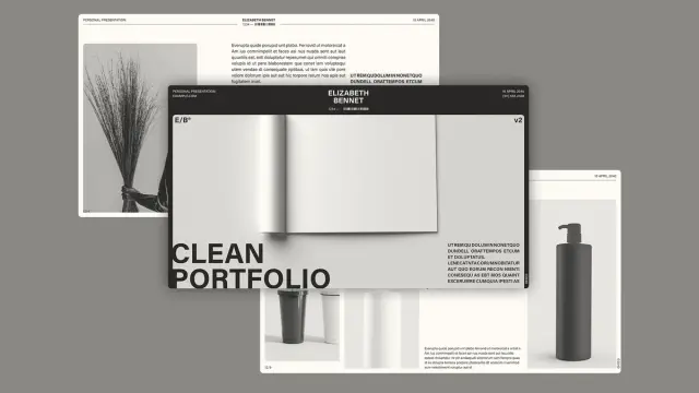
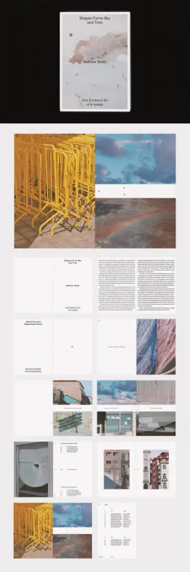
It’s a widescreen InDesign template built at 1920×1080 pixels, optimized for screen presentations from the start. So instead of retrofitting a print layout for digital display, you get a system designed specifically for how work is actually viewed today—on monitors, in browser windows, and during video calls.
The design language is monochrome, typographically driven, and unapologetically modern. Bold, condensed sans-serif headlines dominate each spread. Images function as atmosphere rather than decoration. And the overall structure gives you exactly what you need to present yourself as a working creative professional—not just a designer with a PDF.
Download the template from Adobe StockPlease note that this template requires Adobe InDesign installed on your computer. Whether you use Mac or PC, the latest version is available on the Adobe Creative Cloud website—take a look here.
A Personal Portfolio Presentation Template for Adobe InDesign by RedGiant Download the template from Adobe StockWhat Makes a Portfolio Presentation Template Worth Using in 2025?
The market for portfolio templates is enormous and mostly disappointing. Most options look the same: a sans-serif name in the corner, a hero image that’s too abstract, and twelve slides that feel like they were designed to impress someone who stopped paying attention after the third page. RedGiant’s template avoids all of that.
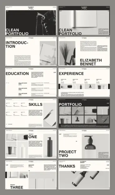
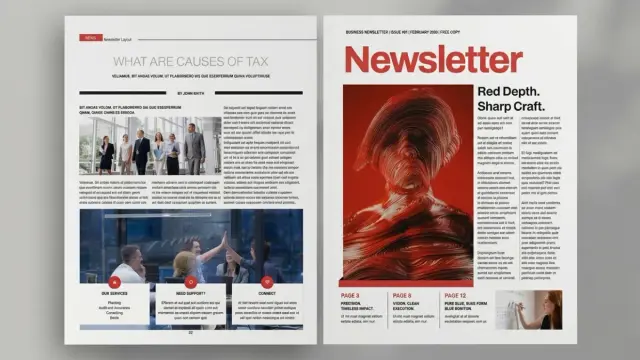
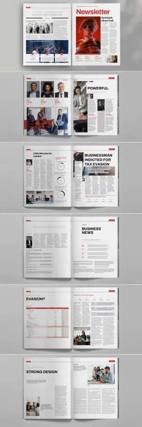
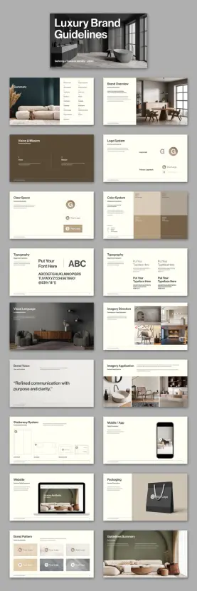
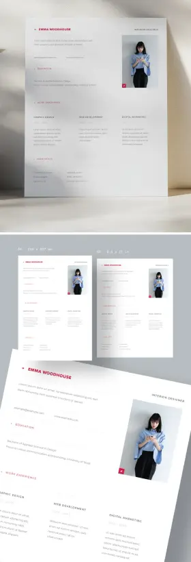
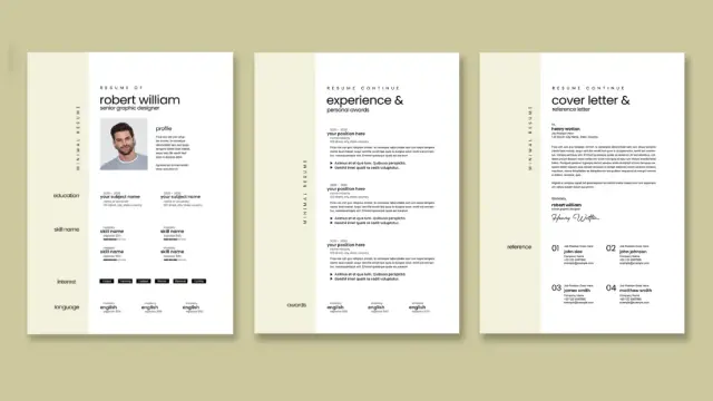
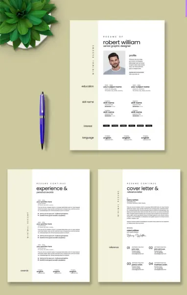
What separates this personal portfolio InDesign template from the majority of alternatives is something I’d call Structural Intentionality—the idea that every slide exists for a specific communicative purpose rather than simply to fill space. The 12 predesigned pages cover the full arc of a professional introduction: opening title, personal introduction, education, experience, skills, portfolio work, individual project showcases, and a closing thank-you slide. That’s a complete narrative, not a collection of disconnected layouts.
Furthermore, the template never tells you what to say. It builds the container and hands you the keys. All text and images are fully replaceable placeholders, so you can drop in your actual work—your photography, your product shots, your case study imagery—without fighting the layout. That’s a critical distinction. A good template should disappear once your content is in it.
The Role of Monochrome in High-Stakes Creative Presentations
The color palette here is essentially black, white, and deep gray. No accent colors, no gradient fills, no decorative palettes. At first glance, that might read as minimal—but it’s actually a strategic choice with real communicative weight.
When your presentation is monochrome, your work becomes the color. Your images carry the visual interest. Your typography becomes the personality. This is a principle I’d call Content-Forward Chromatics—designing a presentation system in a neutral register so that the inserted portfolio content can speak for itself without competing against the template’s own visual noise.
It’s a brave move. And it works, especially for creatives whose actual output is colorful, textural, or photographic. An interior designer presenting this template filled with rich material photography will see their work pop dramatically against the black-and-white grid. A product photographer gets the same effect. Even a brand strategist using brand-color screenshots benefits from the tonal contrast.
Adobe InDesign as a Presentation Tool: Underused and Underrated
Most people still reach for PowerPoint or Keynote when building a presentation. That’s understandable—both tools are purpose-built for the task. But Adobe InDesign offers something neither of them can match: absolute typographic and layout precision, combined with PDF interactivity that most creatives never fully explore.
This personal portfolio template for InDesign is built to take advantage of that. InDesign lets you export fully interactive PDFs complete with clickable navigation, embedded hyperlinks, and page transitions. For a portfolio, that means you can build a presentation that functions like a microsite—structured, navigable, and self-contained—without any web development overhead.
Additionally, InDesign’s master page system means you can apply consistent headers, footers, and branding elements across all 12 slides simultaneously. Change the name in the header once, and it updates everywhere. That’s a workflow efficiency that PowerPoint users can only dream about, especially when you’re making last-minute updates before a client meeting.
12 Slides, One Narrative: Breaking Down the Template’s Structure
Let me walk through the template’s page architecture. Each slide serves a specific function within what I’d describe as a Three-Act Portfolio Framework: Establish, Evidence, Close.
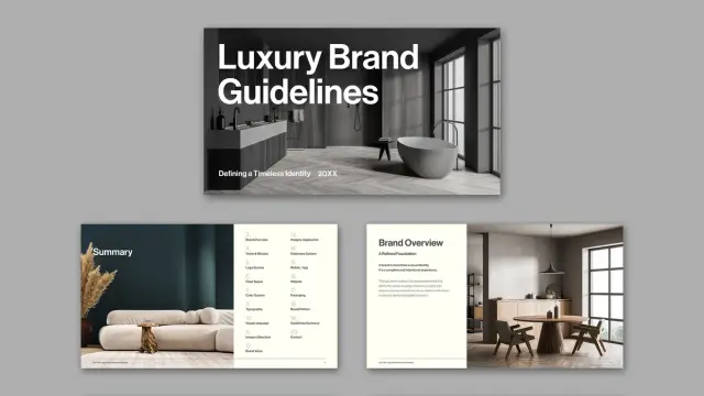
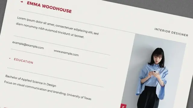
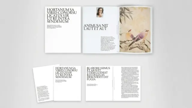
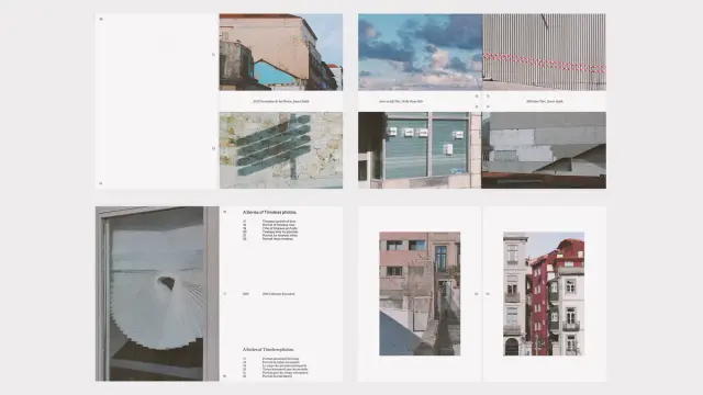
Act One — Establish (Slides 1–3): The opening spreads introduce you. A bold typographic cover with “Clean Portfolio” as the headline placeholder. A secondary title slide. And an introduction page that combines a large portrait or atmospheric image with structured text. This act is about first impressions and identity. The typography here is doing most of the work, and it does it confidently.
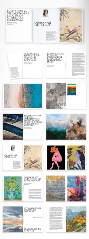
Act Two — Evidence (Slides 4–9): This is the longest section and the most functional. Education, experience, skills, and portfolio overview slides give viewers the facts. Individual project pages—Project One, Project Two, and Project Three—give you space to contextualize specific work with imagery, project titles, and descriptive copy. These slides are the engine of the presentation. They should be loaded with real content.
Act Three — Close (Slides 10–12): The closing sequence brings it home. A final portfolio overview, a contact slide, and a “Thanks” page with full contact details round out the narrative. This isn’t just a formality—a strong close signals professionalism and makes follow-up easy.
Personal Portfolio InDesign Template vs. Keynote and PowerPoint: An Honest Comparison
Let’s be direct about the trade-offs. This template requires Adobe InDesign, which means either an Adobe Creative Cloud subscription or access to the software through an institution. That’s not a trivial barrier for some users. If you’re a student or independent creative without a subscription, that cost matters.
But if you already use InDesign—or if you’re considering it—this template makes a compelling case for the tool as a presentation platform. The precision of layout control you get in InDesign is simply unmatched. Kerning, baseline grids, typographic scaling—all of it is infinitely more controllable than in Keynote or PowerPoint.
Moreover, InDesign’s interactivity panel lets you assign buttons, hyperlinks, and page transitions natively. That means your personal portfolio presentation can include a clickable table of contents, linked email addresses, and smooth animated transitions between slides—all inside a single exported PDF. Try doing that in Keynote without workarounds.
Who Should Use This Template?
This isn’t a universal recommendation. It’s a specific tool for a specific type of creative. Here’s who will get the most out of it:
Graphic designers and visual creatives who want a presentation that feels editorial and controlled—not like a slideshow built with a drag-and-drop tool. The typographic rigor of this template will resonate with design-literate clients and hiring managers.
Photographers and art directors whose work is image-led. The large image areas in the portfolio and project slides are designed to showcase visual work at scale. Drop in your strongest shots and let the neutral template disappear around them.
Architects and interior designers present project work to clients. The clean structure lends itself well to project-by-project storytelling, with enough copy space to add specifications, materials, or brief descriptions.
Branding and identity designers who want a presentation that looks as considered as the work it contains. If your portfolio is full of carefully crafted brand systems, your presentation should signal the same level of care. This template does that.
The Typography System Behind the Template’s Visual Identity
Typography is the backbone of this design. The template leans heavily on a large, bold, condensed typeface for slide titles—the kind of type that commands attention without decorative support. Paired with clean, structured body copy and tight grid alignment, it creates a visual system that feels genuinely editorial rather than templated.
This is worth paying attention to. The font choice signals an awareness of contemporary design culture—the kind of confident, utilitarian typography associated with Swiss design traditions and modernist editorial layout. It’s not trendy in the Instagram-design sense. It’s authoritative in a way that ages well.
Think about what that communicates to a potential client or employer. Before they’ve read a single word of your bio, the typographic confidence of the template tells them, “This person has taste.” That’s an intangible value that’s genuinely difficult to fake—and that this template gives you for free.
How to Customize Without Breaking the System
The smartest approach to customizing any InDesign template is to work within the system before you try to change it. Swap your text in first. Then swap your images. Then—and only then—consider whether you need to adjust spacing, scale, or layout.
For this template specifically, I’d recommend preserving the typographic scale and the overall black-and-white palette unless you have a compelling reason to deviate. If your personal brand includes a strong accent color, you can introduce it selectively—as a rule line, a background tint on one slide, or a typographic highlight—without disrupting the overall coherence of the design.
Keep the header format consistent across all 12 slides. The name, contact details, and date area in the top bar is part of what gives this template its professional polish. Fill it in accurately and leave the formatting alone. That detail, small as it seems, is what makes the difference between a template that looks finished and one that looks like a work-in-progress.
Screen-Optimized at 1920×1080: Why Pixel Dimensions Actually Matter
The 1920×1080 pixel format is significant and deliberate. This is the global standard for HD display—the resolution of most laptop screens, external monitors, and presentation displays. Building a portfolio template at this dimension means your slides will fill the screen edge-to-edge without letterboxing, black bars, or awkward scaling artifacts.
By contrast, many InDesign portfolio templates are still built in A4 or US Letter format, designed primarily for print. They work for PDF portfolios sent via email, but they fall apart on screen. The proportions are wrong. The type is too small for display. The images don’t fill the frame correctly. This template sidesteps all of that by starting from the screen as the primary medium.
This is what I’d call Display-Native Design—the practice of building presentations specifically for how they’ll actually be experienced, rather than repurposing print formats for digital contexts. It’s a simple principle, but it’s surprisingly rare in the template market. Most templates are designed for the wrong medium.
Practical Workflow: Getting From Template to Finished Presentation
Here’s a straightforward process for taking this template from purchase to finished deck.
Step 1 — Audit your content first. Before you open InDesign, know what you’re putting in each slide. What projects will you feature? Which images are strong enough to carry a full-bleed spread? Write your copy before you start placing it. It’s always faster to edit copy in a text document than inside an InDesign frame.
Step 2 — Replace images using the Links panel. InDesign’s Place command (Cmd/Ctrl+D) is your primary tool for image replacement. Use the Links panel to track image resolution and file status. For screen presentations, 72–150 dpi is sufficient; for export to print, you’ll want 300 dpi minimum.
Step 3 — Update all placeholder text systematically. Use Find/Change (Cmd/Ctrl+F) to locate and replace repeated placeholder text across the document in one pass. Then work slide by slide to refine copy, adjust character count, and check for widows and orphans.
Step 4 — Export for your delivery format. For interactive screen presentations, export as an interactive PDF with transitions enabled. Or for print or static email portfolios, export as a print PDF at standard print quality settings. And for Behance or portfolio website upload, export as a high-resolution JPEG sequence.
Original Frameworks for Evaluating Portfolio Presentation Templates
Over years of reviewing design resources, I’ve developed a set of criteria I use to evaluate whether a presentation template is actually worth recommending. I call these the Five Dimensions of Portfolio Template Quality:
1. Narrative Completeness. Does the template provide a full story arc from introduction to close? RedGiant’s template scores high here—its 12-slide structure covers every essential section.
2. Content Flexibility. Can the template accommodate a wide range of portfolio content types without forcing awkward layout compromises? Yes. The image areas are generous and format-agnostic.
3. Typographic Confidence. Is the type system strong enough to carry the presentation even before personal content is added? Absolutely. The bold condensed headline system is distinctive and authoritative.
4. Display-Native Resolution. Is the template built for the medium it will be experienced in? The 1920×1080 format confirms this.
5. Customization Depth. How far can you push the design before it breaks? In InDesign, the answer is always very far. And because the underlying system is disciplined, even significant customization tends to hold together.
This template scores well across all five dimensions. It’s genuinely one of the strongest personal portfolio presentation templates currently available for Adobe InDesign.
Download the template from Adobe StockFrequently Asked Questions About the Personal Portfolio InDesign Template
What software do I need to use this template?
You need Adobe InDesign. The template is a native InDesign file, so it won’t open in Illustrator, Photoshop, or any non-Adobe application. An active Adobe Creative Cloud subscription that includes InDesign is the standard way to access the software.
Can I use this template without design experience?
Yes, with some caveats. InDesign has a steeper learning curve than PowerPoint or Keynote. However, replacing placeholder text and images in a pre-built template is a relatively beginner-friendly task. Adobe’s own tutorials and YouTube resources make the basics accessible. If you’re comfortable with Creative Suite tools in general, you’ll manage this template without difficulty.
Is the template editable in other Adobe apps like Photoshop or Illustrator?
No. The file is an InDesign document and requires InDesign to edit. You can, of course, prepare your images in Photoshop or Illustrator and then place them into the InDesign template. That’s actually the recommended workflow for image-heavy presentations.
What file format should I export for a screen presentation?
For screen presentations, export as an interactive PDF from InDesign. This preserves any interactivity you add—hyperlinks, navigation buttons, and page transitions—and displays correctly at full screen on any monitor running the free Adobe Acrobat Reader.
Can I add more slides to the template?
Absolutely. InDesign’s pages panel lets you add pages, duplicate existing layouts, and apply master page formats to new slides. The 12 included slides give you a complete foundation, but expanding to 15 or 20 slides for a more detailed portfolio is straightforward.
Does the template work for print portfolios as well as screen presentations?
The template is designed specifically for a screen at 1920×1080 pixels. You can print it, but the 16:9 widescreen format doesn’t translate ideally to standard paper sizes. For a print portfolio, you’d want a template designed in A4 or A3 format. For screen-video calls, monitor presentations, and PDF delivery, this template is exactly right.
What industries is this portfolio template best suited for?
The template works especially well for graphic designers, photographers, art directors, branding specialists, interior designers, and architects. Its editorial and monochromatic aesthetic suits any creative field where visual sophistication and professional presentation are valued. It’s less suited to industries where color-heavy, playful, or highly branded presentations are expected—like game design or children’s content creation.
Where can I purchase or download this template?
This personal portfolio presentation template for Adobe InDesign is available through Adobe Stock, where it’s offered by contributor RedGiant. Adobe Stock licenses give you full commercial usage rights, making it suitable for client presentations, job applications, and professional use.
Can I change the color scheme?
Yes. InDesign’s swatches panel makes it easy to update the black-and-white palette to include a brand color. You can apply color to text, background shapes, and rule lines globally using the Edit Colors or Redefine Swatch functions. The monochrome system is a strength of the template, but the tool gives you full control to adapt it.
Is this template compatible with Adobe InDesign CC 2024 and 2025?
Templates distributed through Adobe Stock are generally compatible with recent versions of InDesign CC. Always check the file details on the Adobe Stock product page for specific version compatibility information before purchasing.
Check out other premium graphic design templates for different creative needs here at WE AND THE COLOR.
#AdobeInDesign #AdobeStock #design #graphicDesign #InDesignTemplate #portfolio #portfolioTemplate