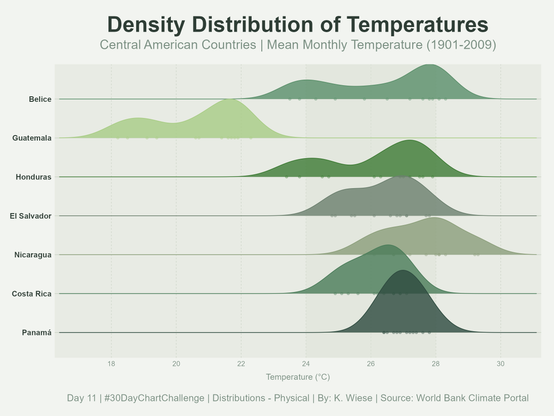
#Day11 | Distributions – Physiscal | #30DayChartChallenge | Density Distribution of Temperatures in Central America, source: World Bank Climate Portal. Built with #RStats using #ggplot2, #tidyverse and #ggridges.
After years of using ggridges for visualization I saw this real-world example on a map at the museum and was surprised at how incredibly apt the name “ridge plot” is
Taking a break from #30DayMapChallenge with a ridgeline plot of the Japanese Alps. I rather like how Mount Fuji stands out, like a signpost to help me figure out where's what.
Inspired and made possible by @jjakon11

Cardamom National Park in Cambodia is an ecologically rich jungle, home to many critically endangered species like sun bears & pangolins who remain under threat from poaching & land clearing
📷 of animals in replies 👇
Code: https://github.com/daxkellie/30DayMapChallenge2023/blob/main/scripts/cambodia.R

R didn't cooperate with me today, so here's a map of Australia that, in my opinion, looks pretty nice anyway 🙃
@jordyvanlangen @dingemansemark Sounds like a useful feature add - but couldn't one just find the quantiles corresponding to the desired cutpoints using ecdf and then use those quantiles? For example, suppose y is the vector of likert responses (assumed coded as 1,2,3,4,5). Perhaps you could set the #ggridges quantile values at sapply(X = c(1,2,3,4,5),FUN = ecdf(y))?
#rstats help needed!
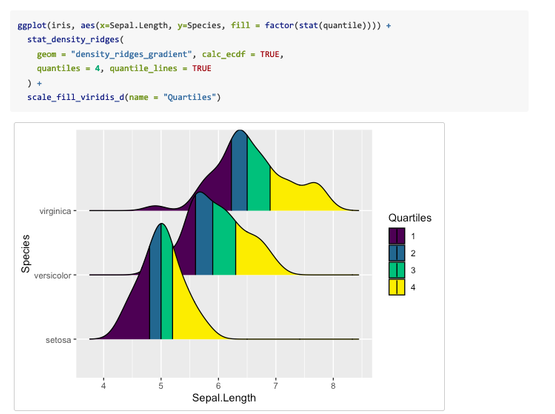
Using #ggridges you can also color by quantile (see 1st Figure).
Our question:
How to color - no quantile - by self-defined borders?
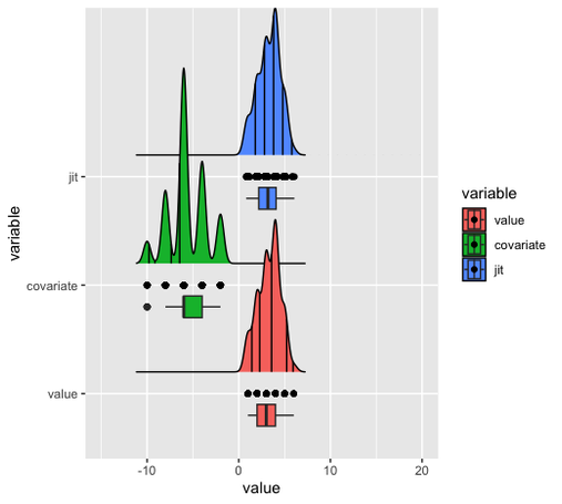
(e.g., for LIKERT data, 2nd figure!)
#openscience #opensciencefund #nwo #datascience #dataviz #opensource #rstats #datavisualization #ggplot2 #rpackage #raincloudplots #github #programming #CRAN #rstudio #posit #scicomm #science #academia #academics #visualization #teamscience #statistics