Unsubscribe from the Church of Graphs
https://www.adorableandharmless.com/p/unsubscribe-from-the-church-of-graphs
#HackerNews #Unsubscribe #Church #of #Graphs #DataVisualization #CriticalThinking #TechCulture
Unsubscribe from the Church of Graphs
https://www.adorableandharmless.com/p/unsubscribe-from-the-church-of-graphs
#HackerNews #Unsubscribe #Church #of #Graphs #DataVisualization #CriticalThinking #TechCulture
Curso de Power BI Gratuito: Aprenda Análise de Dados do Zero e Conquiste um Certificado
https://guiadeti.com.br/curso-power-bi-gratuito-online-certificado/
#analisedados #businessintelligence #carreira #cursofree #cursoonline #dados #datavisualization #powerbi #tecnologia
https://guiadeti.com.br/curso-power-bi-gratuito-online-certificado/?fsp_sid=540
>> GitHub deletes your traffic logs every 14 days. <<
I built a Ruby dashboard that archives them forever, with custom charts using ruby-libgd.
Open source. Automated. Your metrics, permanently yours.
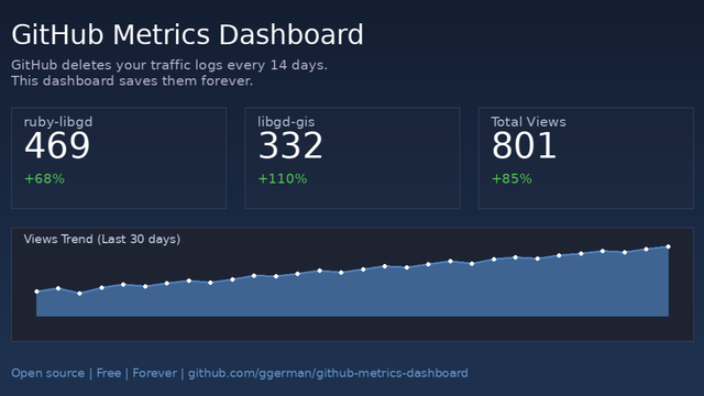
GitHub Deletes Your Traffic Logs Every 14 Days. Here’s How to Stop That with Ruby March 30, 2026 Motivation: I didn’t want to lose the metrics for ruby-libgd and libgd-gis. So I built a…
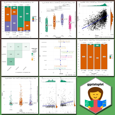
Graphs and Statistics with ggstatsplot in R: New module in the Statistics Globe Hub.
More info: https://statisticsglobe.com/hub
Only 1 day left to get access to all March modules. Join now to secure your access.
#statistics #datascience #rstats #datavisualization #machinelearning #ai
Day 49. Polygon city tiles 🏙️
This project visualizes the Timișoara historical center as a dense field of building polygons, using D3.js with Nextzen context tiles and detailed footprints from OSM Buildings.
Instead of simplifying the scene, it keeps full building coverage visible. As tiles stream in, streets/water/terrain establish context first, then buildings appear layer by layer.
#100DayMapChallenge Day 49/100
#D3js #VectorTiles #Geospatial #DataVisualization #OpenStreetMap
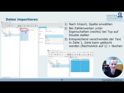
"Presentación sobre el software libre Labplot del Dr. Prof. Cornelius Krellner de la Universidad de Frankfurt."
👉 https://josegon.wordpress.com/2026/03/28/labplot-iv/
#OpenSource #FOSS #FLOSS #DataVisualization #Statistics #Physics #Chemistry
Trust Signals as Sparklines for Hacker News
#HackerNews #TrustSignals #Sparklines #HackerNews #DataVisualization #Trustworthiness
ISBN Visualization – Annas Archive
https://annas-archive.gd/isbn-visualization?
#HackerNews #ISBNVisualization #AnnasArchive #DataVisualization #BookData #ReadingCommunity
Einführung in #LabPlot (2.12.1) – ein Video-Tutorial, erstellt von der KML der Universität Frankfurt (Prof. Dr. Cornelius Krellner).
https://www.youtube.com/watch?v=POR3wldhRx4
#LabPlot #OpenSource #FOSS #FLOSS #DataVisualization #DataAnalysis #Statistics #Plots #Physics #Chemistry #EU
Day 45. Chlorophyll ocean data 🌊
I used NASA Aqua/MODIS chlorophyll concentration data to build an interactive globe that shows monthly phytoplankton distribution across 2021.
The challenge was creating smooth transitions across 12 month textures while preserving scientific meaning. I used Three.js + WebGL for the rendering stack, then added GLSL shaders.
Selected for IIB Awards 2023.
🔗 https://maptheclouds.com/playground/threejs/chlorophyll/
#100DayMapChallenge Day 45/100
#ThreeJS #WebGL #GLSL #DataVisualization