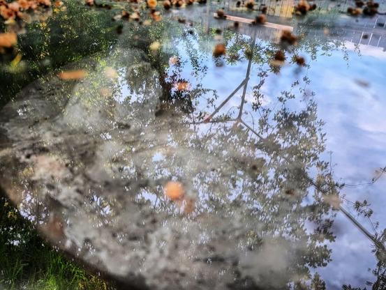
#SilentSunday #digitalphotography #dirty #murky #beauty #pvcpipes #trellis #glasstabletop #ladybanksrose #reflection #sky #clouds #backyard #hanging #vines #deadflowers #asabovesobelow #stjohns #portland #nogenerativeai
Dirty Glass Table
#SilentSunday #digitalphotography #dirty #murky #beauty #pvcpipes #trellis #glasstabletop #ladybanksrose #reflection #sky #clouds #backyard #hanging #vines #deadflowers #asabovesobelow #stjohns #portland #nogenerativeai
Dirty Glass Table
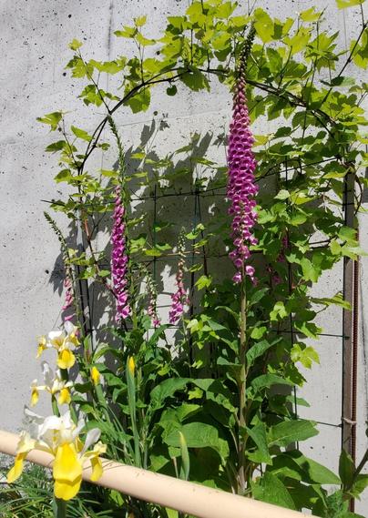
By the entrance to Borden Mercantile store.
#Foxgloves
#Irises
#Grapevine
#Bloomscrolling #florespondence #flowers #InBloom #perennials #trellis #botanical #plants #Spring #Saanich
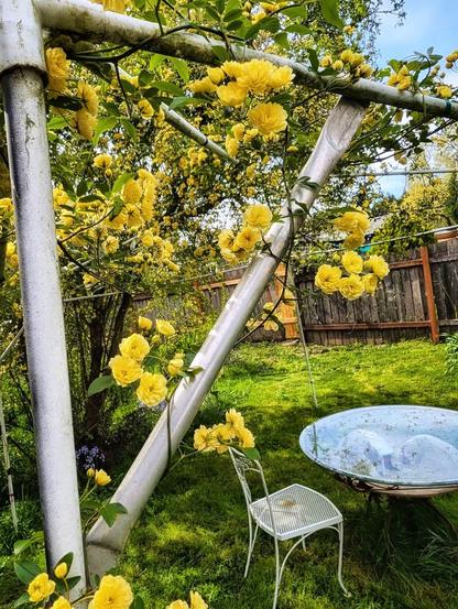
#silentsunday #backyard #hanging #wildroses #yellowroses #chair #glasstable #grass #fences #digitalphotography #stjohns #portland #april #trellis #bloomscrolling #flowers #nogenerativeai
My Backyard
Hadn’t seen this before, but his books on graphics were some of the best I read when I started with visual statistics. They are still relevant today.
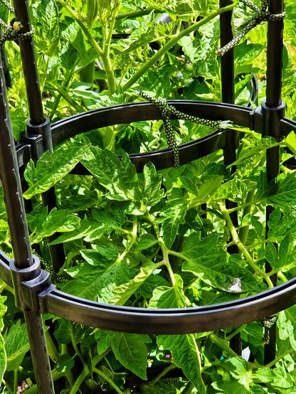
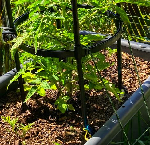
With the #CherokeeSeedlings starting to gain some height & as they are in the same tub as my larger #tomato plant, I added another #Temu round #trellis thingy.
I tied them together for more stability, using some #paracord. #gardening
Gray cold on the air,
trellis bears trembling pale vines
drowsing until spring
#dailyhaikuprompt #trellis #haiku #writing #writingcommunity
What I was talking about earlier re: securing the #heirloom #tomato #trellis/cages with paracord staked over the planter & into the ground with tent pegs.
The whole trellis is about 2 1/2 metres tall.
We just spent an hour outside #gardening.
It’s good weather for it today too. 🌞
#Amazon delivered the spool of #paracord I ordered yesterday, so I used some of my good tent pegs to anchor the #tomato #trellis/cages that were getting moved about a lot in the high winds yesterday.
My paracord is pegged into the ground on either side of the tubs the tomatoes are in, & run through the lowest tier of the trellises.
They straightened up nicely too. Fingers crossed this will fix things.👨🌾