Training in the Dark
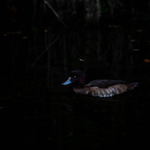
Some birds seem determined to test a photographer’s patience — or their low-light technique. Lately I keep stumbling into the same situation: dark birds on dark water, surrounded by even darker environments. And this time the mystery guest was a Tufted Duck (Aythya fuligula), the Dutch kuifeend, calmly drifting through the shadows at Oranjezon in Zeeland.
Photographing a mostly black bird on black water is a bit like trying to sketch a raven at midnight with a broken pencil. But that’s where the fun begins. With the Canon 5D Mark IV paired with the Sigma 100–400mm, I went for the now-familiar approach: low shutter speed, high ISO, and careful handheld tracking. A balancing act between motion blur and noise, exposure and detail. But when it clicks, it clicks — and this frame caught the elegance of the bird without losing the texture of those inky ripples.
This moment was extra special because I was there with my son. He wanted to escape the pressure of school for a bit, so we drove off at 6:00 in the morning and reached the coast before sunrise. By the time I took this image — around 10:00 — the world had softened, he’d relaxed, and we were just two people sharing cold air, quiet water, and the calming rhythm of nature.
Honestly? Those father-son moments mean more than any perfect exposure ever will.
#TuftedDuck #AythyaFuligula #Kuifeend #Waterfowl #Zeeland #Oranjezon #DutchNature #BirdPhotography #WildlifePhotography #Canon5DMarkIV #Sigma100400 #LowLightPhotography #DarkWaterShots #HandheldPhotography #TrackingShots #NatureLovers #BirdWatching #AvianLife #WildlifeMoments #FatherSonTime #NatureAsTherapy #SchoolStressRelief #EarlyMorningPhotography #BeforeSunrise #CoastalWildlife #EuropeanBirds #BirdingNetherlands #ScientificCuriosity #FieldNotes #StoryBehindTheShot #PhotographyPractice #NatureJournal #ExposureChallenges #ISOHigh #ShutterSpeedLow #NaturalMood #MoodyNature #CalmWaters #WaterBirds #ByMaikeldeBakker