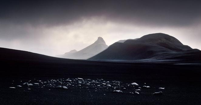
How Photography Helped Me Overcome Grief
#inspiration #opinion #elements #elementsmagazine #japan #landscapephotography #singapore #xuanhuing
How Photography Helped Me Overcome Grief
#inspiration #opinion #elements #elementsmagazine #japan #landscapephotography #singapore #xuanhuing
How Do You Choose Which Photographs to Print or Publish?
#inspiration #opinion #tips #brucebarnbaum #elementsmagazine #fineart #fineartlandscapephotography #landscapephotography #technique
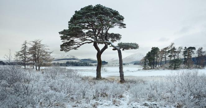
How it Was Shot: Ancient Pines By Loch Tulla, Scotland
#spotlight #elementsmagazine #film #fineart #fineartlandscapephotography #howitwasshot #julianvalverley #landscape #landscapephotography #largeformat
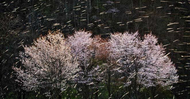
A Landscape Series Focused on Trees: ‘Trees are Poems’
#spotlight #elements #elementsmagazine #fineart #fineartlandscapephotography #fineartphotography #landscape #landscapephotographer #landscapephotography #trees #vesapihanurmi
Leveraging Visual Language and the How to Capture ‘Mood’ in a Photo
#editorial #features #elementsmagazine #landscapephotography #landscapes #michaelfrye #mood #spotlight #theory #visuallanguage #visualstorytelling
Photographing Canyonlands in 1988: Land of Standing Rocks
In 1991, near the end of some book projects that took me on some lengthy photographic journeys through the American West by car for two years, I came up with the idea of creating posters of some of my black and white images for a few of our western National Parks.
My idea was to provide park visitors with a choice instead of the commonplace color posters. Some of those color posters were excellent but I felt there was a large audience who appreciate black and white. My idea, which I pitched to some of my favourite parks, was to provide the visitors with a "fine art" visual interpretation in black and white.
My original attempts were met with great interest by the various Natural History Associations. Most were already familiar with my photography because of various photographic projects such as magazine articles, gallery/museum shows, or word-of-mouth. I had completed a colour slide show for Capitol Reef National Park a few years before, and my black and white work was already known by some Natural History executives of Canyonlands and Death Valley National Parks.
In this series written for the ELEMENTS Magazine, I am discussing most of these posters. I'll give technical information where my memory serves me correctly, aesthetic considerations and some highlights of making the photographs on the scene. Please join me on this journey through the past!
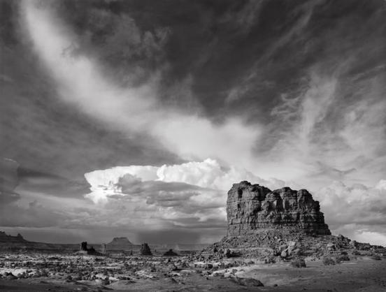
Land of Standing Rocks. Canyonlands National Park, UT, 1988
In 1988 I resolved to make the journey into the Maze District of Canyonlands National Park. I knew it was a long, rough, daunting drive but my 1970 Ford Bronco was in good shape. I had driven the notorious Elephant Hill and S.O.B. hill years before and experienced difficulties (S.O.B. hill claimed a piece of my taillight) mainly due to my lack of "off-road" driving experience and carburetor issues, but now I felt I had better driving skills and the Bronco was up for the challenge.
My assistant Al Callju and I began our drive from the road near Hite Marina with a full tank of gas. The road from this direction goes through the famed and extremely rough Teapot Canyon but bypasses the fearsome Flint Trail and Golden Stairs. Our ultimate destination was the Doll House camping area and a hike into the "Fins." The difficult Jeep trail did not disappoint as it was slow going all the way from Teapot Canyon to the Doll House.
About five miles before the Doll House camp area, we were on a high ridge looking down at the maze of sandstone canyons to the north. On topographic maps this area is known as the "Land of Standing Rocks" and rightfully so; there are standing rocks or buttes near the road and in the distance. I noticed some thunderhead clouds in the distance which appeared to be directly above Candlestick Tower in the Island in the Sky district to the north. I decided this might make a good photograph but there needed to be another element in the sky. Fortunately, a curved band of clouds appeared to be moving from left to right. I recognized the potential for a good photograph here, but the clouds were moving quickly. Too quickly! In panic mode I focused my 4×5 view camera, attached a yellow #8 Wratten filter to my Schneider 121mm Super Angulon lens, calculated the exposure, and shot the image on Tri-X film. I turned over the film holder and made a quick, hasty duplicate exposure but then noticed a jet trail had already moved into the subject area. I really didn't know if the first exposure was good or if the second exposure recorded much of the jet trail.
Back home after developing the film, I found the first exposure was perfectly composed but about a stop too dense. After attempting to print that negative unsuccessfully I decided to treat the negative in Farmer's Reducer, hoping to cut down the high density and yield a more printable negative. It worked, but on a different negative I noticed how the reduction action of Farmer's Reducer was unpredictably quick. At least I had a better negative, but I never used that procedure again.
Because of the nature of this subject the print is very difficult to make. In order to satisfy my vision for the print I currently use a series of pin-registered film contrast masks. I use two Shadow Contrast Increase Masks, a type 1 Fog Mask and a type 2 Fog Mask. This is in addition to substantial burning and dodging as well as varying the paper contrast grade through the masking and burning steps.
I made a mock-up of this image and presented it to the Canyonlands NHA. Fortunately, they liked it and it became a poster to represent the Maze District of the park. I grew to like the image more and more over the years and I feel that it's a good representation of the great American West.
The article courtesy of ELEMENTS Magazine. The ELEMENTS is the monthly magazine dedicated to elegant landscape photography, insightful editorials and fluid, clean design. Inside you will find an exclusive and in-depth articles and imagery by the best landscape photographers in the world such as Bruce Barnbaum, Christopher Burkett, Chuck Kimmerle, Christian Fletcher, Charlie Waite, Rachael Talibart, Erin Babnik and Freeman Patterson, to name a few. Use the PETAPIXEL10 code for a 10% discount off the annual subscription.
About the author: Lynn Radeka’s professional photography career spans more than 50 years. Influenced in his early work by Ansel Adams and Wynn Bullock, both of whom critiqued his prints, he continues to pursue a technical and aesthetic mastery of the medium of photography. His love of the grand landscapes and intimate details of the American West was born on his first trip to Death Valley in 1966.
#spotlight #analog #canyonlands #elements #elementsmagazine #film #filmphotography #fineartlandscapephotography #landscape #landscapephotographer #landscapephotography #lynnradeka #storybehindthephoto #storybehindtheshot #travel #utah

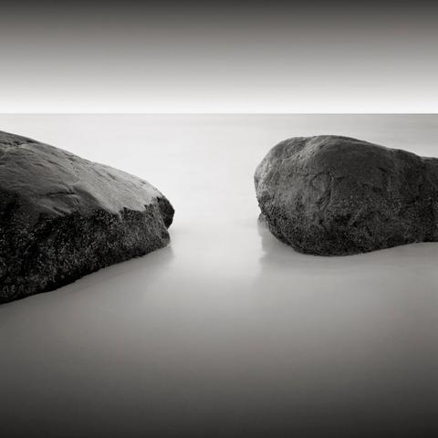
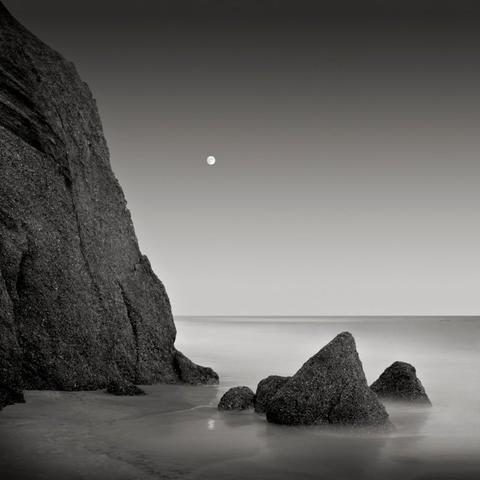
The Power of Long Exposure: Not How A Place Looks, But How It Feels
I set out for the beach before dawn. It’s not always easy getting up when it’s still dark outside, but I always return home thinking I should do this more often. I left the house with 60 pounds of equipment including my old wooden camera -- an 8×10 Korona View that was made in 1929 -- and just 12 sheets of film.
For several exquisite hours, I have the beach to myself. On this day, I bathe in glorious early morning light. Another day, I watch storm clouds pass overhead or sit in the eerie silence of an ethereal early morning fog. Each day is new and wonderful. It’s incomprehensible that I could have such splendor all to myself.
The places I find myself making images are those to which I have a strong, positive emotional reaction. Often, these are places that, through their stillness, expansiveness, stark simplicity, or the juxtaposition of man-made objects with nature, evoke a sense of quiet contemplation.
During the 1980s and early 1990s, I photographed almost exclusively in Martha's Vineyard, a small island off the southeast coast of Massachusetts, where my parents had a summer home. It was there I developed a passion for photographing the ocean.
When I first set out with my camera, my goal was to create images that evoked the same emotions I felt when making them. I was not trying to show the viewer what these places looked like, but rather what they felt like.
For 15 years, I made many images that failed to capture the essence of my experience. Still, just the process of being out there making exposures was meditative. There was a rhythm to it: set up the tripod, mount the camera, frame the shot, focus the camera, set the shutter, insert the film holder, pull the dark slide, make the exposure, re-insert the dark slide, remove the film holder, take down the camera, fold up the tripod, and then move down the beach and do it all over again.
Then, late one day, I was making one last exposure. The sun had set, and the low light required a long exposure of 45 seconds. There was a small area in the foreground of the image where the water had been flowing around some smooth, orange-sized stones. Due to the length of the exposure, the water looked like a mist. And there, I finally had it -- an image (or a small part of one) which looked the way that moment had made me feel.
Many of us take photos every day –-typically with a camera built into our phones. Most of the time, we just point and click to make pictures. And most of the time, we get reasonably satisfying results.
We need to thank the camera engineers for that. They know, for example, that, whenever possible, the camera should capture the picture in 1/60th of a second or less. That’s because most photos will be taken by someone holding the camera in their hands and an exposure any longer than 1/60th of a second will result in a blurry picture. The engineers also know that most people prefer pictures that are not blurry. However, snapshots made with quick shutter speeds can sometimes produce strange and unnatural results.
Imagine yourself walking on a beach at the edge of the water. You’re relaxed, listening to the surf, and enjoying the fresh sea air. You decide to take a picture of the beautiful water and some charismatic rocks. You look at your photo and see a jagged wave crashing into the rocks. The water droplets are frozen in midair like a giant claw and you think, “Huh, that’s not what I saw.” You never see water droplets just hanging suspended in the air. The photo you took doesn’t evoke that feeling of relaxation you had staring out over the water.
What I learned from that first 45-second-long exposure I made years ago is that the camera records a world different from the one we experience because it does not record emotion -- it only sees the world in strange, artificial, frozen slices of time.
Consider our emotions. No one is instantaneously angry or instantaneously bored. Those emotions take time to build in response to what’s going on around us, as experienced over time. Our world exists as a continuum, not a snapshot. Our bodies respond to the world in a cumulative way, averaging our experience as we pass through time.
David Hockney once said, “Duration is life, and the photograph has no duration. It is dead in that sense. All photographs share the same flaw: lack of time.”
By using long exposures, I have been able to encode the element of time in what would otherwise be a static image, revealing what our world “looks” like based on a longer time scale. My photographic process acts as a translator, translating the “invisible” world of non-instantaneous events into the visible world of a photographic print.
In my long exposures of the ocean, there are no jagged, claw-like waves, or water droplets frozen in air. All the short-term, temporal events (such as waves and seagulls) have been stripped away. Instead, what is revealed is the expansiveness of the water and the constancy of the horizon. It is these calming elements that my body is responding to over time. Of course, neither image -- the jagged, claw-like wave frozen midair nor my smooth, wave-free ocean -- is an accurate visual representation of the world. Water droplets do not hang suspended in the air, and you will never see a wave-less ocean. Yet, from my experience, the long exposure of the ocean is more emotionally accurate.
And though we’ll never see the ocean look as it does in my images, viewers have no difficulty accepting that these places exist, and that they are looking at photographs of them. This would seem to indicate that our brain is comfortable believing these images represent reality, because it makes emotional sense to us.
I think of art as the communication of an idea, thought, or emotion through craft. In my case, I am trying to communicate an emotion -- the emotion I felt when I was making the exposure -- using the craft of photography.
When I give talks about my work, I generally begin by showing 10 images without any introduction or commentary. Then I ask the audience, “What words come to your mind when viewing my images?”
Typical responses include words such as, “calm, peaceful, tranquil, and Zen,” words that represent abstract emotions. Never once has anyone ever mentioned objects that are actually seen in my images -- water, sky, poles, rocks, or ocean. Then, I pull a piece of paper from my back pocket, onto which I’ve typed the same words the audience had just suggested.
As I mentioned above, I am not trying to show the viewer what these places look like, but rather what they feel like. Using long exposures to encode the element of time in my images has been the key to achieving that goal.
The article courtesy ofELEMENTS Magazine. The ELEMENTS is the monthly magazine dedicated to elegant landscape photography, insightful editorials and fluid, clean design. Inside you will find an exclusive and in-depth articles and imagery by the best landscape photographers in the world such as Charles Cramer, Christopher Burkett, Hans Strand, Rachael Talibart, Christian Fletcher, Charlie Waite, and Steven Friedman, to name a few. Use the PETAPIXEL10 code for a 10% discount off the annual subscription.
_About the author: For 40 years, David Fokos has worked with his 8×10 view camera to explore differing subjective and objective views of the world.
His work has been the subject of over 60 solo shows in the United States, Europe, and Asia, and can be found in many prominent museum, corporate, and private collections. Mr. Fokos lives in San Diego, California and Martha’s Vineyard, Massachusetts._
#editorial #inspiration #art #davidfokos #elementsmagazine #fineart #fineartlandscapephotography #fineartphotography #landscapephotography #longexposure #longexposurephotography #theory


A Photo’s Subject is Important, but Don’t Forget the Rest of the Frame
The process of crafting great imagery is something I have been studying for years. One of the undertakings in this riveting pursuit was to study hundreds of great images from many photographers.
The works I studied are both well-known and less well-known, from different backgrounds and with unique seeing profiles across most genres of photography. Today I would like to share with you some of those findings.
When observing the world around us we usually want to find one special, grand, dazzling subject. In other words, we look for the central point around which the image will be built. We dream, fantasize and long for great subjects. To fill the void of interesting subjects we often buy expensive trips to the most scenic places in the world, travel to historic sites, research Google maps for the best views, hire models, look for unique characters -- anything that would give us a visual advantage. That’s not a bad thing at all.
But this is the issue: In this relentless pursuit of a great image, we are sometimes so preoccupied with the subject that we forget about “the rest.” Your subject is important, but it is still only part of your image. In fact, in most photographs, the subject only occupies a tiny portion of the image. What about “the rest?”
The “rest” is something we call negative space or white space. Why am I talking about this? Because after studying hundreds great images, I came to the conclusion that it is just where a good image turns into a great image.
Let me explain. We are living in a very open, loud and colorful world. Nowadays, all you need to do is walk the streets of big cities and you will find plenty of interesting subjects. You can also hop on a plane and be in an exotic location within hours or days. Great subjects are everywhere, and we all have access to them.
If that’s the case, we should have a superfluity of great images but somehow it’s not happening. Why? Because when we encounter a great subject, we are so excited and preoccupied with it that we forget about crafting the entire image. We forget that finding a great subject is just a part of this craft. Not only must we place the subject within the frame but we must also craft the frame (or negative space) ourselves.
I really like the phrase “white space.” It reminds me of how painters create their masterpieces. They start with a white canvas and then carefully add elements inside the frame. They might start with the subject and go from there, or they might put in all the elements and leave appropriate space for the subject. We cannot do this in photography, of course, but what we can do is arrange the frame using a few methods which I am going to talk about in future articles.
Going back to the initial thought, of course the subject is important but once you identify your subject, make sure to shift your attention to everything else. The more work you put into arranging the white space, the more powerful your photograph will become. I often remind myself, okay Olaf, now you have the subject, make sure to pay it adequate respect. Organize the space around the subject so it not only complements it but also invites the viewer to go on a visual journey of exploration and awe.
_The article is courtesy ofELEMENTS Magazine. ELEMENTS is the monthly magazine dedicated to the finest landscape photography, insightful editorials and fluid, clean design. Inside you will find exclusive and in-depth articles and imagery by the best landscape photographers in the world such as Charles Cramer, Edward Burtynsky, Michael Kenna, Erin Babnik, Chuck Kimmerle, Rachael Talibart, Hans Strand and John Sexton, Theo Bosboom to name a few.
CYBER MONDAY : Use the LANDSCAPE code for a 15% discount off the annual subscription._
_About the author: Olaf Sztaba first picked up a camera thirty-five years ago. Since then his passion for “seeing” has become a lifetime journey with photography. Widely known as a visual poet, Olaf’s unique eye and relentless pursuit of visual simplicity allows him to capture “superbly creative and aesthetically pleasing images.” The images, along with his writings, can be found at Olafphotoblog. Discussions on seeing, creativity, inspiration and fine art photography parallel the images.
Olaf is a founder and editor-in-chief of the Medium Format Magazine and co-founder of the ELEMENTS Magazine. Olaf spends most of his time curating, writing, and photographing in the field, usually exploring less-traveled roads. He is a sought-after speaker and educator._
#editorial #opinion #elementsmagazine #landscapephotography #phototheory #theory
Shimmering Wall: The Story Behind This Photo Taken in 1997
In my previous article, I walked you through the making of one of my signature photographs, Fallen Sequoias, exposed in 1977. I’ve decided to use the same process in the creation of another image, made 20 years later, on a one-day hike with two friends in 1997.
The location was Hackberry Canyon, Utah. I had previously seen the upper end of the canyon, but not more than a few hundred yards, and I had also seen the lower end of the canyon, perhaps a half-mile or more, so I was anxious to see everything in between.
In those days, fully 17 years after discovering Antelope Canyon, I was still hoping -- perhaps even expecting -- to find similar slit canyons because I felt that Antelope Canyon was the discovery of a lifetime (and I still feel it was, to this day). It turned out that Hackberry Canyon was not one of them. So, with the wrong mindset, I hiked all day with a degree of disappointment that the canyon was not what I had hoped it to be.
Despite my disappointment in failing to find yet another slit canyon, I was still open to the idea of finding things of photographic interest, even if they weren’t what I was seeking. One of those things that grabbed my attention was a nearly flat canyon wall with subtle humps and bumps and troughs and ridges and black lines superimposed upon a very light, almost white, section of wall. I found a pattern that tapered to a point, standing out from the rest not because it jutted out in front of the adjacent wall (it didn’t) but because the shape was so distinctive. Somehow the tapering shape reminded me of a spinning top. Furthermore, the subtle parallel humps and depressions that crossed that section of wall reminded me of glacial tracks I had often seen while backpacking through the high lake basins of the Sierra Nevada Mountains.
So it resonated with me and I exposed a 4×5-inch Tri-X negative on that interesting section of wall. Later, after developing the negative and making a contact proof of it (I make contact proofs of every negative I expose, giving me something to study at leisure), I then carefully evaluated its potential to print to my satisfaction.
First, let me note that I make all of my contact proofs at exactly the same contrast level, all rather low contrast. That allows me to see as much detail in the proof as possible, whereas a high-contrast proof could easily lose detail in either the highlights, the shadows, or both. So, I fully expect the contact proofs to look rather dull, lacking the snap I’d want in the final image, but I want them to give me maximum information about what I have to work with on each negative. I then try to envision the steps needed to put the life back into the final print, when I study and evaluate the proof print.
This contact proof didn’t excite me. It failed to give me the feeling that I could put the tonal qualities into the final print that I wanted, which were the qualities that would make it “sing.” So I set it aside and forgot about it. Recently, reviewing old contact proofs, I ran across this one. Who knows why, but this time I felt the possibility was there to make the print I originally wanted but had previously dismissed.
One reason could be the enlarging paper I’m using today, Fomabrom, made in the Czech Republic. I’ve worked with excellent papers in the past, but this is the finest enlarging paper I’ve ever used. Perhaps I saw the possibilities in that contact proof because of the Foma paper, and the way I’ve learned to work with its remarkably rich qualities. (Yes, I’d recommend it for any darkroom printer…and I’m not on the payroll to say that!)
The other reason might be the greater sophistication of my evaluation, along with accepting that Hackberry Canyon wasn’t the slit canyon I had been hoping for. (It’s possible that I set it down years ago because it didn’t satisfy my desire to find another slit canyon.)
So, this time I decided to seriously evaluate it. I cropped the negative slightly but at an angle, thus eliminating a few bothersome details in two of the corners. Perhaps those corners were the things that made me set the negative aside years ago, and perhaps I never thought of cropping the image at an angle but this time the angled cropping made a huge difference. Over the years I have found that careful cropping is very effective in improving the quality of an image. So, although I always want to use the entire negative, I never hesitate to crop to improve the final image.
In the darkroom I print to get the shimmering tones in the triangular section that tapers to the point at the bottom of the image. Then I burn the two lower corners at much lower contrast to darken them perceptibly from the brighter center portion. Not too much darkening; not too little; just the right amount to allow the center to stand out from the two lower corners. Finally, a little selective bleaching helps to highlight the shimmering qualities in the oblique, parallel humps, and depressions in the sandstone wall, giving it a metallic quality.
It’s surely an abstract image. I imagine it’s one that some viewers will be attracted to, perhaps studying the many little details, whereas others will turn away from it quickly, seeing little of value. It’s a fact that some people simply do not find abstract images attractive. Others are attracted to the enigmatic qualities inherent in abstraction. I find it very attractive, and that’s the most important thing to me in deciding to print or display any image. The salability of the image is of no importance because I found long ago that neither I nor the gallery owners who have displayed my work were ever able to decide in advance whether or not a photograph had real sales potential. So, I simply evaluate how strongly I feel about it. If it resonates with me, I’ll show it and discuss it at my workshops, or have it displayed in a gallery exhibit. That’s my sole consideration.
This article is courtesy ofELEMENTS Magazine. The ELEMENTS is the monthly magazine dedicated to elegant landscape photography, insightful editorials and fluid, clean design. Inside you will find an exclusive and in-depth articles and imagery by the best landscape photographers in the world such as Charles Cramer, Christopher Burkett, Hans Strand, Rachael Talibart, Christian Fletcher, Charlie Waite, and Steven Friedman, to name a few. Use the PETAPIXEL10 code for a 10% discount off the annual subscription.
_About the author: Bruce Barnbaum is one of the most prominent photographic thinkers and educators in the world. His iconic book, “The Art of Photography, A Personal Approach to Artistic Expression,” is widely recognized as the bible of photographic thought, insight and instruction. Bruce is also known as one of the finest black and white traditional darkroom printers. His work is represented by galleries in the United States and Europe and is in the collection of museums and private collectors worldwide. _
#editorial #spotlight #abstract #abstractlandscapephotography #brucebarnbaum #elements #elementsmagazine #fineartlandscapephotography #howitwasshot #landscapephotography


