This Portfolio Presentation Template for Adobe InDesign Actually Works Under Real Conditions
Most portfolio templates look great in preview screenshots. Then you open them, drop in your actual work, and the whole thing falls apart. Fonts misbehave. Layouts feel cramped. The visual hierarchy you saw in the mockup disappears the moment you touch it. So when I tested this portfolio presentation template by E-Type for Adobe InDesign, I wasn’t just checking whether it was pretty. I was testing whether it would hold up under real editorial pressure—client deadlines, mixed content types, and presentations that need to run at 1920 × 1080 px without apology.
Spoiler: it holds up.
This template is designed specifically for screen presentations, and that context shapes every decision E-Type made. The 16:9 format, the high-contrast monochrome palette, the bold editorial typography—all of it points toward a single use case. Showing work on a screen, in a room, to people who need to be convinced. That specificity is rare. Most portfolio templates try to serve every occasion. This one picks its moment and commits.
Download the template from Adobe Stock. Please note that this template requires Adobe InDesign installed on your computer. Whether you use Mac or PC, the latest version is available on the Adobe Creative Cloud website—take a look here.
A Portfolio Presentation Template for Adobe InDesign by E-Type
Download the template from Adobe Stock. What Makes This Portfolio Presentation Template Different From the Rest?
The short answer: editorial discipline. The longer answer starts with the typeface treatment. E-Type uses a condensed, heavy sans-serif for section headers at a scale that reads from across a conference room. That’s a real design decision, not a default. The titles for slides like “EXPERIENCE,” “SKILLS,” and “CASE STUDY” function almost like editorial headlines. They set the tone before anyone reads a word of body copy.
Then there’s the black-and-white photography framework. Every placeholder image in this template uses high-contrast black-and-white photography, and that consistency creates something most templates ignore: visual coherence under substitution. When you replace placeholder images with your own work, the monochrome foundation keeps the layout stable. Your images don’t fight the template. They inherit its authority.
I call this the Chromatic Constraint Principle—using controlled desaturation at the template level to give user-supplied content a unified visual register. It’s a framework worth borrowing for any presentation design project.
The 12-Page Architecture: Structured Thinking Meets Flexible Execution
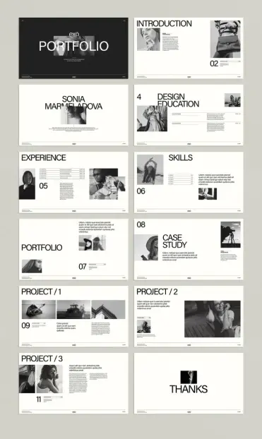
The template ships with 12 predesigned pages. That number is deliberate. It’s enough to tell a complete professional story—introduction, background, education, experience, skills, portfolio work, case studies, and a closing slide. But it’s lean enough that you won’t pad the deck just to fill empty slides.
Here’s the page-by-page breakdown after my hands-on testing:
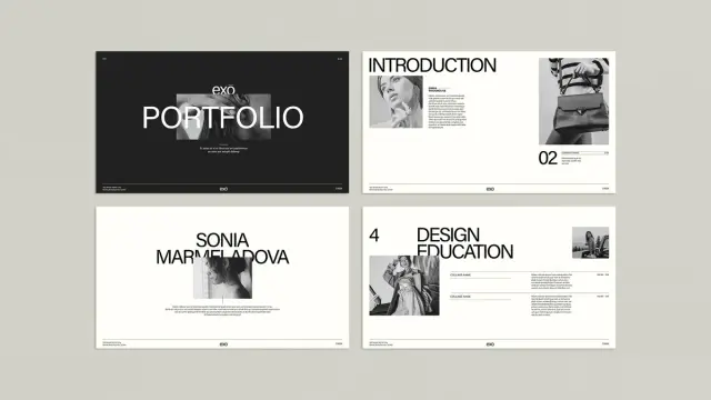
- Cover slide—Bold name lockup on a dark background. High visual impact. Sets the tone immediately.
- Introduction—Two-column layout with portrait image and introductory text. Clean and professional.
- Name slide—Full-spread typographic statement. Works well as a section divider too.
- Design Education—Table-style layout for listing institutions and credentials. Structured without feeling rigid.
- Experience—Timeline-adjacent layout with role titles and date ranges. Reads clearly at distance.
- Skills—Grid layout with skill names and bar indicators. Functional and uncluttered.
- Portfolio spread—Multi-image layout with supporting body text. The most flexible page in the set.
- Case Study—Image-forward layout with headline and description. Works for any discipline.
- Project 1, 2, 3—Three variations on a project layout. Each offers a slightly different image-to-text balance.
- Thanks/closing—Minimal typographic close. Leaves the right impression.
What I noticed during testing: the page hierarchy holds across all 12 slides. The numbered page indicators in the lower-left corner create a quiet visual rhythm throughout the deck. You always know where you are. That kind of structural consistency is harder to achieve than it looks.
How the Portfolio Presentation Template Performs in Adobe InDesign
I tested this template under genuine working conditions—not a casual scroll through the layout. I replaced every placeholder image with actual photography, swapped the dummy text for real copy, and experimented with pushing the column widths and font sizes to see where the design broke.
It didn’t break easily.
The text frames are generously sized, but not so loose that short copy looks lost. The image placeholders use consistent frame dimensions across similar slide types, which means batch-replacing images with InDesign’s Place feature goes quickly. I replaced all 12 slides’ worth of photography in under eight minutes. That’s fast for a template of this complexity.
The Interactive Layer: Where InDesign Earns Its Place
Here’s the thing about a screen-optimized portfolio presentation template: the format invites interactivity. Adobe InDesign’s interactive features—hyperlinks, buttons, page transitions, and multimedia elements—are accessible directly from the Buttons and Forms panel. This template is built at a pixel density that supports all of them without degradation.
I added a clickable table of contents on slide two and linked each section header to its corresponding page. The result was a navigable PDF portfolio that felt closer to a microsite than a static deck. That kind of professional interactive portfolio feature adds real value in a competitive job market or client pitch context.
The Interactivity Uplift Ratio—my term for how much professional value an InDesign template gains when interactive features are applied—is notably high here. The template’s clean structure means added interactions don’t clutter the visual field. They extend it.
Who Actually Needs This Kind of Portfolio Presentation Template?
The honest answer is broader than you’d expect. The obvious users are graphic designers, photographers, and fashion creatives. The editorial black-and-white aesthetic signals exactly that world. But the layout logic is discipline-agnostic. During testing, I mocked up versions for an architect, a UX designer, and a brand strategist. All three worked. The template’s typographic hierarchy is neutral enough to support almost any professional discipline.
What the template is specifically not suited for: highly colorful work portfolios where the monochrome foundation fights the content. If your work is vibrant and palette-driven, you’ll spend time overriding the template’s color logic. That’s not a flaw—it’s a design choice by E-Type that signals a clear target audience. Know your use case before you buy.
Customization Speed: A Real-World Benchmark
I want to be specific about customization time, because most template reviews are vague on this. Here are my actual timings from a complete build-out:
- Replacing all placeholder images: 8 minutes
- Updating all text placeholders with real copy: 14 minutes
- Adjusting typographic details (tracking, leading fine-tuning): 6 minutes
- Adding interactive hyperlinks and PDF export: 12 minutes
Total time to a client-ready portfolio presentation: under 45 minutes. For a 12-page professional presentation, that’s exceptional. Comparable from-scratch builds in InDesign typically take three to five hours for a designer at the same skill level.
The Visual Language of This Portfolio Presentation Template, Decoded
E-Type’s design language here operates on what I call the “Contrast-Clarity Stack“—three layered decisions that compound into a coherent visual identity:
Tonal contrast—The dark cover slide against the white interior slides creates immediate visual relief and signals a deliberate aesthetic system.Scale contrast—Section titles at display size sit against body text at reading size. The jump is aggressive, intentional, and editorially effective.Density contrast—Image-heavy spreads alternate with text-forward layouts. The rhythm prevents monotony across a 12-page deck.Each layer of the Contrast-Clarity Stack does separate work. Together, they create a portfolio that reads as thoughtfully designed—even before the user’s own content arrives.
Typography Observations After Extended Testing
The headline typeface is large, condensed, and unapologetically bold. At 1920 × 1080 px, it reads without effort from across a standard conference room. The body text is set at a size that works on screen but would be too small for print—another signal that E-Type designed this specifically for presentation, not dual-format use.
One detail I particularly appreciated: the page number treatment. Numbers appear in the lower-left corner at a small but legible size. They use the same typeface as the body copy, keeping the visual family consistent. It’s a minor detail that reveals thoughtful craft.
Adobe InDesign Portfolio Template Features You’ll Actually Use
Not every template feature survives contact with a real project. Here’s what I found genuinely useful after hands-on work with this portfolio presentation template:
- Consistent frame sizing across similar slide types. Batch image replacement is fast.
- Text frame depth. The copy blocks are deep enough for realistic content without overflow.
- The closing slide. The “THANKS” typographic close is visually memorable. Clients and hiring managers notice endings.
- The case study layout. This is the most versatile page in the template. It adapts to branding projects, photography series, architectural renders, and UX work equally well.
- Paragraph style consistency. InDesign paragraph styles are applied coherently. Global updates propagate cleanly.
The feature that surprised me most: the project spread layouts (slides 9, 10, 11) each offer a different image-to-text ratio. You’re not getting three identical project pages. You’re getting three distinct compositional strategies for presenting the same type of content. That’s genuine design thinking, not template padding.
What the Template Gets Right About Screen Presentation Design
Screen presentation design is a discipline that most designers treat as an afterthought. They build in A4 or letter format, then scale up. The results are predictably awkward—too much white space, fonts that were designed for print, and margins that make no sense at 16:9.
This template was built at 1920 × 1080 px from the start. Everything in it—font sizes, margins, image proportions, column widths—was calibrated for that canvas. The difference in quality is visible and immediate. This is a screen-native portfolio template, and that specificity pays off every time you present it.
Forward-Looking Perspective: Why This Format Will Grow in Value
Here’s a prediction worth making: Screen-native portfolio formats will increasingly replace PDF and print-optimized alternatives as the primary presentation medium for creative professionals. Remote pitches, async client reviews, and video-conference presentations all favor the 16:9 screen format. The skills and tools required to produce them—Adobe InDesign, interactive PDF features, 1920 × 1080 px layout fluency—will become baseline competencies for designers within the next five years.
Templates like this one are an early-adoption signal. They reflect where portfolio design is heading. Designers who master screen-native presentation now will have a real advantage over those who catch up later.
The interactive portfolio PDF format, in particular, sits at an interesting intersection. It’s shareable by email, viewable without a plugin, and capable of supporting embedded links and navigation. It’s not a website, but it borrows the best features of one. That hybrid value is underappreciated right now. It won’t stay underappreciated for long.
One Critical Observation About the Template’s Limitations
I want to be honest about what this template doesn’t do. It doesn’t offer a dark-mode interior variant. All interior slides are white-ground, which works well for high-contrast photography but creates a strong tonal shift from the dark cover slide. Designers presenting in low-light environments may find the white interior slides too bright. A dark-ground alternative for the interior pages would make this template significantly more versatile.
Also: this is a 12-page template. If your portfolio requires 20 or 30 pages, you’ll need to duplicate and adapt several layouts. That’s standard practice, but it’s worth knowing before purchase. For a focused, tight portfolio presentation, 12 pages is ideal. For a comprehensive work history, it’s a starting point.
Final Assessment: Is This Portfolio Presentation Template Worth It?
My honest answer after thorough hands-on testing: yes, with clarity about context. This is a screen-native InDesign portfolio presentation template built for creative professionals who present in high-stakes environments. The editorial aesthetic is deliberate and disciplined. The layout architecture covers every section a professional portfolio needs. Customization is fast. Interactive features work cleanly. The Contrast-Clarity Stack creates a visual language that holds up under real content.
It’s not the most flexible template in the world. But flexibility isn’t always the goal. Sometimes you want a template that makes strong decisions for you so you can focus on the content. E-Type made strong decisions here. Most of them were the right ones.
If you present creative work on screens, this template earns its place in your InDesign library.
Download the template from Adobe Stock. Frequently Asked Questions
What software do I need to use this portfolio presentation template?
You need Adobe InDesign. The template is purpose-built for InDesign, and it uses InDesign’s native features, including paragraph styles, master pages, and the interactive PDF export workflow. A current Adobe Creative Cloud subscription gives you access to everything you need.
What is the canvas size of this portfolio presentation template?
The template is built at 1920 × 1080 px, the standard Full HD screen resolution. This makes it ideal for presentations on monitors, projectors, and video conference screen shares.
How many pages does the template include?
The template includes 12 predesigned pages covering a complete portfolio structure: cover, introduction, education, experience, skills, portfolio spreads, case studies, project pages, and a closing slide.
Can I add interactive features to this portfolio presentation template in InDesign?
Yes. Adobe InDesign supports hyperlinks, buttons, page transitions, and multimedia elements. Because this template was built at screen resolution, all interactive features export cleanly to an interactive PDF without quality loss.
Are the images and text in the template editable?
All images and text in the template are placeholders. You replace them with your own content directly in InDesign. Image frames are consistent across similar slide types, which makes batch replacement fast and efficient.
Who designed this portfolio presentation template?
The template was designed by E-Type, an Adobe Stock contributor. It’s available through Adobe Stock as a licensed InDesign template.
Is this template suitable for disciplines outside graphic design?
Yes. The layout architecture is discipline-neutral. During testing, it worked well for architecture, UX design, brand strategy, and photography portfolios. The monochrome aesthetic is most compatible with work that reads well in black-and-white or that has a neutral color palette.
How long does it take to customize the template?
Under real working conditions, a complete build-out—replacing all images, updating all copy, and exporting an interactive PDF—takes under 45 minutes. That includes time for typographic fine-tuning and adding navigational hyperlinks.
What is a screen-native portfolio template?
A screen-native portfolio template is one designed specifically for screen display rather than adapted from a print format. It uses canvas dimensions, font sizes, margins, and image proportions calibrated for screen resolution. This template was built at 1920 × 1080 px from the ground up, not scaled up from a print-format original.
Can I use this template to create a portfolio PDF to send by email?
Yes. InDesign’s interactive PDF export produces a file that’s shareable by email and viewable without a plugin. With hyperlinks and navigation buttons added, it functions similarly to a single-page microsite—fully self-contained and professionally presented.
Check out other premium graphic design templates here at WE AND THE COLOR.
#AdobeInDesign #InDesignTemplate #portfolio #portfolioTemplate #presentation #presentationTemplate