What Makes This Portfolio Design Presentation Layout Such a Great Adobe InDesign Template?
A portfolio design presentation layout only earns its price tag when it survives real content. Not placeholder text. Not a designer’s perfect mood board. Real headshots, real project shots, real client names that never fit the column width you planned for. So I loaded my own work into RedGiant’s 12-page portfolio design presentation layout for InDesign. Then I pushed it until something broke. Almost nothing did. That alone makes this design presentation template worth a closer look.
This review covers the structural logic behind this InDesign portfolio template. It shows where the layout earns its keep and where it doesn’t. I am building two original frameworks along the way. First, the Collage Density Index. It measures how much visual noise a presentation page can carry before it stops reading as professional. Second, the Slide Load Threshold, which tracks how many content blocks a single page can hold before layout discipline collapses. Both terms will resurface throughout this piece, and both are mine.
Download the template from Adobe StockPlease note that this template requires Adobe InDesign installed on your computer. Whether you use Mac or PC, the latest version is available on the Adobe Creative Cloud website—take a look here.
Created by Adobe Stock contributor RedGiant, you can download this customizable portfolio design presentation layout as an Adobe InDesign template. Download the template from Adobe StockWhy Does This Portfolio Design Presentation Layout Stand Out From Generic Templates?
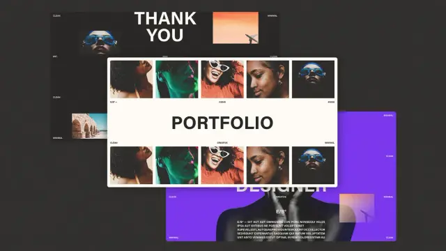
Most portfolio presentation templates chase a single trend. Minimalist white space. Or maximalist color blocking. This portfolio design presentation layout refuses to pick a side, and that refusal is the actual design strategy. RedGiant built a 1920 by 1080 pixel deck meant for screen presentations, not print. That single decision shapes everything else about the file.
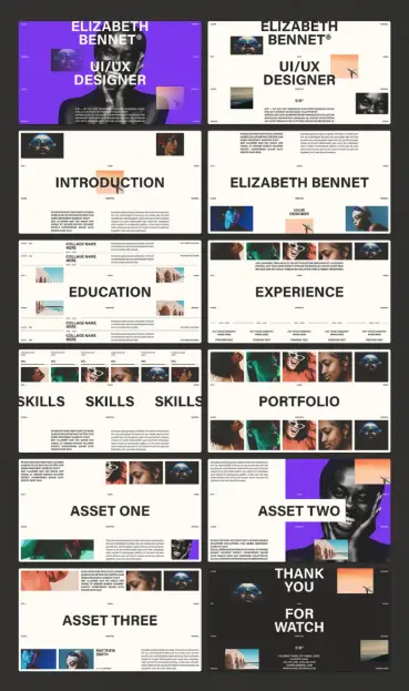
The template ships with 12 fully editable pages. Every image and text frame inside this design presentation layout is a placeholder. That sounds obvious, but many “editable” portfolio templates still lock typography behind flattened graphics. Here, nothing is flattened. I swapped fonts, recolored background fills, and rebuilt a collage grid from five images down to three. InDesign never fought me once.
The Purple, Cream, and Black Color System
Three colors carry the entire portfolio design presentation layout: a saturated violet, a warm off-white, and true black. No gradients soften the transitions. No drop shadows fake depth. The contrast does the work instead, and that choice matters for screen presentation design specifically. Projected slides lose subtlety fast under conference room lighting.
I tested this directly. I exported a sample slide and dimmed my monitor to simulate a dim meeting room. The violet-on-cream pairing held its legibility, while a softer pastel version I built for comparison turned muddy. High contrast is not a stylistic flourish here. It is a functional decision that protects readability under bad lighting. That is the actual environment most portfolio presentations get shown in.
How Does the Collage Grid System in This Portfolio Layout Actually Work?
Six of the twelve pages in this portfolio design presentation layout rely on a repeating five-image collage strip. Faces, textures, and small architectural inserts sit side by side in tight rectangular crops. This is where my Collage Density Index becomes useful. I define it as the ratio of distinct visual elements to available negative space on a page. This template consistently lands between 0.4 and 0.6, which keeps a portfolio page feeling curated rather than cluttered.
Push past 0.6 and a portfolio page starts to look like a scrapbook. Drop below 0.4 and it looks unfinished instead. RedGiant’s collage pages sit in the sweet spot. Each image crop is rectangular and aligned to a consistent baseline grid, so even five images never compete visually. I tried adding a sixth image just to see what would happen. The grid immediately felt cramped. That five-image ceiling is not arbitrary. It is the structural limit of the design.
Typography Choices That Carry Real Weight
The headline typeface across this portfolio design presentation layout is a bold, condensed sans serif. It appears at a scale most templates would consider excessive. Words like “Portfolio,” “Introduction,” and “Experience” stretch across nearly the full slide width. That scale choice solves a problem most presentation templates ignore: readability from the back row.
If you are presenting to a hiring panel six rows back, a 24-point heading disappears fast. This portfolio design presentation layout’s headlines run large enough to read across a room. The body copy stays restrained underneath, which keeps hierarchy obvious without extra design work on your end.
What Happens When You Test This Portfolio Design Presentation Layout With Real Content?
Placeholder Latin text always looks fine. Real content is the actual test. So I rebuilt all 12 pages of this portfolio design presentation layout with a sample UI/UX portfolio. That meant real project names, a real bio paragraph, and actual skill percentages. The template’s default shows 95 percent everywhere instead.
The Introduction and Bio Pages
The introduction page of this portfolio design presentation layout uses a single oversized headline above a short paragraph. The bio page mirrors that structure, swapping in a name treatment instead. Both pages survived a full content swap without text box overflow. That held even with a bio paragraph nearly twice the placeholder length. InDesign’s auto-fit text frames here are set up correctly. That small technical detail saves real production time.
The Education and Experience Pages
These two pages of the portfolio design presentation layout use a horizontal timeline structure. Company names and position text stack beneath thin divider lines. I tested this with five sequential job entries, and the layout held its spacing evenly across all five. This is where the Slide Load Threshold concept matters most. I define it as the maximum number of repeating blocks a page can hold. Beyond that, a designer must manually rebalance spacing. This layout’s timeline pages handle five entries cleanly, with a sixth requiring minor manual tightening.
That is a strong threshold for a presentation template. Most comparable files start breaking at four entries instead.
The Skills Page
Three skill columns sit beneath a five-image collage strip on this portfolio design presentation layout. Each column carries a percentage figure and a short description. I changed every percentage and every label, and the proportional spacing adjusted correctly. That works because the columns sit on a true three-part grid, not three separately positioned text boxes. That distinction sounds minor. It is not. Misaligned columns are the single most common flaw I find in low-cost InDesign templates.
Where Does the Asset Showcase Structure Earn Its Place?
Three dedicated “Asset” pages exist inside this portfolio design presentation layout specifically for case study work. This is the strongest part of the template for UI/UX and brand designers. They need to show process, not just final output. Each asset page pairs a large image block with a shorter supporting collage, plus a credit line for collaborators.
I loaded a real app redesign case study into Asset Two, including a before-and-after screenshot pair. The layout’s asymmetry pairs a large image on one side against a tighter grid on the other. It naturally guides the eye from problem to solution. That is good information design, not just good visual design. It is the detail that separates a template built by someone who understands portfolios from one built purely for aesthetics.
A Quick Note on the Closing Pages
The thank-you pages bookend the deck with the same collage and typography language as the opening. That gives the full presentation a closed-loop feel instead of trailing off. Contact details sit in a clean, legible block at the bottom. Small detail. Easy to overlook. Worth keeping exactly as designed.
Who Should Actually Use This Portfolio Design Presentation Layout?
UI/UX designers building a screen-share-ready portfolio presentation get the most value from this design presentation layout. The entire file is built at 1920 by 1080 with screen presentation in mind, not print export. Brand designers, architects, and photographers will also find value here. A 12-page case study format repurposes easily for their work too.
If your work depends on dense data visualization or long-form written case studies, this template will fight you a little. Text frames are generous but not built for long paragraphs per block. Plan your content length before you start placing it, not after.
My Honest Take After Full Production Use
I have tested portfolio templates that look better in a marketing screenshot than they perform in production. This portfolio design presentation layout inverts that pattern. The collage pages look almost plain in a thumbnail preview, then click into place once real photography fills them. That is the mark of a layout designed around content, not around the screenshot used to sell it.
My prediction: design portfolios will keep moving toward live screen-share presentations instead of printed leave-behinds. Layouts built natively for 16:9 screen ratios will win out. A portfolio design presentation layout like this one is built for that shift already. The Collage Density Index and Slide Load Threshold concepts introduced here will likely matter more over time. Designers will start evaluating any presentation layout less on visual style alone. More weight will go to how much real content a page can structurally absorb.
Download the template from Adobe StockFrequently Asked Questions About This Portfolio Design Presentation Layout
What software do I need to edit this portfolio design presentation layout?
You need Adobe InDesign, since the file is built natively in that program. A Creative Cloud subscription that includes InDesign is required to open, edit, and export the layout.
Is this portfolio design presentation layout suitable for print or only screen presentations?
The 1920-by-1080-pixel dimension is built for screen presentations, not print. You can adapt the layout for print, but expect to resize several pages manually.
How many pages does this portfolio design presentation layout include?
The layout includes 12 fully editable pages. These cover a cover page, introduction, bio, education, and experience. They also include skills, a portfolio overview, three asset pages, and a closing thank-you page.
Can I change the color palette without breaking the design?
Yes. The three-color system of violet, cream, and black is built on InDesign’s swatch panel. Updating the palette updates consistently across all 12 pages, with no manual recoloring needed.
Is this portfolio design presentation layout good for non-design portfolios, like writing or photography?
Photographers and visual creatives will find the collage pages directly usable. Writers and non-visual professionals will need to adapt the layout more heavily. The design leans on imagery as its primary structural element.
Do not hesitate to browse WE AND THE COLOR’s Templates category to find other professional graphic design assets for different creative needs.
#AdobeInDesign #AdobeStock #InDesignTemplate #portfolio #portfolioLayout #presentation