Luxury Brand Guidelines InDesign Template for Screen-Ready Presentations

Brand guidelines used to live in PDFs nobody opened. That era is over. Today, brand identity documents are expected to function as presentations, reference tools, and communication assets — all at once. The luxury brand guidelines InDesign template by Tom Sarraipo answers that demand directly, with a presentation layout built for screens, not printers.

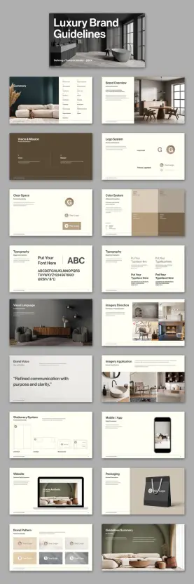
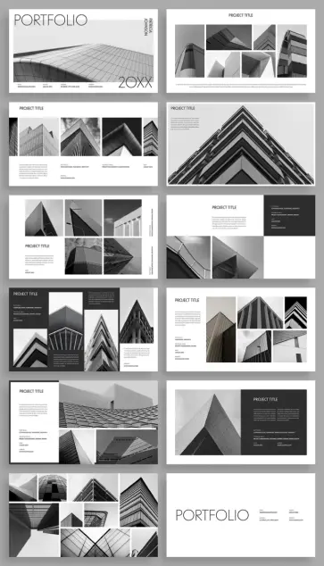
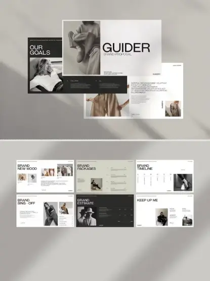
This is a 21-page, 1920 × 1080 px Adobe InDesign template. It covers every major touchpoint of a brand identity system — from logo architecture and color palettes to packaging, stationery, and digital mockups. And it does all of this inside a visual language that feels restrained, precise, and unmistakably premium.

But beyond the aesthetics, this template represents a specific philosophy about how brand documentation should work. Furthermore, it challenges designers to rethink what a brand guidelines document is actually for.

Download the template from Adobe Stock

Please note that this template requires Adobe InDesign installed on your computer. Whether you use Mac or PC, the latest version is available on the Adobe Creative Cloud website—take a look here.

Adobe InDesign Brand Guidelines Presentation Layout by Tom Sarraipo Download the template from Adobe Stock

What Makes a Brand Guidelines Presentation Template Actually Useful?

Most brand guidelines templates fall into one of two failure modes. Either they are too generic — a grid of colors and fonts that tells nobody anything — or they are too rigid, demanding a visual style that overwrites the client’s actual brand. Tom Sarraipo’s template avoids both.

The layout operates on what I’d call the Neutral Scaffold Principle: the structure is opinionated, but the content slots are entirely neutral. Every image, logo, and typeface is a placeholder. Consequently, the designer’s job is to fill the scaffold with the client’s actual brand reality — not adapt their brand to fit a template’s personality.

This distinction matters enormously in practice. A scaffold that imposes its own aesthetic becomes a liability. Meanwhile, a scaffold that stays out of the way becomes a genuine tool. Sarraipo’s template is firmly in the second category.

The minimalist layout is built around high contrast, clean white space, and editorial typographic hierarchy. Therefore, it reads as premium without performing premium — a critical distinction for luxury branding work.

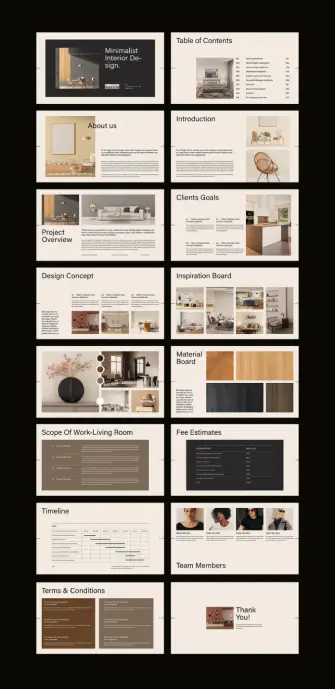
The Architecture of the Template: 21 Pages, Zero Waste

Twenty-one pages sounds like a lot. In practice, every spread in this template earns its place. Let me walk through the structure and explain what each section actually accomplishes.
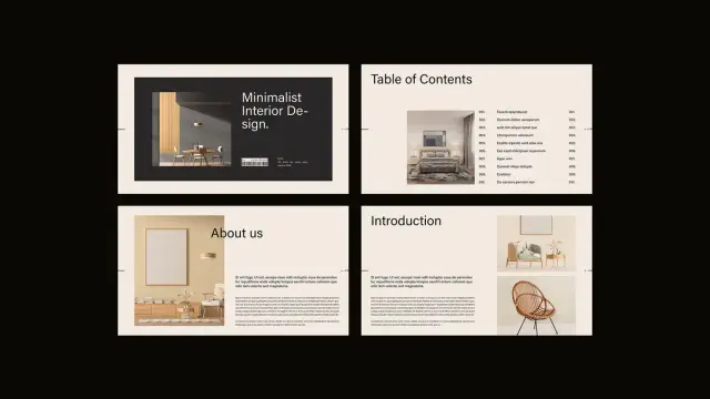
Cover and Summary

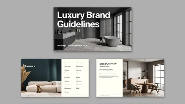
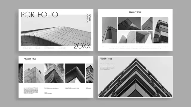
The cover establishes visual tone immediately. It uses a bold sans-serif headline — “Luxury Brand Guidelines” — against a full-bleed lifestyle image. This is the First Impression Frame, the single slide that sets the entire emotional register of the document. Get it wrong, and nothing else recovers. Get it right, and every subsequent page benefits from the credibility established here.

The summary page follows with a structured content index. It lists every section — Brand Overview, Logo System, Color System, Typography, Visual Language, and more — in a scannable two-column layout. Additionally, it sits alongside a curated image block that reinforces the overall visual direction.

Brand Overview and Vision & Mission

The Brand Overview page introduces what Sarraipo’s layout calls “A Refined Foundation.” This section exists to establish context before introducing any visual assets. Moreover, it anchors the subsequent visual decisions in purpose, not just aesthetics.

The Vision & Mission spread is deliberately spacious. Two columns — Vision and Mission — sit against an earth-toned background. The breathing room here is intentional. These statements should feel considered, not compressed. Thus, the whitespace is functional, not decorative.

Logo System and Clear Space

The logo section is where many brand guidelines templates overcomplicate. Sarraipo’s version is admirably direct. It shows the logomark, the primary logomark, and the relationship between the two — clean, labeled, and unambiguous.

The Clear Space page follows with a dedicated spread for logo protection zones. This is often the most ignored section in brand documentation, yet it is among the most practically important. By giving it its own full page, the template signals that this is non-negotiable territory.

Color System

The color palette spread uses a grid of color blocks — warm neutrals, deep taupes, and muted earth tones in the placeholder version. Each block carries the color’s name, HEX, RGB, and CMYK values. This is the Color Specification Matrix approach, and it is the correct one for any brand document that will be used by both digital and print teams.

Furthermore, the grid layout allows for immediate visual comparison, which is exactly what a working designer needs when checking brand compliance on a real project.

Typography Spreads

There are two dedicated typography pages — a notable choice. The first establishes the typeface family, showing the full character set from A to Z and 0 to 9. The second demonstrates typographic hierarchy in use: primary, secondary, and supporting type roles shown side by side.

This dual-page approach reflects what I’d call the Type-in-Context Protocol: never show type in isolation. Always show it doing something. The second spread accomplishes exactly this, and it makes the typography section significantly more useful than a single specimen page.

Visual Language and Imagery Direction

The Visual Language spread is the most editorial section of the template. It uses a full-bleed lifestyle photograph alongside a curated color palette strip — establishing the mood and compositional approach that defines the brand’s image world.

The Imagery Direction page then goes further, showing both approved and rejected image treatments side by side. This is the Approval/Rejection Axis, a framework for communicating aesthetic standards without lengthy written descriptions. One correct image and one incorrect image teach more than three paragraphs of guidelines text.

Brand Voice

A single page carries a single quote: “Refined communication with purpose and clarity.” The entire slide is devoted to this one statement. This is not minimalism for its own sake — it is a demonstration of the principle itself. The brand voice page uses the brand voice to define the brand voice. That kind of self-referential precision is genuinely clever design thinking.

Applications: Stationery, Mobile, Website, Packaging

The applications section is where brand guidelines move from theory into practice. Sarraipo’s template covers four distinct touchpoints: stationery (letterhead, envelope, business card), mobile and app interface, website mockup, and packaging.

Each spread uses realistic mockup photography alongside annotated layout diagrams. This combination — what I’d call the Mockup-to-Blueprint Pairing — gives both the client and the production team exactly what they need. Clients see the vision; production teams see the specifications.

Brand Pattern and Guidelines Summary

The Brand Pattern page shows the logo used as a repeating graphic element — tiles of logomarks across varying backgrounds. This is practically useful for merchandise, packaging, and digital surface design. Additionally, it demonstrates the logo’s flexibility without compromising its integrity.

The final Guidelines Summary page closes the document with a lifestyle image and a structured list of key principles. It is the Closing Anchor Frame — the last impression, designed to leave the reader with clarity and confidence rather than information overload.

Why the 1920 × 1080 px Format Changes Everything

Brand guidelines have historically been delivered as PDFs at print dimensions — A4, US Letter, sometimes A3. That format made sense when the primary output was a printed binder. Today, almost nobody prints brand guidelines. They present them, share them, and review them on screens.

Sarraipo’s choice of 1920 × 1080 px — standard HD resolution and the native aspect ratio of virtually every contemporary monitor, laptop, and projector — is a direct response to this reality. The template fills the screen completely. There are no white bars, no awkward margins, no scroll required. It simply fits.

This format also has a practical advantage in client presentations. When you present brand guidelines at a 16:9 aspect ratio on a widescreen display, the experience is fundamentally different from sharing a PDF via email. The guidelines become a presentation. Consequently, they carry the weight and authority of a presentation.

Moreover, Adobe InDesign’s interactive features — hyperlinks, page transitions, video embeds — work within this format in ways that print-oriented documents cannot accommodate. The template is explicitly designed to support interactivity, transforming what would otherwise be a static reference document into an active communication tool.

The Minimalist Aesthetic as a Strategic Choice

Tom Sarraipo’s design aesthetic throughout this template is restrained to the point of discipline. Warm neutrals — off-whites, taupes, deep browns — dominate the palette. Typography is clean and geometric. Image placements are considered rather than decorative. Nothing competes for attention that isn’t earning it.

This is not merely a stylistic preference. It is a strategic design decision. A brand guidelines template that asserts its own visual identity too strongly will inevitably conflict with the client brand it is meant to document. Therefore, the template needs to be something closer to a neutral container than a designed artifact.

Sarraipo achieves this through what I’d describe as Aesthetic Recessive Design — the deliberate suppression of the template’s own visual personality in service of the content it will hold. The template looks premium because premium brands need premium documentation frameworks. But it does not look like any specific premium brand. That distinction is the entire point.

Who Actually Needs This Template?

The obvious answer is brand designers and creative directors. But the real answer is more specific than that.

This template is built for designers who work with clients for whom presentation quality is part of the value delivered. Luxury brand clients, high-end hospitality groups, fashion brands, architecture firms — these clients evaluate the quality of their designer’s documentation as part of how they assess the quality of their designer’s thinking. A polished, professional brand guidelines presentation communicates competence before anyone reads a single word.

It is also well suited to in-house brand teams at companies undergoing identity work — rebrands, sub-brand launches, brand consolidation projects. These teams need a documentation format that their internal stakeholders will take seriously. A 21-page structured presentation carries considerably more institutional weight than a shared Google Doc.

Additionally, design educators working on brand identity curriculum will find the template’s structural logic useful — not just as a tool, but as a teaching example of how brand documentation should be organized.

Customizing the Template in Adobe InDesign: What to Know

Adobe InDesign remains the professional standard for multi-page layout work, and this template uses it properly. Every text block is a placeholder. Every image frame is ready to accept your own photography or graphics. The color swatches in the Color System page are editable InDesign color objects — replace the HEX values and the blocks update automatically.

The typography placeholders use the message “Put Your Font Here” explicitly — an unusually direct instruction that makes the customization workflow immediately clear. Replace the typeface, update the character samples, and the entire typographic story of your client’s brand becomes visible in seconds.

For interactive use, InDesign’s Export to Interactive PDF or Publish Online features allow the completed template to function as a clickable presentation. Page transitions, hyperlinked table of contents entries, and embedded media all become possible within this document structure.

One practical note: because the template is built at 1920 × 1080 px, it exports cleanly to PowerPoint or Keynote via PDF intermediary — useful for clients who need to maintain the document internally without InDesign access.

The Broader Shift: Brand Guidelines as Brand Experiences

There is a longer argument embedded in a template like this one. Brand guidelines are not just reference documents. They are, in a very real sense, the first experience of the brand that internal teams and external partners have. If the guidelines are clumsy, disorganized, or visually incoherent, they undermine confidence in the brand itself — regardless of how strong the underlying identity work might be.

I’d frame this as the Documentation-as-Brand-Experience Thesis: the quality of your brand documentation is itself a brand signal. Luxury brands, in particular, cannot afford to separate the experience of using their brand from the experience of reading about their brand. They need to be the same experience.

Sarraipo’s template operationalizes this thesis. It is not just a convenient way to document brand decisions. It is a demonstration that brand thinking extends into every artifact the brand produces — including the document that governs the brand.

That is a more sophisticated position than most brand guidelines templates take. And it is why this particular template deserves attention beyond its surface-level functionality.

A Forward-Looking Prediction

Within the next three to five years, static PDF brand guidelines will become the exception rather than the rule. Interactive, screen-native brand documentation — delivered as web apps, interactive PDFs, or hosted brand portals — will become the standard expectation for professional brand identity work. Templates like this one, built at screen resolution with interactivity in mind, are the precursor to that shift.

Designers who build their documentation workflow around screen-native formats now will be significantly ahead of this curve when clients begin expecting it as standard practice. Furthermore, they will have developed the design fluency in this format that takes time to build.

Download the template from Adobe Stock

The Sarraipo luxury brand guidelines template is, among other things, a bet on where professional brand documentation is heading. From where I stand, it is a well-placed bet.

Frequently Asked Questions

What software do I need to use this brand guidelines template?

You need Adobe InDesign to edit this template. Any current Creative Cloud subscription that includes InDesign will work. The template is delivered in standard InDesign format and does not require any additional plugins or extensions.

What is the page size of this brand guidelines template?

The template is designed at 1920 × 1080 px, which matches standard HD screen resolution. This makes it ideal for on-screen presentations, projector display, and interactive PDF export. It is not designed for print use at standard paper dimensions.

How many pages does the template include?

The template includes 21 pre-designed, fully customizable pages covering brand overview, logo system, clear space rules, color system, typography, visual language, imagery direction, brand voice, imagery applications, stationery system, mobile and app mockups, website mockup, packaging, brand pattern, and a guidelines summary.

Can I use this template for clients across different industries?

Yes. Because the template uses a neutral, minimalist aesthetic and placeholder content throughout, it adapts to virtually any brand identity project. It works particularly well for luxury, hospitality, fashion, architecture, and premium consumer brands, but the scaffold is flexible enough to support other sectors.

Can I make the brand guidelines interactive?

Yes. Adobe InDesign supports interactive PDF export and Publish Online, both of which enable hyperlinks, page transitions, and embedded media. The 1920 × 1080 px format is specifically suited to interactive presentation use.

Are the images and fonts in the template included?

All images and typography shown in the template are placeholders. You replace them with your own assets — client photography, brand typefaces, and logo files. The template provides the structural framework; the brand content is yours to supply.

Is this template suitable for a luxury brand identity project?

Yes, and it is specifically designed with that context in mind. The minimalist, screen-native layout communicates professionalism and restraint — exactly the qualities that luxury brand clients expect from their documentation. The template’s Neutral Scaffold Principle ensures it supports rather than overrides the client’s own brand personality.

Where can I get this Adobe InDesign brand guidelines template?

The luxury brand guidelines presentation template by Tom Sarraipo is available on Adobe Stock. You can browse and license it directly through Adobe Stock, where it is available as part of a standard or extended license depending on your intended use.

Check out other graphic design assets here at WE AND THE COLOR.

#AdobeInDesign #brandGuidelines #design #graphicDesign #InDesignTemplate #layout #luxuryBrand #presentation #presentationTemplate

Download a Company Profile Presentation Template for Adobe Illustrator That Actually Works

Most presentation templates fail before anyone opens them. They promise versatility, deliver visual noise, and force you to spend hours overriding decisions someone else made badly. The Monono company profile presentation template takes the opposite approach — and the result is something worth paying close attention to.

Designed by Adobe Stock contributor Guuver, this Illustrator template operates at 1920 × 1080 px, the native resolution of screen presentations. Every slide feels deliberate. The bold cobalt blue palette, uppercase editorial typography, and structured white space aren’t decorative choices — they’re functional. They signal authority. They create visual hierarchy without trying hard.

Strong company profile presentations don’t just share information. They build trust, establish credibility, and leave an impression. Monono does all three. Here’s exactly why it works — and why it deserves a place in your design toolkit.

Download the template from Adobe Stock

Please note that to edit this template, you need professional graphic design software like Adobe Illustrator installed on your computer. You can get the latest version from the Adobe Creative Cloud website. Just have a look here.

Download this Adobe Illustrator Company Profile Presentation Template by Guuver. Download the template from Adobe Stock

What Makes a Company Profile Presentation Template Worth Using in 2025?

That’s the honest question every buyer should ask before downloading anything. Templates are everywhere. Most are generic. So what separates a useful company profile presentation template from one that wastes your time?

Three things: structural clarity, visual restraint, and flexibility. Monono delivers all three in a single 22-slide package designed specifically for Adobe Illustrator. It covers every standard section a professional company profile needs — introduction, about the company, mission and values, project portfolio, team, pricing, testimonials, Q&A, and a contact slide.

Each section has its own distinct layout. Yet the overall presentation feels cohesive. That’s harder to pull off than it sounds. Many templates achieve variety at the cost of unity. Monono maintains both through a disciplined design language built on bold typography, high-contrast imagery placement, and a blue-and-black color system that commands attention without exhausting it.

The minimalist approach isn’t minimalism for its own sake. It’s minimalism as a professional strategy. When your slides are clean, your content gets the attention — not the background gradients or animated transitions.

The Design Language: A Framework for Authoritative Presentations

Let’s define something useful here. Call it the Authority Architecture — a three-part design framework that explains why this template works where others don’t.

1. Chromatic Dominance

Monono uses a striking cobalt blue as its dominant color. This isn’t just an aesthetic decision — it’s a psychological one. Blue communicates trust, stability, and competence in corporate contexts. The Monono Illustrator template applies this color with confidence, using it in large blocks rather than subtle accents. The result reads as bold and assured rather than timid or decorative.

Pair that blue with black-and-white photography and clean white text, and you get a palette that photographs well, projects clearly, and looks polished on any screen.

2. Typographic Authority

The template leans on uppercase, wide-spaced display typography. Headlines like “TEAMWORK IS A MAKE-OR-BREAK SITUATION” take up space intentionally. They don’t whisper. They anchor each slide and give the viewer something to hold onto visually.

This typographic approach aligns with what design critics increasingly call editorial brutalism — the use of raw typographic scale and weight to create hierarchy without ornamentation. It works especially well in company profile presentations where perceived authority matters as much as visual appeal.

3. Structural Modularity

Every slide in Monono is independently functional. Swap out placeholder images, replace the lorem ipsum copy, and each slide works as a standalone unit. Yet nothing breaks the overall flow. This modularity is the product of thoughtful grid architecture — something Guuver executes with real precision throughout the template.

Slide-by-Slide: What the Monono Company Profile Presentation Includes

A professional company profile presentation template is only as good as its slide coverage. Monono covers the full scope of a corporate presentation without padding or unnecessary repetition.

Introduction and Title Slides

The opening slides are designed to project a strong first impression. The title slide uses the brand name in oversized uppercase typography over a full-bleed blue background. Supporting text sits small and subordinate — letting the company name do the work.

A table of contents slide follows, structured cleanly with numbered sections. This is a detail many templates skip. Monono includes it because professional presentations need navigational clarity.

About the Company and Chairman’s Message

Two critical slides that most company profile presentations either rush or over-design. Monono gives each its own layout — one image-forward, one text-forward — so you can balance visual and written content naturally.

The chairman’s message slide features a portrait placeholder alongside a text column. The layout communicates leadership presence without resorting to clichéd headshot-and-quote formats.

Values, Mission, and What We Do

These slides use a split-column approach with numbered sections. The formatting is clean enough to present complex information without overwhelming the viewer. The “What We Do” slide organizes services into four labeled sections — a practical structure for agencies, consultancies, and enterprise businesses alike.

Project Portfolio

Three distinct portfolio layouts appear across the template. Some are image-dominant, others text-dominant, and one uses a dual-image approach that works well for before-and-after or comparison storytelling. This variety gives you options without forcing you to redesign anything.

Team and Culture Slides

“Our Magnificent Team” and “Meet Our Team” provide two different framings of the same content. One uses a grid of headshots with names. The other shows a closer, more personal layout. Both feel editorial rather than corporate-stock-photo generic.

History, Pricing, and Testimonials

A timeline-style history slide, a structured pricing table with three tiers, and a testimonials slide with portrait placeholders cover the commercial and social proof aspects of a company profile presentation. These are conversion-critical slides. Monono treats them with appropriate visual weight.

Q&A, Contact, and Closing

The Q&A slide uses a split-question format, which is unusual and practical for workshops or investor meetings. The contact slide is minimal and functional. The closing slide — “Thanks for Having Us” — lands with warmth rather than corporate formality.

Why Adobe Illustrator Is Still the Right Tool for Company Profile Presentations

PowerPoint and Keynote dominate the presentation space. So why choose an Adobe Illustrator template for a company profile?

Control. As the most advanced graphic design software, Illustrator gives designers absolute precision and flexibility that slideshow software simply can’t match. For company profile presentations that need to look polished in print as well as on screen, Illustrator is a professional solution.

Monono takes full advantage of Illustrator’s strengths. The template keeps headers and footers consistent across all 22 slides. Typography is set with real attention to tracking and leading — details that matter in high-stakes presentations.

The 1920 × 1080 px format makes it directly exportable to PDF for screen use, or printable at A4/letter size with minimal adjustment. That dual-use flexibility is a genuine advantage for design-conscious teams.

Who Should Use This Company Profile Presentation Template

Monono isn’t for every business. Its visual identity is bold and confident — best suited to industries where design credibility matters.

Architecture firms, creative agencies, product studios, tech consultancies, and corporate strategy teams will all find the template useful. The editorial tone of the typography communicates seriousness without stuffiness. The blue palette reads as modern and professional rather than traditional or conservative.

Startups pitching to investors will find the clean structure valuable — it lets the content breathe rather than burying it in visual clutter. Established companies refreshing their corporate identity will appreciate the template’s maturity. It doesn’t feel like a student project. It feels like something a seasoned creative director signed off on.

Customization: Replacing Placeholders Without Breaking the Design

The Monono company profile presentation template uses placeholder images and lorem ipsum text throughout. All placeholders are fully replaceable in Adobe Illustrator. The design system holds together even when you change every visual element.

That’s the test of a well-built template — whether it survives contact with real content. Monono passes. The underlying grid and typographic hierarchy are strong enough to anchor any content you drop in.

Here’s a practical workflow for customizing this Illustrator template without losing the design integrity:

Step 1 — Establish Your Color System First

Before touching a single slide, decide whether you’re keeping the cobalt blue or replacing it with your brand color. Illustrator’s swatches panel makes global color changes fast. Update the primary color swatch, and the change cascades across all slides instantly.

Step 2 — Replace Images in Batches

Swap all placeholder images before touching copy. This gives you an accurate visual read on the final presentation before you start writing. Use high-contrast, editorial-style photography to maintain the template’s aesthetic vocabulary.

Step 3 — Edit Copy Hierarchically

Start with headlines, then subheadings, then body copy. This preserves the layout hierarchy while you work and prevents you from losing your place in complex multi-column slides.

Step 4 — Export and Review at Full Screen

Export to PDF and view at 100% on the screen you’ll present from. The 1920 × 1080 px format is optimized for this — but fonts and images that look fine at 25% zoom sometimes surprise you at full size. Review before your presentation date, not the morning of.

The Minimalist Presentation Paradox: Why Less Converts More

Here’s a perspective worth holding onto. Most presenters believe more information equals more persuasion. Research and real-world experience both say otherwise.

Cognitively dense slides exhaust viewers. When every pixel fights for attention, nothing gets it. The Monono company profile presentation resolves this through what I’d call the Signal Clarity Principle — a design philosophy where visual restraint actively increases message retention.

Each Monono slide carries one primary message. Supporting details exist, but they’re subordinate. The typographic hierarchy enforces this — the headline always wins. As a result, viewers remember what you intended them to remember. That’s not an accident. It’s a strategic design.

The slide that reads “MINIMALIST IS NOT LACK OF SOMETHING. IT’S SIMPLY THE PERFECT AMOUNT OF SOMETHING” isn’t just a motivational quote. It’s a design philosophy statement embedded in the template itself. Guuver isn’t hiding the thesis — it’s on the slide.

How Monono Compares to Other Company Profile Presentation Templates

The Adobe Stock library contains hundreds of company profile presentation templates. Most fall into predictable categories: overly illustrative, color-heavy, icon-dependent, or visually timid.

Monono occupies a different position. Its closest aesthetic relatives are high-end agency decks and architectural pitch presentations — documents that prioritize spatial design and typographic authority over decorative elements.

What sets it apart in practical terms:

First, the color commitment. Most templates use color as an accent. Monono uses it architecturally — blue occupies entire slides, not just borders or icons.

Second, the typographic scale. Oversized headlines in a presentation template require confidence. Guuver commits to scale without apology. The result looks expensive.

Third, the photography integration. Placeholder image frames are sized and positioned to work with real editorial photography — industrial, architectural, and portrait content all fit naturally within the established layouts.

Long-Term Value: When a Company Profile Presentation Template Pays for Itself

A well-designed company profile presentation template isn’t a one-use purchase. The Monono template scales across use cases — client pitches, investor decks, internal strategy presentations, conference talks, and partnership proposals all fit within its structural framework.

For agencies and studios with multiple clients, the template’s modular slide architecture means each new presentation requires adaptation rather than reconstruction. That’s hours saved per project. Over a year, across multiple clients, the economics are clear.

Download the template from Adobe Stock

The Adobe Illustrator format also future-proofs your investment. Illustrator files are the industry standard for professional graphics. Your presentation can become a printed brochure, a PDF download, or an exported slide deck without redesigning anything from scratch.

Frequently Asked Questions About the Monono Company Profile Presentation Template

What software do I need to use this template?

You need Adobe Illustrator. The template is built natively for Illustrator and won’t open correctly in PowerPoint or Keynote. An active Adobe Creative Cloud subscription gives you access to the latest version of Illustrator.

Can I use this template for multiple clients?

Yes. Standard Adobe Stock licensing covers commercial use across multiple projects. Review Adobe’s licensing terms for specific limitations, but for most agency and freelance use cases, a single purchase covers multiple client applications.

Is this template print-ready as well as screen-optimized?

The native format is 1920 × 1080 px, optimized for screen presentations. With minor adjustments to document size and bleed settings in Illustrator, you can adapt it for print output. The design translates well to A4 landscape format.

How long does it take to customize the full template?

For a practiced Illustrator user, a full 22-slide customization takes two to four hours, including image replacement and copy editing. For users new to Illustrator, budget half a day. The template’s clear structure makes the process straightforward even without advanced Illustrator experience.

What industries suit the Monono company profile presentation template best?

Architecture, engineering, creative agencies, technology consultancies, financial services, and corporate strategy teams all align well with the template’s visual identity. Industries where design credibility signals professional competence will find the most value here.

Where can I download the Monono Illustrator template?

The template is available directly through Adobe Stock. An Adobe Stock subscription gives you access to millions of other creative assets — making it a cost-effective choice for designers who regularly need high-quality templates, stock photography, and creative resources.

A Final Thought on What Good Presentation Design Actually Does

Every slide is a beat in a story you’re telling — and the design either supports that story or competes with it.

The Monono company profile presentation template understands this. It creates a visual environment that puts the presenter in control. The bold typography gives you authority. The clean layouts give your content space to breathe. The consistent color system gives your audience a visual anchor across every slide.

That’s what a great Illustrator template actually delivers — not just good-looking slides, but a design system that works for you in the room. Monono earns that description honestly.

If your current company profile presentation is doing the visual equivalent of shouting over itself, this template is the reset you’re looking for. Add your content, trust the grid, and let the design do its job.

Check out other professional graphic design templates here at WE AND THE COLOR.

#companyProfile #design #graphicDesign #illustratorTemplate #presentation #presentationTemplate

An Interior Design Presentation Template That Changes How Designers Win Clients

Every interior designer has sat across from a prospective client, armed with ideas, talent, and vision — and still lost the project to a competitor with a slicker deck. That’s not a talent problem. That’s a presentation problem. The interior design presentation template has quietly become one of the most decisive tools in a designer’s business arsenal. Not because clients understand layout grids or color hierarchies, but because they feel confident when they see it.

The E-Type interior design presentation template for Adobe InDesign is one of the most considered, visually intelligent layouts currently available. It reframes what a design proposal can be: not a document, but a story. This article unpacks exactly why that matters, and how the template delivers it across 16 fully customizable, screen-optimized pages.

Download the template from Adobe Stock

Please note that this template requires Adobe InDesign installed on your computer. Whether you use Mac or PC, the latest version is available on the Adobe Creative Cloud website—take a look here.

Interior Design Presentation Template for Adobe InDesign Download the template from Adobe Stock

Why Do So Many Interior Designers Still Lose Clients at the Proposal Stage?

The interior design industry has a presentation gap. Most designers pour their creative energy into concepts, mood boards, and materials — and then deliver proposals that look like Word documents from 2009. Clients, meanwhile, are surrounded by beautiful visuals at every scroll. Their standards are high, even when they don’t consciously know it.

Additionally, the rise of AI-generated content has made the production of generic content easier than ever. The result? A market flooded with cookie-cutter proposals that all look vaguely the same. What breaks through is precision. What wins trust is polish. And what builds repeat business is a brand identity so consistent that clients immediately recognize your work.

That’s precisely the gap this interior design presentation template fills.

Think about the moment a client opens your proposal. What do they see first? The cover slide establishes tone, brand, and professionalism in under three seconds. After that, every subsequent slide either reinforces or erodes that first impression. With the wrong layout, even brilliant ideas feel uncertain. With the right one, even early-stage concepts feel inevitable.

What Is the E-Type Interior Design Presentation Template?

The E-Type interior design presentation template is a professional Adobe InDesign layout designed specifically for interior designers presenting to clients. It ships with 16 predesigned, fully customizable pages built at 1920 x 1080 px — the standard widescreen resolution that renders perfectly on monitors, projectors, and digital displays.

Furthermore, the template operates entirely within Adobe InDesign, meaning designers who already work in the Adobe ecosystem can adapt it without touching an unfamiliar tool. All images and text shown in the template are placeholder content. Designers simply swap in their own photography, project details, and branding — and the structural elegance of the layout does the rest.

The 16-Page Architecture: A Framework for Designer-Client Communication

What makes this template genuinely useful is its structural logic. The 16 pages don’t just look good — they follow a communication sequence designed to build trust, convey competence, and move a client toward a decision. Here’s how the layout architecture works:

The Trust Stack (Pages 1–4): The cover, table of contents, “About Us,” and introduction pages establish identity and credibility before a single concept is discussed. Clients need to trust the designer before they evaluate the design.

The Diagnostic Layer (Pages 5–6): The Project Overview and Client Goals pages demonstrate that the designer listened. Reflecting a client’s own language and objectives back to them is one of the most powerful persuasion techniques in service-based business.

The Creative Core (Pages 7–10): Design Concept, Inspiration Board, and Material Board give the client a sensory experience of the vision. These pages work best when they’re visually cohesive — which the template’s grid system naturally supports.

The Operational Bridge (Pages 11–14): Scope of Work, Fee Estimates, and Timeline translate creative vision into concrete business terms. This is where proposals often fall apart — but the template’s structured, clean layouts make complex information feel transparent rather than overwhelming.

The Relationship Close (Pages 15–16): Team Members and the Thank You slide humanize the studio, name the people behind the work, and end with a memorable, gracious final impression.

This isn’t just a pretty template. It’s a Proposal Persuasion Architecture — a term worth defining: a sequenced, visual narrative structure that progressively reduces client hesitation while increasing perceived value.

How Does an Adobe InDesign Interior Design Template Actually Save Time?

Here’s a question designers rarely ask themselves: how many hours per proposal do they spend on formatting instead of designing? The answer is usually uncomfortable.

Moreover, when every proposal requires starting from scratch, inconsistency creeps in. Fonts shift. Spacing drifts. Color palettes diverge from brand standards. Over time, this creates a portfolio of proposals that doesn’t feel like a unified studio — it feels like a series of experiments.

The Customization Workflow in Adobe InDesign

The InDesign format gives designers precise control without requiring graphic design expertise beyond the basics. Here’s the practical workflow:

  • Open the template in Adobe InDesign.
  • Replace placeholder images with project photography using the standard Place command.
  • Update all text fields — studio name, project details, scope items, fee structures — directly within each text frame.
  • Adjust colors to match studio branding through the Swatches panel.
  • Export as PDF or package for screen presentation.
  • The entire process — for a designer already familiar with InDesign — takes hours rather than days. For a designer new to the tool, the template’s clean structure actually teaches good layout logic simply through interaction.

    Long-Tail Benefit: Brand Cohesion at Scale

    A studio that uses this customizable interior design presentation template across every pitch builds something more valuable than individual proposals — it builds visual brand memory. When a client refers the studio to a colleague, the referral often begins with “their presentations are so impressive.” That impression isn’t accidental. It’s systemic.

    The Minimalist Aesthetic: Why Restraint Is a Strategic Choice

    The visual language of this interior design proposal template is deliberately restrained. Warm neutrals — creams, tans, charcoals, and warm blacks — establish a palette that recedes gracefully behind the designer’s own photography. Typography is clean and authoritative. White space is generous.

    This aesthetic choice is not simply about taste. It’s rooted in a principle called Visual Deference Design — a framework where the template intentionally subordinates its own visual identity to amplify the content placed within it. A loud, highly branded template competes with the designer’s work. A quiet, precise one frames it.

    The Material Board slide exemplifies this principle perfectly. The grid of wood veneer samples, leather swatches, and textured panels communicates luxury through restraint. Nothing shouts. Everything suggests.

    Who Should Use This Interior Design Presentation Template?

    The honest answer is: any interior design professional who presents work to clients. But let’s be more specific, because context matters.

    Solo practitioners and boutique studios benefit most directly. They often lack dedicated marketing staff, so every proposal must work harder. This template functions as a silent business development tool — polished enough to compete with larger firms.

    Mid-size design studios benefit from standardization. When multiple designers within a studio use the same professional interior design template, proposals become consistent and brand-reinforcing regardless of who prepares them.

    Design educators and students find the template invaluable for academic presentations and portfolio development. The 1920 x 1080 px format is ideal for digital submission and screen-based critique sessions.

    Real estate staging professionals and architectural consultants can equally adapt the template’s structure. The Scope of Work, Fee Estimate, and Timeline pages translate directly to adjacent service contexts.

    Why Your Proposal Template Is a Marketing Asset

    Here’s a perspective that rarely gets discussed: your proposal template is a marketing document. It functions at the intersection of sales, brand identity, and client experience. A strong interior design client presentation template directly affects conversion rate — the percentage of proposals that become signed contracts.

    Consider the math. If a studio sends 20 proposals annually and converts 40% of them, that’s 8 clients. Improving that conversion rate to 55% through a more compelling presentation adds 3 clients per year. Over five years, at average project values of $30,000, that’s $450,000 in additional revenue — attributable, at least in part, to presentation quality.

    That’s not a design expense. That’s a business investment.

    What the Market Is Shifting Toward

    The interior design industry is increasingly moving toward digital-first client communication. Virtual consultations, digital proposals, and screen-based presentations have become standard practice. This makes the 1920 x 1080 px resolution of this template not just convenient — it’s forward-thinking.

    Furthermore, as AI tools begin generating more generic visual content, the premium on considered, human-designed templates increases. A template with genuine structural intelligence — like this one — will become more valuable, not less, as AI-generated mediocrity saturates the market.

    Introducing the “Proposal Perception Gap”: A Framework for Design Studios

    The Proposal Perception Gap describes the distance between how a designer perceives their own expertise and how a client perceives it before a contract is signed. This gap is almost entirely closed or widened by the quality of the presentation.

    Designers with decades of experience regularly lose projects to younger competitors with more polished proposals. Conversely, early-career designers with exceptional presentation skills win projects above their expected market position. This isn’t unfair — it’s rational. Clients are hiring based on the evidence available to them. The proposal is the evidence.

    The E-Type template systematically narrows the Proposal Perception Gap by ensuring that every designer who uses it presents at the visual standard of an established, brand-conscious studio — regardless of their actual studio size.

    Critical Perspective: What This Template Does Well, and What It Doesn’t Do

    This piece would be incomplete without an honest, critical take.

    Where the template excels: The structural sequence is genuinely well-considered. The visual hierarchy is clean. The 1920 x 1080 px format is the correct choice for modern screen presentations. The placeholder content — room photography, material samples, team headshots — gives designers an accurate preview of how the finished proposal will feel.

    Where the template requires designer input: The template cannot replace strategic thinking. The Client Goals section, for instance, is only as powerful as the language a designer uses to articulate those goals. A poorly written scope, even in a beautiful layout, still reads as a poorly written scope. The template is a vehicle — the designer provides the engine.

    The learning curve consideration: Adobe InDesign has a steeper learning curve than Canva or PowerPoint. Designers unfamiliar with InDesign may need to invest time in basic tutorials before the customization process feels fluid. That said, InDesign offers far greater typographic and layout control than template-based alternatives — the investment pays dividends across many future projects.

    Predictions: Where Interior Design Presentations Are Heading

    By 2027, the standard interior design proposal will be interactive. Clients will navigate through digital presentations, click on material samples to view specifications, and toggle between concept options in real time. The static PDF will decline as the primary delivery format.

    This shift makes the foundation provided by a well-structured interior design presentation template more important, not less. The designers who master presentation structure now — who understand how narrative sequencing, visual hierarchy, and Proposal Persuasion Architecture work together — will transition most fluidly into interactive formats.

    Additionally, as sustainability becomes a more explicit client concern, expect to see dedicated slides for materials sourcing, environmental certifications, and carbon footprint estimates entering the standard proposal structure. The current template’s Material Board slide is already positioned to absorb that evolution.

    Download the template from Adobe Stock

    FAQ: Interior Design Presentation Template

    What software do I need to use this template?

    You need Adobe InDesign. The template is built in InDesign format and takes full advantage of its layout and typography capabilities. You cannot open or fully edit it in Canva, PowerPoint, or Illustrator.

    What is the page size and resolution?

    The template is built at 1920 x 1080 px — standard full-HD widescreen resolution. This makes it ideal for screen presentations, projector displays, and digital submission.

    How many slides does the template include?

    The template includes 16 predesigned, fully customizable pages covering the complete interior design proposal sequence — from cover slide through to the closing Thank You page.

    Are the images and text in the template final?

    No. All images and text are placeholder content. They exist to demonstrate how the layout will look with real content. You replace everything with your own photography, project details, studio information, and branding.

    Can I use this template for different types of interior projects?

    Yes. The structure is flexible enough to support residential, commercial, hospitality, and retail interior design projects. The scope and fee sections in particular are highly adaptable to different project types and budgets.

    Is this template suitable for beginner InDesign users?

    The template is accessible to intermediate InDesign users. Beginners will benefit from learning basic InDesign skills first — specifically how to replace linked images and edit text frames — before working with the template. The layout logic is clean enough to serve as a learning tool itself.

    Can I change the color scheme to match my studio’s brand?

    Absolutely. Adobe InDesign’s Swatches panel allows you to replace the existing color palette with your studio’s brand colors throughout the document. This is one of the most impactful customizations you can make to differentiate the template from other studios using the same layout.

    What is the Proposal Persuasion Architecture framework?

    Proposal Persuasion Architecture is a concept introduced in this article to describe the deliberate, sequenced structure of a client proposal, where each section is positioned to reduce hesitation and build trust progressively. The E-Type template’s 16-page sequence naturally embodies this framework.

    How long does it take to customize the template for a new project?

    For an InDesign-proficient designer, a complete customization — replacing all images, updating all text, adjusting colors, and exporting the final PDF — typically takes between two and four hours. Subsequent proposals using the same template become faster as familiarity builds.

    Why should I use Adobe InDesign instead of Canva or PowerPoint for my interior design proposals?

    InDesign offers superior typographic control, precise grid alignment, professional color management, and print-ready export capabilities. For a design professional — whose work is judged on visual detail — using a professional-grade layout tool signals competence. It’s consistent with the standard of work a client is hiring you to deliver.

    Don’t hesitate to find other graphic design templates here at WE AND THE COLOR.

    #AdobeInDesign #AdobeStock #design #graphicDesign #InDesignTemplate #presentationTemplate #template

    Content Strategy Presentation Template by E-Type: The InDesign Deck That Redesigns How Brands Think Out Loud

    A presentation is not just a document. It is a claim. It says: this is how we think, and here is proof. Most strategy decks fail that test spectacularly. They look like they were assembled the night before, formatted with the wrong font, and filled with bullet points that explain nothing. The content strategy presentation template created by E-Type for Adobe InDesign breaks that pattern completely. And that matters, because the way a brand presents its strategy is often as persuasive as the strategy itself.

    This template is not a shortcut. It is a system — a 16-page, 1920 × 1080 px InDesign framework built for screen presentations. It covers the full strategic cycle, from brand voice to content planning. And it does so with a visual language that communicates clarity, ambition, and structure before the reader reads a single word.

    Download the template directly from Adobe Stock

    Please note that this template requires Adobe InDesign installed on your computer. Whether you use Mac or PC, the latest version is available on the Adobe Creative Cloud website—take a look here.

    Content Strategy Presentation Template by E-Type for Adobe InDesign. Download the template directly from Adobe Stock

    Why Does a Content Strategy Presentation Template Actually Change How Teams Work?

    Most marketing teams treat presentation design as an afterthought. The strategy is written in a document first. Then someone converts it into slides. Then someone reformats the slides. By the time the deck reaches a stakeholder, the original thinking has been diluted three times over.

    A well-designed content strategy presentation template interrupts that chain. It forces teams to think in the format from the beginning. That shift is not cosmetic — it is cognitive. When the format is fixed and beautiful, the thinking inside it sharpens.

    The Problem With Generic Slide Templates

    Generic slide templates have no POV. They accommodate everything, which means they communicate nothing specific. A sans-serif font on a white background tells the audience: we did not think about how this looks. That impression bleeds into how they evaluate the content.

    The E-Type template has a POV. Its palette — black, teal, white, and orange — carries intent. The oversized typography creates hierarchy without hierarchy labels. The grid creates rhythm. Together, these choices say: this team has standards.

    What “Strategic Artifact” Means — and Why It Matters

    Here is a concept worth naming: the Strategic Artifact Framework. A strategic artifact is any deliverable that both communicates a plan and embodies that plan’s values. A content strategy deck should not just describe brand voice — it should demonstrate brand voice. The E-Type template operates as a strategic artifact. Its design choices are consistent with the content they contain. That alignment is rare, and it is powerful.

    Inside the Content Strategy Presentation Template: What 16 Pages Actually Cover

    Sixteen slides sounds limited. But structure is not about quantity — it is about sequence. This content strategy presentation template follows a narrative arc that moves from brand identity through to operational planning. Each page earns its place.

    Slide 1–2: Title Page and Index

    The title page opens with a bold typographic lockup: CONTENT STRATEGY ’26. The year is not incidental. It signals currency, ambition, and a time-bound commitment. Below the headline, placeholder contact details establish the human behind the strategy.

    The following index page is clean and structured. Seven sections are listed: Brand Voice & Tone, Audit Existing Content, Content Optimization Tips, Demographics, Target Audience, Content Performance Metrics, and Content Planning. The layout uses a teal color block to differentiate sections and create visual weight. This is not decoration. It is navigation.

    Slide 3–4: Brand Voice and Content Audit

    The brand voice slide introduces a split structure — brand voice on one side, brand tone on the other. This separation is intentional. Voice and tone are related but distinct. Voice is consistent. Tone adapts to context. A template that distinguishes the two tells teams to think more precisely.

    The content audit slide follows with a three-column layout. Each column holds a placeholder for existing content — labeled Content #1, Content #2, Content #3. This layout supports a comparative review process. It invites the presenter to place actual content side by side and evaluate it visually, not just analytically.

    Slide 5–6: Insights and Content Optimization Tips

    The insights slide uses large numerical data points — 57.3K, 23.8K, 62.4K — as anchors. Each figure links to a content item and a brief analysis. This format applies what can be called the Metric-Narrative Pairing Model: every data point earns a sentence of interpretation. Without that pairing, numbers are noise. With it, they become evidence.

    The optimization tips slide organizes recommendations into four columns: Structure, Visuals, Updates, and CTA/UI. This four-part classification system is not arbitrary. It reflects the core variables in content performance. Teams that use this layout are forced to evaluate content across all four dimensions, not just the one they prefer.

    The Color-Blocked Typography System: A Design Language Decoded

    The most striking visual feature of this content strategy presentation template is its typography. Oversized, bold, condensed sans-serif headings dominate every page. Color splits within single words — part of a word in white, part in orange or teal — create emphasis without italics or underlines. This is a typographic hierarchy through chromatic contrast.

    Why Chromatic Contrast Typography Works in Strategy Decks

    Traditional strategy decks emphasize hierarchy with font size. The E-Type template adds color to that system. The result is a Dual-Axis Hierarchy System where size signals importance and color signals category. Orange marks active or analytical content — metrics, optimization tips. Teal marks structural or navigational content — the index, section headers. White anchors body text and definitions.

    This system is not just attractive. It is functional. A reader scanning the deck can orient themselves by color alone, before reading a single word.

    The Role of Negative Space

    Notice how much white space (or dark space on the black-background slides) the template preserves. The grid never feels crowded. That restraint is a design decision with strategic implications. Overcrowded slides signal that the presenter does not trust the audience to hold information in memory. White space communicates confidence. It says: this point is complete.

    Content Strategy Presentation Template in Practice: The Placeholder Philosophy

    All text and images in this template are placeholders. That statement deserves more attention than it usually gets.

    Placeholder design is its own discipline. A well-designed placeholder communicates the type of content expected, the amount of content that fits, and the tone of voice the format supports. Poorly designed placeholders create anxiety in editors — they do not know how much to write or where to start.

    How to Replace Placeholders Without Losing the Design Logic

    The most common mistake teams make when customizing a presentation template for content strategy is replacing placeholders with content that breaks the grid. They write three times as much copy as the placeholder implied, import images with the wrong aspect ratio, change the font because their brand guide says so, and then the hierarchy collapses.

    Here is a practical rule for working with this template: match the placeholder’s character count before you match its meaning. If a headline placeholder is four words, write a four-word headline. Adjust from there. Similarly, all images in the template use consistent aspect ratios — preserve those ratios when importing your own photography or graphics.

    Furthermore, the template supports images, videos, graphics, and text, all easily replaceable through InDesign’s standard tools. The file is fully layered and logically named. Teams with basic InDesign knowledge can complete a full customization in a few hours.

    Demographics, Pillars, and the Audience Architecture Model

    The content strategy presentation template dedicates multiple slides to audience understanding. Specifically, it addresses demographics, content pillars, buyer personas, and target audience segmentation. Together, these slides form what can be called the Audience Architecture Model — a layered approach to understanding who the content is actually for.

    Slide 7–9: Demographics and Content Pillars

    The demographics slide uses a bar chart visualization with large percentage labels. The visual weight of the data makes the slide readable from a distance. This matters in live presentations. If a stakeholder in the back of the room cannot read the chart, the chart has failed.

    Content pillars get their own slide — a three-column table with columns labeled Definition, Purpose, and Information Flow. This structure forces clarity. Most teams define their content pillars by topic alone. This template demands that they also articulate the purpose and how information moves from pillar to audience. That is a meaningfully higher bar.

    Slide 10–12: Buyer Persona and Target Audience

    The buyer persona slide is one of the most useful in the deck. It includes demographics, goals, pain points, and interests — all organized into a clean layout with a large typographic pull quote on the right. The pull quote (“Visionary Entrepreneur, a Creative Entrepreneur Seeking Innovative Ways to Grow Their Brand”) is a persona summary in advertising copy form. That format is memorable in a way that bullet-point descriptions are not.

    The target audience slide expands this into a four-quadrant breakdown: Geographic, Behavioral, Psychographic, and Demographic. This four-quadrant segmentation model reflects standard audience research methodology. The fact that this content strategy deck template surfaces it as a visual format — rather than a text-heavy appendix — is a real strength.

    Content Performance Metrics and Planning: The Operational Backbone

    Strategy without measurement is aspiration. The E-Type template takes measurement seriously. Two full slides address content performance metrics and content planning, respectively.

    The Metrics Slide: Four Data Points, One Clear Picture

    The metrics slide presents engagement metrics, conversion metrics, SEO/traffic metrics, and ROI and revenue metrics. Each figure sits inside a clearly labeled block. The layout makes comparison easy. Teams can update these figures post-campaign and use the same slide structure to track performance across quarters.

    The Content Planning Grid

    The content planning slide is structured as a table with columns for Year, Format, Channel/s, Theme, Journey, and Goal. Three persona rows anchor the rows. This content planning template layout applies what can be called the Cross-Dimensional Planning Matrix — a single view that maps content across format, channel, audience, and stage simultaneously. Most planning tools force teams to view one dimension at a time. This slide eliminates that limitation.

    Workflow, Works, and the Closing Arc

    The workflow and processes slide separates workflow (what you are creating) from process (how you are creating it). The distinction is important. Most teams conflate the two and then wonder why their content production is chaotic.

    The works slide presents four portfolio items in a horizontal strip. It functions as a proof-of-concept gallery — a place to show, briefly, what the strategy has already produced or what it aims to produce.

    The final slide — Thanks for Watching — uses a full-bleed photograph and minimal text. It closes the deck on a human note. That is the right instinct. Strategy presentations often end with a wall of appendices. This template ends with a face and a simple sentence. The effect is warm and confident.

    Why This Template Belongs in Every Creative Team’s InDesign Library

    Adobe InDesign remains the gold standard for editorial and presentation design for a reason. It offers precise typographic control, master page structures, object styles, and linking capabilities that presentation software simply cannot match. A content strategy presentation template built natively in InDesign gives teams access to all of those tools.

    Specifically, this template’s 1920 × 1080 px format is optimized for full-screen digital display. It works on monitors, projected screens, and video exports. For teams presenting to distributed stakeholders over video calls, that format alignment is not a minor detail — it is the difference between a deck that fills the screen and one that floats awkwardly in the center.

    Who Gets the Most Out of This Template

    This template is genuinely useful for content strategists building annual plans, brand managers presenting to C-suite stakeholders, digital marketing teams pitching to clients, creative directors auditing and optimizing existing content, and freelance consultants presenting strategy deliverables. The template’s professional aesthetic signals expertise before the presenter speaks. That is a competitive advantage.

    Forward-Looking Predictions: Where Content Strategy Presentations Are Heading

    The content strategy presentation template market will grow significantly over the next three to five years. Several forces are driving that growth.

    First, remote-first work has permanently elevated the importance of self-explanatory documents. A deck must communicate clearly without a presenter in the room. Templates that bake narrative logic into their design — as this one does — will outperform generic alternatives.

    Second, AI-assisted content planning is increasing the volume of strategic documentation that teams produce. More content strategies mean more presentations. Teams that rely on ad hoc slide design will fall behind teams that use structured templates.

    Download the template directly from Adobe Stock

    Third, the line between brand design and content strategy is blurring. Content teams now make design decisions daily. A presentation template for content strategy that integrates visual identity principles into its structure — as this one does — is better aligned with how modern creative teams actually operate.

    Frequently Asked Questions (FAQ)

    What is a content strategy presentation template?

    A content strategy presentation template is a pre-designed slide deck that structures the communication of a brand’s content plan. It typically covers brand voice, audience research, content pillars, performance metrics, and planning grids. The E-Type template for Adobe InDesign includes 16 fully customizable pages built for screen presentations at 1920 × 1080 px.

    Who designed this content strategy deck template?

    Adobe Stock contributor E-Type designed this template. E-Type specializes in professional design assets for Adobe Creative Cloud, including editorial and presentation formats built natively in Adobe InDesign.

    What software do I need to use this template?

    This template requires Adobe InDesign. It is not compatible with PowerPoint, Keynote, or Google Slides. InDesign allows for the most precise typographic and layout control, which is why the template’s design quality is significantly higher than slide software alternatives.

    Can I add my own images and videos to this template?

    Yes. All images and texts in the template are placeholders. Teams can replace them with their own photography, graphics, video frames, and text directly within Adobe InDesign. The layout accommodates a range of media types without requiring significant redesign.

    How many pages does this content strategy presentation template include?

    The template includes 16 predesigned pages. These pages cover: title, index, brand voice and tone, content audit, actionable insights, content optimization tips, demographics, content pillars, content performance metrics, content planning, workflow and processes, buyer persona, target audience, testimonials, works/portfolio, and a closing slide.

    Is this template fully customizable?

    Yes. The 16 pages are fully customizable. Teams can adjust typography, colors, images, text content, and layout structure using standard InDesign tools. The design uses a coherent visual system — black, teal, white, and orange — but that palette can be updated to match a specific brand identity.

    What makes this template better than a generic PowerPoint deck?

    This template was designed in Adobe InDesign with editorial-level typographic precision. It uses a chromatic contrast hierarchy system, a coherent grid, and a narrative structure that follows the full strategic cycle. Generic PowerPoint templates accommodate everything and communicate nothing specific. This template has a point of view, and that specificity makes it significantly more persuasive in a professional setting.

    What is the ideal use case for a content strategy presentation template like this?

    Ideal use cases include annual content strategy planning sessions, client-facing strategy pitches, brand audits, content performance reviews, and onboarding new team members to an existing content framework. The template is especially useful for consultants and agencies that present strategy deliverables regularly and need a professional, repeatable format.

    How does this template support SEO and content planning workflows?

    The content planning grid in the template maps content across format, channel, theme, audience journey, and goal simultaneously. That structure supports SEO-aligned planning by making keyword-to-theme and channel-to-audience mapping visible in a single view. It also includes a dedicated metrics slide for tracking SEO and traffic performance alongside conversion and revenue data.

    Where can I find this template?

    This template is available through Adobe Stock, designed by contributor E-Type. It is available as an Adobe InDesign file and can be downloaded directly through the Adobe Stock marketplace.

    Check out other amazing graphic design assets in the Templates category here at WE AND THE COLOR.

    #1 #2 #3 #AdobeInDesign #AdobeStock #contentStrategy #design #graphicDesign #presentationTemplate

    Graphic Designer Portfolio Presentation Template for Visual Storytelling in InDesign

    The modern creative landscape demands more than just a collection of pretty images; it requires a cohesive narrative. A static archive of past work no longer suffices for securing high-level contracts or employment. Instead, the industry now favors the Narrative Velocity Framework. This concept prioritizes how quickly and effectively a viewer understands your creative voice. The graphic designer portfolio presentation template by Adobe Stock contributor GraphyPix perfectly embodies this framework. This tool transforms a standard body of work into a compelling visual story. It leverages a screen-first approach that aligns with contemporary viewing habits.

    Download the template from Adobe Stock

    Please note that this template requires Adobe InDesign installed on your computer. Whether you use Mac or PC, the latest version is available on the Adobe Creative Cloud website—take a look here.

    Graphic Designer Portfolio Presentation Template by GraphyPix for Adobe InDesign Layouts Download the template from Adobe Stock

    Why does the standard graphic designer portfolio presentation template often fail to convert?

    Many designers treat their portfolios as storage units rather than curated exhibitions. Consequently, they overwhelm the viewer with contextless visuals. A chaotic layout distracts from the actual skill set. Therefore, the Narrative Velocity Framework suggests that structure is as important as content. The viewer’s eye must travel effortlessly across the screen.

    This specific graphic designer portfolio presentation template solves the chaos problem through modular grid systems. It uses a 1920 x 1080 px resolution. This ratio is crucial because it fits perfectly on standard monitors and projection screens. You no longer need to worry about awkward cropping during a Zoom pitch. Furthermore, the template encourages brevity. It forces the designer to select only their strongest work.

    The “Vermilion Anchor” Design Philosophy

    Visual consistency builds trust. This template utilizes a bold, high-contrast color palette. We can define this approach as the Vermilion Anchor Strategy. Deep charcoal backgrounds contrast with vibrant orange (vermilion) accents and creamy beige whitespace. This creates a “Pop and Pause” effect. The orange draws attention to headlines like “Book Des.” or “Logo!”, while the beige areas allow the eyes to rest.

    Every graphic designer portfolio presentation template should utilize such psychological color theory. The GraphyPix design does this masterfully. It directs the viewer’s gaze exactly where you want it. This control is essential for a successful creative pitch. Without it, you lose the viewer’s attention to digital fatigue.

    Mastering Macro-Typographic Hierarchy

    Typography is the voice of your design. Weak typography ruins even the best case studies. This template employs Macro-Typographic Hierarchy. This term refers to the use of oversized, sans-serif headers that act as graphical elements themselves. Look at the “TYPO!” slide in the preview. The text is not just a label; it is art.

    A superior graphic designer portfolio presentation template treats text as a primary visual component. It balances the weight of the images. Consequently, the viewer absorbs the category of work instantly. You do not need to explain that a section is about typography. The design screams it. This clarity reduces cognitive load for the hiring manager or client.

    How does this Adobe InDesign portfolio layout streamline your workflow?

    Efficiency is the currency of the creative industry. Building a presentation from scratch wastes valuable billable hours. This graphic designer portfolio presentation template for Adobe InDesign eliminates that friction. It functions as a turnkey solution for creative professionals. The template includes fully editable placeholders. You simply drag and drop your images into the frames.

    Moreover, the technical setup is professional-grade. The file structure handles fonts and colors globally. If the orange accent does not match your personal brand, you change it once. Then, it updates across all slides. This feature is vital for maintaining brand consistency. A graphic designer portfolio presentation template must be flexible. This one adapts to your identity while keeping the structural integrity intact.

    The Transition from Print to Screen

    We must acknowledge the Screen-First Mandate. Print portfolios are becoming artifacts. Most initial screenings happen via email or video call. Therefore, a landscape format is non-negotiable. This template’s 1920 x 1080 px dimensions acknowledge this reality. It functions as a digital brochure, a projection slide deck, or an interactive PDF.

    Designers often ignore this shift. They cling to A4 or Letter-sized vertical formats. However, those formats look terrible on a 16:9 monitor. This graphic designer portfolio presentation template embraces the horizontal canvas. It allows for side-by-side comparisons of work, such as the “Before and After” potential in the branding section.

    Specific Section Breakdown for Maximum Impact

    A generic template offers generic pages. However, this layout provides specialized sections that mirror a real design career.

  • The Intro: The “About Me” and “Skills” slides use progress bars and large portraits. This humanizes the data.
  • The Case Studies: Sections for “Book Des,” “Logo,” and “Web” provide ample space for context. You can show the mockup alongside the flat design.
  • The Process: The “Experimental Poster Series” layouts allow for artistic expression.
  • The Call to Action: The “Thanks” and “Social” slides ensure the conversation continues.
  • Each section within this graphic designer portfolio presentation template serves a distinct purpose. They move the narrative forward. There is no filler.

    Why is the “Personal Brand Ecosystem” critical for creatives?

    Your portfolio is the flagship of your Personal Brand Ecosystem. This ecosystem includes your resume, your social media, and your presentation deck. If your deck looks amateurish, your brand suffers. This template aligns your visual output with high-end agency standards. It signals that you understand presentation dynamics.

    Using a premium graphic designer portfolio presentation template suggests you invest in yourself. It separates you from hobbyists. The clean, modern style of this layout communicates sophistication. It says you value white space. It says you understand grid theory. These are silent signals that creative directors look for.

    Customization and Flexibility in InDesign

    Adobe InDesign is the industry standard for multipage layout. Unlike presentation software, InDesign offers typographic precision. You have control over kerning, leading, and grids. This graphic designer portfolio presentation template takes full advantage of InDesign’s capabilities.

    You can duplicate slides to expand sections. You can delete slides to shorten the pitch. The placeholders act as a guide, but they do not limit you. You can break the grid if necessary. However, the existing structure provides a safety net. It ensures that even if you customize heavily, the foundation remains solid.

    Final Thoughts on Visual Strategy

    The graphic designer portfolio presentation template is a tool, but you are the pilot. The “Narrative Velocity Framework” works only if you curate your work ruthlessly. Use this template to frame your best projects. Let the bold typography announce your confidence. Let the clean layout demonstrate your discipline.

    Download the template from Adobe Stock

    In an attention economy, you have seconds to impress. This template buys you time. It captivates the viewer immediately. Consequently, they linger on your work. They read your case studies. They remember your name. That is the power of a well-executed portfolio presentation.

    Frequently Asked Questions (FAQ)

    What software do I need to edit this graphic designer portfolio presentation template?
    You need Adobe InDesign. The file is optimized for this software to ensure precise control over typography and layout.

    Is the 1920 x 1080 px size suitable for printing?
    This size is primarily for screen presentations (16:9 aspect ratio). However, you can print it. It will fit on paper, but you may have wide margins on standard A4 or Letter paper unless you crop it.

    Can I change the orange accent color in the template?
    Yes. InDesign allows you to change global color swatches. You can replace the orange with your personal brand color in seconds.

    Does the template include the photos shown in the preview?
    No. The images are placeholders. You must replace them with your own design work and photography.

    Is this template good for non-designers?
    Yes. While it is a graphic designer portfolio presentation template, copywriters, marketers, and architects can also use it. The layout is versatile enough for any creative professional.

    How do I export this for a client?
    You should export it as an Interactive PDF for emailing. Alternatively, you can export it as JPEGs for a slide carousel on social media.

    Check out other amazing graphic design templates here at WE AND THE COLOR.

    Subscribe to our newsletter!

    [newsletter_form type=”minimal”]

    #AdobeInDesign #AdobeStock #design #InDesignTemplate #portfolio #portfolioTemplate #presentation #presentationTemplate

    This is the Minimalist Digital Portfolio Presentation Template You Need

    A creative professional’s portfolio is their single most important asset. It communicates skill, vision, and professional identity in a way no resume ever could. The challenge, however, is finding a structure that elevates the work without overshadowing it. This is where a truly exceptional digital portfolio presentation template becomes essential. It provides a framework that is both invisible and impactful. This specific InDesign template achieves that delicate balance, offering a lesson in how strategic minimalism can make the boldest statement. It proves that confidence doesn’t always need to be shouted.

    Download the template from Adobe Stock

    Please note that this professional graphic design template requires Adobe InDesign installed on your computer. Whether you use Mac or PC, the latest version is available on the Adobe Creative Cloud website—take a look here.

    Modern and Minimalist Digital Portfolio Presentation with Green Accents by Wavebreak Media for Adobe InDesign Download the template from Adobe Stock

    The Power of a Strong First Impression

    First impressions are forged in seconds. This template immediately establishes a sense of order and sophistication. Its foundation is a strong, asymmetrical grid. This choice creates a dynamic visual flow. Consequently, it guides the viewer’s attention deliberately from one element to the next. The generous use of white space is equally important. It allows each project and piece of information to breathe. This prevents the cluttered feeling that plagues so many other portfolios. What does this communicate to a potential client? It shows intentionality, precision, and an understanding of modern design principles before they even see your first project.

    A Closer Look at the Design Elements

    The genius of this design lies in its deceptively simple components. Each element is chosen with purpose. Together, they create a cohesive and powerful visual language. This isn’t just about looking good; it’s about communicating effectively.

    Strategic Use of Color

    The color palette is a masterstroke of restraint and impact. It relies almost entirely on a monochrome scheme of black, white, and gray. This classic combination ensures that your work—your photography, your designs, your case studies—remains the undisputed hero. However, the template then introduces a single, vibrant accent of lime green. This splash of color is used surgically. It highlights key information like project numbers, names, and calls to action. This creates a powerful visual hierarchy and an unforgettable brand accent.

    Typography That Speaks Volumes

    Typography is the voice of your written content. This template utilizes a clean, bold, sans-serif typeface. This choice reinforces the modern and minimalist aesthetic. Headlines are strong and clear, making the portfolio easy to scan. Body copy is legible and unpretentious. This typographic clarity ensures that your project descriptions and personal information are absorbed effortlessly. It communicates professionalism without trying too hard.

    A Layout Built for Your Best Visuals

    This digital portfolio presentation template is unapologetically image-centric. The layouts consistently prioritize large, impactful visuals. Whether it’s a full-bleed image on the cover or carefully placed project shots, the design understands that creative work must be seen. The structure elegantly frames your visuals, giving them the space and prominence they deserve. This shows a deep respect for the creative work being presented.

    Why Adobe InDesign is the Right Tool for this Portfolio

    This template, designed by Wavebreak Media, is built for Adobe InDesign. This is a crucial detail. InDesign offers unparalleled control over layout and typography, making it the industry standard for professional documents. The template is sized at 1920 x 1080 pixels, making it ideal for high-resolution screen presentations. With 10 pre-designed pages, it provides a complete, customizable narrative structure. You can easily drag and drop your own images and edit the text placeholders. InDesign’s style sheets also allow you to change the accent color or fonts globally with just a few clicks.

    Making this Minimalist Portfolio Template Uniquely Yours

    A great template is a starting point, not a final destination. The goal is to infuse this strong structure with your unique creative identity. How can you personalize this design?

    First, consider the accent color. The lime green is energetic and bold, but does it represent you? Changing this one color can completely alter the template’s mood. A deep navy could feel more corporate and established. A warm terracotta might feel more artisanal and grounded.

    Next, curate your projects with care. A minimalist layout demands high-quality content. Select only your strongest work that tells a cohesive story about your skills. Each project should feel like a deliberate choice.

    Finally, while the default typography is excellent, feel free to experiment. A different sans-serif or even a carefully chosen serif for headings could better align with your personal brand. The key is to maintain the template’s core principles: clarity, hierarchy, and a respect for white space.

    Download the template from Adobe Stock

    Ultimately, this digital portfolio presentation template is a powerful communication tool. It provides a sophisticated and modern framework that helps you present your work with confidence and clarity. It strips away the unnecessary noise, allowing your talent to take center stage.

    Feel free to find other amazing design templates here at WE AND THE COLOR.

    Subscribe to our newsletter!

    [newsletter_form type=”minimal”]

    #AdobeInDesign #AdobeStock #design #graphicDesign #InDesignTemplate #portfolioTemplate #presentation #presentationTemplate #template

    Your Best Portfolio Presentation is a Template Away: Craft a Masterpiece Quickly

    A strong portfolio presentation is your most powerful career tool. It communicates your skills, vision, and professional identity. In a competitive creative landscape, however, the time required to design a compelling layout from scratch can be a significant hurdle. This often leads to rushed, uninspired portfolios that fail to do justice to the work within. But what if you could achieve a polished, high-impact result without the extensive time investment? This is where a well-designed template becomes not just a convenience but a strategic advantage.

    Download this template from Adobe Stock

    Please note that this professional graphic design template requires Adobe InDesign installed on your computer. Whether you use Mac or PC, the latest version is available on the Adobe Creative Cloud website—take a look here.

    Architecture Portfolio Presentation Template by Bourjart for Adobe InDesign Download this template from Adobe Stock

    What Defines This Standout Portfolio Presentation?

    This particular Adobe InDesign template, created by Adobe Stock contributor Bourjart, offers a sophisticated solution. It provides a framework for a stunning portfolio presentation that is both elegant and highly functional. The design prioritizes clean lines, a strong grid, and a minimalist black-and-white aesthetic. Consequently, this approach ensures your creative work remains the undeniable focal point. The template is meticulously crafted to make your projects shine without unnecessary distraction.

    Designed for Digital Excellence

    The template is configured at a resolution of 1920 x 1080 pixels. This makes it perfectly suited for screen-based viewing, such as on tablets, laptops, and large presentation monitors. It includes 12 uniquely designed pages, giving you a versatile range of layouts for different types of content. For example, you can introduce projects, showcase details, and present case studies with visual consistency. Each page is fully customizable, allowing you to tailor fonts, colors, and image placements to align with your personal brand.

    The Ideal Canvas for Creative Professionals

    While universally appealing, this portfolio presentation template is exceptionally suited for certain creative fields. Its strong architectural and geometric feel makes it a perfect architecture portfolio. Photographers will also appreciate how the minimalist design emphasizes their images. Likewise, graphic designers and visual artists can leverage the clean structure to present their work in a highly professional context. It provides the perfect backdrop for high-quality, impactful design projects that demand a sophisticated presentation.

    Why a Template is Your Secret Weapon for a Professional Portfolio

    Using a pre-designed template is a smart, strategic decision, not a creative shortcut. It allows you to focus your energy on what truly matters: curating your best work and telling a compelling story around it. The foundational design work is already complete. Therefore, you are free to concentrate on content and narrative, which is where a portfolio truly succeeds or fails.

    The Smart Investment of Time and Money

    Think about the hours it takes to develop a portfolio layout from the ground up. You have to consider typography, grid systems, and visual hierarchy. A professional designer could charge a significant fee for this service. This InDesign template offers a professional-grade solution at a fraction of the cost and time. It provides an accessible path to a high-end design portfolio layout, enabling you to produce an impressive document quickly and efficiently.

    Effortlessly Achieve a Cohesive Look

    Consistency is key to a professional portfolio. A well-designed template inherently enforces a consistent visual language across all pages. This cohesion makes your portfolio look more polished and easier for viewers to navigate. It shows that you have a keen eye for detail and a respect for presentation—qualities every client and employer looks for. This template provides that cohesive structure right out of the box.

    How to Create a Professional Portfolio Quickly

    Customizing this template is remarkably straightforward, even for those with basic knowledge of Adobe InDesign. The process is designed to be intuitive, allowing you to build your unique portfolio presentation without a steep learning curve. This is one of the best easy portfolio templates for designers available.

    Your Step-by-Step Customization Guide

  • Organize Your Content: Before you even open InDesign, gather your best images and write the accompanying text for each project. Having your content ready makes the population process seamless.
  • Open the Template: Launch the template file in Adobe InDesign. Familiarize yourself with the 12 pre-designed page layouts to decide which ones best suit your projects.
  • Place Your Images: Simply drag and drop your high-resolution images into the designated image frames. The template’s structure ensures they are automatically scaled and positioned correctly.
  • Update the Text: Click on the text boxes to replace the placeholder text with your own project titles, descriptions, and details. You can easily change the fonts to match your personal branding if desired.
  • Export Your Final Portfolio: Once you are satisfied with your design, export the file as a PDF. Choose the “Interactive PDF” option for digital sharing or the “Print PDF” for physical copies.
  • By following these simple steps, you can customize an InDesign portfolio in a very short amount of time. The result is a bespoke, professional document that appears to have been custom-designed from scratch. This approach offers one of the most effective and best portfolio presentation ideas for busy creatives seeking maximum impact with minimal fuss.

    Download this template from Adobe Stock

    Feel free to find other professional graphic design templates here at WE AND THE COLOR.

    Subscribe to our newsletter!

    [newsletter_form type=”minimal”]

    #AdobeStock #InDesignTemplate #portfolio #portfolioPresentation #portfolioTemplate #presentationTemplate

    Social Media Report Presentation Template: Beyond the Numbers

    A social media report presentation template can transform your data. It turns raw numbers into a compelling visual story. Many people struggle to present social media analytics effectively. They often present lists of metrics without context or visual appeal. This approach fails to communicate the true impact of a social media strategy. What if your presentation could look as dynamic as the content you manage? This is where a strong design framework becomes essential.

    This particular social media report presentation template for Adobe InDesign, created by Adobe Stock contributor E-Type, offers a powerful solution. It moves beyond generic charts and boring text. Instead, it provides a bold, engaging, and professional canvas. This allows you to showcase your social media performance with authority and style.

    Download from Adobe Stock

    Please note that this professional graphic design template requires Adobe InDesign installed on your computer. Whether you use Mac or PC, the latest version is available on the Adobe Creative Cloud website—take a look here.

    Social Media Report Presentation Template by E-Type for Adobe InDesign Download from Adobe Stock

    Why Your Social Media Report Deserves a Better Design

    Visuals are not just about making things pretty. They are about making information understandable. A well-designed report helps your audience grasp complex data quickly. It highlights key insights and reinforces your strategic recommendations. Think about the last presentation you sat through. Which slides do you remember? Most likely, the ones that were visually striking and easy to understand.

    This template uses a strong, modern aesthetic. The bold typography and a striking red, black, and white color palette demand attention. This is not a passive, background-style design. It is assertive and confident. Consequently, it reflects the kind of confidence you want to project when discussing your results. It’s designed for impact.

    Deconstructing This InDesign Social Media Template

    So, what exactly do you get with this social media report presentation template? It’s a comprehensive toolkit designed for professionals who need to communicate their social media efforts clearly.

    Technical Specifications

    The template is formatted to 1920 x 1080 pixels. This is the standard for high-definition screen presentations. Your slides will look sharp and professional on any modern display. It includes 12 unique, pre-designed pages. Each page is fully customizable within Adobe InDesign. This means you can easily tailor it to your brand and specific data needs. All the images and text are placeholders, allowing you to drag and drop your own content seamlessly.

    Inside the Template: A Slide-by-Slide Look

    The 12 pages cover all the essential components of a thorough social media report. You will find dedicated layouts for:

    • Title and Introduction: Make a strong first impression.
    • Performance Overview: Present key metrics in a visually digestible format.
    • Social Media Insight: Go deeper into audience analysis and engagement.
    • Top Posts and Stories: Showcase your most successful content with visual proof.
    • Budget and Planning: Clearly outline financial aspects and future strategies.
    • Mood Board and Next Steps: Communicate your creative vision and actionable plans.

    This structure provides a logical flow for your narrative. It guides your audience from high-level performance down to the granular details of your future strategy.

    How to Present Social Media Data Effectively with this Template

    Using this social media report presentation template is straightforward. However, its effectiveness depends on how you populate it. The design provides the framework. You provide the substance.

    First, gather all your data. This includes key performance indicators (KPIs), audience demographics, top-performing content, and campaign results. Next, match your data to the corresponding slides. For instance, the “Performance Overview” is perfect for your reach, engagement, and conversion rates. The “Top Post” section is where you’ll insert screenshots of your most successful content.

    Then, customize the design elements. While the existing color scheme is powerful, you can easily adjust it to match your own brand guidelines in Adobe InDesign. Change the fonts, update the color swatches, and insert your logo. This customization makes the report uniquely yours. It reinforces brand consistency across all your communications.

    A Design Critic’s Perspective

    From a design standpoint, this template is exceptionally well-crafted. The use of bold, condensed sans-serif typography creates a strong visual hierarchy. Your eyes are immediately drawn to the most important information. The grid-based layout ensures that every element is perfectly aligned. This creates a sense of order and professionalism.

    The designer, E-Type, has skillfully balanced text, imagery, and negative space. The slides never feel cluttered. Even data-heavy sections, like the “Age Range” chart, are presented cleanly. This minimalist approach allows your content to be the hero. What I find particularly compelling is the blend of a modern, almost brutalist, typographic style with clean corporate presentation formats. It’s a fresh take in a world of generic templates. It communicates that your social media presence is not just another marketing channel; it’s a core part of a modern, forward-thinking brand.

    Download from Adobe Stock

    Ultimately, this social media report presentation template is more than just a set of slides. It is a tool for communication. It empowers you to present your social media results with clarity, confidence, and visual impact. It helps you tell a story that resonates with your audience, whether they are your internal team, management, or clients. By investing in a professional presentation design, you elevate the perception of your work. You show that you are not just reporting numbers; you are driving meaningful results.

    Check out more design templates on WE AND THE COLOR.

    Subscribe to our newsletter!

    [newsletter_form type=”minimal”]

    #AdobeInDesign #adobeIndesignTemplate #AdobeStock #presentationTemplate #SocialMedia #socialMediaReport