I think that pull to refresh is a bad UX pattern.
1. PTR is not discoverable. You have to know to attempt to scroll up beyond the bounds of what you’re looking at in order to use this. Many PTR implementations try to help with this by showing (part of) a loading indicator as close to when you start scrolling up as possible.
2. PTR basically forces you to layout items in chronological order, newest at the top. What if you want things laid out with newest things at the bottom, like many chat apps have? What if it doesn’t make sense to arrange things in chronological order? In Instagram (which, yeah…), PTR is not “check for any more recent posts”, but rather “give me an entirely new list of posts”, and it’s very confusing if that’s not what you’re expecting. More benignly, if someone edits a mastodon post, you won’t see that edited post at the top of your chronologically-ordered timeline when you PTR. Unless you check the notification, you won’t see the edit.
3. PTR requires you to lose your scroll position when you want to refresh. You have to scroll to the top, and then scroll beyond that in order to get new things. Many apps offer affordances for this by detecting the scroll-to-top and showing a “return to previous position” button for some amount of time after. This is still a bit of a hacky workaround compared to have a refresh button that you can tap from any scroll position, where you won’t lose your position while the refresh happens.
4. Similar to 3, most PTR implementations (e.g. using UIRefreshControl on iOS) require you to stay at the top in order to see the status of the refresh. A lot of apps also show a loading indicator in a more static area (like the navbar) in recognition of the fact that, when viewing your email, you don’t want to have to stay at the top of the list just to verify that you’ve completed a fetch. It’s frankly silly.
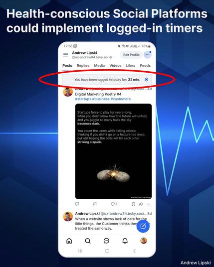
#MobileDesign #UserExperience