#UIDesign #UIUX #UXDesign #UserInterface #DesignEvolution #IconDesign #MobileDesign #AppDesign #ProductDesign #DigitalDesign #DesignInspiration #MinimalDesign #FlatDesign #GraphicDesign #visualdesign
#UIDesign #UIUX #UXDesign #UserInterface #DesignEvolution #IconDesign #MobileDesign #AppDesign #ProductDesign #DigitalDesign #DesignInspiration #MinimalDesign #FlatDesign #GraphicDesign #visualdesign
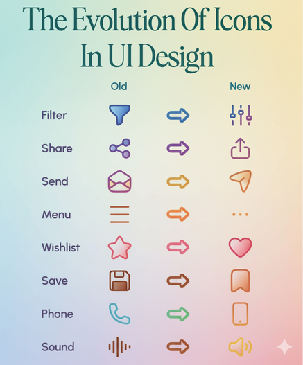
Material 3 Expressive: Building on the Failures of Flat Design, by @uxdesigncc:
https://www.facebook.com/share/p/1C9dmDy83g/
#illustration
#art
#artistsoninstagram
#instaart
#drawing
#digitalart
#sketch
#artwork
#illustrator
#artoftheday
#silhouette
#blackandwhite
#minimalistart
#lineart
#graphicdesign
#vectorart
#flatdesign
#modernart
#simpledesign
#cleandesign
#mumlife
#motherhood
#momsofinstagram
#parenting
#familylife
#momlife
#mumsofinstagram
#motherhoodunplugged
#momblogger
#momhumor
#Design #Trends
From flat to feel · “Design is no longer moving in one unified direction.” https://ilo.im/1652ra
_____
#Emotion #Usability #UserResearch #DesignLanguages #FlatDesign #ProductDesign #UxDesign #UiDesign #VisualDesign #WebDesign
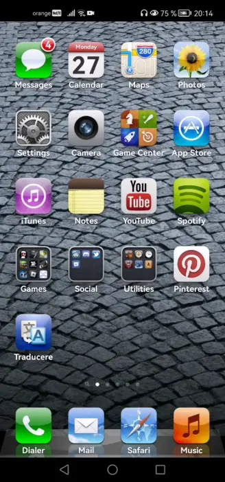
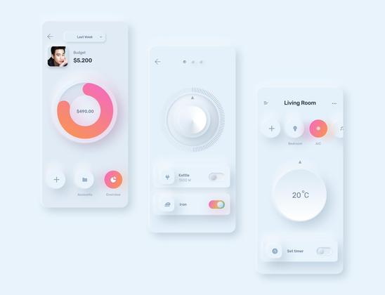
I really dislike the flat design that has come to overpower everything since 2013. I prefer the old iphone Skeuomorphism, pixel art icons from the '90s (e.g. #BeOS), and the new #neuomorphism (but with more contrast than shown in the pic). But flat design, no, thank you.
#flatdesign #skeuomorphism #ui #userinterface #visualdesign #design
#Design #Trends
From flat to fancy · How Apple quietly revived skeuomorphism https://ilo.im/164ltz
_____
#Apple #DesignLanguage #Accessibility #Skeuomorphism #FlatDesign #ProductDesign #UxDesign #UiDesign #WebDesign
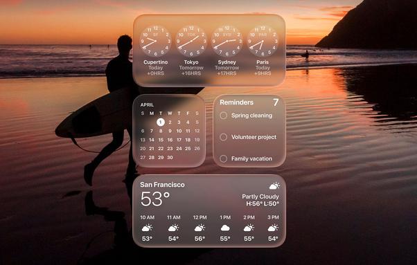
How Apple Quietly Brought Skeuomorphism Back to Life
Apple just resurrected skeuomorphism, but it's hiding behind shiny buzzwords like "Liquid Glass." Is this a stunning reinvention of UI or a glossy distraction from Siri's ongoing failure? Either way, Apple’s new design looks incredible… until you try to read it.
