#statstab #541 Titles & Captions: Adding Context to Your Plots
Thoughts: A good plot can showcase your entire paper. Normalise plotting effects of interest!
#statstab #541 Titles & Captions: Adding Context to Your Plots
Thoughts: A good plot can showcase your entire paper. Normalise plotting effects of interest!
This legibility problem is rampant in human resources functions worldwide. If they even make a job function legible, a rare feat indeed, their salience is typically severely biased and seen through a rearview mirror. Read James C Scott's Seeing Like a State for more insights.
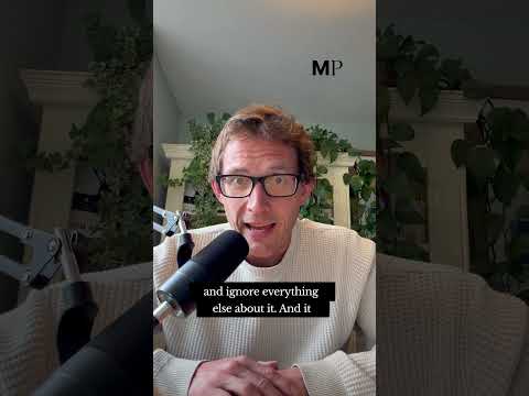
https://www.youtube.com/shorts/CWf03RbJapw
#sutherland #employment #perspective #hiring #humanresources #jobs #function #philosophy #work #function #compression #bias #legibility
One #accessibility issue I mention frequently is web designers, presumably for aesthetic reasons, making low-contrast colour choices. It also frequently goes along with selecting a #font so small that only people with excellent vision (and no #presbyopia) can read them, even if the #contrast were higher.
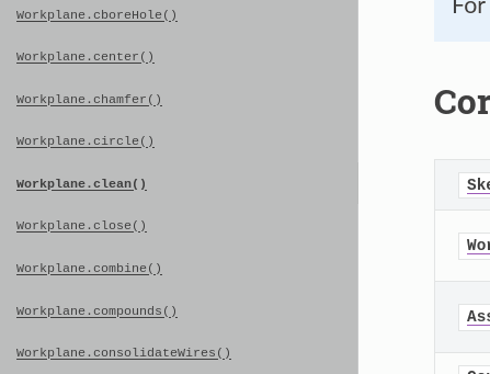
Here's an example. I'm not pointing out the software in question, even though you could identify it easily, because this isn't a dunk on that project, specifically.
This is the reference #documentation for an API, a small excerpt from the navigation links that run down a column on the left side of the page. The #text is darkish #grey on a lighter grey background. The contrast is terrible, particularly ignoring the highlighted entry because that's bolded as the current selection.
If you have #cataracts or any other #vision problem, you're going to have trouble with this. But it gets worse.
That text is 7 pixels high. On my monitors, it's 3 mm high. Ridiculous. Note that if you have fine motor-control problems or use alternative input devices, these are also extremely difficult to click on.
Here's the kicker: for this site, I have Firefox set to #scale the text up to 133%. That 7 pixels / 3 mm is *after* enlarging it.
#Web folks, please try to remember that not everyone is a twenty-something able-bodied person with zero accessibility issues.
#WebDesign #WebDesigner #usability #readability #legibility #WebPage
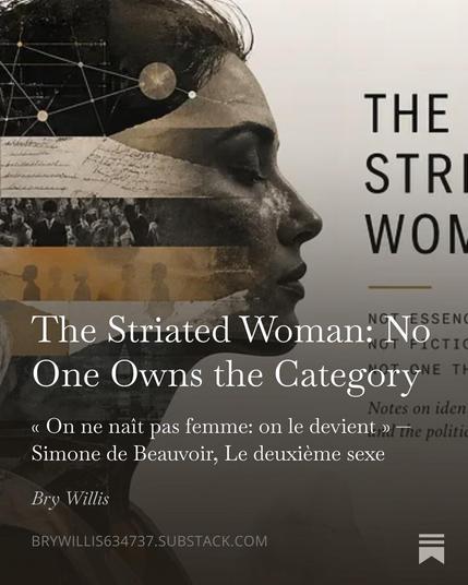
I'm not sure the gender debate is all that these days with the distraction factory in DC; nonetheless, I've been reading Judith Butler's Gender Trouble.
I like Butler's ideas a lot, so I wanted to engage her material directly. Beauvoir is another favourite.
#philosophy #language #writing #blog #podcast #identity #women #feminism #judithbutler #beauvoir #socialontology #legibility #substack #ontologicalgrammar #gendertheory #criticaltheory #politics
People seem to love philosophical trolley problems, but they expose more about ontological grammar than a morality profile.
The first of a 2-part series on the trolley problem. Part 2 will extend the issue out of the lab and into reality with autonomous devices.
#philosophy #psychology #morality #ontologicalgrammar #harm #trolleyproblem #choice #legibility #acculturation #society #ethics #deontology #virtue #consequences #utility #value #stoicism #blog #podcast
The Legibility of Serif and Sans Serif Typefaces (2022)
https://library.oapen.org//handle/20.500.12657/53344
#HackerNews #Legibility #Typography #Serif #SansSerif #DesignInsights
#Design #Launches
Symbl · Preview your logo under visual stress https://ilo.im/16bi0d
_____
#Business #Logo #Symbol #Legibility #UiDesign #VisualDesign #WebDesign #Development #WebDev #Frontend
I discuss physics through the lens of a Procrustean bed.
https://open.substack.com/pub/brywillis634737/p/the-procrustean-universe?r=pvxh5&utm_campaign=post&utm_medium=web&showWelcomeOnShare=true
#philosophy #physics #language #perception #classics #blog #podcast #measurement #order #truth #paradox #legibility #administration