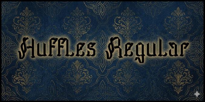
Great Victorian Swashed Font : AtoZ Font

Great Victorian Swashed, designed by Alit Suarnegara, falls under the Serif category & Great Victorian font family. Its smooth, flowing letterforms make it a versatile choice for projects that require both elegance and readability. Great Victorian is particularly...

https://www.atozfont.com/font/great-victorian-swashed

#GreatVictorianSwashed #Fonts #AtoZFont #AtoZFonts #A2ZFont #A2ZFonts #ttf #otf #Fontdownload #Downloads #Canvas #Party #Movieposter #Script #Regular #BoldFont

Calamity Jane NF Bold Font : AtoZ Font

Calamity Jane NF Bold, designed by Nick Curtis, falls under the Display, Sans Serif category & Calamity Jane NF font family. Its smooth, flowing letterforms make it a versatile choice for projects that require both elegance and readability. Calamity Jane NF is particularly...

https://www.atozfont.com/font/calamity-jane-nf-bold

#CalamityJaneNF #Fonts #AtoZFont #AtoZFonts #A2ZFont #A2ZFonts #ttf #otf #Fontdownload #Downloads #Canvas #Party #Movieposter #Script #Regular #BoldFont

SLTF Curo Font: A Bold, Heavy Display Typeface by SilverStag Type Foundry

Most type families try to solve the weight problem by adding more weights. The SLTF Curo font does the opposite. It commits to one extreme — super heavy — and then asks a more interesting question: what if the personality shift happened somewhere else entirely? The answer is five corner style variants that give designers complete tonal control without ever changing the weight. That’s not a workaround. That’s a design philosophy.

Released by SilverStag Type Foundry, the SLTF Curo heavy display typeface lands at a moment when brand typography is under serious pressure. Brands need to work harder across more surfaces — packaging, social media, apparel, editorial, digital campaigns — while staying visually coherent. A typeface that can shift from aggressive to approachable within a single family? That’s not just useful. It’s strategically essential.

You can download the typeface for a low budget from:

Creative Market YouWorkForThem

So let’s talk about what Curo actually is, why the five-style architecture matters, and why this particular heavy display typeface deserves serious attention from brand designers, art directors, and anyone building a visual identity that needs to last.

SLTF Curo Font: A Heavy Display Typeface by SilverStag Type Foundry.

You can download the typeface for a low budget from:

Creative Market YouWorkForThem

What Makes a Heavy Display Typeface Worth Building a Brand Around?

Display typefaces carry enormous responsibility. They don’t support the design — they are the design. At display sizes, every decision a type designer makes becomes impossible to hide. The weight, the terminals, the counter structure, the rhythm of the forms — all of it is exposed, amplified, and judged in a fraction of a second.

SLTF Curo meets this pressure directly. Its super-heavy mass is the load-bearing structure of the entire family. Large x-height maximizes visual impact at display sizes. Tight counter structures keep the letterforms dense and authoritative without collapsing into illegibility. These aren’t aesthetic flourishes. They’re engineering decisions that make the font perform under real production conditions — on a poster, on a label, on a phone screen, on a hoodie.

What elevates Curo beyond a standard heavy sans is the typographic character embedded in its details. The distinctive lowercase g gives the font an immediate personality marker — something recognizable, something that signals craft rather than utility. The alternate single-story a offers a secondary personality mode, letting designers dial the voice up or down within the same setting. These details matter. They’re the difference between a typeface that supports a design and a typeface that becomes the design.

The overall construction lands in what I’d call a retro-modern register — expressive without being decorative, bold without being blunt. It references the confident mass of mid-century commercial lettering while remaining entirely contemporary in its logic and execution.

The Corner Personality System: How Five Variants Replace Five Weights

Here’s the framework that makes SLTF Curo structurally unique. I call it the Corner Personality System (CPS) — a design architecture where tonal range is achieved through corner geometry rather than weight variation. Every variant in the Curo family shares the same super-heavy mass, the same large x-height, and the same tight counter structure. What changes is the corner. And that single variable controls everything.

Think about what corners actually do to a letterform. A hard corner creates tension. It reads as decisive, aggressive, and uncompromising. A fully rounded corner softens mass, introduces warmth, and signals accessibility. The five Curo variants map this spectrum with deliberate precision.

Curo Sharp — Maximum Tension

Hard-edged, angular, unresolved. Curo Sharp is built for brands that don’t soften anything — streetwear labels, music releases, event branding, anything that needs to hit fast and hit hard. The tension in those corners is the point. It signals that this brand doesn’t negotiate.

Curo Crisp — Refined Edge

Slightly eased corners, but all the sharpness of intent remains intact. Curo Crisp is where premium and editorial designers will land most often. It retains the authority of Sharp while adding just enough resolution to work in luxury packaging, high-end magazine layouts, and brand identities that need to read as both confident and considered.

Curo Regular — The Calibrated Center

The balanced variant. Curo Regular doesn’t lean in either direction, which actually makes it the most versatile member of the family. It works across a wide range of applications — brand lockups, product labels, social media headers — without the tonal specificity of the variants on either side of it. When in doubt, Regular holds.

Curo Soft — Approachable Authority

Warm, rounded enough to invite, but still heavy enough to command space. Curo Soft is the variant for lifestyle brands, consumer packaged goods, and campaigns that need mass and warmth simultaneously. It proves that a heavy display typeface doesn’t have to feel aggressive to feel powerful.

Curo Rounded — Tactile and Voluminous

Full rounded corners, almost sculptural. Curo Rounded carries a physical quality — the kind of bold that feels like it exists in three dimensions. It works beautifully on apparel, merchandise, and packaging where the letterforms need to feel as substantial as the product itself.

How the Tonal Spectrum Index Works in Practice

The five-variant architecture functions as what I’d describe as a Tonal Spectrum Index (TSI) — a measurable range of brand personality that a single type family can express without losing visual coherence. This matters enormously for multi-surface brand systems.

Consider a brand that uses Curo Sharp for its core identity and event collateral, Curo Crisp for editorial content and premium product lines, and Curo Soft for social media and consumer-facing campaigns. The weight stays constant. The mass stays constant. The brand feels unified. But the personality shifts to match the context. That’s sophisticated typographic thinking built directly into the font’s architecture.

Alternatively, layering multiple Curo variants within a single project creates intentional typographic contrast — headline in Sharp, subheading in Soft, pull quote in Rounded — while maintaining the visual cohesion that a single-family system provides. This is the kind of flexibility that usually requires sourcing multiple typefaces and hoping they coexist. Curo makes it native.

The Mass-to-Counter Ratio: A Design Principle Worth Naming

One of the more underappreciated technical decisions in Curo is what I’d call its Mass-to-Counter Ratio (MCR) — the relationship between the super heavy stroke weight and the deliberately tight counter structure. This ratio is not incidental. It’s the core engineering decision that determines how the font performs at display sizes.

Heavy typefaces fail in one of two ways. Either the counters are too open, which makes the font feel loose and disconnected at large sizes. Or the counters close too tightly, which destroys legibility and turns bold letterforms into blobs. Curo’s tight counter structure threads this needle precisely. The counters stay open enough to read, but compressed enough to reinforce the sense of mass and density that a heavy display typeface demands.

The large x-height compounds this effect. Taller lowercase letterforms mean that Curo reads as optically larger than its point size suggests — a significant practical advantage when working with display typography across mixed media, where perceived scale matters as much as actual scale.

Where SLTF Curo Actually Performs Best

Heavy display typefaces live or die by their versatility across use cases. Curo’s design brief is unusually broad, and it earns that breadth.

In brand identity and logo design, the five-variant system lets designers select the exact tonal register a brand needs rather than forcing a compromise. In packaging and product labels, the tight counter structure and large x-height deliver maximum shelf presence at variable sizes. For posters and event collateral, particularly in music and streetwear contexts, Curo Sharp operates without peer.

In editorial design, Curo Crisp and Regular bring the authority of a heavy display typeface without the aggression that can overwhelm refined layouts. For apparel and merchandise, Curo Rounded’s tactile, voluminous quality translates exceptionally well to embroidery, screen printing, and embossed labels. And across social media and digital campaigns, the family’s visual weight ensures legibility and impact at compressed screen sizes — a real and often overlooked technical requirement for display typography in 2025.

Why Weight-First Design Philosophy Is the Right Framework for Modern Brand Typography

The conventional approach to building a type family starts with the Regular weight and expands outward. Curo inverts this entirely. It starts at the extreme and asks what can be expressed from that single position. I call this a Weight-First Design Philosophy — the idea that a single, precisely chosen weight, executed with enough internal variation, can serve as a complete typographic system.

This approach has real strategic advantages. It forces maximum design investment into one weight rather than spreading craft across a broad range of weights that often see minimal use. It produces a more cohesive visual system because every variant shares the same structural DNA. And it gives the designer a cleaner decision-making framework: choose the corner that fits the brand, not the weight.

My honest assessment? This is the direction more type foundries should be moving. The obsession with weight ranges has produced thousands of typefaces with eight or more weights, most of which are used only in Regular and Bold. Curo’s architecture is more honest about how display typefaces actually get used — and more useful because of it.

SLTF Curo and the Future of Single-Weight Display Systems

Here’s a forward-looking prediction worth making directly: the next wave of high-performance display typefaces will be defined by internal variation rather than weight range. Corner geometry, terminal variation, optical size calibration — these are the levers that give a type family genuine expressive range without the bloat of full-weight families.

SLTF Curo is early evidence of this shift. Its five-variant Corner Personality System makes the case that a heavy display typeface can function as a complete design toolkit — brand identity, packaging, editorial, apparel, social — without requiring any weight outside the super heavy. That’s a significant claim. And based on the architecture of this font, it’s a claim that holds.

You can download the typeface for a low budget from:

Creative Market YouWorkForThem

For designers building brand systems that need to work across surfaces, categories, and contexts, Curo offers something genuinely rare: a single typeface investment that returns five distinct typographic tools, all sharing a coherent visual logic. That’s not a feature list. That’s a design argument. And it’s a compelling one.

Frequently Asked Questions About SLTF Curo

What is SLTF Curo?

SLTF Curo is a heavy display typeface by SilverStag Type Foundry. It comes in five corner style variants — Sharp, Crisp, Regular, Soft, and Rounded — all sharing the same super heavy weight, large x-height, and tight counter structure. The variants differ only in corner geometry, which shifts the tonal personality of each style.

How many styles does SLTF Curo include?

Curo includes five styles: Curo Sharp, Curo Crisp, Curo Regular, Curo Soft, and Curo Rounded. Each style occupies a distinct position on the tonal spectrum from high-tension angular to warm and voluminous.

What is the Corner Personality System?

The Corner Personality System is a design framework embedded in Curo’s architecture where tonal range is achieved through corner geometry variation rather than weight variation. All five variants share the same mass; only the corner treatment changes, which controls the overall personality of the typeface.

What is SLTF Curo best used for?

Curo is built for brand identity, logo design, packaging, product labels, posters, event collateral, editorial headlines, apparel, merchandise, and social media campaigns. Its five-variant system makes it particularly effective for multi-surface brand systems that require tonal flexibility within a single typeface.

Does SLTF Curo have alternate characters?

Yes. Curo features a distinctive lowercase g and an alternate single-story a, both of which add typographic character and give designers options for adjusting the voice of the typeface within a single setting.

Can multiple Curo variants be used together in one project?

Absolutely. The five variants are designed to coexist within a single project, enabling typographic contrast — for example, Sharp for a headline, Soft for a subheading — while maintaining visual coherence because all variants share the same structural DNA.

What makes SLTF Curo different from other heavy display typefaces?

Most heavy display typefaces offer one aesthetic direction. Curo’s five-variant Corner Personality System gives designers complete tonal control from aggressive and angular to warm and rounded within a single family. Combined with its large x-height, tight counters, and retro-modern construction, it functions as a complete typographic toolkit rather than a single-use display font.

Is SLTF Curo suitable for logo design?

Yes, and it’s one of the typeface’s strongest use cases. The five corner variants allow a designer to select the exact tonal register that fits a brand’s personality, rather than accepting a typographic compromise. Its distinctive alternate characters further increase its suitability for logo and brand identity work.

Check out other trending typefaces here at WE AND THE COLOR.

#boldFont #displayFont #font #SilverStagTypeFoundry #SLTFCuro #typeface

Fargo is perfect for designers, marketers, agencies, and anyone who loves powerful, modern typography.
Ready to use — just download and let your ideas shine!

#graphicdesigner #creativecommunity #digitalart #designresources #boldfont #brandidentity

Bring positive energy and a bold, playful mood to your project with Moscow!
Every letter is crafted to inspire and make your headlines unforgettable.

#creativefonts #colorfulfont #designinspiration #playfuldesign #visualidentity #boldfont #artisticfonts

Gimme Extra Bold Sans Serif Font by BilberryCreates

Rock Your Designs with The Gimme Extra Bold Font, a Groovy 80s Sans Serif Typeface!

Have you been searching for a font that just screams personality? Something that grabs attention and refuses to let go? Let’s chat about Gimme Extra Bold. It’s a fantastic sans-serif font crafted by the talented folks at BilberryCreates. Now, this isn’t just any typeface; Gimme Extra Bold packs a serious punch with its, well, extra bold weight and unmistakable 80s energy. Think groovy, think funky, think totally rad. It’s designed specifically to help your digital images stand out, making them more beautiful and unique. Ready to see how this bold font can electrify your own creative projects?

Download from Creative Market

What Makes Gimme Extra Bold Stand Out?

What really gives Gimme Extra Bold its magnetic pull? Well, it proudly wears its 80s inspiration on its sleeve. You instantly get that groovy, funky feeling the moment you see it. It’s playful. Furthermore, it’s incredibly energetic. This font captures the essence of a vibrant decade known for its bold style. That ‘Extra Bold’ weight isn’t shy, either. It demands attention. Consequently, it’s perfect for making a strong visual statement. Need a headline to pop? Or a logo that lingers in the mind? Gimme Extra Bold delivers that impact.

Gimme Extra Bold Sans Serif Font by BilberryCreates Download from Creative Market

Yet, because it’s a sans-serif font, it maintains a surprising level of clarity and modern appeal despite its retro roots. BilberryCreates clearly put thought into balancing that fun, nostalgic 80s font feel with practical usability. It’s undeniably a bold font, a true retro font, and absolutely a groovy font that adds character without sacrificing legibility entirely, especially at larger sizes. It’s this unique combination that sets it apart.

The Vibe: More Than Just Letters with Gimme Extra Bold

This font has vibe. Seriously. It’s more than just carefully designed shapes on a screen or page. Gimme Extra Bold brings an attitude, a retro coolness that’s hard to ignore. How does that translate visually? It feels confident, maybe a little rebellious, and definitely fun. How does that energy make you feel when you look at it? Can you picture that confidence boosting your next project?

It works incredibly well as a display font. Imagine headlines that practically jump off the page or screen. Think posters, social media graphics, or website banners that need immediate impact. Or consider it a potential logo font. Does your brand identity need a dash of playful energy and unmistakable character? This could be the secret ingredient. It’s certainly a unique, bold font for branding if you’re aiming for something memorable and distinctively retro. Finding the right BilberryCreates font can truly elevate a brand’s voice.

Unleashing Creativity: Where Can You Use This Font?

Okay, so where can you actually use Gimme Extra Bold? The possibilities are wonderfully broad, stretching across digital and print mediums. Imagine sending out invitations – perhaps for a lively birthday bash, a retro-themed party, or even a uniquely styled wedding announcement – using this font. Instantly more fun and engaging, right? It stands out as a fantastic creative font for invitations.

Think about scrapbooking projects. Gimme Extra Bold can add instant retro flair and personality to your layouts and captions. What about product packaging? If you want your items to pop on the shelf and convey a sense of fun or nostalgia, this font could be a game-changer. Even home decor items, like custom prints or signage, could get a funky boost. Consider printing patterns or quotes on fabrics for pillows or bags. BilberryCreates designed this sans-serif typeface to be versatile, encouraging you to experiment. So, the real question is, what amazing things will you create with it?

Getting Technical: Formats and Usability

Let’s touch on the practical side. When you get Gimme Extra Bold, what do you actually receive in the package? BilberryCreates provides this font in three essential, industry-standard formats: OTF, TTF, and WOFF. What does this mean for you?

  • OTF (OpenType Font): Often preferred by designers, OTF files can sometimes include extra features like ligatures or stylistic alternates (though the specifics depend on the font). It’s great for desktop use across various design software.
  • TTF (TrueType Font): This is a very common format that works reliably across most operating systems and applications, making it excellent for general desktop use, including word processing and standard design tasks.
  • WOFF (Web Open Font Format): As the name suggests, WOFF (and its successor WOFF2) is specifically optimized for use on websites. It generally results in smaller file sizes for faster loading times online.

Having all three formats means BilberryCreates has ensured Gimme Extra Bold is ready, whether you’re designing for print, crafting digital graphics, or building a website. Installation is typically straightforward on both Mac and Windows systems, allowing you to access and use your Gimme Extra Bold font download quickly and efficiently in your preferred software.

Why Choose Gimme Extra Bold for Your Next Project?

So, with countless fonts available, why should Gimme Extra Bold make your shortlist? It comes down to its unique blend of potent personality and practical function. You get that unmistakable, vibrant 80s font vibe, cranked up to eleven with an emphatic extra bold weight. It’s the perfect choice if your project needs something genuinely groovy, undeniably funky, yet still grounded in the clean lines of a sans-serif font.

Its versatility shines, making it suitable for impactful logos, attention-grabbing headlines, fun invitations, dynamic packaging, and so much more. Maybe it’s the best 80s-inspired sans-serif font for your specific vision? It brings an infectious energy effortlessly, adding character without you needing overly complex graphics. Isn’t that something your designs could benefit from? Considering a BilberryCreates Gimme Extra Bold review perspective, its focused style and useful formats make it a strong contender for specific design needs.

Download from Creative Market

Gimme Extra Bold by BilberryCreates is waiting to inject its retro magic and bold confidence into your creations. Give it a try and see where its funky, groovy personality takes your designs! It might just be the spark you were looking for.

All images © by BilberryCreates. Feel free to find other trending typefaces in the Fonts category here at WE AND THE COLOR – your destination for professional graphic design and typography content.

Subscribe to our newsletter!

[newsletter_form type=”minimal”]

#boldFont #displayFont #font #GimmeExtraBold #sansSerifFont #typeface #Typography

Extra Chunk Please Font by Supfonts

The Extra Chunk Please Typeface is a Bold Geometric Font Your Designs Need Now

Are you searching for that perfect display font? You know the one. It needs to be modern, yet friendly, and a bit quirky. Bold, but not aggressive. Clean, yet full of personality. It’s a common quest for designers, brand builders, and content creators everywhere. Finding a type that truly speaks your project’s language can feel like searching for a needle in a digital haystack. Sometimes, the options seem endless, yet nothing quite hits the mark. Does this sound familiar? You might spend hours trying different styles, hoping for that spark of recognition, that moment when the letters on the screen perfectly capture the feeling you’re aiming for. It’s more than just aesthetics; it’s about communication, about setting a tone before a single word is truly read.

Think about the impact type has. It shapes perception, guides the eye. It can also make a message feel urgent, sophisticated, playful, or trustworthy. Choosing the right font is a foundational step in visual communication. And that brings us to a delightful discovery making waves in the design community: the Extra Chunk Please font from Supfonts. This isn’t just another typeface; it’s a statement piece. It blends characteristics that often seem contradictory – strong geometry with a soft, approachable feel. If your design needs a voice that’s confident, contemporary, and incredibly clean, you might want to lean in a little closer. The Extra Chunk Please font could be the answer you’ve been seeking. Let’s explore what makes this particular font capture attention and why it’s becoming a go-to choice for so many discerning eyes.

You can purchase the typeface at these platforms:

Font Bundles Creative Market

What Exactly is the Extra Chunk Please Font?

At its core, Extra Chunk Please is a modern display font. But what does that really mean for your projects? Imagine bold, confident shapes. Think clean lines and geometric precision. Now, soften those edges just a touch. Add a sprinkle of playful minimalism. That’s where Extra Chunk Please finds its unique charm. It manages to be substantial, almost architectural, without feeling heavy or imposing.

The designers at Supfonts crafted Extra Chunk Please with a specific vision: to merge boldness with approachability. Its letterforms are strong and intentionally designed. You’ll notice the geometry isn’t harsh; instead, subtly rounded edges give it a friendly, almost huggable quality. This careful balance makes it incredibly versatile. It avoids the coldness sometimes associated with pure geometric fonts, yet retains a powerful sense of structure and modernity. It feels solid, reliable, but also inviting. This combination is quite compelling, don’t you think? It allows the font to stand out without shouting, offering a sophisticated yet relaxed vibe.

Extra Chunk Please Font by supfonts.

You can purchase the typeface at these platforms:

Font Bundles Creative Market

The Anatomy of Impact: Dissecting Its Style

Let’s look closer at the elements that give Extra Chunk Please its distinct personality. As a display font, its primary role is to grab attention, typically in larger sizes like headlines, titles, or key messages. Its inherent “chunkiness” provides significant visual weight, making it immediately noticeable. However, it’s not just about being big and bold.

The genius lies in the details. The rounded corners are crucial. They prevent the boldness from becoming abrasive, lending a softer, more organic feel. The character design is strong, meaning each letter is distinct and well-defined, contributing to overall clarity even with its substantial form. This clarity is vital. Have you ever seen a bold font that becomes muddy or hard to read? Extra Chunk Please sidesteps that pitfall. It’s designed for clean, typography-focused layouts where the font itself is a major design element. It doesn’t need excessive decoration; its form is the statement. This minimalist approach ensures it feels current and avoids looking dated quickly.

Extra Chunk Please in Action: Where Does It Shine?

Knowing its characteristics is one thing, but where does Extra Chunk Please truly make a difference? Its unique blend of traits makes it suitable for a surprisingly wide range of applications. Consider these prime examples:

  • Minimal Branding & Packaging: Need a logo or product name that feels modern, clean, and trustworthy? Extra Chunk Please delivers. Its boldness ensures brand recognition, while the rounded edges make it feel approachable and consumer-friendly. Imagine it on a coffee bag, a tech startup’s logo, or a skincare line – it conveys quality without pretension.
  • Bold Editorial Design: Think magazine headlines, feature spreads, or impactful pull quotes. In editorial contexts, Extra Chunk Please can create a strong visual hierarchy, drawing the reader’s eye to key information. Its clarity ensures readability even at large sizes, making a powerful graphic statement on the page.
  • Clean Menus & Posters: Whether it’s a chic cafe menu or a striking event poster, this font offers both style and legibility. For menus, section headers in Extra Chunk Please can look fantastic. On posters, it serves as a powerful focal point, conveying information clearly and with contemporary flair.
  • Social Media Graphics: In the fast-scrolling world of social media, grabbing attention instantly is key. Extra Chunk Please excels here. Its bold, clean look ensures your message stands out in crowded feeds. Perfect for quote cards, promotional announcements, or brand statements that need to pop. You need visuals that stop the scroll, right? This font helps achieve that.

The common thread? Extra Chunk Please works best where you need type to be both a visual anchor and a clear communicator. Its inherent style elevates simple layouts and complements minimalist aesthetics beautifully.

Beyond the Looks: The Technical Side of Extra Chunk Please

A font isn’t just about aesthetics; its technical features are crucial for practical use. Supfonts equipped Extra Chunk Please with capabilities that make designers’ lives easier. What are these helpful features?

First, there’s Multilingual Support. Designing for a global audience? This is essential. Extra Chunk Please includes the necessary characters to set text in various languages, broadening its usability significantly. You won’t hit a wall when you need to include accents or special characters for different regions.

Second, Full Punctuation is included. This might sound basic, but it’s vital for professional typography. Missing punctuation marks can derail a project. Extra Chunk Please provides a complete set, ensuring you can typeset accurately and comprehensively without needing to substitute symbols from other fonts.

Finally, it’s PUA Encoded. What does PUA (Private Use Areas) encoding mean for you? It means that any extra glyphs, stylistic alternates, or special characters included in the font can be accessed easily in most design software, even without OpenType-savvy programs. This simplifies workflow and unlocks the font’s full creative potential without technical headaches. These thoughtful inclusions demonstrate Supfonts’ commitment to creating not just beautiful, but also highly functional tools for designers.

Why is Extra Chunk Please Resonating Now?

So, why the buzz around Extra Chunk Please? It seems to hit a sweet spot in current design trends. There’s a strong movement towards designs that are clean, minimalist, yet warm and human-centered. This font embodies that duality. Its geometric foundation speaks to modernity and order, while its rounded softness adds approachability and a touch of playfulness.

It offers designers a way to be bold without being cold, and minimalist without being boring. It feels fresh, optimistic, and incredibly versatile. Can you picture it enhancing your next project? Whether you’re crafting a brand identity, designing a website header, or creating eye-catching social content, the Extra Chunk Please font provides a compelling option. It’s a tool that feels both contemporary and enduring, capable of making a significant visual impact through its confident, friendly forms. It’s a reminder that sometimes, a little extra chunk is exactly what a design needs.

You can purchase the typeface at these platforms:

Font Bundles Creative Market

Don’t hesitate to find other trending typefaces in the Fonts section on WE AND THE COLOR.

Subscribe to our newsletter!

[newsletter_form type=”minimal”]

#bold #boldFont #ExtraChunkPlease #font #sansSerif #Supfonts #typeface

Chunko Bold: The Go-To Font for Modern, Minimalist, Fun Design

When it comes to bold, impactful, yet minimalist but also fun typography, one font is quickly becoming a favorite: Chunko Bold. But what makes it so special? Why is everyone talking about it? And how can you use it to level up your designs?

This isn’t just another font review; it’s a deep exploration into the world of Chunko Bold, a sans-serif masterpiece crafted by Zarma Type. We’ll uncover what makes this typeface tick, why it’s perfect for today’s design trends, and how to use it effectively. Get ready to discover why this typeface might just be your new go-to font.

Download at Creative Market Download at YouWorkForThem

What is Chunko Bold and Why Should You Care?

Chunko Bold is more than just a collection of letters; it’s a statement. It’s a sans-serif font that embodies modern minimalism, which is huge these days. Its chunky geometry and playful rounded edges give it a strong presence. This makes it ideal for brands and designers aiming for a clean, impactful look.

Think about some of the brands you admire. Notice how many are using bold, simple typography? Chunko Bold fits right into that aesthetic. This makes it perfect for anyone looking to create a lasting impression.

Chunko Bold Sans Serif Font by Zarma Type Download at Creative Market Download at YouWorkForThem

The Power of Chunko Bold’s Design

What makes Chunko Bold stand out from the crowd? It’s all in the details.

  • Bold Minimalism: It’s right there in the name. Chunko Bold embraces the minimalist approach but isn’t afraid to be seen. The strong, thick letterforms command attention without being overwhelming.
  • Rounded Edges: These subtle curves add a touch of playfulness and approachability to the font. It prevents it from feeling too sterile or corporate.
  • Balanced Weight: The weight distribution is carefully considered, ensuring each character is visually balanced and harmonious. This means easy readability, even at larger sizes.
  • Modern Aesthetic: Chunko Bold feels contemporary. It avoids looking dated or generic, making it perfect for forward-thinking brands.

Where Does Chunko Bold Shine?

Now that you know what Chunko Bold is all about, let’s talk about where it truly excels. Its versatility makes it a powerful tool in many scenarios.

  • Branding: Creating a logo or brand identity? This fun font can be a fantastic choice. It conveys confidence, modernity, and simplicity. It works great on websites, business cards, and marketing materials.
  • Headlines: Need to grab attention? Chunko Bold is perfect for headlines. Its strong presence ensures your message is seen and read. It makes the words pop off the page.
  • Posters: Designing a poster? This striking typeface can be the star of the show. Its bold nature makes it ideal for impactful designs. It’s great for events, announcements, and promotions.
  • Packaging: Want your product to stand out on the shelf? Chunko Bold can help. Its clean, modern aesthetic adds a touch of sophistication to any package. Consumers can easily read what you are selling.
  • Social Media Graphics: Want to make eye-catching content? This font provides strong visuals and creates captivating social media content.

Chunko Bold: Features That Make a Difference

Beyond its aesthetic appeal, Chunko Bold packs a punch in terms of functionality. These features make it a designer’s dream.

  • Multilingual Support: Reach a global audience with its broad language support.
  • PUA Encoded Characters: Easy access to special characters for unique design touches.
  • Stylistic Alternates: Customize your designs with alternative letterforms.
  • Standard & Discretionary Ligatures: Elevate your typography with elegant letter combinations.
  • Complete Punctuation Set: Ensure you have all the necessary characters for perfect punctuation.

Why this Typeface Resonates in the Era of Minimalism

Minimalism isn’t just a trend; it’s a design philosophy. People crave simplicity, clarity, and authenticity. The typeface embodies these values perfectly. Its clean lines, bold presence, and playful curves create a typeface that is both modern and approachable.

With all the information that we have to consume every day, Chunko Bold cuts through the noise. It helps brands communicate their message clearly and effectively.

How to Make this Sans-Serif Typeface Work for You

Ready to start using the typeface? Here are a few tips to keep in mind:

  • Contrast is Key: Pair it with a lighter-weight font for body text to create a visual hierarchy.
  • Embrace White Space: Let it breathe by giving it plenty of white space.
  • Experiment with Color: Use color to enhance its impact and create visual interest.
  • Consider Your Audience: Ensure it aligns with your brand’s personality and target audience.

Is Chunko Bold the Right Choice?

So, is this the perfect font for you? If you’re looking for a typeface that is bold, modern, and minimalist, the answer is likely yes. Its versatility, readability, and impactful design make it a valuable asset for any designer or brand. Chunko Bold gives your work quality.

Give it a try and see how it can elevate your designs. What are you waiting for?

Download at Creative Market Download at YouWorkForThem

Feel free to find other trending typefaces in WE AND THE COLOR’s Fonts category. Our reviews will help you to find the perfect for every type of design project.

Subscribe to our newsletter!

[newsletter_form type=”minimal”]

#boldFont #ChunkoBold #font #fonts #sansSerif #typeface

The Bold Font Pro

Is Your Typography Ready to Ditch the Dull and Embrace the Daring? Introducing: THE BOLD FONT PRO

Does that sound familiar to you? You just stared at a design and felt like it was… well, just kind of there? Like it was missing that oomph, that visual punch that grabs your attention and doesn’t let go? We’ve all been there. You craft a brilliant concept and spend hours fine-tuning the details, but somehow, the typography just feels… flat. It’s like the design is whispering when it should be shouting from the rooftops.

Well, what if I told you there was a way to not just fix that, but completely transform the way you approach typography? What if you could take your designs from ordinary to extraordinary with a single font? No, this isn’t a fairytale; it’s the real deal, and it’s called THE BOLD FONT PRO. Think of it as your secret weapon in the battle against boredom.

Download at Creative Market

You might be asking, “Okay, but what makes this font so special?” That’s a fair question. See, fonts are like the clothes your design wears; they set the mood, tell a story, and can make or break the entire look. THE BOLD FONT has always been about making a statement, about embracing that feeling of “yes, I can be seen and heard.” It’s about standing out. But with the release of THE BOLD FONT. PRO, the possibilities have expanded like never before. We’re not just talking about a new version; it’s a whole new dimension of boldness.

The Bold Font Pro Download at Creative Market

What’s the Buzz About THE BOLD FONT PRO?

Imagine having a whole new set of tools to play with. That’s essentially what we’ve done. THE BOLD FONT. PRO isn’t just an upgrade; it’s an evolution. We took the original bold typeface you love and pushed it further, adding key features that creatives like you have been asking for. So what’s new? Let’s get into the juicy details:

  • Lowercase Characters: The missing piece of the puzzle: Finally, yes! You now have the option of lowercase letters. We get it. Sometimes, the all-caps look isn’t right for the project. Sometimes, the message needs to be a bit softer, or a little more playful, and now, with THE BOLD FONT. PRO, you can have it all. It gives you a new range of expressiveness that you never thought was possible with this font before.
  • More Glyphs: Adding the “wow” factor: You know those little characters and symbols that add a bit of personality to your designs? Well, we’ve sprinkled in some more, giving you more tools to add visual flair. From subtle details to bold statements, these new glyphs unlock a whole new level of creativity. You can finally let your inner design genius shine.
  • Free Italic Version: Because Bold Needs to Lean Sometimes: And here’s the cherry on top, we didn’t just stop at lowercases and more glyphs. We also created a free italic version. It’s all about flexibility. Maybe your design needs that dynamic look that only an italicized font can provide. You can seamlessly switch between styles without losing the core boldness that is characteristic of THE BOLD FONT.

Why Is This a Game Changer?

Think about it. The original THE BOLD FONT was fantastic for catching the eye, for making a statement. But with THE BOLD FONT. PRO, you can achieve so much more. You now have the ability to craft a more nuanced visual language. You can create designs that are both bold and subtle, powerful and playful. You are no longer limited by the typeface, you’re empowered by it.

Here’s the truth: Your creativity isn’t meant to be caged; it’s meant to soar. With THE BOLD FONT. PRO, you have a new playground to create, innovate, and leave a lasting impact. Whether you’re designing for a social media campaign, a website, or a brand identity, this font will help you stand out.

It’s Time to Unleash Your Inner Boldness

You’ve always known that good design is about more than just aesthetics. It’s about the message, the feeling, and the impact it creates. THE BOLD FONT PRO isn’t just a font; it’s a tool to help you articulate your ideas and bring your vision to life.

Download at Creative Market

Are you ready to leave behind the ordinary and embrace the extraordinary? Are you prepared to let your creativity run wild and make a bold statement? If so, then THE BOLD FONT. PRO is waiting for you. Upgrade today and unlock a new dimension of typographic power. It’s time to stop simply designing and start making an impact. It’s time to make a bold move, starting with your font choice.

Check out other trending typefaces in the Fonts category on WE AND THE COLOR.

Subscribe to our newsletter!

By continuing, you accept the privacy policy