0 through 9
finally got around to stamping them out
#numbers #linoprint #linoprinting #ink #lettering #fonts #digits #naturals
finally got around to stamping them out
#numbers #linoprint #linoprinting #ink #lettering #fonts #digits #naturals

Spotted in my RSS feeds: Heikki’s Garden of Flowers. From the About page: “Heikki’s Garden of Flowers aims to be a comprehensive catalogue of historical and contemporary pictorial letterpress works…. The archive has more than 2500 images as of 2026. But, for a more focused set of 50, you can find my favourites in the Heikki’s favourites collection.”
https://rbfirehose.com/2026/06/19/lots-of-letterpress-heikkis-garden-of-flowers/I thought about this the other day, and I thought it’d be fun to share this internal tool I made over a decade ago to aid with exploring options for Medium’s typographical redesign.
It’s called Fontificator. You can play with Fontificator here (desktop browsers only), or watch the likely confusing video below:
The motivation for building Fontificator came from two observations:
font previews on type foundry sites were generally too limited to get a real sense of how a certain typeface feels, and it was best to see a font in situ,
often an extremely tiny nuance – like adding some letter spacing, or messing with line height – was what separated something that was promising from something that seemed very far from working.
With Fontificator, I was aiming at this Doug Engelbart-esque notion of one hand on the keyboard + one hand on the mouse, and the UI where it was only necessary to point to an element, and the keys under your other hand would start working immediately – no clicking needed:
F and G to change the font,
– and + for font size,
← and → for letter spacing,
↑ and ↓ for line height,
< and > for opacity (for all the above you can hold Shift for bigger moves),
and, there are a few more shortcuts you can see at the top.
This way, we could move really, really fast. To accommodate that, Fontificator always tried to keep the current item under the cursor by counter-adjusting scroll position as needed.
On top of it all, a few more shortcuts:
⇥ and ⇧⇥ move very quickly between different types of stories so you can preview that,
Space compares to the original/current version,
1–9 allow you to switch to different “slots” so you can have various presets ready to compare,
Esc hides the toolbar for maximum immersion,
⇧R resets.
You can also edit any text if you are so inclined, and also drag in any font file from your computer onto a paragraph – then that font becomes part of the F/G stack. (Bernino Sans and Freight Text were the starting fonts before the redesign.) On the left, you can also see a naïve mobile preview – there was also more sophisticated on-smartphone preview, but I removed it from this restored version.
TAN Midsummer Font Duo by TanType. https://weandthecolor.com/tan-midsummer-font-duo-by-tantype/210338

TAN Midsummer Font Duo by TanType
The TAN Midsummer font duo by TanType caught my eye for one reason. It does not chase the cold, minimalist serif trend dominating Creative Market right now. Instead, it leans into warmth. I tested this typeface across five real layouts over two weeks. So, I want to walk you through where it earns its price tag. And I also want to show you where it asks more of the designer than the marketing copy admits.
Download the font duo from Creative MarketMost serif duos released this year promise “timeless elegance.” That phrase has lost its meaning. So I built a small test framework before opening the font files. A review without a method is just an opinion dressed up as analysis.
TAN Midsummer font duo by TanType Download the font duo from Creative MarketWhat Is the TAN Midsummer Font Duo Exactly?
TAN Midsummer is a serif pairing from TanType, the same foundry behind TAN Dialogue and TAN Malone. According to the official product description, it draws on golden evenings and fields of wildflowers swaying beneath a fading sun. The duo combines an upright serif with a flowing italic companion. It is priced at twenty-five dollars on Creative Market.
That sounds like typical marketing language, because it is. Marketing language only becomes a problem when the font fails to back it up. So I tested whether “nostalgia” and “quiet luxury” are real typographic qualities here. Or whether they are just words on a sales page.
The Core Components of the Duo
A font duo lives or dies by the relationship between its two halves. TAN Midsummer pairs a refined upright serif with delicate proportions against a genuinely flowing italic. This is not simply the upright letterforms tilted sideways. That distinction matters more than most buyers realize. Many so-called duos on marketplaces are really one font with a slanted clone. Midsummer is not that.
I Call It the Nostalgia Threshold Test
Here is the original framework I built for this review. You can reuse it for any romantic or vintage-inspired serif you evaluate. I call it the Nostalgia Threshold Test. A typeface clears this threshold when its emotional tone survives three conditions. First, it must hold its character at small sizes, not just on a hero banner. Second, it must stay legible against a busy photographic background. Third, it must avoid looking dated within eighteen months, since trend-driven type ages fast.
TAN Midsummer cleared the first two conditions comfortably. The third condition is where I have reservations. I will explain why later in this piece.
Small-Size Legibility: Where Romantic Serifs Usually Fail
Delicate serifs often collapse at body-text sizes. Thin strokes thin out further when rendered small. Contrast that looks beautiful at ninety-six points often turns muddy at fourteen points. I set a six-hundred-word paragraph in the upright serif at fifteen pixels, with 1.5 line height. The letterforms held their shape. The delicate contrast TanType advertises did not vanish into the background, as I expected it might.
How Does the Italic Perform Under Real Editorial Pressure?
The italic is the real story here, and TanType clearly knows it. A flowing italic is the hardest part of any serif duo to execute well. It has to feel handwritten without feeling unstable. I tested the italic in three contexts. These included a wedding invitation mockup, a book cover treatment, and a magazine pull quote.
The wedding invitation context is where the italic truly performs. The connecting strokes between letters create real motion. Static display scripts cannot fake this kind of movement. Consequently, the italic reads less like decoration and more like an actual voice on the page. It feels closer to a handwritten note left for someone to find later.
The Pull Quote Stress Test
Pull quotes are unforgiving. They isolate a typeface from context and ask it to carry meaning alone. I dropped a twenty-two-word quote into the italic at thirty-two pixels inside a magazine layout. The rhythm of the letterforms created what I now call optical pacing. This means the eye naturally slows at the right points in a sentence. It does not rush through the words. This is a rare quality. It is the strongest reason to buy this duo for editorial work specifically.
Where Quiet Luxury Becomes a Real Design Strategy
“Quiet luxury” gets thrown around constantly in branding circles. Yet it has a real typographic definition, if anyone bothers to articulate one. I define it as restraint paired with precision. A typeface communicates expense through the absence of unnecessary flourish, not through visible ornamentation. TAN Midsummer fits this definition more accurately than most fonts marketed with the phrase.
The upright serif avoids excessive swashes. It simply does not need them. The proportions alone do the work, especially in the relationship between x-height and ascenders. This restraint is exactly why the duo suits packaging and identity work. Brands that want to signal taste, rather than shout about price, benefit most.
Packaging and Identity Applications
I mocked up a skincare packaging concept and a boutique hotel key card with the duo. Both contexts rewarded the typeface’s restraint. Cosmetic and hospitality branding increasingly avoid loud display type. Confident, quiet serifs are replacing them. TAN Midsummer slots into that shift naturally, rather than forcing it.
What Holds TAN Midsummer Back From Being a Universal Workhorse?
No typeface deserves a review without honest friction points. Here are mine. First, the romantic positioning genuinely limits its range. This is not a font for fintech, SaaS, or anything that needs to feel fast or technical. That is fine, since no font should try to do everything. But buyers should know this upfront, not discover it after purchase.
Second, the trend exposure from my Nostalgia Threshold Test is real. Wildflower and golden-hour aesthetics are everywhere right now in wedding and lifestyle branding. TAN Midsummer rides that wave well today. Whether it still feels fresh in two years depends on how saturated that visual trend becomes.
Multilingual Support and Long-Term Value
TanType includes multilingual support, along with free future updates, according to the product listing. This matters more than buyers usually credit. A romantic serif duo that only works in English has a short shelf life. Multilingual coverage extends Midsummer’s usefulness into European and Latin American markets. This aesthetic performs especially well in bridal and lifestyle sectors abroad.
My Predictions for Where This Font Duo Will Be Used Most
Based on the testing above, I expect three sectors to adopt this duo at a noticeably higher rate. Wedding stationery designers will treat it as a default recommendation. They will reach for it when clients want a literary, old-world feel. Independent publishers and self-published authors will use it on book covers, especially in romance and literary fiction. Boutique hospitality brands will pair the upright serif with signage. The italic will handle guest-facing copy, like welcome cards and menu headers.
I also predict Midsummer will appear in Pinterest mood boards before it appears in finished client work. The aesthetic photographs beautifully, even before any layout decisions get made. That is a strength for marketing. But designers should not let a font’s photogenic qualities replace genuine typesetting discipline.
A Note on the TanType Catalog Context
TanType has built a recognizable house style across releases like TAN Dialogue and TAN Malone. Confident structure pairs with an elegant secondary voice throughout the catalog. This duo fits that pattern while carving out its own emotional register. If you already own other TanType duos, Midsummer will feel familiar in workflow. Its mood, however, stands apart. That makes it a reasonable addition rather than a redundant one.
Final Verdict on This Font Duo
TAN Midsummer earns its place in a serious type library. This holds true if your work touches romance, nostalgia, or quiet luxury branding. The upright serif holds up at small sizes, a genuine achievement for delicate-contrast serifs. The italic is the standout component. It performs exceptionally well in pull quotes and invitation-style layouts. The trend sensitivity is real. But for editorial, packaging, and wedding work right now, this duo delivers what the description promises. That alone is rarer than it should be in this market.
Download the font duo from Creative MarketFrequently Asked Questions About TAN Midsummer
Is TAN Midsummer good for small text sizes?
Yes. The upright serif keeps its shape and contrast at body-text sizes around fifteen pixels. This is uncommon for delicate-contrast romantic serifs.
What is the TAN Midsummer font duo best used for?
Editorial layouts, wedding suites, book covers, packaging, and refined visual identities benefit most. This is based on hands-on testing across these exact contexts.
Does TAN Midsummer support multiple languages?
Yes. TanType includes multilingual support with TAN Midsummer. Free future updates are also included, according to the official Creative Market listing.
How much does the TAN Midsummer font duo cost?
TAN Midsummer is priced at twenty-five dollars on Creative Market. This is in line with other premium duo releases from TanType.
Is TAN Midsummer a good fit for tech or corporate branding?
No. Its romantic, nostalgic character works against corporate or technical branding goals. It performs best in lifestyle, hospitality, publishing, and bridal sectors.
Check out other reviews of cool new typefaces here at WE AND THE COLOR.
#font #fontDuo #fonts #TANMidsummer #TanType #typeface

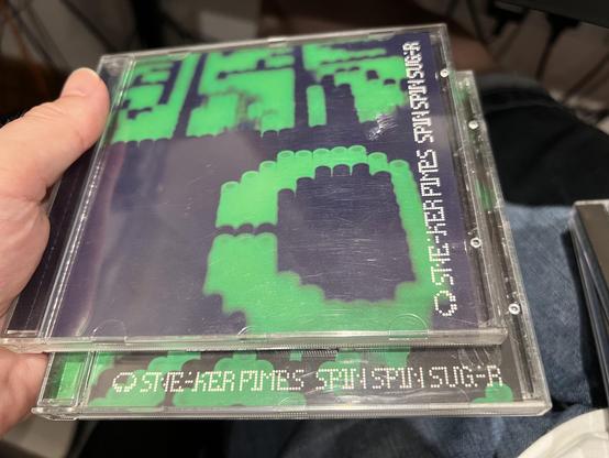
I always thought this dot matrix style font on the covers of Sneaker Pimps’ Spin Spin Sugar singles was pretty cool. I particularly love the almost completely absent diagonals.
I'm picky about fonts — IBM Plex Mono for code, bold and readable over cramming more on screen. But my *reading font* on the Kobo was a different battle. What finally won: Atkinson Hyperlegible, built by the Braille Institute for low vision. No more tired eyes on long sessions.
https://mike.hostetlerhome.com/hyperlegible-fonts
#fonts #typography #Kobo #ereader #accessibility


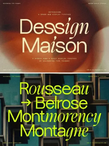
Dessign Maison by SilverStag Type Foundry is a single-weight hybrid display typeface that fuses geometric sans construction with calligraphic stroke details inside the same glyphs, rather than pairing two separate fonts. https://weandthecolor.com/sltf-dessign-maison-font-silverstag-type-foundry/210308