I like to verify my remote-sensing results directly in the field. Besides basic self-validation, field walks often generate new ideas and hypotheses.

For mobile field GIS, I use QField, loading both final map layers and custom templates for data collection.
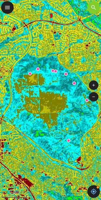
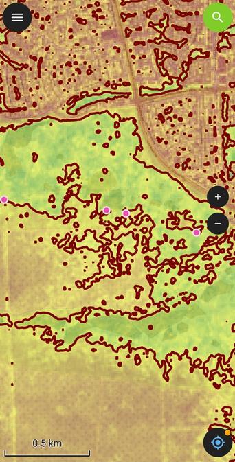
Here’s an example from Nose Hill Park, where I checked several locations that showed a consistent NDVI increase in 2025 compared to 2024.
Field observations help confirm whether the spectral trends match real vegetation changes on the ground.

#RemoteSensing #EarthObservation #GIS #QGIS #QField #NDVI #VegetationMonitoring #Sentinel2 #FieldWork #GeoSpatial #OpenData #GeoDataScience #UrbanEcology #Calgary #NoseHillPark #Alberta #Canada #Copernicus #CopernicusSentinel #GreennessOfCalgary

🚀 Atualização do Módulo Python para o Projeto Fogo Cruzado! 🚀

Criado em 2021 para acessar dados do
#fogocruzado o módulo foi atualizado para a versão 1.0.0 após a evolução do projeto para a versão 2.0 do banco de dados e API.
Agradeço ao incrível
@cuducos pela orientação! 👏

Confira o repositório: https://github.com/felipesbarros/crossfire
e o PyPI: https://pypi.org/project/crossfire/

Em breve, exemplos de uso! 🌟 #Python #FogoCruzado #DataScience #GeoDataScience #SpatialDataScience

GitHub - FelipeSBarros/crossfire: R package about shootings reported in Fogo Cruzado app, in Rio de Janeiro and Recife

R package about shootings reported in Fogo Cruzado app, in Rio de Janeiro and Recife - GitHub - FelipeSBarros/crossfire: R package about shootings reported in Fogo Cruzado app, in Rio de Janeiro an...

GitHub

This is why you need real geographers , or more buzzwordy #GeoDataScience .... Modifiable Areal Unit Problem 😱
RT @lisacrost@twitter.com The same data tells a different story depending on the level of detail you choose. Here's the same data about population growth in Europe (orange = growth, blue = decline) in five different units.

I wrote more about it here: https://blog.datawrapper.de/weekly-chart-europegrowth/
https://twitter.com/lisacrost/status/977117773875810304

Different units, different patterns

In the last few days, I thought a lot about choropleth maps: these maps where regions are filled with colors that represent a certain value, like unemployment, life expectancy, votes for a certain par