One more thing. Don't assume AI understands your business. Always spell out timeframes, units, and what success looks like. A lot of people skip this step and end up with generic answers that don't help.

#DataAnalysis #AITips #BusinessIntelligence #DataDriven #PromptEngineering #AIForBusiness #DataVisualization #Analytics #MachineLearning #TechTips (3/3)

274 PLA aircraft sorties and 72 median line crossings were recorded around Taiwan in May 2026. Activity remains lower than in much of 2025, but the quieter periods seen earlier this year have largely disappeared as operations returned to a near-daily pattern.

#Taiwan #MilitaryAviation #datavisualization #china #military

“A simile is just a metaphor with the scaffolding still up”*…

From the 1964 textbook Examine Your English

Russell Samora has been fooling around with figures of speech; with his colleagues at The Pudding, he’s fielded a fascinating analysis of of that comparative workhorse, the simile…

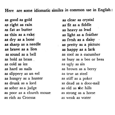
Similes are all around us. But, if you haven’t considered this figure of speech since grade school, here’s a refresher: similes compare a shared quality of two things, often using “like” or “as.”

I pulled every simile in the form “as ___ as ___” from tens of thousands of fiction books for the top 500 most common adjectives… I thought it would be a trivial exercise, but the more I poked around, the more questions I had…

Samora explains how similes are structured and how they are used (and with what relative frequency) in literature. He examines some of the most common– and several special cases (“The Ironic Ones”). And he explains his methodology and sources… all in the context of a lovely interactive data visualization.

It’s as cool as hell: “Comparisons as Predictable as the Sunrise,” from @pudding.cool.

James Geary

###

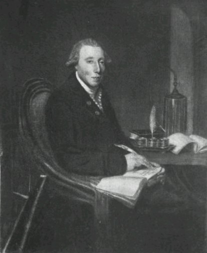
As we agree with Steve Martin that “a day without sunshine is like, you know, night,” we might recall that it was on this date in 1789 that Richard Kirwan published his essay in support of the phlogiston theory (the belief, that dates to alchemical times, in the existence of a fire-like element (dubbed “phlogiston”) contained within combustible bodies and released during burning. Kirwan was among the last of its advocates.

A well-regarded scientist in the late 18th and early 19th centuries, Kirwan met and corresponded with Black, LavoisierPriestley, and Cavendish. Indeed, while scientific history remembers him as a defender of an incorrect theory, his work probably spurred Priestley and Lavoisier, who respectively discovered and named the actual elemental agent of combustion, oxygen.

But Kirwan is also remembered for a personal eccentricity (one of many) that led to some referring to him (all too poignantly) as “crazy as a bed bug”: he hated bugs (especially flies). Kirwan paid his servants a bounty for each one they killed.

source

#bugs #Cavendish #culture #dataVisualization #eccentricity #figureOfSpeech #history #infographics #language #Lavoisier #literature #phlogiston #Priestley #RichardKirwan #Science #simile #similes

The Commodification of Visual Logic: Browser-Based Graphing as Infrastructure

Are you using Graph Maker or LiveGap for charts? Learn how these browser tools are changing how people turn raw data into visuals as of May 2026.

#datavisualization, #graphmaker, #livegap, #datatools, #techtrends

https://newsletter.tf/browser-based-graphing-tools-may-2026/

Data tools like Graph Maker and LiveGap are now used by more people than ever to make charts. This is a big change from using complex statistical software.

#datavisualization, #graphmaker, #livegap, #datatools, #techtrends
https://newsletter.tf/browser-based-graphing-tools-may-2026/

Why Graph Maker and LiveGap Charts Are Changing Data Visuals in 2026

Are you using Graph Maker or LiveGap for charts? Learn how these browser tools are changing how people turn raw data into visuals as of May 2026.

NewsletterTF

#TidyTuesday this week explored sustainable energy, and I chose to look into the infrequently-discussed Marine Energy.

#DataViz #Datavis #DataVisualization #RStats #Quarto #GGplot2

🔗 https://github.com/afrikaniz3d-za/Tidy-Tuesday-Participation/tree/main/tt_2026_21
Open to freelance data viz/reporting work

Have you heard of Omeka? Omeka is a software. It is a #PublishingPlatform, and can be used for #DataVisualization, #Publishing and #Annotation.

Check it out at https://reasonator.toolforge.org/?q=Q3524651.

To get daily toots advertising a computational tool from the Tool Registry for Digital Humanities on Wikidata follow this account.

#Tools #DigitalTool #DigitalHumanities #DigitalHistory

Omeka

software

#TidyTuesday last week ORCID and ROR metadata from Crossref. I chose to modify an evaluation tool (OSMI) to look at Sub-Saharan Africa members.

#Dataviz #Datavis #sf #DataVisualization #RStats #Quarto #ggplot2 #Inkscape #Kdenlive
🔗 https://github.com/afrikaniz3d-za/Tidy-Tuesday-Participation/tree/main/tt_2026_20

📽️ What can film historical #metadata tell us about Lotte Reiniger?

Explore my latest #datavisualization about the work of the pioneering filmmaker: https://lotte-reiniger.oabooks.de/

Together with media designer Christian Laesser, I analyze how Reiniger is represented across three key databases: the DFF – Deutsches Filminstitut & Filmmuseum, the Women Film Pioneers Project, and #Wikidata.

Questions and comments are very welcome!

#womenandfilm #datafeminism #digitalfilmhistory #missingmetadata

Have you heard of Rational BI? Rational BI is a data exploration and publishing company. It can be used for #DataVisualization, #BusinessIntelligence and #DataMining.

Check it out at https://reasonator.toolforge.org/?q=Q108429507.

To get daily toots advertising a computational tool from the Tool Registry for Digital Humanities on Wikidata follow this account.

#Tools #DigitalTool #DigitalHumanities #DigitalHistory

Rational BI

data exploration and publishing company