Linear Cosine Palettes(2025)
https://blog.djnavarro.net/posts/2025-09-14_cosine-palettes/
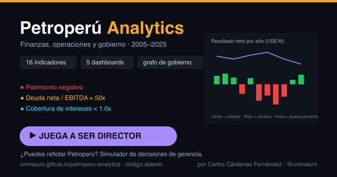
A friend has made a #dataviz and #simulation about #Petroperu (the national #oil company of #Peru), showing how bad it is, and allowing you to play trying to save it.
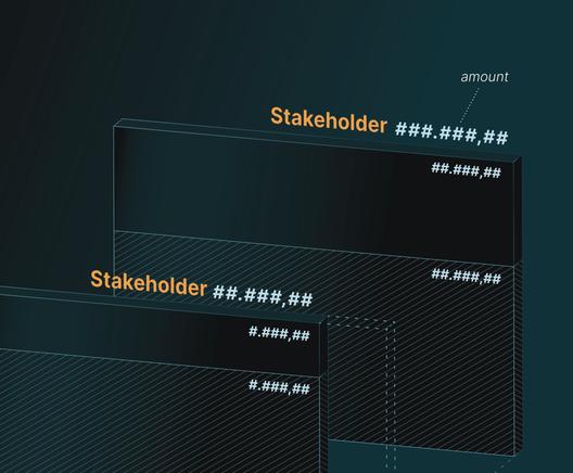
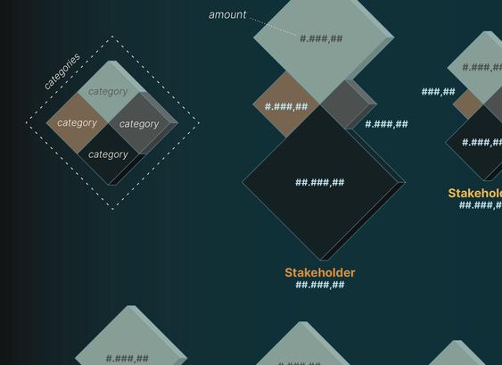
Diagramming Program Values by Spatial Refinement
Hope to be able to publish this project one day soon. For now waiting for probable data changes and green light for completion. Meanwhile here are some screenshots with placeholder texts.
#dataviz #informationdesign