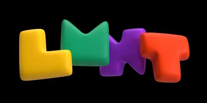
This UI is a masterpiece. (see alt text for more details)
http://www.madcapps.com/bogas_productions.htm
Originally seen in https://bitbang.social/@1Bit/114752566187678808 @1Bit
| prns | he him |
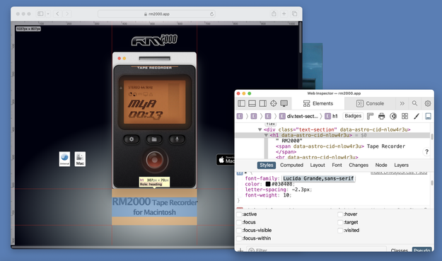
| download my app | https://rm2000.app |
| bridged to bsky? | Yes! |
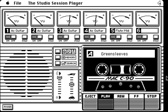
This UI is a masterpiece. (see alt text for more details)
http://www.madcapps.com/bogas_productions.htm
Originally seen in https://bitbang.social/@1Bit/114752566187678808 @1Bit
I AM THE UNKNOWN GLITCH, CATCH ME IF YOU CAN
JANUARY 1974
https://wholeearth.info/p/ii-cybernetic-frontiers-january-1974?format=spreads&index=63
@lucas Hopefully soon !
Re: screencapturekit, have you guys looked into this api? rm2000 uses sck but I'm planning to move to coreaudio taps as it seems to be more efficient and purpose-built from what I gathered from the demo xcodeproj: https://developer.apple.com/documentation/coreaudio/capturing-system-audio-with-core-audio-taps
@chockenberry this post is how I learned NSDrawer hasn't been removed yet.
And I shall be implementing it soon
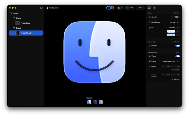
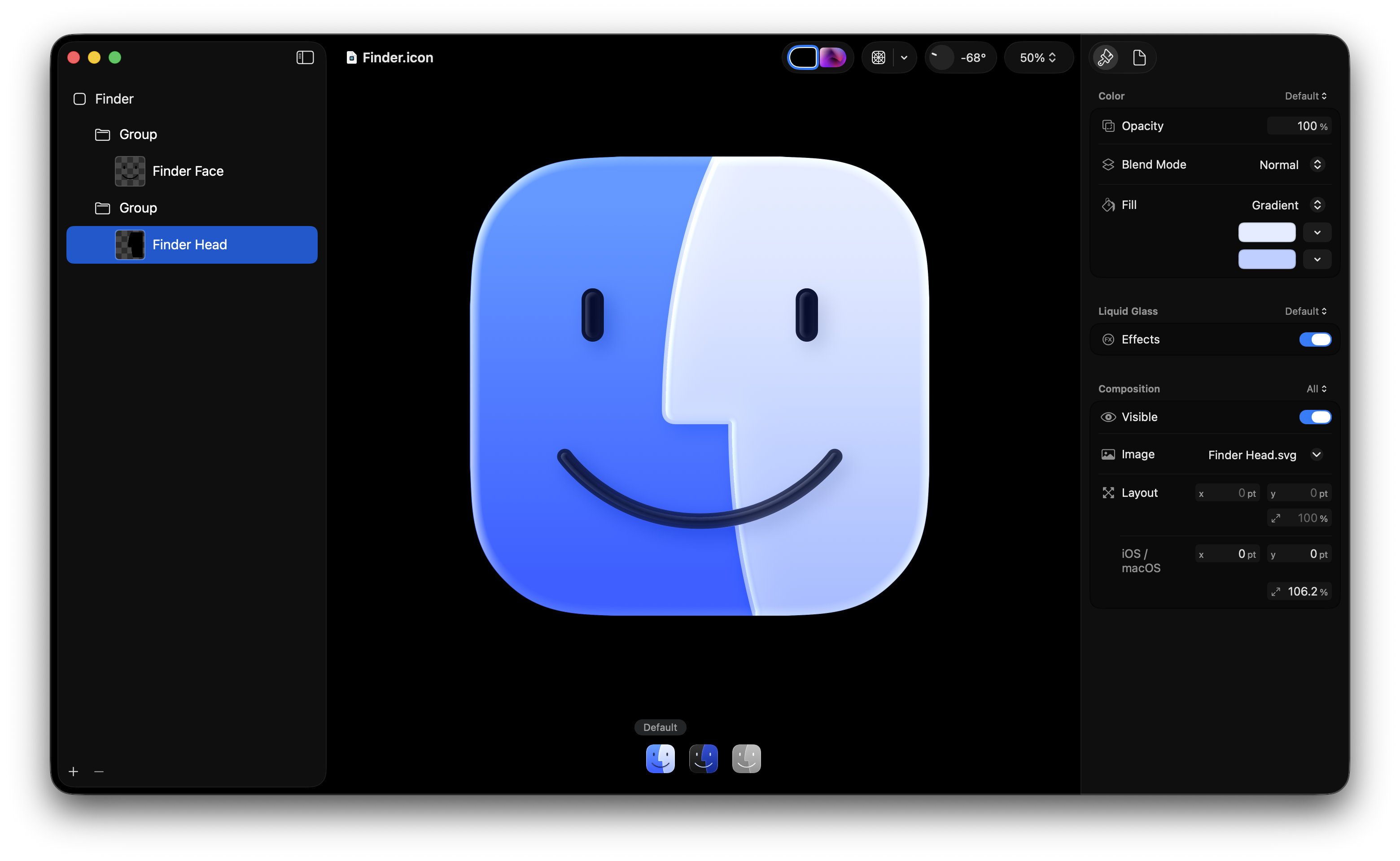
Not that anyone cares *when* I did this, but I made this 15 days ago.
It doesn’t seem hard to me to do this.
As a person who used to make app icons at Apple, I don’t think the situation is that the designer doesn’t know, but rather the decision maker who is supposed to have taste doesn’t know. (If this person isn’t Alan Dye, then that’s even more embarrassing for him that he’s not the person making that call.)
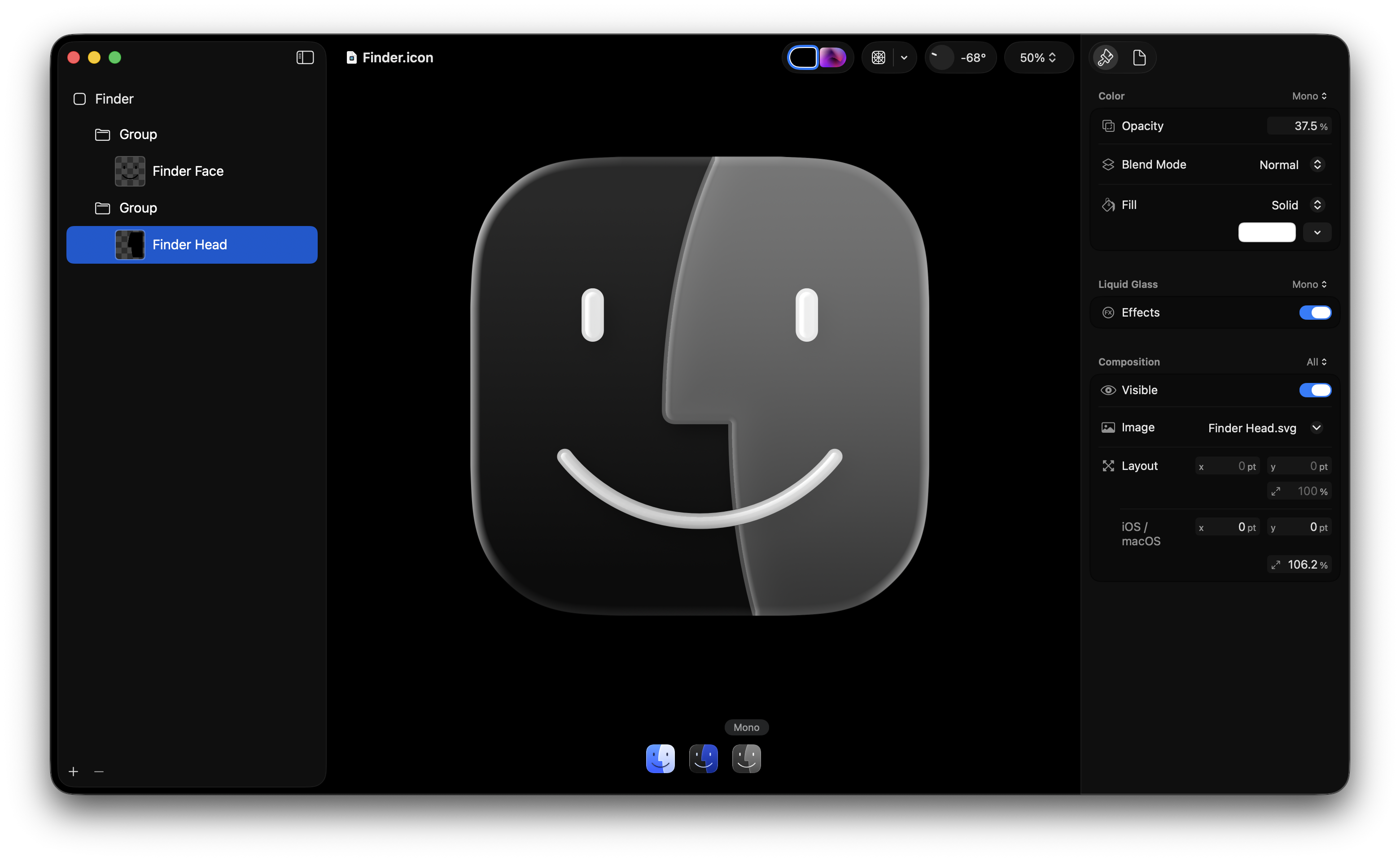
Also, slightly purpler is better. More Mac, less Mail / Safari like I said before.
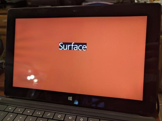
testing out @lucas & co new Macrowave app, and while there are some harmless window bugs, its a whole lot of fun and i cant wait for more updates
spent around 5 minutes just clicking on buttons before realizing that the app has actual features, and I started broadcasting some quick audio from firefox. it seems like an awesome idea. i would totally want to become a dj and put on my ambient playlist
The interactivity in the UI has pretty much persuaded me to stop using bitmaps and make all future RM2000 Tape Recorder themes in 90% interactive swiftUI
Amazing stuff
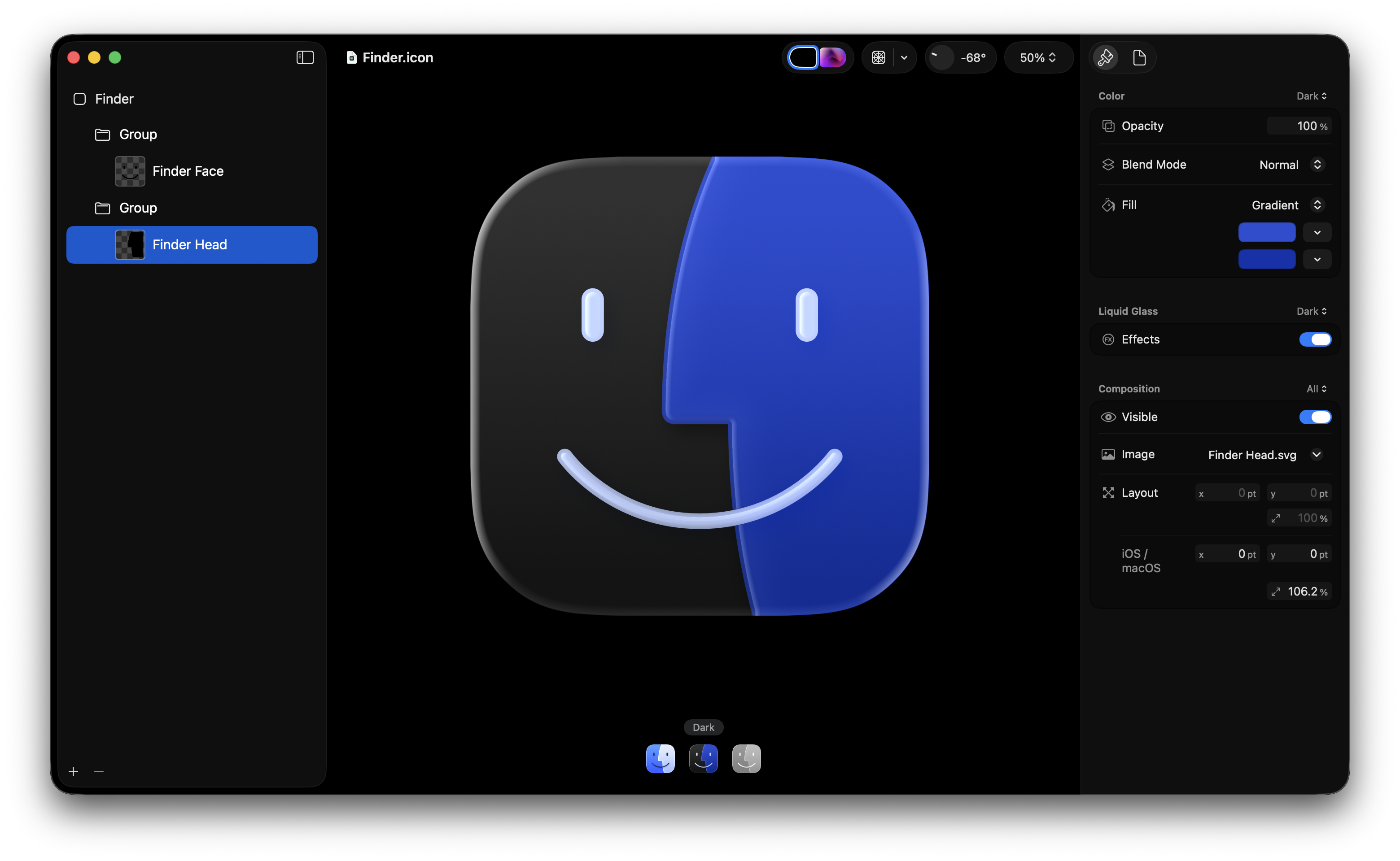
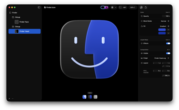
Not that anyone cares *when* I did this, but I made this 15 days ago.
It doesn’t seem hard to me to do this.
As a person who used to make app icons at Apple, I don’t think the situation is that the designer doesn’t know, but rather the decision maker who is supposed to have taste doesn’t know. (If this person isn’t Alan Dye, then that’s even more embarrassing for him that he’s not the person making that call.)
Also, slightly purpler is better. More Mac, less Mail / Safari like I said before.
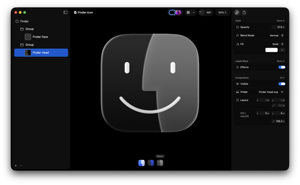
Like I don’t even understand why they went this route with the Dark version. Why... would you go about it this way? Keep the strongest point of contrast in the facial features. So on light mode, they’re the darkest color. On dark mode, they’re the lightest color.
I really, really do not like spending my time pointing this out. I could write a whole blog post but I don’t want to seem angry about it. I just think the right solutions are simpler than what they’re doing.
I just want to remark and say thanks for everyone who appreciates this.
This is not the first time I’ve spent my time addressing this icon during the beta phase of an OS release. Years ago, I mentioned the eyes weren’t centered, and people told me I was wrong and the eyes were “optically” centered, only for Apple to fix it in the next beta.
That being said—
I don’t really like working for free, especially when it benefits a three trillion dollar company. I don’t need a job from them. And I don’t claim to be the only person who cares about this. But I do resent a little bit that when I spend my time on these things that aren’t what I care most about, they get tons of attention. But when I post about things I just absolutely adore and want to spend all my time on, it gets considerably less attention.
@louie How can we get you back to Apple to save us from further disasters?
*stares at the Xcode icon*
If they just have to decide between three great variants their taste doesn't matter.
@ricobeck The issue is direction, not execution.
It’s not that I’m not there, or that another designer isn’t there. It’s that the company put people in directorial roles who don’t have good taste. I have no doubt there are many designers at Apple who could pull off the right thing if given good direction or if they had more power to challenge those without good taste.
@the_alsatian Not bait. I seriously don’t understand why a) there is no louder critique and outcry regarding what Dye did to UX design in the last years, and b) how he wasn’t fired yet.
So, I am also honestly interested in what redeeming qualities you see that made you ask that question.
I am deeply deeply worried that Dye destroys what the HIG team built, irreparably.
@louie “In fact, the rounded square icons that became the hallmark visual design characteristic of iPhone and iPhoneOS originated as a way to differentiate proper OS X apps from Dashboard widgets. And to be fair, at the time, a lot of iPhone apps felt like they were little widgets themselves. Even though the platform was forked from OS X, the little screen and low resolution encouraged smaller apps on iPhone.”
Omg I almost forgot about Dashboard widget icons!
@louie you have resurrected my boy!!!
seriously though who do I gotta poke at apple with a protest movement to fix this???
@basskitten i don't use apple stuff anymore... not after my mac mini bricked itself back in 2015 or so and i fixed it by switching to linux...
still, will tell my friends