Not that anyone cares *when* I did this, but I made this 15 days ago.

It doesn’t seem hard to me to do this.

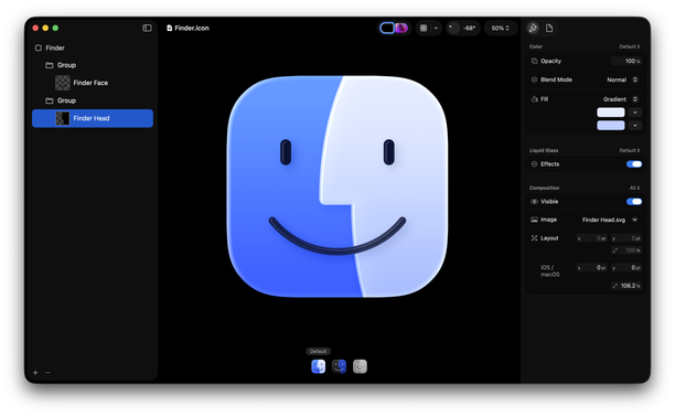
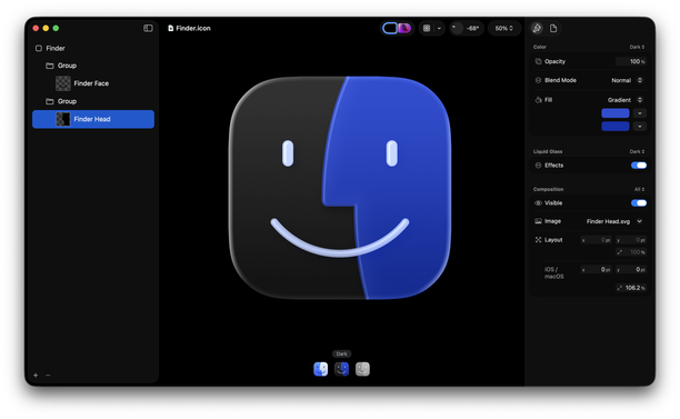
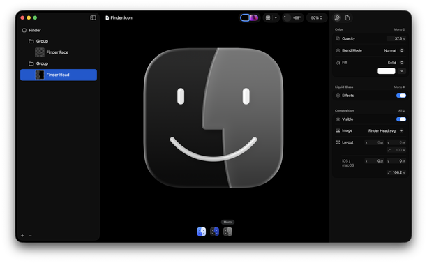
As a person who used to make app icons at Apple, I don’t think the situation is that the designer doesn’t know, but rather the decision maker who is supposed to have taste doesn’t know. (If this person isn’t Alan Dye, then that’s even more embarrassing for him that he’s not the person making that call.)

Also, slightly purpler is better. More Mac, less Mail / Safari like I said before.

Like I don’t even understand why they went this route with the Dark version. Why... would you go about it this way? Keep the strongest point of contrast in the facial features. So on light mode, they’re the darkest color. On dark mode, they’re the lightest color.

I really, really do not like spending my time pointing this out. I could write a whole blog post but I don’t want to seem angry about it. I just think the right solutions are simpler than what they’re doing.

@louie I really like that last sentence. It’s almost like they’re trying to think too clever about it.
@duncandesi9n Honestly, cleverness is the worst poison a designer can drink. It’s not the key to making a good thing. It’s just the key to making people notice. And sometimes the job is not to make people notice it so much.
@louie My design teacher in college would sometimes write “clever” on a design, and it was her most scathing, damning critique.
@louie @duncandesi9n @louie Spot on. Yours is an authentic adaptation of the icon following solid design principles, but Apple’s dark mode Finder icon looks like they’re primarily trying to use it as a mascot for every single new feature in the new design (concentricity, layering, adaptive colour, etc), over staying true to the design… The kerfuffle with the beta 1 icon messing with the colours is kind of indicative, breaking the metaphor of face & screen.

@louie @duncandesi9n

1. mentally bright; having sharp or quick intelligence; able.

2. superficially skillful, witty, or original in character or construction; facile.

3. showing inventiveness or originality; ingenious.

1 doesn’t apply to non-sentient things, 2 surely isn’t the goal of design, but 3 I think is not a bad thing for your design to exhibit.

I always think of it this way; I don’t aim for clever solutions, but sometimes as I refine and perfect a solution it becomes clever and starts solving my problems for me. It’s the point at which I start feeling really great about the design—when every new problem and edge case is answered without any more changes.