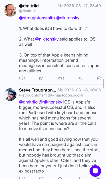
If the original Mac had used icons in menus from the start, nobody in their right mind would be calling for their removal today.
That's how you know that argument doesn't reflect reality. All major platforms now have icons in menus; you can't wind back the clock on that one, you're just obstinately refusing to follow the system standards and user expectation.
So much ink and many podcast hours have been wasted discussing the wrong parts of the issues with Liquid Glass on the Mac