New blog post! A close look at Tahoe menu icons. With 109 illustrations! https://tonsky.me/blog/tahoe-icons/


160K unique visitors, 12hrs at the front page of HN, 3hrs as #1
Hope that’s enough for Apple to notice


@nikitonsky congrats! The decline of Apple’s UX prowess has a silver lining - by become less competent, they have become more receptive to public feedback. There is a good chance this post will be a wake-up call for someone internally, just like how all the Liquid Glass outage gave us iOS 26.1.
Just so you know 99% of responses are going to be complaints about the snow animation and your choice of layout and color scheme.

@nikitonsky I think the snow should pile up or stick to the screen so you've got to wipe it off to keep reading. I think that would add a lot to the experience.
sorry the council of topic understanders at the orange website decided you must perish as your website has whimsy
@nikitonsky Excellent post! Though, for someone who is so perceptive, why create a blog page with a 'snow' effect, making everything difficult to read.
@ged thanks! There’s a button to turn it off
@nikitonsky @ged +1 with Ged, and if you try to disable JavaScript (I couldn't see the button), the page background turns completely yellow.
@xarvos @ged @nikitonsky OK, I see. From the profile description, the author specializes in 'bad interfaces'. That might be a form of built-in irony. 😆 Thanks Firefox "Toggle Reader View" I could read it. Good article.
@davidrevoy @nikitonsky @ged For me the button (snowflake on the top more to the right) turns the background from blue to yellow but does not disable the snow – … Ohhh, it *does* turn off the snow it just takes quite a while so I did not notice it actually does anything to the snow (I thought it only changes the background colour which was very weird ^__^) …
@nikitonsky I hit the button but continued to see snow fall so I figured it was a weird icon for changing the background color. I didn’t notice until after I saw this and tried again that *new* snow stops falling.
Great article though!
@nikitonsky @ged Using reader view was my solution to the snow interference.
@nikitonsky @ged it doesn't actually turn it off though, just stops new snow being spawned. I even searched for a button to turn it off, thought I'd found it and figured "nope, that's not it" when I tapped the button and the immediately visible effect was just to change the background color. Bad design: if the user wants to turn it off, just turn it off already
@ged @nikitonsky the snow was hard to read past.
I was thankful to have an option to turn it off, though.
And there's a certain nostalgia to it, à la websites during the turn of the millennium.
@markotway @nikitonsky Making it difficult to read is 'fun'? Im asuming you're in a bad mood today : )
@nikitonsky I would love to see Steven Lemay resharing, commenting positively on, or starring this post.
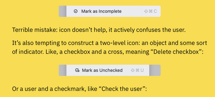
my guess: its to represent the "Ctrl + A" shortcut, which was already well known


@irrenwirr interesting theory! I didn’t think of that, because A everywhere else means “Abstract Character”, not A specifically as a letter. But given how consistent everything else is, it might as well be!

@irrenwirr @nikitonsky I'm a big proponent of "match the keyboard" for menu items. The ⌘A at the end of the menu command is all that's needed to show Command-A.
@nikitonsky @freakshow Vorschlag was bzgl Apple mal diskutiert werden sollte: Apples zunehmende Fehlentscheidungen beim Design.
@nikitonsky Further evidence that Apple's core idea of "one size fits all" is a bad strategy. The more they use it, the more it fails. The penny pinching is so confusing/frustrating.
@nikitonsky good article, didn't mind the snow.
What are the odds they just threw AI at it and let that choose icons for every menu item?
That's the fastest way I could see them messing up this badly...
I would have expected most sane companies to have a style guide that included prescriptive rules on what icon to use for what actions.
@nikitonsky fantastic post, and really makes me wonder if there's anyone still interested in human interface design left at Apple.
@nikitonsky At first I thought you were about to talk about the design of application icons, but this is way more interesting. I hadn’t realised Apple had flooded application menus with these little icons in Tahoe (I’m still on an older version of Mac OS). And I hadn’t realised how disastrous all this looked. The Writing Direction menu looks like a joke. 200% agree with your criticisms!
@nikitonsky I'll add: when you don’t know how to standardise icon usage across your system and applications (because, as you correctly observe, it’s a fool’s errand), it’s just better to avoid putting icons everywhere. Older versions of OS X didn’t have icons in most menus, and they were fine. Reading the text in a menu command is less ambiguous anyway.
By the way: this is the Finder → Go menu in High Sierra: icons were big (almost like toolbar icons) and consistent with other places in the OS.

@morrick I remember when those were colored (Snow Leopard was last to have them), switching to grayscale felt like a downgrade (Lion and later)

@nikitonsky Indeed!
@nikitonsky @morrick I miss coloured icons both in the sidebar and toolbars. The monochrome grey icons everywhere is just depressing
@nikitonsky Further evidence that Apple's core idea of "one size fits all" is a bad strategy. The more they use it, the more it fails. The penny pinching is so confusing/frustrating.
I turn off icons in menus on Linux.
Though at least on Linux you can mostly change them easily, though some status icons are determined to remain as ugly black fat lines: Speaker, Network, Battery, Bluetooth. Though I could swap them via filemanager.
@nikitonsky I think the System Preferences->System Settings redesign was the canary in the coal mine for MacOS UI/UX crapfest that is Tahoe.
@nikitonsky Thanks. I'm disgusted. good job!
@nikitonsky @gedeonm Very good blog post and 100% agree… things look a mess these days, and 100% harder to read.
@nikitonsky I haven't used Apple products in a while, but I struggle to understanding how things ended up this way. It cannot just be incompetence, there must be other factors at play here, right? Have Apple developed a new UX theory that says that icons are and have always been purely decorative, and none of this matters?
@diego It’s how all big companies get: people care about their own promotions, new projects get you a promotion, no matter if it’s a good project for the user or a bad one
@nikitonsky I can see how "make every menu item have an icon" would begin, what I'm struggling to understand is why they didn't revert it once they saw the disastrous results. It seems like it should be a fairly low-stakes scenario where walking it back wouldn't be such an issue. But maybe I'm underestimating how many career trajectories were tied to this initiative.
The 'consistency inside the same app' bit is slightly underplaying this.
The main purpose of the menu bar is discoverability. In theory, every operation that you can perform in the app is in the menu. You can explore the functionality of the app by browsing the menus and submenus. This is why it's called a menu.
Shortcut keys are put in the menu bar to give a gradual improvement in UI speed. First you find the item in the menu. Then, when you've used it a bunch of times, you realise you want to use it without going to the menu and are able to hit the keyboard instead. This is also why NeXT had tear-off submenus (I think the developer previews of OS X had them, but 10.0 lost them): you could turn any submenu into a palette and put it near the mouse.
Putting (a small number of) icons that are also elsewhere within the UI has the same benefit: you can learn that a thing you were going to the menu for is also available in the tool bar or similar UI element.
As you say, the lack of consistency destroys this aspect of discoverability. For this to be useful, you need the thing in the menu to look exactly (or, at least, trivially recognisably) like the other element.
On the difficulty of differentiating icons side, Jef Raskin made a similar argument about toolbars 20ish years ago (and he was right as well). As I recall, he pointed to a study that showed that about 20 distinct icons is the upper limit on the number that you can usefully differentiate and (as you say) he was talking about colour icons 4x or more the size of these ones.
This makes me think back to the big CAD app I used to work on.
We had a collection of terrible 32x32 toolbar icons (a size we had selected back when we were a Unix/X11 app), pixel art drawn by programmers. And just in case that wasn't a huge enough visual target, we had always had the ability to double them in size (nearest neighbor) to 64x64
so when the directive came down to make it "more like Windows [XP?]" I behaved like a genie and added code to scale down (linear filtering) the icons to 16x16 and put every command icon next to its corresponding menu option. This is just one of the many crimes we committed in the name of "visual modernization", but perhaps it's one of the ones I should repent the hardest from. It was cluttered, gaudy, illegible, ...
@nikitonsky Great article! Btw, which app is this? and how do you find that menu? I thought it was Reminders at first but Reminders has a different icon.

@nikitonsky huh that's awful , the Reminders-related icons are different between the Reminders app and the Reminders in Calendar.
Thank you SO much for that wonderful research and explanations!
These weird icons are one of the really stupid and useless new "features" in the crazy buggy and hard-to-use #macOS 26 "Tahoe" release.
My upcoming NeoFinder 9.2 will remove all these stupid random shapes and blobs that macOS infused to its main menu.
I hope other developers will do that as well.
@nikitonsky I hope you'll get hired by Apple to fix things
@borkdude They have a new head of design now, maybe things will start to improve in a couple of years
@nikitonsky Please go work for him and be an influencer :)
I notice one looks like a turkey baster; some kind of vegan statement, maybe?
@nikitonsky I commend you for taking the time to document this disaster in this much detail. I went in thinking it would be bad, but I had no idea it could be *this bad*

@nikitonsky @gabrielesvelto I agree and commend your effort documenting this! 🙏 But then … your site is using a snow effect? While talking about distracting UI elements? That felt slightly odd to me :)
@maxheadroom @nikitonsky @gabrielesvelto Also cooks my iPhone and makes the effect stuttering after some time. 🔥
@nikitonsky fantastic work! Thank you so much for taking the time to make a nice and clear argument to something that should be in apple's dna without us telling them.
Awesome write-up! I fear that UI design is becoming a lost art, especially given what Apple and Microsoft are up to these days. There's still hope, but it's diminishing quickly, with most non-techie people I talk not even noticing the iOS 26 redesign.