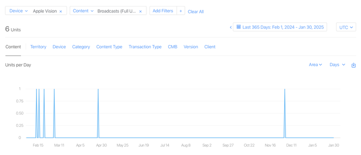
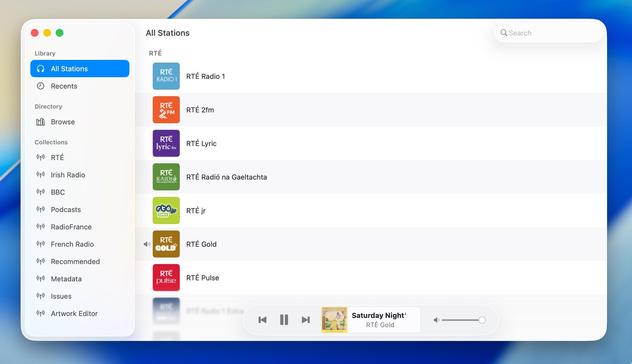
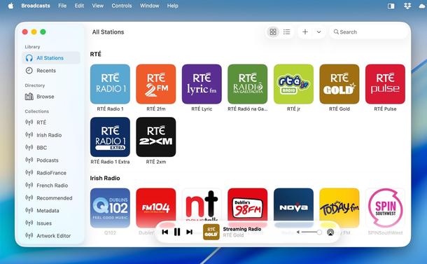
I have a whole year of sales data for @broadcastsapp on visionOS now!
In total, six full copies of the app were purchased on the platform in the past 12 months, and it has about 400 users total there.
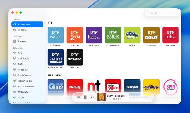
This is my best-performing app on Apple Vision Pro, and it took about seven months of work to create 🤡
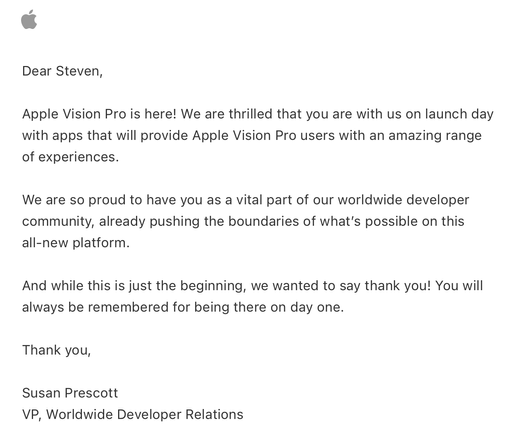
Apple offered a pat on the head in lieu of a devkit
Verifying that my older
@broadcastsapp alternate UI feature flags still work before the WWDC keynote — always good to build yourself some options before you need them. Next time we see this, I expect it will be with an unhealthy amount of frosted glass
Complete double-take while browsing Apple's Developer site.
"…hey, wait a second, I know that app…"
Yeaaaaahhh now I remember what UI overhaul season feels like…
Threading the needle on targeted if statements that won’t also break the app across older OS designs on Mac, iOS, and visionOS 😂
This may not be the UI layout I ship, but I’m opting in all my custom views into the new stuff to see where that gets me before I start worrying about making decisions
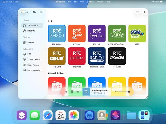
Getting closer to a reasonable starting point for
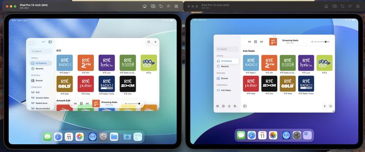
@broadcastsapp in iPadOS 26 using my existing feature flags, before I start actually writing any new code or doing new layout. Progressive blurs and new glass effects all present and accounted for
I have toned down the glass effect from the default by setting its background color to be 80% white. I expect that somewhere over the beta period Apple is going to do something similar (maybe meet somewhere in the middle). Or maybe the user base will get used to it, and decide they want something more like the glassier version. It will be an easy thing to tweak, if so
I will try to maintain dual-compatibility with iPadOS 26 and earlier versions of the OS as we move through the summer. Maintaining two different design languages, *per platform*, is going to be a struggle, but we'll see how it turns out. I built Broadcasts to be flexible, and it has paid off so far
The new layout does work on the old design language too, so that's something I could consider down the road as features coalesce into a Broadcasts 4
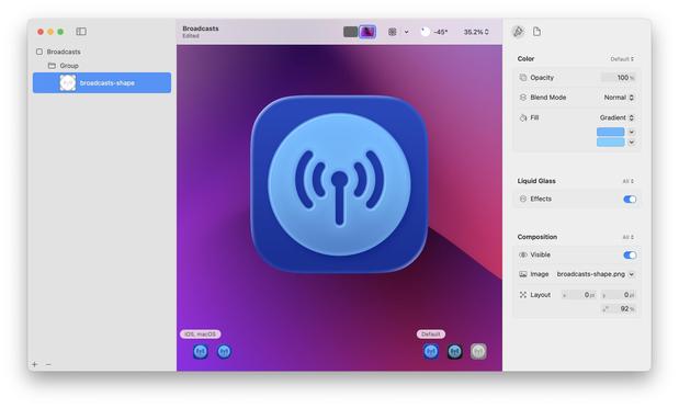
If I were making my living on designing app icons, I would be pretty upset with Icon Composer. Apple has gradually defined whole classes of designers out of existence throughout this era, but this is a K.O.
As a developer, though, this stuff is great!
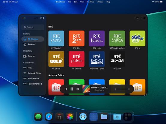
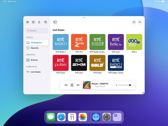
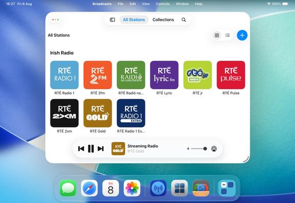
Had a couple of tiny tweaks to make, but my starting point for Broadcasts on macOS 26 is looking OK. If I manage to build and ship no other features this summer, this is at least how it will look like on the new OS
Alternate Broadcasts layout, should all the bottom toolbar stuff stick on macOS.
When you see it all laid out like this, I'm almost surprised Apple didn't make macOS more like visionOS, and move the sidebar and the bottom bars out of the window chrome like visionOS' ornaments
Adding icons to all my menu items, as per the new HIG. UIKit has made the Liquid Glass transition surprisingly easy — benefit of such a flexible framework that runs on everything from watch to headset — and it still looks and runs like it used to on older OSes at the same time
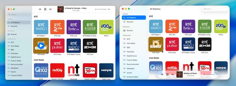
Side by side, the old and new. I'm not afraid to lean into it, if this is really the way the wind is blowing. The more time you spend on this OS, the more you get used to the new way of doing stuff. It does seem pretty stark, looking in from the outside, but when /all/ your apps look like this, it does feel better to lean in and try more ambitious things
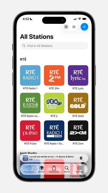
I'm at the 'ripping up all my layouts' stage of transitioning to the modern-tab-bar-with-alt-compact-view-controller stuff and hoping I'll be able to put the pieces back together again before I give up 😅
I have reduced Broadcasts to its platonic ideal on iOS 26 😜
Trying to shoehorn all the new stuff into my existing view controller hierarchy was just overcomplicating things; I'm going to start over from first principles, and I think that means using the modern iPad (/mighty morphin') tab bar structure that I so hated upon its introduction last year. But I think it makes a lot more sense now, now that there's a spectrum across device sizes
I'd be lying if I said I knew what I was doing with these APIs, chat, but we'll get there
Getting somewhere, at least. I am always so glad that I built all my new apps in a composable form, as it has made all these new layouts and platforms over the past years so much easier
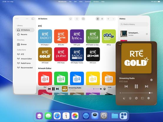
If iPadOS only respected the window scene size restrictions maximum size, as well as minimum (which it now does), I could enable more of my expanded featureset on iPad — like my Mini Player window. I think it would be worth doing 🤷♂️
I'm kinda tempted to spawn windows now on iPadOS instead of presenting view controllers like I used to. I feel like now the OS has enough flexibility for me to enable all the workflows that I've kept locked to macOS and visionOS previously, which is fun
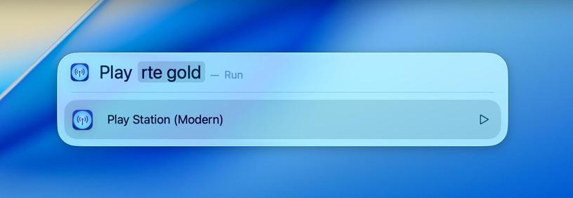
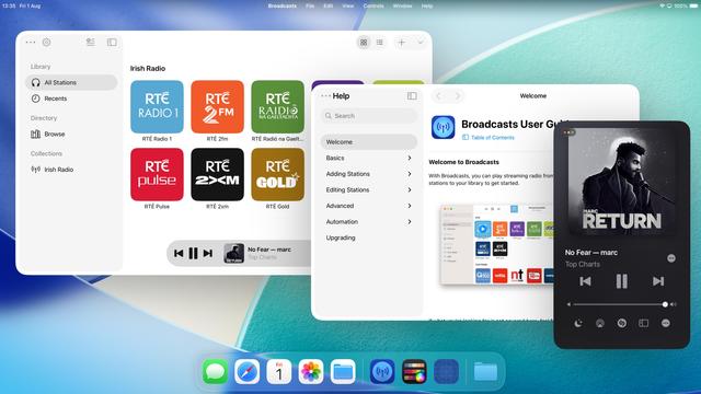
Took the morning to add Spotlight action support to Broadcasts, and it's pretty cool. It's like having a command bar, available systemwide, for your favorite apps. If this comes to iPadOS in the coming years it will be incredible
Shifting my list view code path from the macOS-specific one to the iOS version, as I think it fits the new design language better (don't worry, Regular and Large modes still exist)
If you've never really considered the complexity in updating an app for a new iOS release over the summer, welcome to my hell:
I'm currently working on two completely different versions of the UI in Broadcasts. One, using the old layout, which needs a reasonable amount of fixup. And another, using a new layout using all the newer APIs, currently very broken and is going to need a mountain of work to finish, and from my initial experimentation looks like it's unable to do all the things I want
Will I ship the ambitious rewrite that won't be as pretty but will be way more flexible for folding phones? Or will I ship the battle-tested existing UI that doesn't handle transitioning from small to large mode very well, and won't have a good solution for the 'middle' posture the platform now demands? I really don't know right now. Many of the APIs are unfinished and/or broken, so it's really up in the air. I will have to progress *both* far enough to make a decision
https://mastodon.social/@stroughtonsmith/114726300637233438
Speaking of rewrites, this redesign is finally going to push me to finish rebuilding my playback bar in UIKit. It now has to scale down a size class further to handle the new iPhone tab accessory mode, so it makes sense I do this here rather than in the doomed SwiftUI version.
My codebase basically has at least two versions for every view controller you see onscreen, either as new un-shipped versions, or versions I replaced a while back but never fully ripped out. I can sense a clean-out coming
Here's a side by side just to show my two codepaths. I'll be happy to finally get rid of the SwiftUI one (which, of course, has bizarre new interaction bugs on iOS 26, continuing its flaky history). Pay no heed to the layout or level of blurriness; neither are fully ready for the new design language
Bit by bit, the Broadcasts design is coming together. There's still a long way to go before September, and this is but one of my many apps to get through. With each passing day, the old visual style is looking more and more ancient to my eyes
So what if I sacrifice the morphing tab bar, but hide/show a tab bar when the sidebar is opened/closed instead? That way I can keep my custom sidebar logic and ornamentation, but also have a unique middle posture layout 🤔
It's an option — probably the most sensible one — but I'm undecided
Broadcasts progress journal: I am starting to wonder if maybe I should just put all my energy into the redesign instead of continuing to support iOS 18. Whatever way I cut it, this is going to be Broadcasts 4, and I feel like it won't have the same impact when it doesn't look or feel very different (on the legacy OSes). I still have a lot to think about, and I'm at the stage where everything looks ok but is completely broken and probably will stay that way for a while 😂
I have been making slow progress at building out the new Broadcasts UI, but I'm not at all sold on the level of glass in the bottom bar that Podcasts and Music use. I'm not tearing it out and building something custom, in the hope that Apple makes some decisions to fix that in its own apps first (that I can follow). In the meantime I've been building things that aren't immediately visible, like multi-select
I am, of course, keeping my new UI working in UIDesignRequiresCompatibility mode, in case of emergency, even though I don't think I'll be supporting older versions of the OS with this release. And maintaining the legacy UI too 🥲
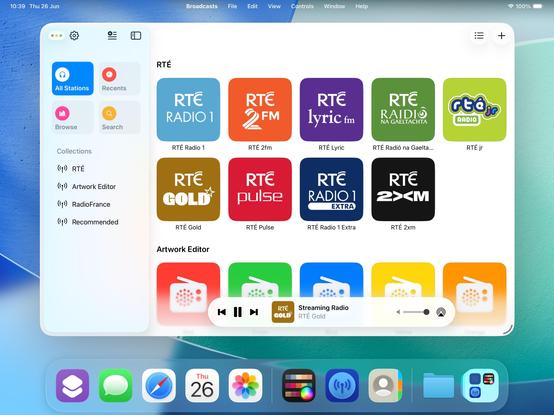
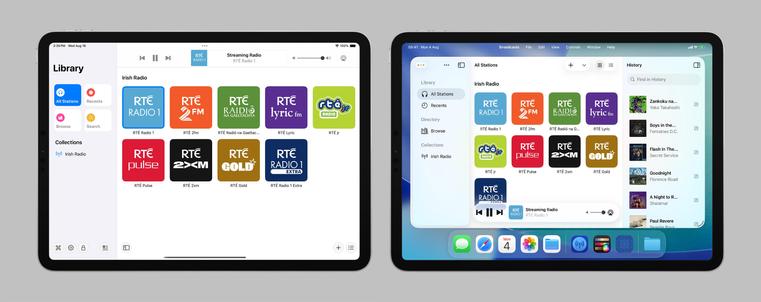
Broadcasts is already a very different app on iOS 26 compared to what it was on iOS 18, especially on iPad, and I'm not even a significant fraction through my redesign. Designing for iPad now very much feels like building a desktop app, and it just makes me want to expand on all my features in ways I wouldn't have thought of doing before
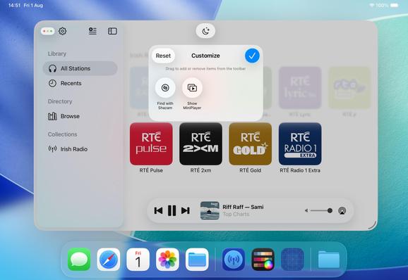
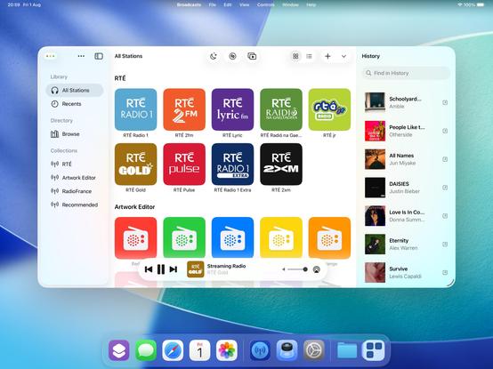
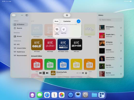
I'm not wholly convinced yet, but I'm experimenting with making the toolbar area in Broadcasts customizable. Empty by default, but you can put extra buttons in there if you want them. Feels like something I should start doing in my apps, but maybe not /this/ particular app
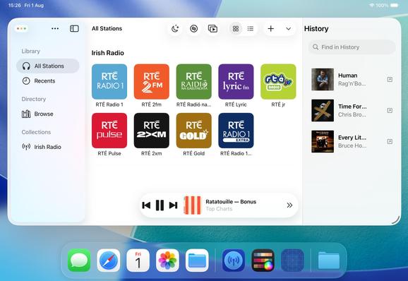
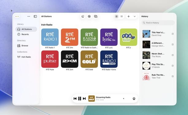
Another aspect floating around my head is the inspector panel, a new option in UIKit. I haven't figured out if it's something I want in the app, or if it is what would I put there. History is an interesting option, however…
UINavigationController's alternate titlebar modes are kinda pretty. It's making me want to actually try this inspector panel thing. Bigger, better apps, for a bigger, better iPad
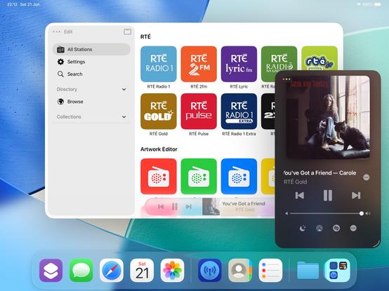
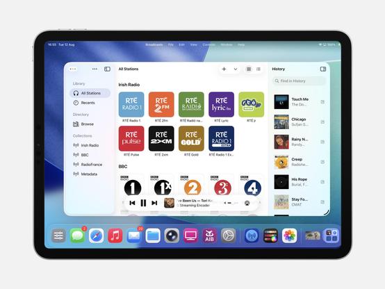
With this, Broadcasts now persists track history to disk, something I've been meaning to add for months
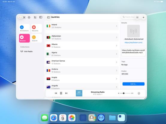
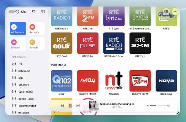
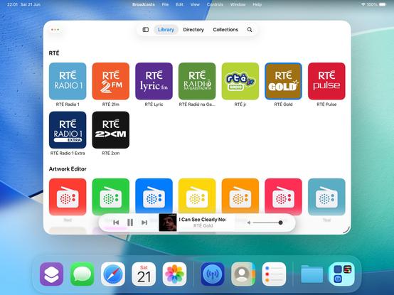
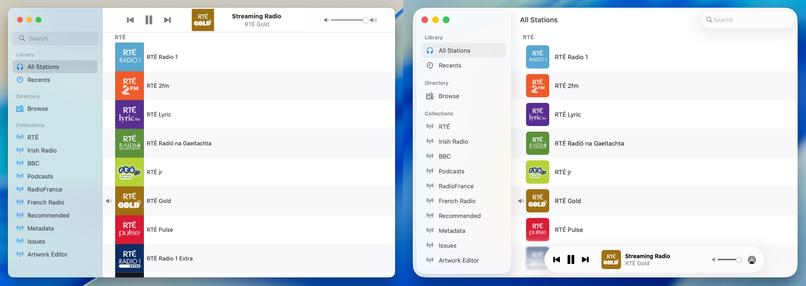
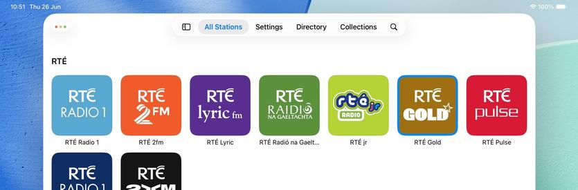
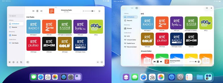
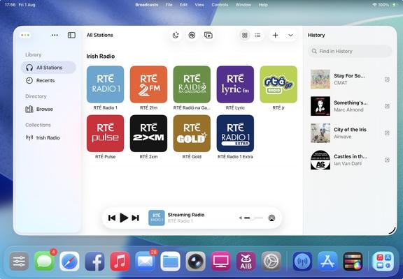
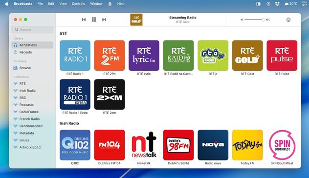
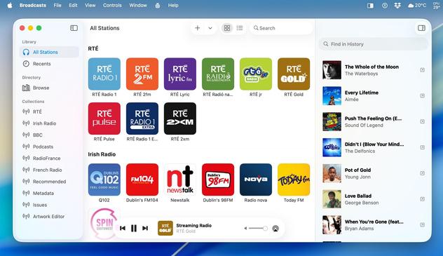
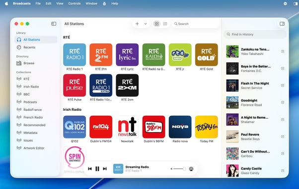
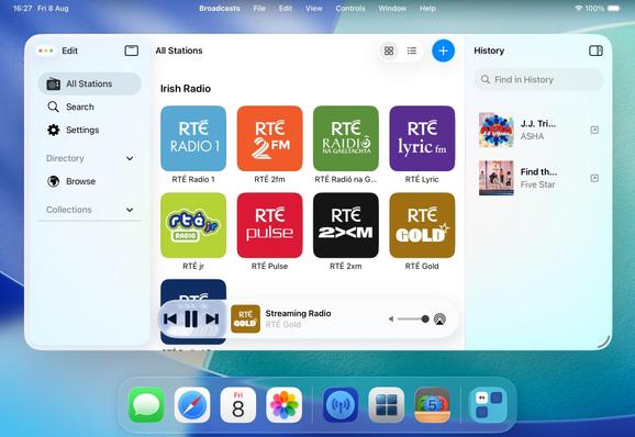
Broadcasts' three-column layout is quickly becoming canon in my head, and nobody has tried to talk me out of it yet 👀
There comes a moment in every major update you build where your app really starts to fork from the previous version and it becomes hard to imagine going back. I'm starting to feel that way about Broadcasts 4 now. At the time everything I did felt like tiny changes, but looking back now I'm like "wait, I did all of that since June?"
The question remains, will anybody actually like what I've done, or was I on the wrong path from the start 😅
The intent is for Broadcasts on iPad to be closer to the Mac version than ever before. Some of this is predicated on Apple getting iPadOS 26 into a reliable state, which is a little up in the air right now, but I'm continuing to build under the assumption that they'll get there
The most important thing I need to do for Broadcasts 4 is move the monetization to a subscription model (for new users only), something I've been talking about for way too long at this point and just been too afraid to pull the trigger on.
And I think part of that is going to involve making the app iOS 26-only — if I'm going to offer subscriptions, I don't want that to tie me down to supporting older versions of the OS indefinitely, when this is very clearly a line-in-the-sand update year
I figured I should take another pass at my 'iTunes Visualizer' idea, now that I'm armed with ChatGPT in Xcode. It took a lot of convincing to have it write a Metal shader for me, but I kinda like the results? Metal shaders are very much a case where I haven't got a clue what I'm doing. Sadly I can't get actual audio buffers from streaming audio using system APIs, so I can't actually wire it up to anything. It's basically just a screensaver