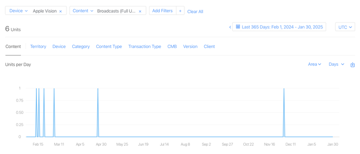
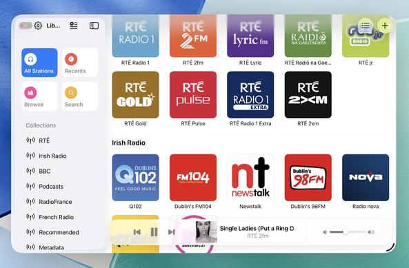
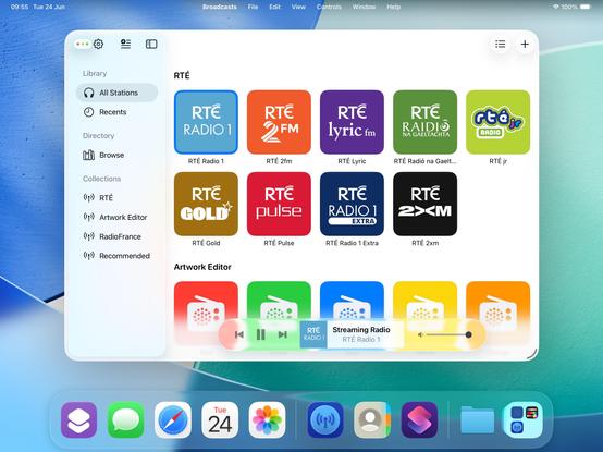
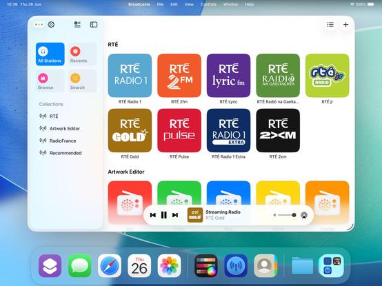
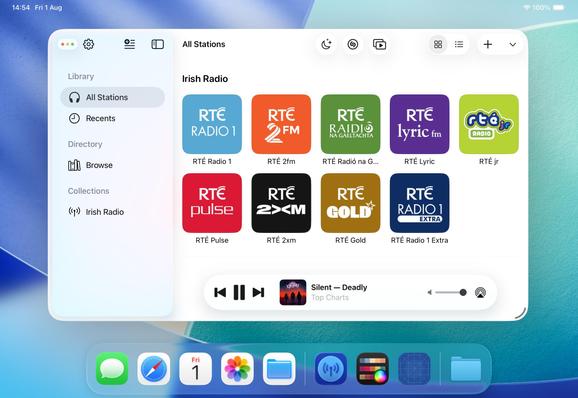
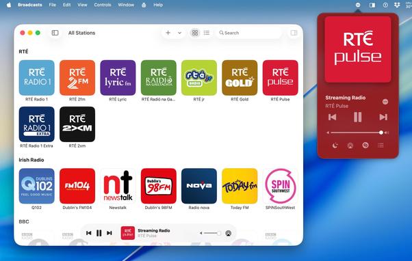
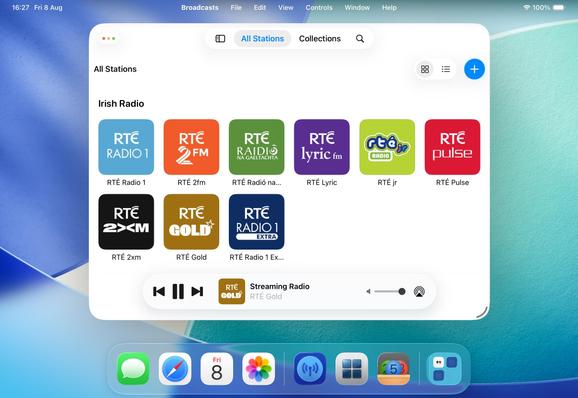
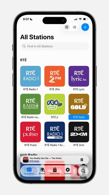
I have a whole year of sales data for @broadcastsapp on visionOS now!
In total, six full copies of the app were purchased on the platform in the past 12 months, and it has about 400 users total there.
This is my best-performing app on Apple Vision Pro, and it took about seven months of work to create 🤡
Apple offered a pat on the head in lieu of a devkit
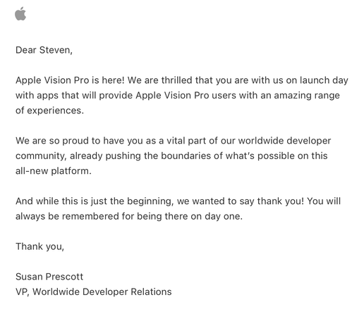
Complete double-take while browsing Apple's Developer site.
"…hey, wait a second, I know that app…"
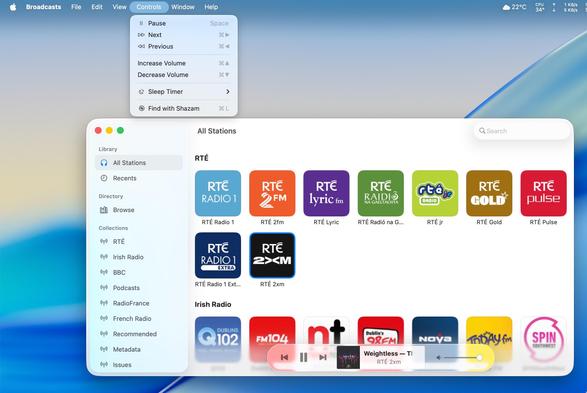
Threading the needle on targeted if statements that won’t also break the app across older OS designs on Mac, iOS, and visionOS 😂
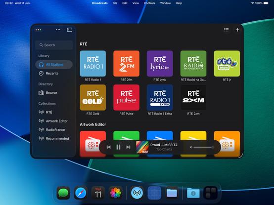
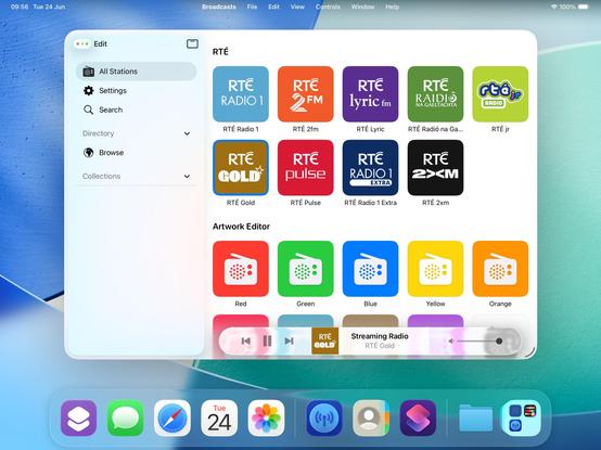
This may not be the UI layout I ship, but I’m opting in all my custom views into the new stuff to see where that gets me before I start worrying about making decisions


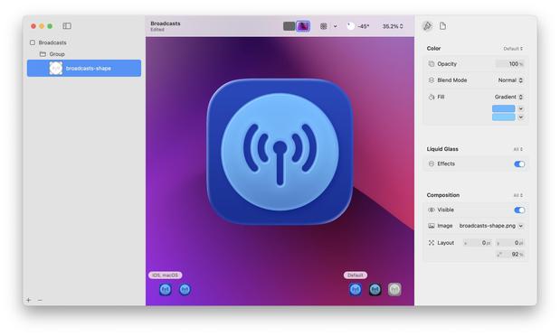
If I were making my living on designing app icons, I would be pretty upset with Icon Composer. Apple has gradually defined whole classes of designers out of existence throughout this era, but this is a K.O.
As a developer, though, this stuff is great!
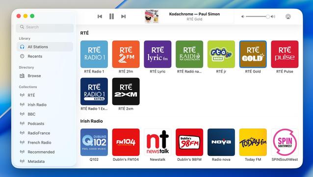
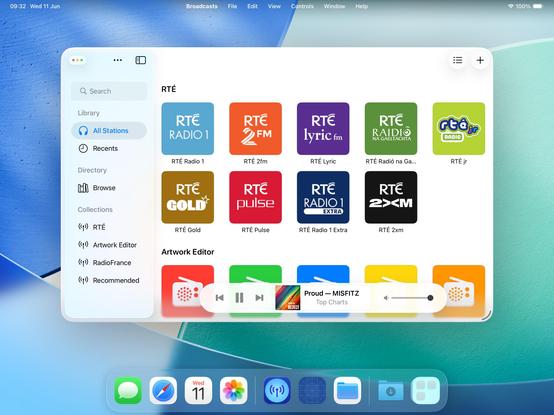
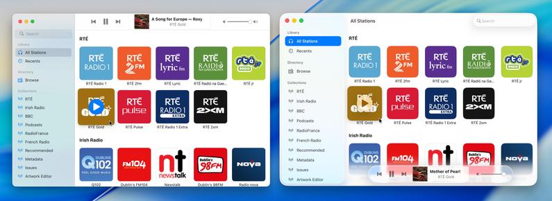
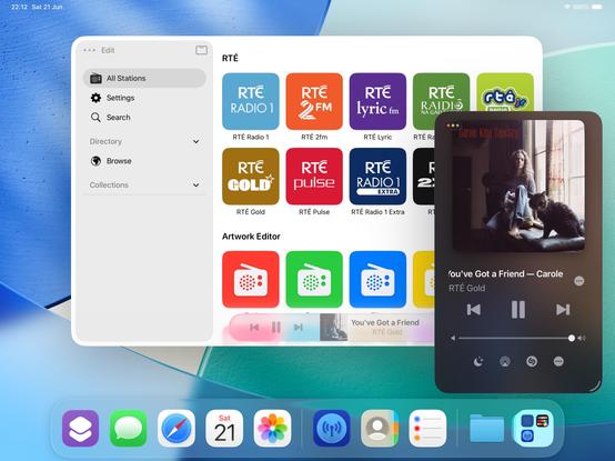
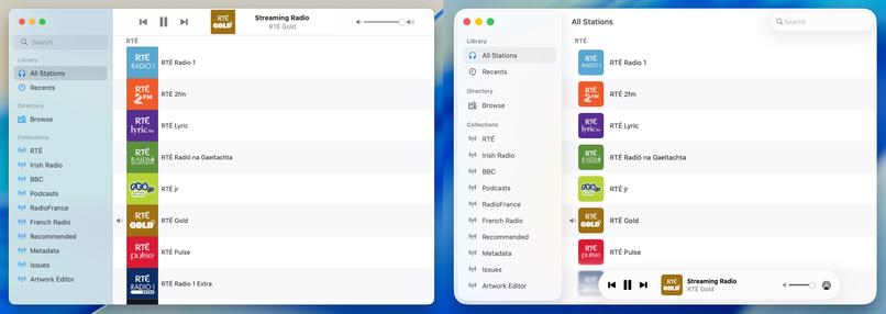
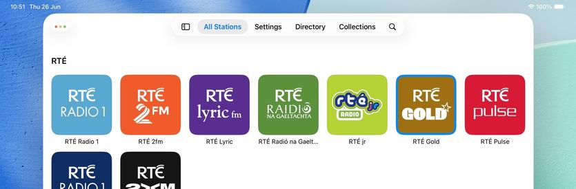
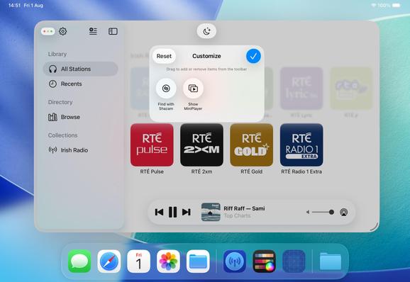
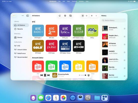
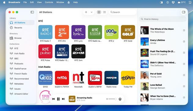
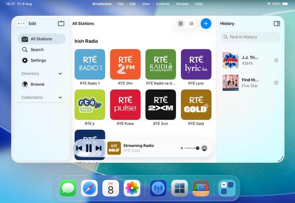
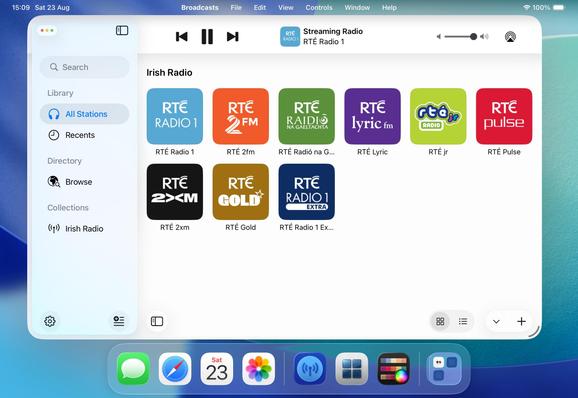
Alternate Broadcasts layout, should all the bottom toolbar stuff stick on macOS.
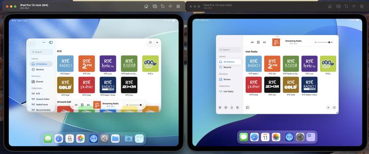
When you see it all laid out like this, I'm almost surprised Apple didn't make macOS more like visionOS, and move the sidebar and the bottom bars out of the window chrome like visionOS' ornaments
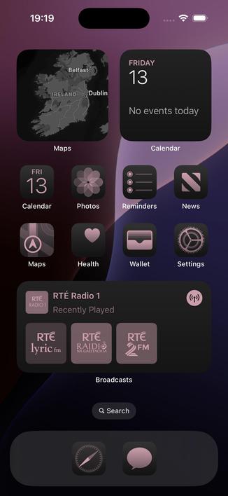
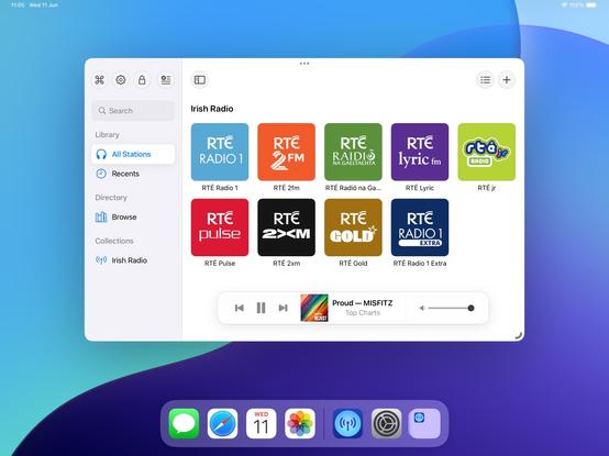
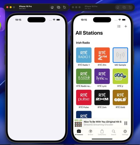
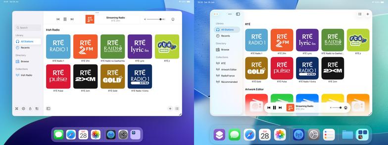
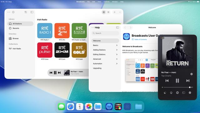
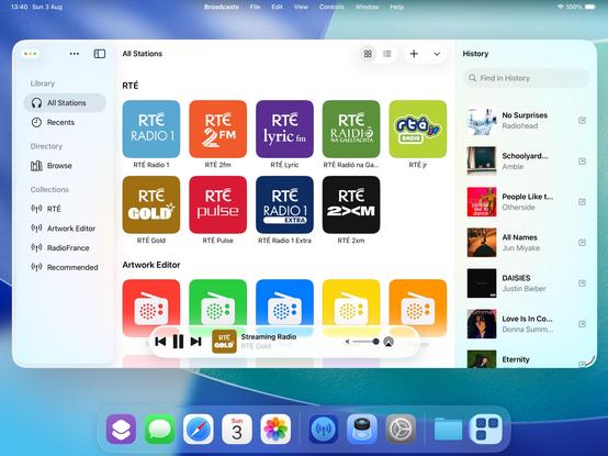
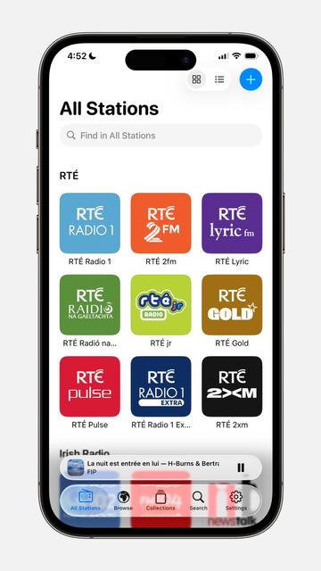
I have reduced Broadcasts to its platonic ideal on iOS 26 😜
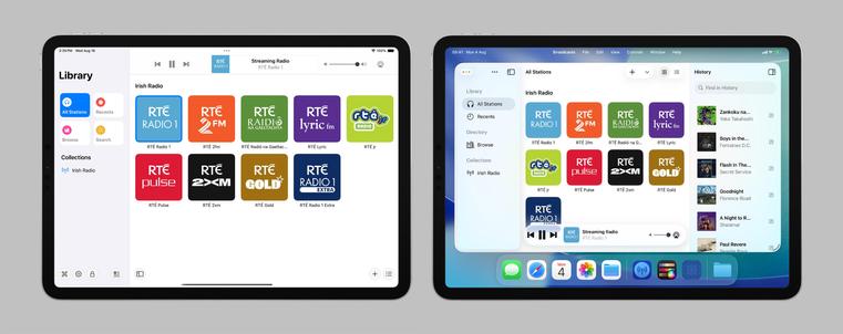
Trying to shoehorn all the new stuff into my existing view controller hierarchy was just overcomplicating things; I'm going to start over from first principles, and I think that means using the modern iPad (/mighty morphin') tab bar structure that I so hated upon its introduction last year. But I think it makes a lot more sense now, now that there's a spectrum across device sizes
If you've never really considered the complexity in updating an app for a new iOS release over the summer, welcome to my hell:
I'm currently working on two completely different versions of the UI in Broadcasts. One, using the old layout, which needs a reasonable amount of fixup. And another, using a new layout using all the newer APIs, currently very broken and is going to need a mountain of work to finish, and from my initial experimentation looks like it's unable to do all the things I want
Will I ship the ambitious rewrite that won't be as pretty but will be way more flexible for folding phones? Or will I ship the battle-tested existing UI that doesn't handle transitioning from small to large mode very well, and won't have a good solution for the 'middle' posture the platform now demands? I really don't know right now. Many of the APIs are unfinished and/or broken, so it's really up in the air. I will have to progress *both* far enough to make a decision
Speaking of rewrites, this redesign is finally going to push me to finish rebuilding my playback bar in UIKit. It now has to scale down a size class further to handle the new iPhone tab accessory mode, so it makes sense I do this here rather than in the doomed SwiftUI version.
My codebase basically has at least two versions for every view controller you see onscreen, either as new un-shipped versions, or versions I replaced a while back but never fully ripped out. I can sense a clean-out coming


So what if I sacrifice the morphing tab bar, but hide/show a tab bar when the sidebar is opened/closed instead? That way I can keep my custom sidebar logic and ornamentation, but also have a unique middle posture layout 🤔
It's an option — probably the most sensible one — but I'm undecided
There comes a moment in every major update you build where your app really starts to fork from the previous version and it becomes hard to imagine going back. I'm starting to feel that way about Broadcasts 4 now. At the time everything I did felt like tiny changes, but looking back now I'm like "wait, I did all of that since June?"
The question remains, will anybody actually like what I've done, or was I on the wrong path from the start 😅
The most important thing I need to do for Broadcasts 4 is move the monetization to a subscription model (for new users only), something I've been talking about for way too long at this point and just been too afraid to pull the trigger on.
And I think part of that is going to involve making the app iOS 26-only — if I'm going to offer subscriptions, I don't want that to tie me down to supporting older versions of the OS indefinitely, when this is very clearly a line-in-the-sand update year

There is an alternate timeline where this is what became Broadcasts 4. A timeline without crunching for six months to port to visionOS, without despair at an iPad platform vision with seemingly no future, without disgust at Apple's handling of antitrust issues, all of which combined I lost a good 18 months to
I made two tiny changes and it transformed how I feel about the Liquid Glass in my iPhone design
1) I use 0.99 white/black instead of systemBackgroundColor
2) I added a stronger fade underneath my tab bar
Both of these changes could trivially be implemented by Apple
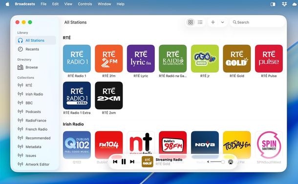
There is a ton left to do in Broadcasts before I can even start pushing it to TestFlight — it is the most changed of any of my apps, touching a lot of the parts of the system that look or behave badly even at this late stage.
Plus, it adopts the new Music/Podcasts design, and I want to see how people react to Apple's, first 😅
At the moment I'm not targeting 26.0 or September, as I want to get everything else out the door before I turn my attention back to it. It will be done when it's done
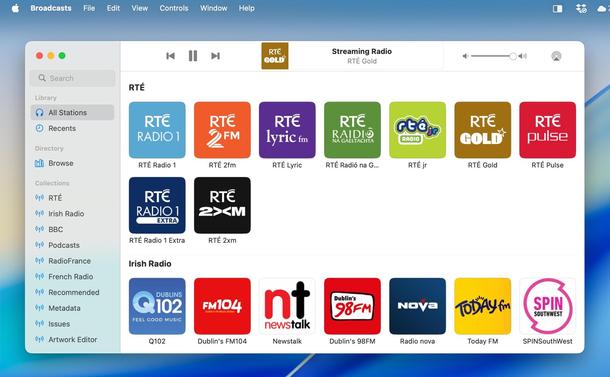
"Why doesn't the last-played station automatically pre-load at launch?"
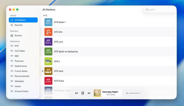
Good question. So now it does. Same amount of clicks, but no need to scroll
You ever come across a one-line-of-code change and wonder 'how the heck did I not know this?'
Today's example: setting .accessibilityTraits = .header on your collection view section headers.
Now you can navigate blisteringly fast between them with VoiceOver, like I've enabled in Broadcasts
@stroughtonsmith The fade version is so more more parseable and readable and less cluttered and distracting.
TBH I think liquid glass is a pure regression, Apple’s own-goal of shiny form-way-too-far-over-function in pursuit of ill conceived, retconned goals (“focus on content”, lol). Gotta spend every last extra transistor in that Apple Silicon! But this is the least bad version of it I’ve seen that still basically honors it. Mostly because it reduces it.

@stroughtonsmith I really don't like it to be honest...
I mean - the tricks. Having to "fix" system components and standard behaviors seems like some total failure from the Apple design team 🙄 - but indeed your version seems to be more legible (I’m not sure if I like it much though, except the more blur underneath)
Personally - I wouldn't bother, we're still in beta, They can also modify and fix it anytime, or in early updates after the release.
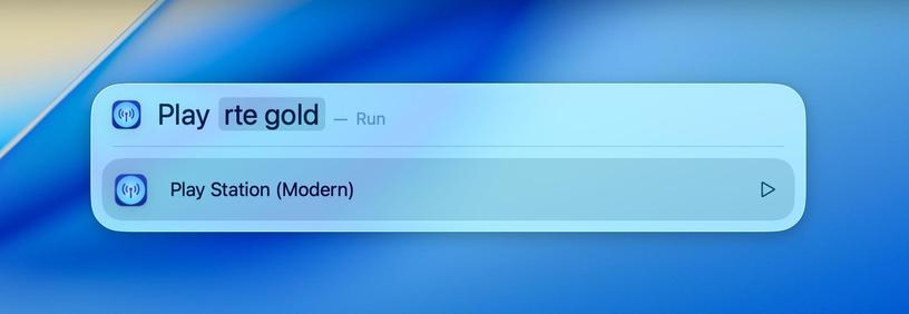
@stroughtonsmith Not to barge in here at the list minute asking for features a month before the OS launch...but... Any plans to increase Shortcuts or osascript support? I'd love to be able to control via a script (triggered by an external keypad). Play URL, pause, resume, select audio destination...
I currently use Music.app for this, but for some reason as soon as I connect it to Homepods, the current track/artist info is lost.
@stroughtonsmith I played with that a few months back and I'm not sure I could... Though maybe I could pick a favorited stream by index? Might've been the audio output switching that blocked me going forward.
I'll give it another look. :) Thanks for the response!
@stroughtonsmith by old layout do you mean frame-based?
In the AI age, I find myself reaching more and more for frame-based UIKit layouts; AI is really good at writing it. I find that it is much better at that than it is at Auto Layout, and certainly much better at that than it is at SwiftUI.
I think it’s because there’s so little implicit in frame-based layouts—it can kinda see everything.