Yuto

@yidev
30 Followers
112 Following
206 Posts
iOS Developer
Bookmarks, Paint, Simple Notes., and etc
homepagehttps://yidev.app
App Storehttps://apps.apple.com/developer/id1584545568
Bookmarks(App)https://indieapps.space/@Bookmarks

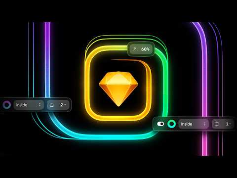
Our first major update of 2026 — Dublin — is out of beta!

This release includes plenty of things you’ve asked us for; selection colors, independent borders, corner smoothing controls, and an all-new eyedropper with Color Variable support. Plus 150+ improvements and fixes.

https://youtu.be/BcECFIQhuZE

New in Sketch: Selection colors, better corners, independent corners, and so much more

YouTube
Looks like Apple broke #CloudKit sync in OS 26.4. Remote notifications don’t seem to arrive, so no updates unless the app is relaunched. https://developer.apple.com/forums/thread/820550
iCloud Sync not working with iPhon… | Apple Developer Forums

RE: https://mastodon.social/@yidev/114459789093494157

Portals is now available on the App Store!
Version 1.1 adds calendar integration, set default app, and more
https://apps.apple.com/app/id6748067201

Incredible news: Skip is now free and open-source for everyone!

Create fully native x-platform apps in Swift and #SwiftUI, with deep Android and #JetpackCompose integration, powered by the Swift Android SDK

Read more and learn how to contribute:
https://skip.dev/blog/skip-is-free/

If you put the Apple icons in reverse it looks like the portfolio of someone getting really really good at icon design

love these icons! what a clever way to draw symbols for:

- TV with antenna
- plate
- shortcuts with line
- tilted TV
- weird clock
- rectangles
- stuff
- McDonalds
- panorama
- street sign under snow

It seems like these new icons were designed so that they could form a rainbow marketing image rather than as actual usable, beautiful icons for your dock. Each one has almost entirely lost its identity. Some make no sense at all. These are the first Liquid Glass era designs that I truly dislike.
Using similar design language with Liquid Glass for iWork, pro apps and Pixelmator look unified and nice
but Pro apps icon are big downgrade from the big sur era, which utilized their physical counterparts and was easily recognizable
Pixelmator is just bad
New blog post! A close look at Tahoe menu icons. With 109 illustrations! https://tonsky.me/blog/tahoe-icons/
It’s hard to justify Tahoe icons

Looking at the first principles of icon design—and how Apple failed to apply all of them in macOS Tahoe

tonsky.me

Bookmarks 4 is now available!
Home tab, pinning, AI suggestions, new customization, and more.

Download from the link below:
https://apps.apple.com/app/id1590304377?eventid=6752505820