With all the buzz about Final Cut, it sure would have been a good time for me to have had my clapperboard app ready to go, huh? 😒
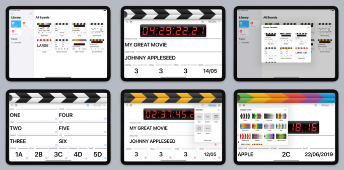
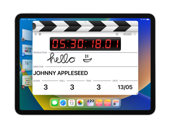
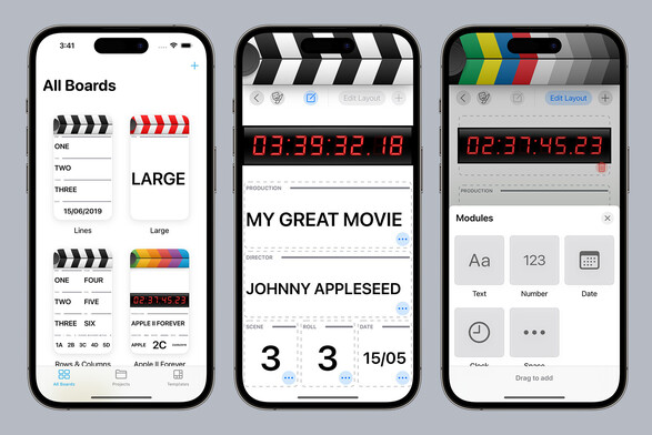
If I'm to cut features to get to a ship target, it’ll primarily be by not including iPhone & Mac support at launch. Even so, I'll be progressing all three platforms at the same time as I go, as iPad still needs multiple resizable windows and compact/regular size class switching.
No platforms means I don't have to have a sync strategy out of the gate, too… 👀


@stroughtonsmith @takeoneapp Looks really cool. Wish I had a use case for it 😅
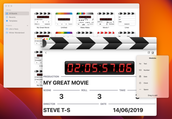
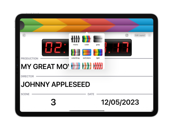
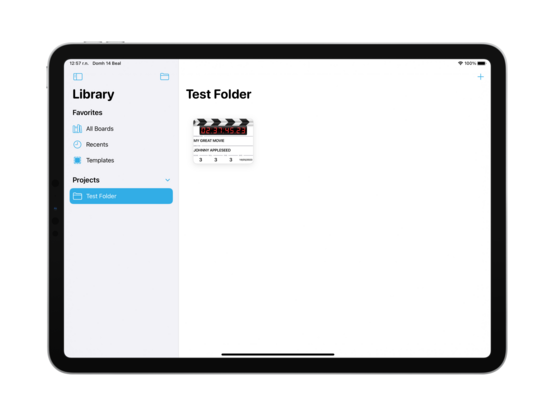
Small remark: the color of New Collection is different from the tintColor.
@stroughtonsmith I want to love Freeform but something about it just doesn’t work for me quite yet. If they can pull in more of the FigJam tools and ease of use I think I’d use it much more.
Would also love for them to add more easy text formatting tools/UI like they’ve done with Notes over the years. It feels hard to format things.
@stroughtonsmith 100%
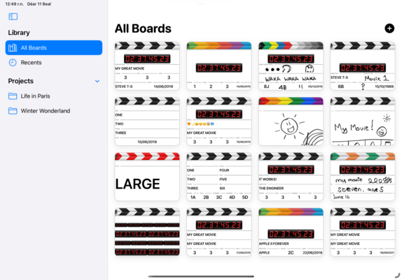
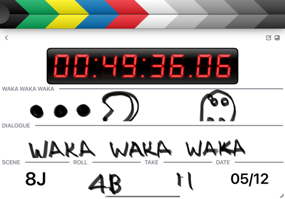
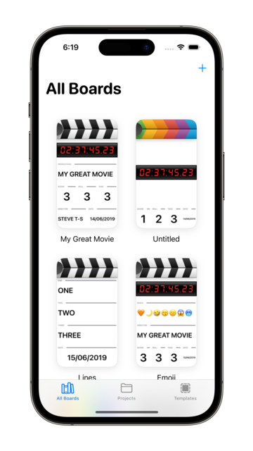
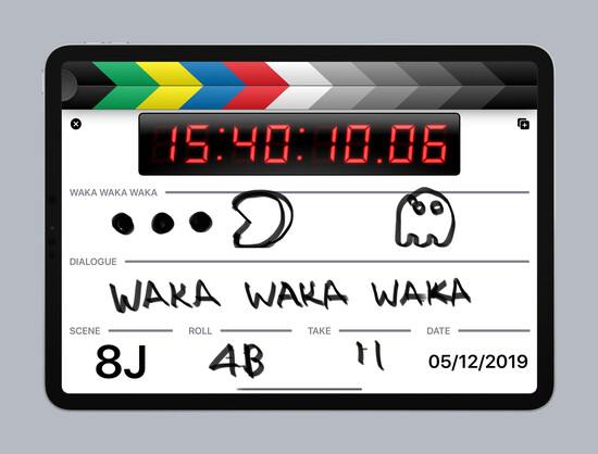
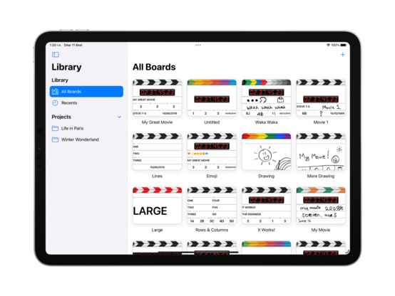
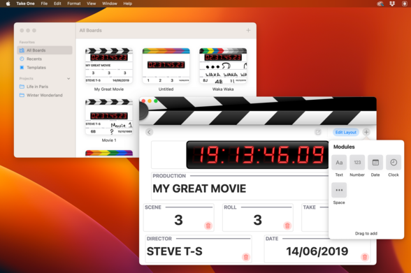
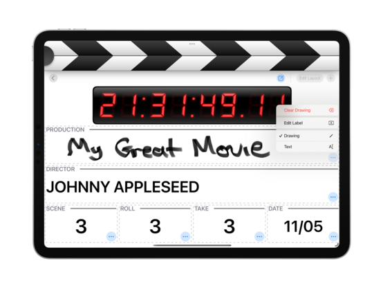
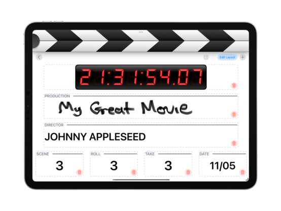
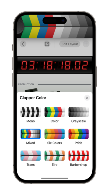
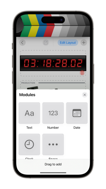
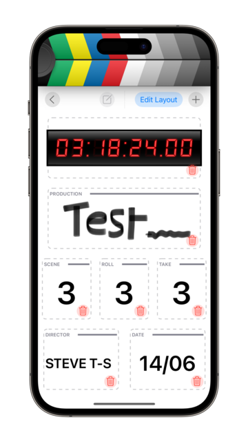
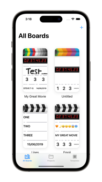
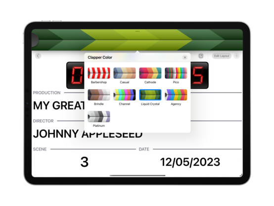
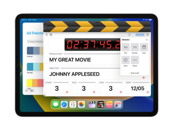
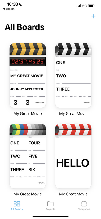
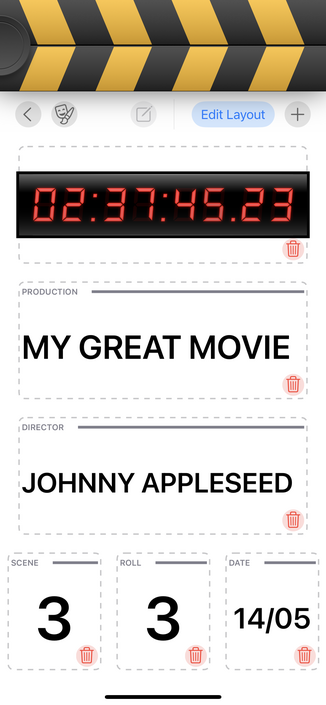
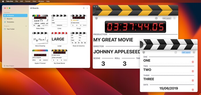
I dunno who’s using a windowed clapper
@stroughtonsmith 100%
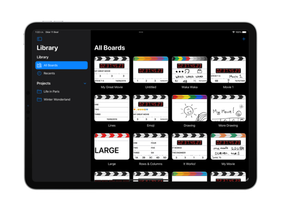
I dunno who’s using a windowed clapper