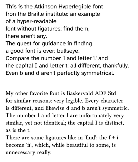
This is fascinating! The Braille Institute has developed a font - free to download - that's designed to be clearer for readers with lower vision.

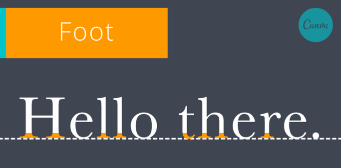
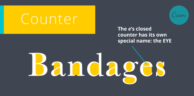
An example of one of the aspects of low legibility that they tackled attached.

It's named Atkinson Hyperlegible. Atkinson was the Institute's founder - https://en.wikipedia.org/wiki/J._Robert_Atkinson

Here's where you can read about the font and download it: https://brailleinstitute.org/freefont

#Accessibility

Via @tombofnull

J. Robert Atkinson - Wikipedia

@hildabast @tombofnull I wonder how this compares with fonts meant to be more legible for dyslexics. Better, worse, the same efficacy?

@DD @hildabast @tombofnull I've noticed there aren't symmetrical letters, but the weights of a character's trace aren't differentiated quite as heavily as in fonts to facilitate reading for dyslexics.

An example, comparing #AtkinsonHyperlegible with #BaskervaldADFStd fonts:

@albertcardona @DD @hildabast @tombofnull There's no peer reviewed evidence that the font characteristics of open dyslexic help fluent adult dyslexic readers and the evidence for dyslexic pre-reading kids shows no effect except perhaps a small one for learning letter shapes.

(Anecdotally, some dyslexic folks do prefer it.)

I think Atkinson Hyperlegible is a much better choice as it likely helps a much wider group of people.

@agvbergin @albertcardona @DD @hildabast @tombofnull Ann Bergin has said what I wanted to about the dyslexie fonts. John Richardson OU academic wrote a whole open access book on text readability and fonts https://link.springer.com/book/10.1007/978-3-030-90984-0

And agree Atkinson Hyperlegible doesn't make it harder for most people to read, whereas dyslexie and clones can (me for example).

The Legibility of Serif and Sans Serif Typefaces

This book provides a detailed and up-to-date account of the relevant literature on the legibility of different kinds of typefaces.

SpringerLink
@NatalyaD I didn't know about this book, I'm very excited to read it.

@agvbergin I came across it cos a friend of mine used to work with the author, who apparently died last year or something. I've read some of it, very interesting, very little about font-face and readability in the huge literature review. It's as much about size and things like line spacing.

I still think users should be able to fully reformat all text as they need as much as possible. EPUB is my friend.

@NatalyaD @agvbergin @DD @hildabast @tombofnull

Thank you! Remarkably, this book on the legibility of fonts is open access and freely downloadable as an EPUB or PDF:

"The Legibility of Serif and Sans Serif Typefaces - Reading from Paper and Reading from Screens" by John T. E. Richardson

#fonts #design #openaccess #reading

https://link.springer.com/book/10.1007/978-3-030-90984-0

The Legibility of Serif and Sans Serif Typefaces

This book provides a detailed and up-to-date account of the relevant literature on the legibility of different kinds of typefaces.

SpringerLink
@albertcardona @DD @hildabast @tombofnull Thanks for the serif font recommendation, although I can definitely see that Atkinson Hyperlegible works better.

@albertcardona @DD @hildabast @tombofnull

Even the zero is differentiated from capital O - beautiful.

@DD @hildabast @tombofnull I'm trying to come up with a design for a dyslexic Arabic font and I'm disheartened with the progress so far, and how regular fonts can do the same job with some adjustments.

The design goals for the common dyslexic-friendly fonts are to differentiate similar characters (like bdpq) as much as possible and with extra thickness for the baseline (feets) and wider openings (counters).

But extra letter spacing (tracking) and line spacing (leading) is more effective.

@DD @hildabast @tombofnull

The second solution can be applied for more fonts, alongside high contrast solution and bigger text size. People affected with dyslexia can read serif fonts just as well as sans serif. It's a field that desperately needs more serious research: if there were general design practices that favor dyslexic readers that would provide them with far more options than what's currently suggested.

@DD @hildabast @tombofnull

This solution for lower vision diverges in many ways from commonly cited dyslexic fonts (but those are not necessarily what dyslexic people prefer) and embraces serifs for capital i, exaggerated asymmetric shapes yet they still feel familiar (the function is not just "serious", but also "recognizable"), differentiates commonly confused pairs too and can be tested with a gaussian blur filter (although words would blend with low tracking)...

I think it's better.

@DD @hildabast @tombofnull I have Irlen syndrome and possibly also Dyslexia. I had same question as you so just added this font to my kindle and so far Iโ€™m reading even faster than with OpenDyslexic. May be placebo effect but letโ€™s see in time :)
@hildabast @tombofnull Last year, the company I was at made this their default font for all internal docs. It really made a difference.
@hildabast @tombofnull Do you think we could convince our optometrists to use it on their damn eye charts?
@hildabast @tombofnull Also: really need a monospace version for us aging coders
@mjgardner @hildabast @tombofnull I've found that JetBrains Mono (which is FOSS) has similar shapes and considerations. However, it wasn't explicitly built with people with vision difficulties or impairments in mind. It's a suggestion but I don't know if it will fit your needs.
@terminallytrisk @mjgardner @hildabast @tombofnull
JetBrains Mono is very legible for writing code. It even has ligatures for people who prefer seeing ligature-symbols (e.g., "โ‰ " instead of "!=")
GitHub - dtinth/comic-mono-font: A legible monospace font... the very typeface youโ€™ve been trained to recognize since childhood

A legible monospace font... the very typeface youโ€™ve been trained to recognize since childhood - dtinth/comic-mono-font

GitHub
@hildabast @tombofnull A fascinating side effect of this work is possibly a font that also solves one of social media's bigger headaches, which is look-alike spoof accounts. These accounts take advantage of the similarity in lower and upper case letters like l and I to create an account that pretends to be another at first glance. A font that emphasizes legibility for low vision readers seems like an interesting and simple solution to this problem as well.

@hildabast @tombofnull

I shared thus on Facn and got thanks from a IRL Friend who I never knew is legally blind.

So I am.passung her gratitude back to you .

@hildabast @tombofnull Here is a video from one of the designers about the process! Definitely worth a watch:
youtu.be/wjE5eHLICzc
Hyperlegible: an approach to accessible type design

YouTube
@hildabast @tombofnull This would make it harder for jerks to spoof people's handles too
@hildabast I'm quite heavily myopic, and this was the easiest I ever had to read something without my glasses, so it seems like it really works @tombofnull

@hildabast @tombofnull @ShaulaEvans

This font will be excellent for representing passwords clearly! The amount of time Iโ€™ve lost deciphering passwords from screenshotsโ€ฆ

@MadSci @hildabast @tombofnull @ShaulaEvans yes! For passwords it'd be brilliant ๐Ÿ‘
@hildabast @tombofnull My eldest daughter is Low Vision. Iโ€™ve sent her the link. Thank you.
@hildabast @tombofnull I misunderstood the post and thought the blurred version was the font. Strangely with my myopia and astigmatism the blurred font is more legible! I wonder why that is?

@hildabast @tombofnull

I'm looking forward to giving it a trial in our web apps for social workers.

btw. for selfhosted webfont there is a npm package at https://www.npmjs.com/package/@fontsource/atkinson-hyperlegible

@fontsource/atkinson-hyperlegible

Self-host the Atkinson Hyperlegible font in a neatly bundled NPM package.. Latest version: 4.5.11, last published: 5 days ago. Start using @fontsource/atkinson-hyperlegible in your project by running `npm i @fontsource/atkinson-hyperlegible`. There is 1 other project in the npm registry using @fontsource/atkinson-hyperlegible.

npm
@hildabast @tombofnull this is a super pleasant font, both professional and very comfortable on the eyes. I wonder who we need to talk with to ask for a fixed width variant

@hildabast @tombofnull There is also a font designed to be clearer to read for people with dislexia:

https://www.dyslexiefont.com/en/typeface/

Dyslexie Font - Better reading for everybody

A unique typeface that prevents 3D movements and innovative tools to read, learn and work with more ease โ€“ anytime and anywhere. Want to try Dyslexie Font

@jimmygolitely there's also #OpenDyslexic: https://opendyslexic.org/ which doesn't come with a price tag.
@hildabast @tombofnull
OpenDyslexic

OpenDyslexic is a typeface designed against some common symptoms of dyslexia.

@hildabast @tombofnull AFAICT, this is not the first such font, see https://www.fontspace.com/tiresias-infofont-font-f44542 thet exists since at least 2012 (the Finnish public TV has been using it for subtitles since then).
Tiresias Infofont Font | The Royal National Institute for the Blind | FontSpace

Free download of Tiresias Infofont Font Family with 6 styles. Released in 2000 by The Royal National Institute for the Blind and licensed for personal and commercial-use. Click now to create a custom image with your own words that you can download.

fontspace
@hildabast @tombofnull
@annso just posted a link to a very nice video about that font: https://www.youtube.com/watch?v=wjE5eHLICzc
Hyperlegible: an approach to accessible type design

YouTube

@hildabast @tombofnull

Die Schrift ist grossartig, ein echter Lesebeschleuniger!
๐Ÿ‘

@hildabast @tombofnull time to integrate with #LaTeX๐Ÿ˜Š

@hildabast @tombofnull @phessler

The font is available on #FreeBSD

https://www.freshports.org/x11-fonts/atkinson-hyperlegible/

Such a resource is a true gift to the world.

FreshPorts -- x11-fonts/atkinson-hyperlegible: Braille Institute font for low vision readers

Atkinson Hyperlegible font is named after Braille Institute founder, J. Robert Atkinson. What makes it different from traditional typography design is that it focuses on letterform distinction to increase character recognition, ultimately improving readability.

@hildabast I love this font ๐Ÿ˜ Been using it for a bit on my blog and I think it looks great too.
@hildabast @tombofnull even though I have the privilege of being able to read 11pt fonts at arm's length, the clear distinctions shown in examples like B8 and 1IiL examples are things I wish all fonts were required to do. Especially fonts used for phones and computers; any time you need to read filenames, urls, wifi card numbers, code, etc, etc, those distinctions are extremely important.
@hildabast @tombofnull oooh, love a new font that focus on legibility. A monospaced version for code would be even more awesome!
@hildabast Thanks for sharing, this is sick!
@hildabast @tombofnull ๐Ÿ˜ฎ ๐Ÿ˜ฎ๐Ÿ˜ฎ
@hildabast that's amazing! it took me a while to realize that, obviously, they're using it on their website. It looks great in all sizes.
@hildabast @tombofnull I recently convinced my Feminist Theory group to write all of our documents in Atkinson Hyperlegible. It looks great even if you're not hard of sight.
@hildabast @tombofnull This would definitely have been helpful to me before I got one of my cataracts fixed. I'm sure it'll be helpful to lots of people with low vision.

@hildabast @tombofnull

All I need to know is that it has the proper zero.

@hildabast @tombofnull I didn't even realize at first their entire website seems to be using it. It's not just useful, it's actually a pretty nice looking font as well

@hildabast @tombofnull

People need to know how to set this as a default font for web content on their devices...

@hildabast oh, lovely! i'm not really low-vision but i do have astigmatism that sometimes makes it hard to read text at certain sizes, looks like it should be helpful!
it's also just... very pretty 
@hildabast @tombofnull
Pretty and usefull to all.
#mastodon #instances #admin, #dev and apps like @Tusky might use it by default as it seems to be licensed under the SIL Open Font License
@hildabast @tombofnull hmmm... Was going to check it out, but the license won't display on my phone (latest Android). It just gets a pop-up animation then nothing.