A Fractal Glass Lines Text Effect Mockup for Adobe Photoshop That Redefines Visual Depth
Typography moves fast. What felt experimental two seasons ago is already everywhere — on album covers, editorial spreads, social campaigns, and brand identities competing for the same ten seconds of attention. So when a tool arrives that genuinely shifts what’s possible, it’s worth stopping and paying attention. The fractal glass lines text effect mockup by Pixelbuddha Studio for Adobe Photoshop is one of those tools. It doesn’t just add a style. It introduces a visual logic that feels both mathematically precise and emotionally charged at the same time.
Furthermore, the timing is right. Designers across disciplines are actively moving away from clean, sterile minimalism toward effects that feel physical, optical, and textured. Glass morphism opened that door. Fractal geometry has kept it open. This mockup sits exactly at that intersection — and it does it with a resolution and build quality that makes professional use not just possible, but immediate.
Download the template from Adobe Stock Please note that this mockup requires Adobe Photoshop. The latest version can be downloaded from the Adobe Creative Cloud website; visit this link.
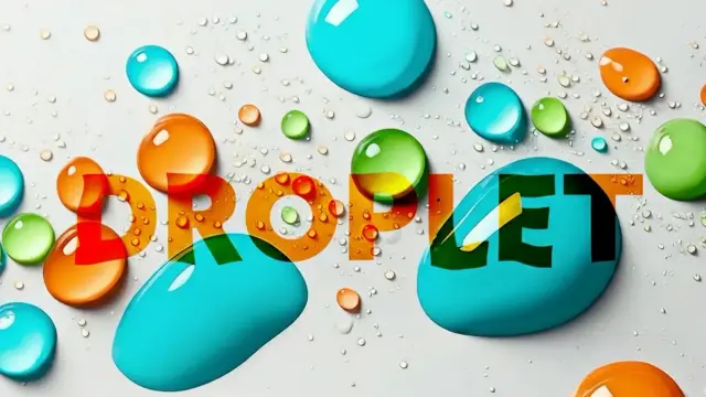
Fractal Glass Lines Text Effect Mockup by Pixelbuddha Studio for Adobe Photoshop.
Download the template from Adobe Stock What Exactly Is a Fractal Glass Lines Text Effect in Photoshop?
Before anything else, let’s be precise about what this effect actually is. The term “glass lines” refers to a visual simulation of light refracting through parallel vertical glass strips, like looking at a surface through corrugated or ribbed glass panels. Each strip bends, displaces, and color-shifts the letterform behind it in a slightly different way. The result is a stacked, prismatic fragmentation of the original type.
The word “fractal” here describes the self-similar quality of the distortion. Zoom into any section of the effect, and the structural rhythm of vertical bands repeating with subtle variance holds true at every scale. That’s a fractal principle — recursive visual structure — applied to a typographic context. Specifically, this creates what I call the Prismatic Repetition Effect: a pattern where optical complexity is generated through the disciplined multiplication of a simple visual unit.
Additionally, the chromatic layering in this mockup isn’t arbitrary. The warm-to-cool gradient (amber through aqua) isn’t just decorative. It functions as a visual depth cue, making the glass panels appear to recede in space. Consequently, the typography gains a three-dimensional quality without any actual 3D rendering involved. That’s a significant design achievement — and it’s all contained in a single Photoshop mockup file.
Why This Fractal Glass Lines Photoshop Mockup Stands Apart
There are plenty of text effect mockups available. Most of them follow a predictable formula: apply a layer style, change the color, export. They’re serviceable but forgettable. The fractal glass lines text effect mockup by Pixelbuddha Studio operates on a different level entirely.
The Resolution Argument
At 4500 × 3000 pixels, this mockup is built for professional output. That matters more than people typically acknowledge. A mockup that degrades at larger sizes forces compromises in print work, large-format campaigns, and high-resolution digital displays. Here, every band, every refraction arc, every chromatic gradient holds sharp at full resolution. So you’re not choosing between quality and speed — you get both.
The Spectral Shift Framework
Let me introduce a concept I’ve developed for analyzing this category of effects: the Spectral Shift Framework. It evaluates glass-based text effects across three axes — Optical Fidelity, Chromatic Coherence, and Typographic Integrity.
Optical Fidelity measures how convincingly the effect simulates actual light behavior. Does the refraction look physically plausible? Chromatic Coherence asks whether the color transitions support or undermine the visual logic of the effect. Typographic Integrity examines whether the base letterform remains readable and intentional beneath the effect, or disappears into noise.
Moreover, this mockup scores high across all three axes. The vertical band displacement is consistent enough to read as real optics. The warm-to-cool spectral transition is cohesive, not chaotic. And the underlying bold type remains structurally present even at high distortion levels. That’s a balanced, professional result.
How to Use the Fractal Glass Lines Text Effect Mockup in Seconds
One of the most underappreciated qualities of a well-built Photoshop mockup is its speed. The fractal glass lines text effect mockup from Pixelbuddha Studio uses Photoshop’s Smart Object system, which means the entire workflow is essentially three steps.
First, open the file in Adobe Photoshop. Second, locate the Smart Object layer and double-click it. Third, replace the placeholder text or artwork with your own, save, and close the Smart Object. Photoshop applies the full fractal glass lines effect to your content automatically. Therefore, you’re looking at a turnaround of under two minutes from open to final render — even for complex typographic compositions.
Which Projects Benefit Most?
The fractal glass lines Photoshop mockup performs best in contexts where visual drama is intentional and expected. Think music festival branding, nightlife event posters, fashion editorial headlines, tech product launch graphics, and motion-influenced still imagery. It also works well in digital contexts — social media headers, YouTube thumbnails, and promotional banners where the effect needs to stop the scroll.
However, it’s worth thinking critically about where it doesn’t belong. For body copy, small-scale logotypes, or contexts requiring maximum legibility at small sizes, a high-distortion glass effect can work against readability. Use it where size and context allow the effect to breathe.
The Visual Language of Refraction & Why Glass Effects Are Dominating Design Right Now
Glass as a design metaphor has had a long run — and it’s not done yet. The shift from flat design toward textural, optical effects reflects a broader cultural appetite for visual depth. Screens are sharper than they’ve ever been. Designers are using that resolution to simulate materiality, physics, and light in ways that were technically impractical just a few years ago.
Furthermore, the fractal glass lines text effect taps into something psychologically resonant. Refraction implies hidden depth — the idea that there’s more behind what you see. That’s compelling in branding and editorial contexts alike. It creates what I call Implied Dimensionality: the perception of spatial depth in a flat medium, achieved through optical simulation rather than geometric 3D.
The Chromatic Gradient as a Design Signal
The specific color palette in this mockup — transitioning from deep amber and orange through rich teal and aqua — carries its own cultural weight. These are the colors of heated metal, spectroscopic light, and cinematic anamorphic lens flares. They signal intensity, precision, and a slightly retro-futurist aesthetic that resonates with audiences who grew up watching sci-fi cinema and now consume design-forward brand content daily.
Additionally, this color range avoids the oversaturation problem that plagues many gradient-heavy effects. The transition is controlled and purposeful. Consequently, the visual result reads as sophisticated rather than garish — an important distinction when you’re using the effect in client-facing or brand-critical work.
Pixelbuddha Studio and the Standard of Adobe Stock Mockup Design
Pixelbuddha Studio has built a reputation as one of the most technically consistent contributors to the Adobe Stock ecosystem. Their work tends to prioritize resolution, flexibility, and real-world usability over flashy preview images that don’t translate to actual production. The fractal glass lines text effect mockup reflects that philosophy clearly.
The mockup is available through Adobe Stock, which means it integrates directly with the Creative Cloud ecosystem. If you’re already an Adobe subscriber, your licensing workflow is minimal. The file drops into your Photoshop workspace and behaves exactly as expected. That frictionless integration is increasingly valuable when project timelines are tight and asset sourcing needs to be fast.
What the Smart Object Architecture Tells You
A mockup’s internal architecture reveals a lot about how its creator thinks. A well-constructed Smart Object layer suggests that the designer considered how others would actually use the file — not just how it would look in a preview screenshot. The fractal glass lines mockup uses a clean Smart Object structure, which means your content gets the full effect treatment without requiring any manual layer management. That’s professional-grade file architecture.
The Refractive Typography Spectrum: A Framework for Classifying Glass Text Effects
Not all glass text effects are the same. I’ve developed what I call the Refractive Typography Spectrum to categorize this growing genre of Photoshop effects by their distortion intensity and chromatic behavior.
At one end sits Minimal Refraction — subtle glass panel displacement, near-neutral color, high legibility. In the middle is Structured Prismatic — rhythmic banding, moderate chromatic shift, balanced drama. At the far end is Full Spectral Fractal — high displacement, strong chromatic gradients, complex optical behavior that prioritizes visual impact over immediate readability.
This mockup lands confidently in the Structured Prismatic to Full Spectral zone. It’s dramatic but not illegible. The typographic structure underneath remains navigable even as the effect asserts itself strongly. That balance is precisely what makes it useful across such a wide range of projects.
Practical Tips for Getting the Most Out of This Fractal Glass Text Mockup
Working with a high-impact effect like this requires some intentional decisions on the typography and composition side. Here are the considerations that matter most.
Choose Your Typeface Carefully
Bold, high-contrast sans serifs and wide display typefaces tend to perform best with the fractal glass lines text effect. The vertical banding interacts most dramatically with wide letterforms — the horizontal mass of a bold character gives the refraction pattern more surface area to articulate. Think extended grotesques, display slabs, and condensed display typefaces with generous stroke weight.
Conversely, thin serifs and script faces can lose structural coherence at high distortion levels. Furthermore, tight letter-spacing can cause adjacent characters to visually merge under the glass displacement. So give your text room to breathe — generous tracking helps the individual characters remain distinct.
Background Context Matters
The mockup’s default dark background serves the chromatic gradient particularly well. The amber-to-aqua spectrum reads most vividly against deep neutral backgrounds. Additionally, light backgrounds tend to compress the perceived contrast of the glass effect, reducing its visual impact. If your project requires a light background, consider testing with increased effect contrast or pairing the text with a dark panel or overlay behind it.
Scale for Maximum Impact
Because the fractal glass lines effect depends on fine detail — the tight vertical bands and subtle chromatic shifts — it benefits significantly from large display sizes. Use it at headline scale. Let it fill the frame. This is not a body-text treatment; it’s a display effect designed to command attention at scale.
Long-Tail Use Cases & Where This Mockup Creates Real Commercial Value
Beyond the obvious poster and editorial applications, this mockup has concrete commercial value in several specific contexts that don’t always get mentioned in standard product descriptions.
Music producers creating album artwork need effects that feel sonically charged — textural, intense, and technically sophisticated. The fractal glass lines effect delivers all three qualities and exports cleanly at the resolution needed for streaming platform artwork. Additionally, game studios building promotional materials for titles in the sci-fi, cyberpunk, or action genres will find the effect’s visual language directly compatible with genre expectations.
Fashion brands — particularly those operating in the premium streetwear or avant-garde luxury space — are actively using typographic effects like this in seasonal campaign imagery. The effect’s combination of precision and optical complexity fits the visual vocabulary of high-end fashion photography very naturally. Moreover, motion designers who use still mockups as reference frames for animated sequences will find this mockup’s frame-by-frame visual logic easy to translate into After Effects or similar tools.
Is This the Future of Photoshop Text Effects?
Honest answer: probably not the future in isolation. But it’s a clear indicator of the direction. The design industry’s shift toward simulation — optical physics, material behavior, light interaction — is accelerating. As display resolutions increase and AI-assisted tools make complex effects more accessible, the bar for what constitutes a visually interesting text treatment rises with them.
Effects like the fractal glass lines text effect are valuable precisely because they sit at a sophistication level that automated tools haven’t fully replicated. There’s a specific aesthetic judgment involved in constructing this kind of refraction pattern — in choosing the band width, the chromatic range, the displacement intensity — that currently requires human creative decisions. Therefore, mockups like this one occupy a durable creative space.
My prediction: within three years, glass and refraction effects will be as standard in professional design toolkits as gradient overlays and drop shadows are today. The designers who get fluent with high-quality tools in this category now will be ahead of that curve.
The Legibility Paradox in High-Distortion Typography
There’s an interesting tension at the heart of effects like this one. The stronger the distortion, the more visually compelling the result — and simultaneously, the harder the text becomes to read at a glance. This is what I call the Legibility Paradox of Refractive Typography.
However, that paradox is only a problem if legibility is the primary goal. In many high-impact design contexts, the primary goal is emotional impact — and legibility operates as a secondary concern, handled by context, hierarchy, or supporting copy. A festival poster headline doesn’t need to be decoded in a millisecond. It needs to create a feeling first, and deliver its message second.
Furthermore, the fractal glass lines effect doesn’t actually destroy letterform recognition — it displaces it. The letter shapes are still present, still readable with a moment’s attention. That’s the difference between a sophisticated optical effect and visual noise.
Fractal Glass Lines Text Effects vs. Other Popular Photoshop Text Treatments
How does this effect compare to other current Photoshop text treatments? A direct comparison helps clarify where it earns its place.
Glitch text effects share some visual DNA — both involve displacement and chromatic aberration. But glitch effects tend to feel chaotic and gestural, whereas the fractal glass lines effect is rhythmically controlled and optically precise. Neon glow effects create luminosity but lack the material depth of glass refraction. Chrome effects simulate metallic surfaces but typically produce a harder, colder visual quality than the warm prismatic character of this mockup.
Additionally, holographic effects come closest as a category comparison — both simulate light interference and produce spectral color ranges. But holographic effects typically simulate surface iridescence rather than volumetric refraction. The fractal glass lines effect implies depth and physical thickness, which gives it a more substantial visual presence.
Final Thoughts: When an Effect Is More Than an Effect
What makes the fractal glass lines text effect mockup from Pixelbuddha Studio genuinely interesting isn’t just the visual output — though the visual output is excellent. It’s that the effect carries a coherent visual philosophy. Vertical rhythm. Spectral logic. Physical plausibility within an obviously constructed frame. Those qualities don’t happen by accident.
Good mockup design is a kind of editorial decision — a statement about what visual ideas are worth making accessible. This one makes a clear argument: that optical complexity, executed with discipline, can add genuine meaning to typographic work. I think that argument is right. And at 4500 × 3000 pixels, fully Photoshop-native, it makes the case convincingly.
Download the template from Adobe Stock Use it for the right projects. Give it the right typefaces. Let it fill the frame. The effect will do the rest.
Frequently Asked Questions About the Fractal Glass Lines Text Effect Mockup
What is the fractal glass lines text effect?
The fractal glass lines text effect is a Photoshop-based visual treatment that simulates the appearance of typography viewed through parallel ribbed or corrugated glass panels. Vertical bands of glass displace and color-shift the letterforms, creating a prismatic, refractive visual effect. The “fractal” quality refers to the self-similar repetition of the banding pattern across the composition.
Who created this fractal glass lines Photoshop mockup?
Pixelbuddha Studio created this mockup and published it through Adobe Stock. Pixelbuddha Studio is a recognized Adobe Stock contributor known for high-resolution, professionally structured Photoshop mockup files.
What resolution is the fractal glass lines text effect mockup?
The mockup is 4500 × 3000 pixels, making it suitable for high-resolution print output, large-format digital displays, and professional commercial use.
Do I need advanced Photoshop skills to use this mockup?
No. The mockup uses Adobe Photoshop’s Smart Object system, which makes the application process straightforward. You open the Smart Object, place your own text or artwork, save, and Photoshop applies the fractal glass lines effect automatically.
What typefaces work best with the fractal glass lines text effect?
Bold sans-serif display typefaces and wide, high-weight fonts perform best. Wide letterforms give the vertical banding pattern more surface area to articulate, resulting in more impactful visual output. Thin serifs and narrow scripts tend to lose structural definition at high distortion levels.
Where can I buy or license the fractal glass lines Photoshop mockup?
The mockup is available through Adobe Stock. If you have an Adobe Creative Cloud subscription that includes Stock, you may be able to access it through your plan. Standard and extended licenses are available for commercial use.
Is the fractal glass lines text effect suitable for print projects?
Yes. At 4500 × 3000 pixels, the file resolves cleanly at print scale for standard poster, editorial, and packaging dimensions. Always verify your specific output DPI requirements before final production.
Can I use this effect for commercial client work?
Yes, under an appropriate Adobe Stock commercial license. Review the licensing terms for your specific use case, particularly for high-volume print runs or product packaging, which may require an extended license.
How does this mockup differ from a glitch text effect?
Glitch text effects simulate digital signal errors — they typically involve random, irregular displacement and chromatic aberration that mimics corrupted data. The fractal glass lines text effect, by contrast, simulates physical optical refraction — the displacement is rhythmic, consistent, and structurally coherent. The visual logic of glass optics is fundamentally different from the randomized chaos of digital glitch aesthetics.
What design projects benefit most from the fractal glass lines text effect mockup?
Music event posters, album artwork, fashion editorial headlines, tech product launch visuals, festival branding, social media headers, and motion design reference frames all benefit strongly from this effect. It performs best at large display scales where the fine detail of the refractive banding can be clearly seen.
Check out other professional graphic design templates here at WE AND THE COLOR.
#adobePhotoshop #AdobeStock #fractalGlass #glassLines #mockup #textEffect