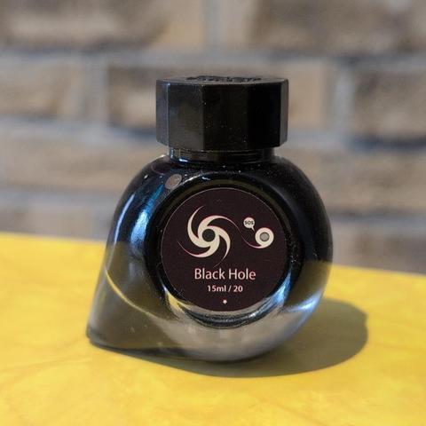
Swatch Wednesday: Colorverse Black Hole
This was a gift from a friend who said it was more for the fun little bottle than anything exciting about the ink. It’s a pretty cute little bottle and I didn’t have one since I think the only colorverse ink I have is a sample.
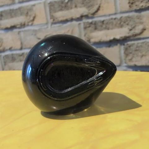
Colorverse Black Hole ink bottle, which has an unusual teardrop shaped base. This is the front view showing the bit sticking out on one side. The illustration has a stylized black hole and a little planet saying “SOS” on it.
Love that little picture on the front. The bottle has a teardrop shaped base which I guess makes it a bit less likely to tip over and mostly just makes it interesting.
Colorverse Black Hole ink bottle, which has an unusual teardrop shaped base. This is thebottom view showing the teardrop shape, though it sits nice and flat because of the flat label on the front.
Inside, the ink is as one expects, a pleasant black. There’s a tiny bit of sheen visible in the swatch on the right, and indeed I can see that in my writing occasionally if I look at it under a sufficiently bright light, but it’s more a cute coincidence than a regular feature of the ink on the paper I’m using. Might be fun to try it on the iroful paper to see if it happens more consistently there; my current notebook is a leuchtterm.
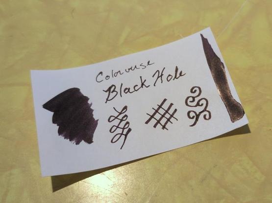
My swatch card for Colorverse Black Hole, a black ink with a tiny hint of sheen in the bigger swatches.
I’m not too worried about getting the sheen to show up more, though, since the only other black ink bottle I have is a black with sheen from Inkvent Black (uuuh, Good Tidings I think it was called?). I’m guessing that Black Hole dries quicker, though I didn’t actually test that. I did, however, have some fun painting with it in the margins of my journal.
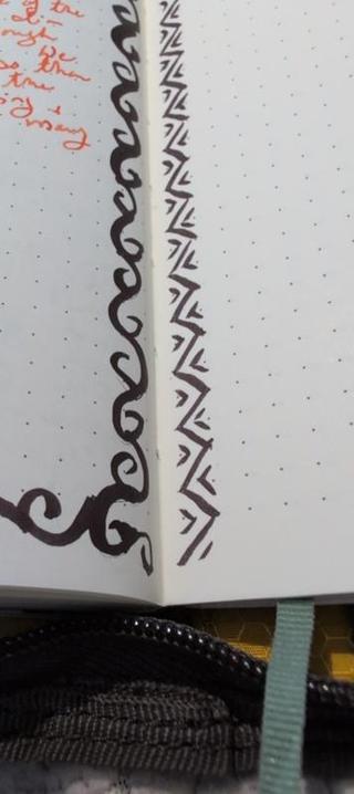
Some margin patterns in my notebook using Colorverse Black Hole ink on a paintbrush. One side has curly vine-like shapes, the other a geometric zig-zag with partial triangles.
Fun bottle and a nice practical ink. Overall a very nice present! And I think this is the last ink bottle or sample I had that I hadn’t swatched in my collection, so I’m all caught up and there’s no ink purchases on my horizon until the weather warms up, and maybe not even then — I’ve got so much to play with now!
#FountainPens #InkSwatch #stationery #SwatchWednesdaySwatching these Parker inks that @silhelm sent was tricky! They were in mini cartridges, so I had to pierce the cart, transfer the ink to an inkwell, and then use dip pens on the small amount of ink, which took lots of dips. It mostly worked, but I didn't dare swab them because that would have soaked up half the ink.
Pink is rather fluorescent as suspected, and Purple is a little, too. They had a surprising amount of sheen in the large swatches.
#SwatchWednesday
Pelikan Edelstein Rose Quartz
I quite like this color, it does really look like the gem it's trying to emulate. Very dusty pink with nice shading. I used this in this M600 IB for a few weeks and it was really effective as a heading ink. Probably not so much as a writing ink.
I like this color a lot. It doesn't have a lot of variation in the line but it is a nice solid color. From Noodler's, it is called Liberty's Elysium.
Quote from The Black Wolf by Louise Penny
"I know how power works, *merci*." ... "And I know what happens to trumped-up little people who abuse what power they have. How the need for more and more hollows them out, eats away at them. Until they appear human but have lost all humanity."
Slightly late #SwatchWednesday
Pelikan Edelstein Topaz
Got this at Pelikan Hub and proceeded to swatch it right there. I'm not so attracted to this sky blue color range (I don't really use kon-peki or ama-iro either) but the shading is nice and it's certainly a cheery ink. I've used a pretty wet nib here (a 14K OBB) so that bears out in the shading.
A nice dark grey from The Birmingham Pen Co.
The name of the ink is Megalodon.
I really like it. I am experimenting with a fine nib which I do not love. I look forward to trying this in a bigger nib size!
Contemplating this book still. I’m not ready to do this the way he suggests yet but I will be.
The quote is from Digital Minimalism by Cal Newport
"The underlying behaviors we hope to fix are ingrained in our culture, and, as I argued in the previous chapter, they’re backed by powerful psychological forces that empower our base instincts. To reestablish control, we need to move beyond tweaks and instead rebuild our relationship with technology from scratch, using our deeply held values as a foundation."
2025 Diamine Inkvent Teal – Day 21-25
At the time that I’m preparing this post (a week in advance), we’re still waiting on moving company nonsense, my internet keeps cutting out while I’m trying to do stuff, the furnace still doesn’t work, and the work training I took today got glitched somehow so I can’t finish it and I’m stuck re-listening to an hour of video. But hopefully by the time this posts, everything will be great and this frustrating day will be a distant memory. In the meantime, I have pretty inks and a nice crisp apple to eat.
A view of the “green” space by the power lines, with trees and ground covered in snow and with the sun breaking through the clouds near the horizon.Let’s talk inks:
A set of 5 ink swatches from the last of the Diamine Inkvent Teal calendar. Day 21: Chaos, deep burgundy with grene sheen. Day 22: Pineapple Spritz, two-toned yellow with yellow sparkles. Day 21: Let It Snow, bright light blue with blue shimmer. Day 24: Antler, light brown with a bit of a pink tone. Day 25: Myrrh the Merrier, rich medium blue with blue shimmer and red sheen.Showing 5 samples to finish out the calendar!
An ink swatch of Diamine Chaos, a dark burgundy ink with green sheen (although it looks more red and less purple in this image)Day 21: Chaos. Deep burgundy with green sheen. I think this ink is considerably more attractive than last year’s Sleigh Ride, so it might actually get used. Not in love with it, though.
A swatch of Diamine Pineapple Spritz showing the yellow shimmer in the yellow ink. It isn’t very legible, though.Day 22: Pineapple Spritz. Yellow with yellow iridescent sparkle. This ink is very pretty but only barely legible in my journal even with a dip pen so it may get relegated to decorative status because I doubt it’s going to be better in a regular pen. It’s really pretty with all that shimmer so I’ve got some hope that it might be fun for painting or filling in tracking squares or something.
A swatch of Diamine Let it Snow fountain pen ink. It’s bright blue with blue shimmer.Day 23: Let It Snow. Bright blue with blue iridescent shimmer. Absolutely the kind of fancy holiday ink that I wanted out of this calendar. Love it. Describing it makes it sound similar to Brrr! but it’s not a pigment ink so it should be a bit less of a hassle in a pen. And it is a very different bright blue instead of the more moody Brrr! blue.
Day 24: Antler. Light brown. Fairly similar to Smoky Tobacco from day 4 but with less yellow and more of a pink feel to the brown. Also, it doesn’t stink. Basically better in every way than Smoky Tobacco thanks to the lack of scent. I’ll use this one and possibly never open Smoky Tobacco again.
A swatch of Diamine Myrrh the Merrier fountain pen ink, a jewel toned blue with blue sparkle and red sheen.Day 25: Myrrh the Merrier. Blue with red sheen and blue sparkles. This is the 30ml bottle and it’s completely over the top holiday ink. I expected something more green-leaning for Inkvent Teal and this really reads as blue to me especially with the blue shimmer, so I would have swapped this with day 1’s Celestial Skies if I were Diamine. But it’s a really lovely ink and I’m excited to use it.
Overall: I had fun with this year’s calendar despite how busy my December was! Most of these inks are good additions to my collection: I’m glad to try some pigment inks, I’m excited about a lot of the colours, and there were only a few disappointments. If I’m honest with myself about what inks I reach for most, I’ve got to admit that I don’t really need more shimmer or sheening inks so maybe I shouldn’t get an inkvent calendar next year. If I’m talking purely about inks I use most, I should focus on getting a few more “standard” inks. But if I treat it as an experience, it’s definitely been fun! It expanded my ink collection in a few ways I might not have done otherwise: I was curious about pigment inks but hadn’t worked up the nerve to buy any and now they’re right there — I’m especially excited to try them in art. Some of this year’s colours wouldn’t have been on my radar if I was shopping but they’re going to work so well in my monthly palettes. So I’m absolutely not sad to have done it again this year, and I’m excited to play with these more in 2026!
#FountainPens #ink #review #SwatchWednesday
Moving continues, February 2026 life and ink
As of this writing (happening on Monday), I’ve gotten the paperwork done at customs and in theory we get the rest of our stuff tomorrow. We left Oregon on December 29th and had theoretically paid for the truck to get packed and our stuff delivered ASAP, and instead this is more like the time I moved the other way where, among other chaos, my work visa claimed that I was an 11 year old with a PhD and understandably that wasn’t going to fly at the border but without a valid work visa I couldn’t do import paperwork. Le sigh. So now we have a move that has been both extremely expensive, slow, and caused huge amounts of stress and labour that we didn’t expect. But it’s nearly done so I guess that’s something? I’m excited to finally set up my office maybe later this week, though!
Stickers
Using up some unfinished valentines sheets from last year!
Fountain Pens and Inks
Leaning into the new inks for this month: three from the Inkvent calendar I just opened and one new ink from Fountain Pen Day (November 2025). Celestial Skies is continuing from last month.
Commuter Stationary
The new part of this is the Kakuno — I was finding that I really missed swapping in colours day to day to make it really obvious where yesterdays’ stuff started. I’d bought the Kakuno to be my purse pen (cheap, light, easy to write with) but it hasn’t gotten used in a while because I was rotating other pens in and out. I’m not sure I’m going to love Rose Gold Antiqua in this pen (I’ve had trouble with it clogging in other pens) but I’ll give it a shot since I’m trying to use up some samples and it is a pretty ink when it works.
The Eco has been working beautifully, and I love Nitrogen’s shine on the Lochby paper. The notebook itself has worked out nicely for commuting — I mostly write with it at work and it’s a mix of work notes, todo lists for home, journal-style entries, and creative writing. I may eventually get a second TN-sized refill to be just a work notebook, but for now the everything notebook format is working well. It’s a little bit less weight, I can get by with the zip case as cover, and I’ll use up the refill faster this way.
In the same vein: the plan is to write these pens dry unless I run into clogging problems, so you likely won’t see these next month!
And In Unrelated News…
I finally went and found a plugin that replaces WordPress’s Block Mode editor. I’ve never been a huge fan, but lately it’s been… hanging? Not switching blocks? Whatever is happening, it’s actually been getting in the way of writing a lot lately. So far this is the first thing I’ve written with the new old-style editor and it’s really helped.
#FountainPens #review #SwatchWednesday