Thawing April 2026, Ink & Life & Space Dragons
We’re in the tail end of winter according to the birds, though there’s still chunks of snow in the shade and every time we think it might be warm for good we get a little bonus freezing rain. Still, it’s nice to feel the change of the seasons even when it feels like only a tentative moment of warmth.
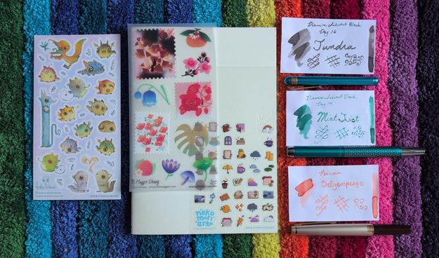
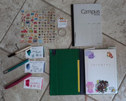
Three sheets of stickers: cute dragons, large botanicals and weather icons, an ivory covered MD notebook, three ink swatches (Diamine Tundra [grey], Diamine Mint Twist [green with blue shimmer], and Pennoia Selyempezgo [peach]) and fountain pens (Kaweco Liliput, Pelikan Pura, Pilot E95S).
Stickers
- Cute dragon-y creatures by Heather Sketcheroos
- Botanica pop-art by Maggie Chiang
- Weather related icons by Neko Mori Arts
Inks & Fountain Pens
- Diamine Tundra (grey) – in my Pilot E95S <M> (although I had the pens arranged differently before I filled them)
- Diamine Mint Twist (green with blue shimmer) – in my Pelikan Pura <B>
- Pennoia Selyempezgo (peach) – in my Kaweco Liliput <BB>
The pennoia ink was a random sample from a fountain pen order a while ago, the other two are both last year’s inkvent.
New Notebook Month!
After many months, I’m bidding farewell to my Leuchtterm notebook, which I started back in October with the plan that it would see me through the move. It saw me through 6 incredibly stressful months with medical emergencies on top of the expected move, but we’ve made it out the other side and that’s worth celebrating!
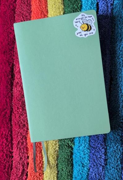
Green Leuchtterm softcover notebook with a bee sticker from The Latest Kate that reads “It’s enough to bee here just as you are”
I liked the Leuchtterm notebook better than expected — it was nice not having to write my own page numbers, and it packs a decent amount of pages into a small size. I did eventually get used to the ghosting but I didn’t love it. Still, it’s a relief to go back to something smaller so my journalling setup is considerably lighter.
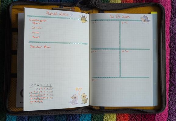
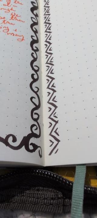
The new notebook is an MD Paper grid notebook. Cheap and 40-some pages instead of 120-some. I usually prefer dot over grid but I wanted to try this because the lines looked light enough that it would be pleasant, and so far it’s working nicely and they don’t feel in the way. I don’t think I’ve shown a monthly spread in a while so here it is in the new notebook:
April 2026 spread in my journal, showing tracking for my yearly creative goals, fountain pens, a calendar, and a set of todo list spaces.
My monthly spreads have gotten fairly utilitarian since most of my smaller tracking and notes go on the monthly calendar now that I have space for that. I still find doing a monthly tracking of the creative goals is useful, and I’m so-so on the todo lists: I use this page so I don’t forget things that I should do this week but don’t have to be done today. Sometimes everything goes on the day’s todo list and gets done within a day or two so this page isn’t needed. But other times it’s the only way important-but-non-urgent tasks get done, so it’s staying for now.
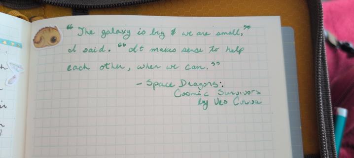
I don’t keep a separate commonplace book of quotes and instead just write down quotes in my journal. Here’s the one from the book I finished this morning:
A quote which reads,
“The galazy is big & we are small,” I said. “It makes sense to help each other, when we can.”
– Space Dragons: Cosmic Survivors by Veo Corva
I love Veo Corva’s Space Dragons series. Book two feels especially in the moment, since a lot of it is about trying to figure out what the right thing is that you should be doing, and then doing it even if you’re scared or angry or not ready or don’t know how to make it happen. And as is a common theme across these books, it’s about finding your people. But also it’s about a society where space ships are pulled by dragons and if that’s not enough of a pitch I don’t know what else to tell you. Plus there’s crochet in this one! https://veocorva.xyz/books/ for more.
And speaking of crafts and space travel, here’s how my latest knitting is going:
Time of the Doctor Scarf, a Doctor Who themed scarf with Gallifreyan style circle-text. It has been knit in ivory and dark teal yarn, and there is a a bright orange/yellow batik project bag and a pom pom sitting beside it.
I’m getting close to the end of chart 3 out of 10. This is going to be a gift for John but I’m not sure it’s even going to be ready in time for *next* winter at this rate! It’s one that nees a fair bit of attention so it’s a bit much if I want to read, but it’s been okay for work meetings when I don’t have to participate much (we have a lot of talks on how to use new internal tools).
Notes from March
Ink Swatches from March 2026 (described below)
Three of these inks were new last month so here’s some notes:
- Inkebana Cowslip (Yellow) – This was quite usable in good light but not my favourite when it got dim. I’ll try playing around with it in art but I’m not sure I’ll use it for journalling again. I only have a sample anyhow. I’d forgotten how finicky my Pilot Metropolitan CM nib can be about angles, but I got used to it again pretty quickly.
- Endless Alchemy Golden Sunburst (orange with gold shimmer) – I liked this a lot more than expected for an ink I really bought to be a fidget. Super pretty while it’s drying. Like most (but not all) of my shimmers it takes a fair bit of pen turning if you want to keep the shimmer consistent, but it’s a nice enough colour even with less shimmer so it doesn’t bother me as much as it might.
- Diamine Marie Rose (peachy brown) – A new one from Inkvent 2025. I was kind of meh on the idea of writing with a colour inspired by chip sauce, but I actually really liked this one to my own surprise. Behaved perfectly.
- Diamine Apple Glory (intense spring green) – This I’ve had for a while. It’s nice but honestly was a bit too intense a green in this mostly warmish palette which was a pity. Was nice to pull out the eco with the stub nib for this, though.
I might have a post up soon about some pens I inherited from my grandfather that I’m trying out, but I think that it’ll be its own thing!
#FountainPens #InkSwatch #knitting #Life