A 12-page Adobe InDesign project proposal presentation template by E-Type, available on Adobe Stock. https://weandthecolor.com/a-project-proposal-presentation-layout-by-e-type-this-indesign-template-gets-it-right/209026
A 12-page Adobe InDesign project proposal presentation template by E-Type, available on Adobe Stock. https://weandthecolor.com/a-project-proposal-presentation-layout-by-e-type-this-indesign-template-gets-it-right/209026
A Project Proposal Presentation Layout by E-Type: This InDesign Template Gets It Right
Honestly, most project proposal presentations fail before anyone reads a single word. They fail at the layout stage — cluttered grids, mismatched type scales, no visual hierarchy to guide the eye. Clients tune out. Stakeholders skim. The work behind the proposal gets buried under a mediocre design. That’s the real problem this particular project proposal presentation layout for Adobe InDesign is built to solve.
Download the template from Adobe StockPlease note that this template requires Adobe InDesign installed on your computer. Whether you use Mac or PC, the latest version is available on the Adobe Creative Cloud website—take a look here.
Download this customizable project proposal presentation layout for Adobe InDesign, designed by E-Type. Download the template from Adobe StockThis InDesign template by Adobe Stock contributor E-Type doesn’t just look polished. It operates with editorial logic. Every one of its 12 predesigned, fully customizable pages carries a clear structural intent — and that matters enormously when you’re trying to persuade, inform, and impress all at once.
So let’s talk about what separates a functional project proposal presentation layout from one that actually moves decisions forward.
What Makes a Project Proposal Presentation Layout Actually Work?
The answer isn’t decoration. It’s a sequence. A strong proposal layout controls the narrative. It tells the reader where to look, what to absorb, and when to commit. The E-Type template does exactly this across its 12-page architecture.
Formatted at 1920 × 1080 pixels, the template is built for interactive screen presentations — the format that now dominates boardrooms, remote pitches, and client portals. That horizontal orientation matches the native aspect ratio of desktop monitors and widescreen displays, placing content exactly where modern audiences expect it.
Visually, the layout combines a military-dark typographic weight with olive-green accent tones. That palette signals authority without coldness. It reads serious but not sterile — which is exactly the tone a winning pitch needs.
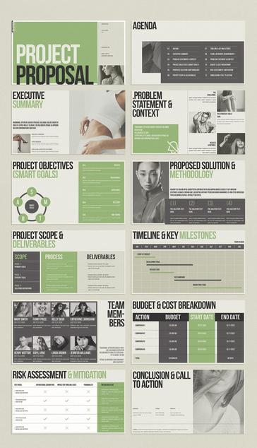
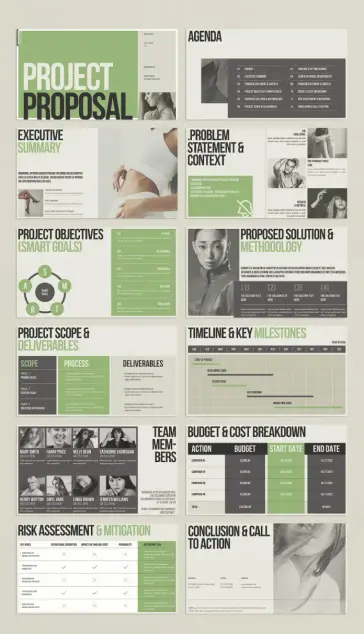
A Framework for Proposal Structure: The 12-Layer Clarity Model
Most proposal templates hand you blank pages and call it flexibility. This one gives you something more useful: a predetermined sequence of persuasion. I call this the 12-Layer Clarity Model — a coined framework for understanding how each page in a structured proposal deck builds trust and momentum.
Here’s how the 12 pages function as a system:
Layer 1 — The Cover: First Contact Architecture
The cover page establishes immediate authority. In this InDesign template, “PROJECT PROPOSAL” dominates in massive uppercase type. A contributor photo slot sits alongside the issue date and author name. This is First Contact Architecture — the intentional design of the first impression to carry maximum signal with minimum noise. Your name is here. Your project is named. Nothing else competes for attention.
Layer 2 — The Agenda: Structural Transparency
The agenda page lists all 12 sections with clean numbering. Transparency here builds credibility before your content even begins. Stakeholders who can see the roadmap trust the presenter. This layer embeds what I call Navigational Trust — the psychological benefit of showing your audience the full structure upfront.
Layer 3 — Executive Summary: The Compression Layer
This page does the hardest editorial work in any proposal. It compresses the entire pitch into its most essential elements: project purpose, core problem, and high-level expected outcomes. The template pairs this text content with a full-bleed image panel, giving visual weight to what might otherwise read as dry text. Decision-makers often stop here. Design this page like it’s the only one they’ll read.
Layer 4 — Problem Statement & Context: The Stakes Page
This section defines the problem with precision. The template divides it across challenge, strategy, and results columns, using a pullquote format to anchor the key insight. A strong problem statement isn’t just informative. It’s emotionally engaging. It makes the reader feel the friction your proposal is resolving.
Layer 5 — Project Objectives (SMART Goals): The Proof of Rigor
The SMART Goals page uses a circular diagram alongside five labeled criteria: Specific, Measurable, Achievable, Relevant, and Time-Bound. This structure signals methodological seriousness. Including a SMART framework in your project proposal presentation layout isn’t a formality. It’s a trust signal. It tells your audience that your thinking is structured, not improvised.
Layer 6 — Proposed Solution & Methodology: The How Page
Four numbered solution blocks sit beneath a bold full-bleed image. This layout answers the reader’s central unspoken question: How exactly will you deliver? The numbered visual structure makes the complex methodology scannable. That scannability is itself a design achievement — it respects your audience’s time while conveying depth.
Layer 7 — Project Scope & Deliverables: Boundary Setting
Scope creep destroys projects. This page exists precisely to prevent that. Three columns — Scope, Process, and Deliverables — set clear boundaries before work begins. Visually, the column structure signals order and clarity. This is one of the most practically important pages in any project proposal presentation template, and it’s often the most poorly designed in generic decks.
Layer 8 — Timeline & Key Milestones: The Gantt Layer
A horizontal Gantt-style chart maps phases from January through December. The template makes this visual without making it complicated. Clients read timelines visually, not numerically. A clean timeline chart does more persuasive work than a table full of dates ever could.
Layer 9 — Team Members: The Human Signal
Eight team member profiles with photos, names, and job titles. The human element here is strategic, not decorative. Proposals that show real people win more often than those that don’t. Decision-makers fund teams as much as they fund ideas. This InDesign template gives that reality the visual real estate it deserves.
Layer 10 — Budget & Cost Breakdown: The Trust Table
A structured four-row table presents campaigns, budgets, start dates, and end dates. The total sits clearly at the bottom. Clarity in budget presentation signals financial competence. Burying or vaguely referencing costs in a proposal is a red flag. This template makes cost transparency a design feature, not an afterthought.
Layer 11 — Risk Assessment & Mitigation: The Maturity Signal
Presenting risks proactively is one of the strongest credibility moves in any proposal. This page maps key risks against operational disruption, timeline impact, probability, and mitigation plans. Only confident, experienced teams acknowledge risk openly. This page communicates exactly that.
Layer 12 — Conclusion & Call to Action: The Close
The final page consolidates contact information — address, phone, website — alongside a closing editorial image. It’s deliberately calm and uncluttered. After 11 pages of structured argument, the close needs to exhale. This page does that. It says: we’ve made our case. Now, let’s talk.
Why 1920 × 1080 px Is the Right Format for Modern Proposals
Screen-first presentation design is no longer optional. Clients review proposals on desktop monitors. Stakeholders open decks during video calls on widescreen displays. Boardroom screens run at 1920 × 1080 px by default. A project proposal presentation layout built for that resolution meets your audience in exactly the environment where pitches actually happen.
The 1920 × 1080 px format also aligns with Adobe InDesign’s interactive output features. You can export this template as an interactive PDF with clickable navigation, embedded links, and smooth page transitions. Those features transform a static document into an immersive pitch experience — one that feels intentional and technologically current.
InDesign Features That Make This Template Shine
Adobe InDesign isn’t just a layout tool. It’s a persuasion engineering platform when used well. Here’s what makes it the right software for a project proposal presentation template like this one.
Master Pages for Systemic Consistency
InDesign’s master page system lets you lock repeating elements — page numbers, logo positions, footers — across all 12 slides simultaneously. Change one element on the master, and every page updates instantly. For a customizable project proposal InDesign template with 12 pages, this feature alone saves hours of manual alignment work.
Paragraph and Character Styles
This template ships with its own typographic logic baked in. Paragraph styles govern headings, body text, captions, and pullquotes. You don’t redesign the typography each time — you apply a style and maintain consistency automatically. That’s how professional editorial teams operate at scale.
Interactive PDF Export
InDesign exports directly to interactive PDF with hyperlinks, button triggers, and page transitions. For a screen presentation like this, you can add clickable table-of-contents links from the agenda page to each section. That small interaction detail transforms the experience from passive reading to active navigation.
Linked Image Placement
All image frames in this template are linked containers. You swap your own photography or illustrations in without rebuilding any layouts. InDesign manages scaling, cropping, and resolution checks automatically. The workflow is fast, clean, and production-ready from day one.
Color Swatches and Brand Adaptation
The olive-green and dark charcoal palette is set as global color swatches. Change the swatch definition once, and every element using that color updates site-wide. Adapting this InDesign template to match your brand colors takes minutes, not hours.
The Visual Language of Authority: Decoding This Template’s Design Choices
Design isn’t neutral. Every color, weight, and spacing decision communicates something. This template makes intentional choices that deserve unpacking.
The primary typeface is set in a condensed, heavy grotesque. That weight signals confidence and directness. Thin, elegant typefaces work beautifully for luxury branding. But for a project proposal, you need type that reads like commitment — and this template delivers exactly that.
The green accent color lands in a specific tonal zone: military-adjacent but not aggressive, natural but not casual. It’s a color that reads as contemporary and grounded simultaneously. Used selectively on headers and highlights, it draws the eye without overwhelming the grayscale photograph panels.
Speaking of photographs: the editorial image choices throughout this template are unexpected for a business document. Instead of stock-photo handshakes and laptop screens, the images lean toward high-fashion editorial aesthetics. That’s a deliberate visual positioning strategy. It says this proposal comes from people with refined taste — and taste, in creative industries especially, is a professional credential.
Who Should Use This Project Proposal Presentation Layout?
This template targets a specific professional context. It works best for creative agencies, content studios, marketing consultancies, brand strategists, and freelance creative directors. The aesthetic is too refined for construction bids or municipal tenders. But for any proposal pitched to clients with design sensibility, this layout speaks the right visual language.
It also works well for internal pitches within organizations that value design culture — product teams proposing new features, UX departments presenting strategic recommendations, or brand teams pitching campaign investments to leadership.
If your audience cares about how something looks as a signal of how you think, this project proposal InDesign template positions you immediately and effectively.
Customizing the Template Without Losing Its Logic
Customization is where most designers either excel or collapse. Here’s a principled approach to adapting this template without dismantling what makes it work.
Keep the Type Scale Intact
The relationship between headline sizes and body text is carefully calibrated. Resist the urge to increase body type for readability — the current scale is already optimized for 1920 × 1080 px screen viewing. Scaling it up disrupts the editorial rhythm across all 12 pages.
Replace Images Strategically
The image placements in this template aren’t decorative fillers. They carry visual weight that balances dense text sections. When substituting your own photography, match the tonal range of the originals — dark, moody, editorial. Light and cheerful photos will break the template’s visual logic.
Limit Your Palette Adjustments
The template uses essentially three values: near-black, off-white, and that signature olive-green. You can substitute your brand color for the green. But introducing a fourth color disrupts the visual discipline that makes this layout feel authoritative. Restraint is a feature, not a limitation.
Maintain the Structural Sequence
The 12-page sequence follows persuasive logic. If you eliminate pages, do so thoughtfully. Removing the Risk Assessment page, for example, isn’t just a design decision — it’s a persuasive one. That page builds credibility. Every element in this layout earns its place.
A Prediction: Widescreen Proposal Design Will Become the Creative Standard
Here’s a forward-looking position worth stating clearly: within five years, widescreen interactive screen proposals will dominate professional pitching across creative and knowledge industries. The shift is already underway. Remote-first work norms, boardroom display standards, and the normalization of interactive PDFs are all accelerating this transition.
Templates like this E-Type design — optimized for 1920 × 1080 px, built for interactive InDesign export, structured for narrative clarity — represent the leading edge of where professional proposal design is heading. Designers and agencies that adopt screen-native formats now will establish a visible competitive advantage before this approach becomes ubiquitous.
The proposal that looks like it belongs to the future wins attention in the present.
Where to Get This Template
This project proposal presentation layout is available through Adobe Stock, created by contributor E-Type. As an Adobe Stock asset, it integrates directly into your InDesign workflow — downloadable, licensable, and ready to customize from the moment you open it. If you hold an Adobe Creative Cloud subscription that includes Stock, accessing this template carries no additional barrier.
Download the template from Adobe StockFor designers already working in InDesign, this isn’t just a time-saving asset. It’s a structural template that encodes professional pitch logic into every layer. You’re not just getting a layout. You’re getting a persuasion framework built into the file.
Frequently Asked Questions
What is a project proposal presentation layout in InDesign?
A project proposal presentation layout in InDesign is a structured, multi-page document template designed to communicate a project’s goals, methodology, timeline, budget, and team in a visually organized format. InDesign’s layout tools make it possible to create highly professional, screen-optimized presentations with interactive export options.
How many pages does this InDesign template include?
This template by E-Type includes 12 predesigned, fully customizable pages. Each page covers a distinct section of a comprehensive project proposal, from the cover and executive summary through to the risk assessment and call to action.
What dimensions is this project proposal InDesign template?
The template is formatted at 1920 × 1080 pixels — a widescreen format optimized for interactive screen presentations. This dimension matches standard desktop monitors, boardroom displays, and widescreen setups, making it ideal for live pitches and interactive PDF distribution.
Can I change the colors and fonts in this InDesign template?
Yes. The template uses InDesign’s global color swatches and paragraph styles, which allow you to update colors and typography across all 12 pages simultaneously. Brand adaptation is fast and non-destructive.
Is this template suitable for freelancers as well as agencies?
Absolutely. The template’s structure and visual language work equally well for individual creative professionals and larger studio teams. Any practitioner pitching design, marketing, content, or strategic services to clients will find the layout appropriate and effective.
Can I export this presentation as an interactive PDF from InDesign?
Yes. InDesign’s Export to Interactive PDF feature supports hyperlinks, navigation buttons, and page transitions. This template’s structure — particularly its agenda page — is well-suited to interactive linking, creating a navigable document experience for clients reviewing the proposal digitally.
Where can I buy or license this project proposal InDesign template?
This template is available through Adobe Stock, created by contributor E-Type. Adobe Creative Cloud subscribers with Stock access can license and download it directly within InDesign via the Adobe Stock panel.
What industries is this template best suited for?
The template’s editorial visual language makes it an ideal fit for creative agencies, marketing consultancies, brand studios, content production companies, UX and product design teams, and independent creative professionals. Its aesthetic is contemporary and refined, making it most effective when pitching to clients who value design thinking as a professional signal.
How do I replace the placeholder images in the template?
In InDesign, right-click any image frame and select “Place” to swap in your own photography or illustrations. The template’s linked image workflow handles scaling and cropping automatically. For best visual results, use high-contrast editorial photography that matches the template’s existing dark, moody aesthetic.
What makes this InDesign proposal template different from PowerPoint alternatives?
InDesign offers superior typographic control, master page consistency, and interactive PDF export compared to PowerPoint. The E-Type template takes full advantage of these capabilities with a design precision that PowerPoint templates rarely achieve. For proposals where visual credibility is part of the pitch, InDesign produces a measurably more professional result.
Don’t hesitate to find other popular graphic design templates here at WE AND THE COLOR.
#design #graphicDesign #InDesignTemplate #presentation #projectProposal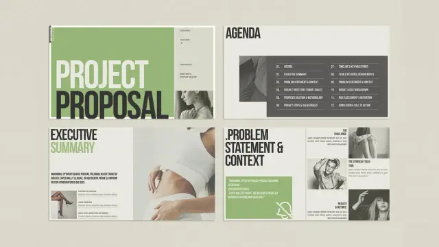
'Vertical' Heartbreak
I was your incomplete work plan.
You were my failed funding bid.
There was no grant there,
let alone a project proposal
Or an outcome index.
We were destined but to be
strategically obtuse,
verifiably incomplete.
Almost ready with my first #projectproposal draft. It's been so hard to get to this point and I really need to get this fellowship... so y'all cross fingers for me please 🍀🍀🍀
Postpartum brain fog is real 😪.
Looking for advice:
Is Arial 11 too small for a #projectproposal? In my experience Arial 12 is too big, but I am happy to hear your opinion on this.