While deciding on font for my site at neocities.org, I visited Google Fonts, to see what I could grab from their API.

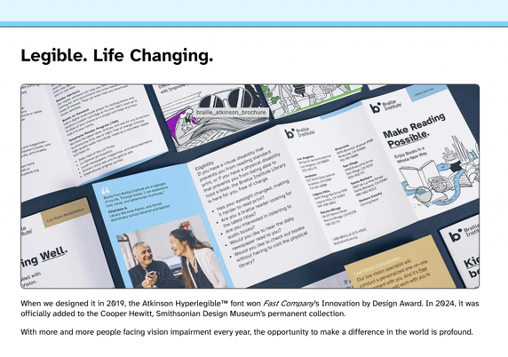
One of the subjects I teach is Digital Inclusion & Accessibility. I use LibreOffice Impress for creating my presentations and since a couple of years back, the default font for those is Atkinson Hyperlegible.

I had already decided that I wanted a font size larger than regular throughout the site (1.15em) and a monospace.
So what's more logical than to look up Atkinson+Hyperlegible+Mono, and add to my style sheet?
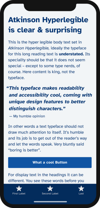
While doing so, I noticed a new version of the variable/proportional font, Atkinson Hyperlegible Next, which I downloaded and installed for use in Libre Office and PDFs.
It looks great, and compared to the one released in 2019:
It has seven weights instead of two, expanded character set as well as language support (up to 150 languages from the original 27).

I highly recommend it, designed for supporting readers with lower vision, etc.

LINKS
Atkinson at Braille Institute: https://www.brailleinstitute.org/freefont/
The Next version at Google Fonts: https://fonts.google.com/specimen/Atkinson+Hyperlegible+Next
Interview about the font: https://www.printmag.com/type-tuesday/atkinson-hyperlegible-next-applied-design/
While at it, I also found Letters From Sweden that has several interesting fonts: https://lettersfromsweden.se/

#fonts #hyperlegible #a11y #t12t #accessibility

Atkinson Hyperlegible Font - Braille Institute

Read easier with Atkinson Hyperlegible Font, crafted for low-vision readers. Download for free and enjoy clear letters and numbers on your computer!

Braille Institute

Boah wie schön ist denn der Hyperlegible Font?
Form follows Function und diese Schriftart ist vom Braille Institut für Menschen, die weniger gut sehen können entwickelt worden und ist richtig hübsch

https://www.brailleinstitute.org/freefont
https://blog.lxkhl.com/boah-wie-schoen-ist-denn-der-hyperlegible-font
#BrailleInstitut #Font #Hyperlegible #Schriftart

Atkinson Hyperlegible Font - Braille Institute

Read easier with Atkinson Hyperlegible Font, crafted for low-vision readers. Download for free and enjoy clear letters and numbers on your computer!

Braille Institute

Con un poco de #Pandoc y un pequeño script en #Python, hemos empezado a publicar los trabajos de RIBES en formato HTML y EPUB además de en PDF. ¡¡Pandoc hace magia con las conversiones!!

Además, en HTML y EPUB hemos dado un formato CSS muy simple con la letra #Atkinson #Hyperlegible:

https://revistas.ucm.es/index.php/RIBE/issue/view/4349

#Revistas #Papers #Bibliotecas #Educaicón #Sociedad #RIBES

Vol. 1 (2024) | Revista de Investigación sobre Bibliotecas, Educación y Sociedad

🔵 Font friday
Atkinson Hyperlegible (free font) by @BrailleInst designed by Elliott Scott, Megan Eiswerth, Linus Boman, Theodore Petrosky
by Oliver Schöndorfer @glyphe
#freefont #Hyperlegible #typography

https://pimpmytype.com/atkinson-hyperlegible/

Atkinson Hyperlegible (free font) - Pimp my Type

A free sans-serif typeface tailored towards ideal character recognition. It makes your copy more accessible while also giving it a unique look.

Pimp my Type
Very pleased to see support for the #OpenDyslexic and #HyperLegible typefaces in the latest #IceCubes client. Hurrah! #Accessibility
Download the Atkinson Hyperlegible Font | Braille Institute

A new typeface – greater legibility and readability for low vision readers Atkinson Hyperlegible font is named after Braille Institute founder, J. Robert Atkinson.  What makes it different from traditional typography design is that it focuses on letterform distinction to increase character recognition, ultimately improving readability.  We are making it free for anyone to use!

Braille Institute

A new typeface – greater legibility and readability for low vision readers

#Atkinson #Hyperlegible font is named after #Braille #Institute founder, J. Robert Atkinson. What makes it different from traditional #typography design is that it focuses on letterform distinction to increase character recognition, ultimately improving #readability. Braille Institute has made it free for anyone to use.

https://brailleinstitute.org/freefont

Download the Atkinson Hyperlegible Font | Braille Institute

A new typeface – greater legibility and readability for low vision readers Atkinson Hyperlegible font is named after Braille Institute founder, J. Robert Atkinson.  What makes it different from traditional typography design is that it focuses on letterform distinction to increase character recognition, ultimately improving readability.  We are making it free for anyone to use!

Braille Institute

@hildabast @tombofnull

... for discovery since *no one* else seems to have bothered (beyond Hilda's initial effort).

#Atkinson #Hyperlegible #Fonts #legibility #BrailleInstitute #visionimpairment #dyslexia