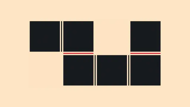
#Development #Previews
A new way to style gaps · Say hello to consistent separators across CSS layouts https://ilo.im/164kgh
_____
#Layout #Chrome #Edge #Browser #WebDev #Frontend #CSS #CssGrid #CssFlexbox #CssMultiColumn
#Development #Previews
A new way to style gaps · Say hello to consistent separators across CSS layouts https://ilo.im/164kgh
_____
#Layout #Chrome #Edge #Browser #WebDev #Frontend #CSS #CssGrid #CssFlexbox #CssMultiColumn
Mastering Flexbox and Grid: Advanced Layout Techniques in CSS
1,122 words, 6 minutes read time.
Introduction
There comes a time in every seasoned web programmer’s journey where floats and clearfix hacks just don’t cut it anymore. Responsive design, dynamic content placement, and flexible UIs demand more modern, robust solutions. That’s where CSS Flexbox and Grid come into play. For the male programmer looking to elevate his front-end game, mastering these two layout systems isn’t just useful — it’s essential. This deep-dive aims to help you master Flexbox and Grid with practical examples, expert insights, and advanced strategies that go beyond the basics. We’re not just talking theory. We’re building solid mental models and workflows that empower you to lay out interfaces with surgical precision.
Understanding the Layout Landscape
Before diving headfirst into Flexbox and Grid, it’s important to understand the layout problems they were designed to solve. Flexbox is a one-dimensional layout system (either horizontal or vertical), ideal for aligning items in a row or column. Grid is two-dimensional, making it perfect for more complex page structures.
With the demise of IE11 and the dominance of evergreen browsers, you no longer have to worry about compatibility nightmares. Modern CSS is fully supported, so it’s time to go all in.
Flexbox: A Precision Tool for One-Dimensional Layouts
At its core, Flexbox makes aligning items along a single axis easier than ever before. But beyond the basics of display: flex
, Flexbox offers a suite of properties that allow you to control wrapping, alignment, distribution, and sizing.
Let’s start with a typical use case: a navigation bar. With justify-content: space-between
and align-items: center
, you can spread items out across the horizontal plane while aligning them vertically — without writing a single float or margin hack.
But let’s not stop at nav bars. Consider a product list that needs to dynamically wrap based on available screen width. With flex-wrap: wrap
, and flex-basis
to control item width, Flexbox allows for responsive behaviors that would be extremely convoluted with floats or inline-blocks.
Moreover, the order
property is a game-changer. Imagine building a layout where the visual order doesn’t match the source order — useful for accessibility or SEO reasons. Flexbox lets you rearrange items visually while preserving semantic HTML structure.
Grid: Mastering Two-Dimensional Layouts
CSS Grid is where things really get interesting. Whether you’re creating a magazine-style layout, a dashboard, or even a game board, Grid lets you manage both rows and columns with ease.
The key concepts to internalize are:
grid-template-columns
and grid-template-rows
properties define the layout structure.grid-template-areas
can make your layout self-documenting.Take a landing page with a hero image, call-to-action, and three columns of content. With Grid, you can define a layout where each element occupies a specific area using named regions — no more nested divs or clearfixes.
Advanced use of minmax()
, auto-fit
, and auto-fill
unlocks the magic of responsive grids that adapt to screen size while preserving structure. And with fr
units, you can proportionally allocate space with flexibility and elegance.
When to Use Flexbox vs. Grid
One of the most common questions is: when should I use Flexbox, and when should I use Grid? The answer lies in understanding your layout goals.
Use Flexbox when you’re aligning items along a single axis. Think navigation menus, form fields, media objects. It excels in linear content flows.
Use Grid when your layout has both rows and columns. Think entire page layouts, dashboards, image galleries, and multi-column content. Grid provides you with unparalleled control over structure and alignment.
Sometimes, the most effective strategy is a hybrid approach. For example, a page might use Grid for the overarching layout and Flexbox for the alignment of items within individual components.
Advanced Techniques
Once you grasp the fundamentals, you can start bending CSS to your will.
Nested Grids and Flex Containers
Modern layouts often require nested structures. Grid within Grid, or Flex items inside a Grid cell. The key is to avoid unnecessary complexity. Define each container’s behavior based on its function. A card component might use Grid for internal structure while being placed within a Flex container for alignment.
Aligning Across Containers
Using properties like place-items
, align-self
, and justify-self
, you can control alignment at both the container and item level. This fine-grain control is crucial for pixel-perfect UIs.
Responsive Design with Media Queries and Modern Units
Pairing Flexbox and Grid with CSS custom properties and clamp()
for fluid typography and spacing makes for responsive designs that don’t require endless breakpoints. Combine repeat(auto-fit, minmax(...))
with grid-gap
and you can create layouts that adapt intuitively.
Grid Debugging Tools
Modern browsers like Chrome and Firefox offer built-in dev tools for visualizing grid lines and areas. Learn how to use these tools to inspect your layouts and resolve alignment issues quickly.
Practical Use Cases
Imagine building a portfolio site with a hero section, about, projects, and contact blocks. Grid helps you structure the overall layout, while Flexbox keeps buttons aligned and testimonials neatly stacked. Similarly, in a CMS like WordPress or SharePoint, use Grid to define the section layouts and Flexbox within web parts or blocks.
Or consider a SaaS dashboard. Grid is perfect for laying out graphs, metrics, and tables. Flexbox makes it easy to control user profile panels, toolbars, and interactive buttons.
In team environments, especially on platforms like SharePoint, leveraging Grid and Flexbox strategically can drastically reduce reliance on custom JavaScript or heavy frameworks.
SEO Considerations
Semantic HTML structure combined with visual flexibility is where Flexbox and Grid shine. By decoupling layout from source order, you can prioritize content for crawlers while designing for users. Always prefer HTML5 semantic tags and use ARIA roles wisely when altering the visual order.
Avoid hiding content with display: none
unless necessary, and ensure your layouts are keyboard-navigable. Accessibility isn’t just good UX — it affects SEO rankings too.
Conclusion: Craft Layouts Like a Pro
Mastering CSS Flexbox and Grid isn’t just about knowing the syntax. It’s about developing an intuitive sense of layout that adapts to user needs, device constraints, and content dynamics. Whether you’re building slick UIs, responsive apps, or robust admin dashboards, the combination of Flexbox and Grid will keep your layouts scalable and maintainable.
If you’ve found this guide helpful, don’t stop here. Subscribe to our newsletter for deeper dives, coding challenges, and cutting-edge tutorials. Or join the conversation below by leaving a comment. We’d love to hear how you use Flexbox and Grid in your projects.
D. Bryan King
Sources
Disclaimer:
The views and opinions expressed in this post are solely those of the author. The information provided is based on personal research, experience, and understanding of the subject matter at the time of writing. Readers should consult relevant experts or authorities for specific guidance related to their unique situations.
Related Posts
#accessibilityInCSS #advancedCSS #ChromeDevTools #clampCSS #CSSBestPractices #CSSCardLayout #CSSContainers #CSSCustomProperties #CSSDeveloperBlog #CSSForLandingPages #cssForProgrammers #CSSForSaaS #CSSFrUnit #CSSGapProperty #cssGrid #CSSLayout #CSSLayoutSystem #CSSMentalModels #CSSNamingAreas #CSSOrderProperty #CSSTechniques #CSSTips #CSSTraining #CSSTricks #CSSTutorials #CSSVisualFlow #cssWorkflow #dashboardDesign #developerGuide #dynamicCSS #FirefoxCSSTools #flexbox #FlexboxExamples #FlexboxGridHybrid #flexboxLayout #frontEndDevelopment #frontendWorkflow #GridExamples #gridLayout #HTMLLayout #layoutDebugging #layoutRendering #layoutTechniques #mediaQueries #mobileFirstDesign #modernCss #nestedLayouts #responsiveDesign #responsiveLayouts #semanticHTML #SEOLayoutStrategy #sharepointLayout #UIAlignment #UIPrecision #visualOrderCSS #WebDevelopment #webProgrammer #wordpressCSS
I made a little thing on @codepen :pure #CSS #scroll controlled swipe transition https://codepen.io/thebabydino/pen/azObZOe
Note how the swipe always clockwise, regardless of scroll direction and how the text fades in after the swipe in.
Inspiration https://x.com/avanderpotte/status/1923382432784412771
(via @codrops motion highlights roundup)
cc @bramus
#scrollAnimation #code #coding #frontend #cssGradient #cssMask #conicGradient #cssMaths #maths #scrollEffect #cssGrid #web #dev #webDev #webDevelopment
5️⃣ 850 ♥️ No SVG, no image fluid slider https://codepen.io/thebabydino/pen/qByGqOm
#JS used only for
a) feature support detection
b) updating slider value in --val
Uses only
1 × input[type=range] for actual slider
1 × output for current value display
1 × datalist for ruler
One of my best sliders on @codepen.
#CSS #slider #rangeInput #coding #web #dev #webDevelopment #webDev #code #frontend #cssGrid #cssMask #cssGradient
Alex Riviere presents 'Fresh Hot CSS Features!' July 25th at Nebraska.Code().
https://nebraskacode.amegala.com/
#cssframework #bootstrap #cssgrid #containerqueries #css #css2025 #cssfeatures #softwaredevelopment #TechConference #softwareengineering #DeveloperCommunity #networkingevent #lincolnnebraska #Nebraska #midlands #heartland #SiliconPrairie
#Design #Guides
Figma’s new grid · How the shift to CSS Grid affects designers https://ilo.im/163twe
_____
#Figma #Layout #CssGrid #ProductDesign #UiDesign #WebDesign #Development #WebDev #Frontend #CSS
#Development #Techniques
The CSS height enigma · Unraveling the mystery of percentage-based heights https://ilo.im/163u5k
_____
#Layout #CssUnits #CssGrid #CssFlexbox #WebDev #Frontend #HTML #CSS
One of the most perplexing and befuddling things in CSS for me, for many years, was the behaviour of percentage-based heights. Sometimes, seemingly at random, setting “height: 100%” would have no effect at all. When I finally figured out what was going on, it was like a puzzle piece snapping into place; everything made so much more sense! In this post, I’ll share the epiphany I had, and we’ll explore some solutions.
Style Smarter: Responsive Design with SCSS
1,328 words, 7 minutes read time.
Software Developer Coder Programmer Programming T-ShirtResponsive web design isn’t just a trendy term—it’s the bedrock of effective digital experiences in a world where screens come in all sizes. Whether it’s a smartwatch, a smartphone, or a wide-screen desktop monitor, users expect seamless, intuitive interfaces that just work. If you’re a developer, especially someone who spends your days elbow-deep in code, you know that this expectation isn’t going anywhere. In fact, it’s only getting more demanding. That’s where mobile-first design paired with SCSS (Sassy CSS) becomes your secret weapon.
This deep dive is tailored for professional developers who want to up their game, master responsive design workflows, and take full advantage of SCSS’s capabilities. You’re not just building pretty sites—you’re crafting experiences that feel right on every device. Let’s explore how.
The Evolution of Responsive Web Design
Back in the day, websites were built for desktop screens only. Fixed-width layouts ruled the web, and if your site didn’t fit on a smaller screen, tough luck. Then came fluid grids, flexible images, and eventually, media queries. Responsive design emerged as the answer to the explosion of mobile device usage, and it quickly became a standard.
But then Google shifted the entire game with mobile-first indexing. Sites are now ranked based on their mobile versions before desktop, and that means mobile-first isn’t a nice-to-have—it’s a must.
Fundamentals of Mobile-First Design
Mobile-first design flips the traditional development approach on its head. Instead of designing for desktop and scaling down, you start with the smallest screens and progressively enhance the experience for larger ones. This mindset encourages content prioritization: what absolutely needs to be seen first? It also leads to better performance since mobile-first codebases tend to be leaner, loading fewer assets upfront.
Progressive enhancement is another core idea here. It ensures your app works well on older or less capable devices and browsers, while still shining on the latest tech. It’s about laying a strong foundation, then layering on advanced features as screen real estate and capabilities grow.
Introduction to SCSS (Sassy CSS)
Let’s talk about SCSS, the powerful CSS preprocessor that gives your stylesheets superpowers. If you’re used to the limitations of vanilla CSS, SCSS feels like upgrading from a screwdriver to a power drill. It brings in features like variables, mixins, functions, partials, and inheritance, all of which let you write cleaner, more modular, and maintainable code.
But most importantly for responsive design, SCSS empowers you to create dynamic, DRY (Don’t Repeat Yourself) code that scales. Rather than duplicating media queries all over the place, you can define them once in a mixin and reuse them anywhere. That’s a game-changer.
SASS Professional NotesSetting Up a Mobile-First Project with SCSS
To start strong, your project structure should reflect scalability. A typical SCSS architecture might include folders like base
, components
, layout
, themes
, and utilities
, with an index.scss
file that imports everything cleanly. This keeps your codebase clean and organized.
When writing styles, define your base (mobile) styles first. Think of them as the default. Then, use min-width
media queries to layer on styles for tablets, desktops, and beyond. This cascading effect fits perfectly with how CSS itself works, allowing for logical overrides and enhancements.
Naming conventions matter too. Whether you use BEM (Block Element Modifier) or SMACSS, consistent naming improves readability and collaboration—especially when you’re working in a team or on a large codebase.
Using SCSS to Manage Responsive Breakpoints Like a Pro
One of the most powerful things about SCSS is how it lets you streamline breakpoint management. Instead of writing clunky media queries like:
@media (min-width: 768px) { .container { width: 90%; }}You can write a simple mixin:
@mixin respond($breakpoint) { @if $breakpoint == tablet { @media (min-width: 768px) { @content; } } @else if $breakpoint == desktop { @media (min-width: 1024px) { @content; } }}
And use it like this:
.container { width: 100%; @include respond(tablet) { width: 90%; }}
This approach keeps your code DRY and centralized. It also gives you full control to tweak breakpoints project-wide with just a few changes in one place.
Responsive Layout Techniques with SCSS
Now that you have breakpoint control, let’s talk layout. Combining SCSS with modern layout systems like Flexbox and CSS Grid lets you build robust responsive structures fast. A responsive card layout, for instance, can start as a single-column stack on mobile and evolve into a multi-column grid on desktop—all with a few strategic SCSS media queries and mixins.
For example:
.card-grid { display: flex; flex-direction: column; gap: 1rem; @include respond(tablet) { flex-direction: row; flex-wrap: wrap; }}
This kind of control makes your layouts flexible and easy to adjust later on, without having to refactor your entire stylesheet.
Building Responsive Components
Responsive design isn’t just about layout. Every component—from buttons to navbars to modals—should adapt to the screen it lives on. With SCSS, you can write modular component styles using partials. This encourages reusability and isolates changes.
Let’s say you’re building a responsive navigation bar. You might create _navbar.scss
with base styles, and conditionally apply layout changes via your breakpoint mixin. Your nav items can stack vertically on mobile and switch to horizontal alignment on desktop, all without duplicating code.
Performance Optimization Tips for SCSS-based Responsive Apps
SCSS can grow heavy if mismanaged. One key strategy is to use partials and import only what you need. If you’re using a bundler like Webpack or Vite, you can combine this with PurgeCSS to strip out unused styles before deployment. Also, avoid deeply nested selectors—they may be tempting but can cause specificity headaches.
Use SCSS functions for repeated logic, like calculating margins or spacing based on a scale. Automating spacing with functions keeps your design consistent and avoids hard-coded values sprinkled everywhere.
Real-World Workflow: SCSS + Responsive Design
In a real project, you’ll likely be using SCSS with a JavaScript framework like React or Vue. Tools like Vite, Webpack, or Gulp help automate the build process, watch for changes, and compile your SCSS into compressed CSS.
A great workflow involves a main.scss
file that imports partials from folders like /components
, /layouts
, and /utilities
. From there, use logical nesting, maintain a consistent naming convention, and rely on your mixins to manage breakpoints. Your team will thank you later.
Common Pitfalls and How to Avoid Them
One mistake devs make is overusing media queries. You don’t need to write a media query for every 100px width difference. Choose breakpoints based on your content, not arbitrary screen sizes.
Another trap is ignoring the mobile experience until the end. With mobile-first, your baseline is mobile. This not only improves performance but also prevents layout surprises later on.
Lastly, if you’re not organizing your SCSS with scalability in mind, technical debt will sneak up on you. Use folders, partials, and naming conventions religiously.
Conclusion
Responsive design isn’t going anywhere. And with SCSS in your toolkit, you’re not just adapting to the demands of multiple screen sizes—you’re thriving. The mobile-first approach forces you to think smart, optimize early, and prioritize what really matters. SCSS gives you the flexibility and control to implement that vision without friction.
If you’re building anything on the web in 2025, SCSS and mobile-first design are the duo you need to master.
Want more expert tips and pro-level guides like this? Subscribe to our newsletter and stay ahead of the curve in modern web development.
D. Bryan King
Sources
Disclaimer:
The views and opinions expressed in this post are solely those of the author. The information provided is based on personal research, experience, and understanding of the subject matter at the time of writing. Readers should consult relevant experts or authorities for specific guidance related to their unique situations.
Related Posts
#advancedScss #breakpointsInScss #buildingMobileFirst #cssArchitecture #cssComponents #CSSForDevelopers #cssForProgrammers #cssGrid #cssPerformance #cssPreprocessors #cssResponsiveness #cssSystems #cssWorkflow #devToolsCss #developerGuide #efficientScss #flexbox #frontEndDevelopment #frontendPerformance #frontendTips #googleResponsiveDesign #layoutOptimization #mediaQueries #mobileOptimization #mobileFirstApproach #mobileFirstDesign #mobileFirstIndex #mobileFirstWorkflow #modernCss #modernWebDesign #organizeScss #performanceScss #professionalWebDevelopment #progressiveEnhancement #responsiveBreakpoints #responsiveCoding #responsiveDesign #responsiveFrameworks #responsiveLayout #responsiveScss #responsiveUiDesign #responsiveWebApps #responsiveWebDesign #sassCss #scalableCss #SCSS #scssBestPractices #scssGuide #scssLayout #scssMixins #scssMixinsExamples #scssMobile #scssMobileFirst #scssResponsive #scssTips #scssTutorial #scssVsCss #WebDevelopment #webProgramming
A little pill shape. Because someone asked how to do this, I had to come up with a solution that uses no extra elements for the rounded side decorations, but also doesn't replace the 4 extra elements with at least just as many background layers.
https://www.reddit.com/r/css/comments/1ke0n1q/comment/mqhm6o0/
#CSS #code #coding #frontend #cssGrid #web #dev #webDev #webDevelopment
#Development #Releases
CSS ‘reading-flow’ and ‘reading-order’ · New properties to make visual order accessible https://ilo.im/163mvw
_____
#Layout #Accessibility #Keyboard #CssGrid #CssFlex #Chrome #Browser #WebDev #Frontend #CSS