 Gea-Suan Lin
https://blog.gslin.org/archives/2026/06/22/13079/mediawiki-%e4%b8%8a%e7%9a%84-colspan100/
MediaWiki 上的 colspan="100%"
#100% #all #colspan #column #columns #css #developer #layout #mdn #mediawiki #mozilla #network #table #td #th
https://blog.gslin.org/archives/2026/06/22/13079/mediawiki-%e4%b8%8a%e7%9a%84-colspan100/
MediaWiki 上的 colspan="100%"
#100% #all #colspan #column #columns #css #developer #layout #mdn #mediawiki #mozilla #network #table #td #th
On #CSS #grid #layout and how to simplify it:
https://www.reddit.com/r/css/comments/1uacy80/comment/ospxwj3/
#cssLayout #cssGrid #coding #frontend #web #dev #webDev #webDevelopment #code

Whoever designed the latest #Mastodon #layout… it isn’t good. The boost button and the look/colour scheme are like they haven’t been boosted. And there are some other things that aren’t cool. #opinion 👎️
Also, when one has several notifications and boosts a notification many times, the click in the browser goes through the button, so that the previous notification timeline resets and one can start looking for the notification from the beginning—which is truly uncool when someone has many notifications… :exhales:
Also, the :emoji invocation doesn’t work properly…
Also the red color of the edit and re draft is pale like… idk it is pale like a anemic
Flli Bellalì ad
#illustration #digitalillustration #fllibellali #zeppole #ad #graphics #layout

“Grid’Dulles #008” by Thomas Typewriter – a new painting
If you like this, or any of my other art, please consider throwing some support my way through my Patreon (https://www.patreon.com/c/ThomasTypewriterTypes) or Ko-fi (https://ko-fi.com/thomastypewriter).https://thomastypewriter.art/2026/06/17/griddulles-008-by-thomas-typewriter-a-new-painting/

So what are they really doing? If laying off is not due to business being slow.
Robinhood cuts 290 jobs while saying business has ‘never been stronger’ - San Francisco Chronicle https://apple.news/AYOwQnOnmSqmzyuoblH4y3A
Представляем путеводитель по grid lanes. Джен Симмонс анонсирует новый интерактивный гайд по CSS grid lanes. Можно поиграть с песочницей в режимах Waterfall и Brick, разобраться в размерах треков через fr, minmax() и repeat(), а ещё пройтись по шести демо: фотографии, рецепты, газеты, меню, таймлайны и пинборды. Лучше всего работает в Safari 26.4+. #css #layout
https://webkit.org/blog/18098/introducing-the-field-guide-to-grid-lanes/

Introducing the field guide to grid lanes. @jensimmons announces a new interactive learning resource for CSS grid lanes. Tweak the playground with Waterfall and Brick modes, learn track sizing with fr, minmax(), and repeat(), and explore six real-world demos: photos, recipes, newspapers, menus, timelines, and pinboards. Best in Safari 26.4+. #css #layout
https://webkit.org/blog/18098/introducing-the-field-guide-to-grid-lanes/

What’s !important #13: “@ function”, “alpha()”, CSS Wordle, and More, by @dxnny.fun (@csstricks):
https://css-tricks.com/whats-important-13/?ref=frontenddogma.com
“The #22 Bricks” by Thomas Typewriter – a new illustration
"The #22 Bricks" by Thomas Typewriter (digital, 36"w x 24"h, vector illustration) If you like this, or any of my other art, please consider throwing some support my way through my Patreon (https://www.patreon.com/c/ThomasTypewriterTypes) or Ko-fi (https://ko-fi.com/thomastypewriter).https://thomastypewriter.art/2026/06/15/the-22-bricks-by-thomas-typewriter-a-new-illustration/

 Ana Tudor 🐯
 🐦🔥nemo™🐦⬛ 🇺🇦🍉
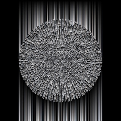 MauroGata
 Thomas Typewriter
 Shoesmith Life Cycle LLC
 Веб-стандарты
 Web Standards
 Frontend Dogma