Pink Pelican Srebarna Rosé Label Design Turns a UNESCO Wetland Into a Tactile Wine Experience
I think that most wine labels try to seduce you with a pretty picture. A vineyard at sunset. A coat of arms. A stylized animal that looks like it was licensed from a stock illustration library. The Pink Pelican Srebarna Rosé label design by Foxtrot Studio does none of that — and that’s exactly why it matters. This is a wine label design as landscape architecture. It’s physical, conceptual, and quietly radical in the best possible way.
The project arrives at a moment when the packaging design industry is reckoning with authenticity. Consumers are increasingly skeptical of labels that perform meaning without embodying it. So when a studio genuinely translates a protected natural environment — Bulgaria’s Srebarna Nature Reserve, a UNESCO-listed wetland — into a structural and material system rather than an illustration, it signals something worth paying attention to.
Furthermore, this design raises a question that every label designer should sit with: What does it mean to represent a place without picturing it?
What Makes the Pink Pelican Srebarna Rosé Label Design So Different From Conventional Wine Packaging?
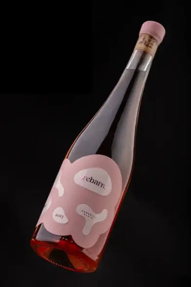
The short answer is materiality. Most wine labels communicate through imagery and typography. Foxtrot Studio chose to communicate through structure. The label system uses two contrasting paper stocks — one referencing the solidity of the small island formations within Srebarna Lake, the other evoking the fluid, constantly shifting surface of the water surrounding them.
This contrast is not decorative. It’s conceptual. The choice of paper is a design argument: that the tension between land and water, between permanence and flux, is the defining character of this landscape. And therefore, it should be the defining character of the label.
Think about that for a moment. The material is the message.
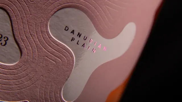
Additionally, embossed ripple patterns move organically across the label’s surface, referencing the subtle movement of water as it passes between the island formations. These aren’t textures for texture’s sake. They create a sensory layer that rewards touch as much as sight. You feel the reserve before you consciously read the label.
This approach positions the Srebarna Rosé label squarely within what we might call topographic abstraction — a design methodology where the physical properties of a landscape are translated directly into material and structural decisions, rather than illustrated through representation.
Pink Pelican Srebarna Rosé label design by Foxtrot StudioSrebarna Nature Reserve as a Design Concept
To fully understand the Pink Pelican Srebarna Rosé wine label design, you need to understand the place it draws from. Srebarna Nature Reserve sits in northeastern Bulgaria, near the Danube. UNESCO added it to the World Heritage List in 1983. It’s home to one of Europe’s largest colonies of Dalmatian pelicans — hence the “Pink Pelican” name — along with over 100 bird species and a fragile, ever-changing wetland ecosystem.
The reserve is defined by instability, paradoxically. Its island formations shift. The boundary between water and land is never fixed. Seasonal flooding reshapes the landscape constantly. This is not a serene, static pastoral scene. It’s a dynamic, living system in permanent negotiation with itself.
Foxtrot Studio observed this carefully. Rather than romanticizing the reserve through a literal pelican illustration or a stylized map, the studio identified the core spatial and material tension — solid versus fluid, stable versus shifting — and built the label around that tension.
This is rigorous concept work. It requires resisting the temptation of the obvious, which is always harder than it sounds.
Why Abstraction Works Better Than Illustration Here
Illustration is efficient. It communicates instantly. A pelican on a label tells you immediately what this wine is called and where it comes from. But illustration also flattens. It reduces a complex, living environment to a single frozen image.
Abstraction, by contrast, asks more of the viewer. It creates a relationship rather than delivering a message. When you hold the Srebarna Rosé bottle, you’re not looking at a picture of the wetland — you’re experiencing a structural analogy of it. The layered paper stocks, the embossed ripples, the soft transitions between forms: these require the viewer to engage, to feel, to interpret.
That engagement builds a stronger, more durable connection to the product. Moreover, it’s far more honest to the complexity of the place it references.
The Pink Pelican Rosé Label Design System: A Structural Analysis
Let’s get specific about how the design actually works, because the details here are genuinely instructive for anyone working in packaging design or wine label design.
Dual Paper Stock Construction
The label uses two distinct paper stocks positioned in deliberate contrast. One stock is denser, more opaque, suggesting solidity — the island formations of Srebarna Lake. The other is lighter, possibly with a slightly different surface texture or translucency, evoking the lake’s fluid, reflective surface.
This layered construction gives the label physical depth. Consequently, it becomes a three-dimensional object as much as a two-dimensional graphic. You notice the edge where the two stocks meet. You notice the slight difference in surface quality. This is deliberate — those transitions mirror the soft, ambiguous boundaries between land and water in the actual reserve.
Embossed Ripple Patterns
The embossed ripple patterns are the most explicitly referential element in the design. They flow organically across the label surface, connecting the island-like paper forms in a way that reads immediately as water movement. Yet because they’re embossed rather than printed, they exist as texture rather than image.
This is critical. A printed illustration of ripples is a representation. An embossed ripple pattern is a fact — you feel it under your fingertips. The sensory shift is significant. It moves the label from depicting the landscape to enacting it.
Minimalist Typography Integration
The Pink Pelican Srebarna Rosé label design reportedly integrates typography in a way that respects the spatial logic of the overall composition. Type placement follows the landscape structure rather than overriding it. The label doesn’t sacrifice its material concept for legibility — instead, it finds a balance that allows both to coexist.
This is a discipline that many packaging designers struggle with. Type is often treated as a separate layer dropped on top of a design system. Here, it feels considered as part of the same compositional logic.
Sensory Packaging Design and the Future of Wine Labels
The Srebarna Rosé label is part of a broader and growing movement in premium packaging design toward what designers and researchers are beginning to call multisensory brand materiality. This refers to packaging that communicates brand identity and product narrative through tactile, structural, and material decisions rather than relying solely on visual surface treatments.
Wine is a particularly interesting category for this approach. The product itself is multisensory — color, aroma, taste, texture, temperature. Yet for decades, wine label design has been almost exclusively visual. The Pink Pelican Srebarna Rosé label design challenges that convention directly.
Think about what happens when someone picks up this bottle. They see the dual paper construction, feel the embossed ripples, and notice the edge transitions. Before they read a single word, they’ve already received a narrative: this wine comes from a place that is textured, layered, alive with movement.
That’s powerful brand communication. And it operates below the level of conscious reading.
The Role of UNESCO and Place-Based Branding
Srebarna Nature Reserve’s UNESCO status isn’t incidental to this design. It’s central to the brand positioning. UNESCO recognition signals ecological significance, cultural importance, and international credibility. A wine associated with a UNESCO-protected wetland carries implied authenticity — this is not just a regional wine, it’s a wine from a place that the world has agreed is worth protecting.
The label design honors that weight. It doesn’t trivialize the reserve with a cute pelican mascot. Instead, it approaches the landscape with the seriousness it deserves, translating its essential character into design decisions that communicate respect as much as beauty.
This approach to place-based wine label design — where the label is genuinely derived from the specific character of a specific place — is becoming increasingly important as consumers seek authenticity over aesthetics.
Foxtrot Studio’s Design Philosophy: Concept-Led Packaging
Foxtrot Studio’s approach to the Pink Pelican project reflects a broader design philosophy that prioritizes concept integrity over execution fluency. Many studios are technically accomplished. Fewer are conceptually rigorous. The Srebarna Rosé label suggests that Foxtrot Studio operates in the latter category.
Concept-led packaging design starts with a question: What is the essential truth of this product and this place? Then it asks a second question: what is the most honest material and structural language for communicating that truth? Only after those questions are answered does execution begin.
This sequence matters. When execution precedes concept, you get beautiful labels that mean nothing. When concept precedes execution, you get labels that are both beautiful and true.
The Pink Pelican Srebarna Rosé label is both beautiful and true. That’s rarer than it should be.
Minimalism With Substance
The design sits comfortably in the tradition of European minimalist packaging, but it avoids the emptiness that minimalism sometimes produces when it’s used as a style rather than a methodology. Here, the restraint is earned. There’s nothing on this label that isn’t doing conceptual work.
The two paper stocks aren’t there because they look expensive. The embossed ripples aren’t there because texture is fashionable. Each element exists because it’s the most accurate material translation of a specific aspect of the Srebarna landscape. That’s the difference between style and substance.
Pink Pelican Srebarna Rosé and the Language of Terroir Design
In wine culture, terroir refers to the complete natural environment in which a wine is produced — the soil, climate, topography, and microorganisms that give a wine its distinctive character. Terroir is what makes a wine from a specific place taste like that place and no other.
There’s an emerging concept in packaging design that we might call terroir design: a label philosophy where the design is as specific to its place of origin as the wine itself. Not a generic “premium wine” aesthetic, but a design that could only ever belong to this wine from this place.
The Pink Pelican Srebarna Rosé label design is a compelling example of terroir design in practice. Remove the Srebarna Nature Reserve from the concept, and the design falls apart, because the design is the reserve. The dual paper stocks are the lake and the islands. The embossed ripples are the water movement. The soft transitions are the fragmented, ever-shifting boundary between land and water.
This level of concept specificity is what separates memorable packaging from forgettable packaging.
Why This Wine Label Design Has Viral Potential
Speaking purely from the perspective of social media behavior, the Srebarna Rosé label has several characteristics that make it highly shareable. First, it’s visually distinctive. It doesn’t look like anything else on a wine shelf, which means it’s an automatic stop-scroll moment.
Second, it rewards discovery. The more you look at and touch this label, the more you find. That experience of progressive revelation is exactly what drives sharing behavior — people want to show others something they’ve found, especially when it rewards closer attention.
Third, the story behind the design is genuinely interesting. A UNESCO-protected wetland translated into a dual paper stock label system with embossed water ripples — that’s a real story, not a PR construct. And real stories travel.
Consequently, the Pink Pelican Srebarna Rosé design works simultaneously as a physical object and as social media content. That dual effectiveness is something most packaging designers still struggle to achieve.
Critical Perspective: What Could Be Even Stronger
Honest criticism matters in design criticism, so let me offer a thought. The risk with this level of conceptual sophistication is that it demands a great deal from the consumer. Most people buying wine don’t read the label concept notes. They pick up a bottle, look at it for three to five seconds, and decide.
The question is whether the embossed ripples and dual paper stocks communicate their meaning fast enough, at the point of sale, without explanation. In a boutique wine shop where a sommelier might walk a customer through the concept, absolutely. In a supermarket, less certain.
However, this is ultimately a question of distribution context rather than design quality. For the premium segment where this wine likely sits, the design is exactly right. It communicates the right things to the right audience in the right way. And frankly, a design this considered deserves an audience that’s ready to receive it.
What Packaging Designers Can Learn from the Srebarna Rosé Label
If you work in packaging design — or if you’re a brand manager commissioning packaging — the Pink Pelican Srebarna Rosé label offers several genuinely applicable lessons.
Start With Place, Not Aesthetics
Before you open a design software, understand the place your product comes from. Not just its geography, but its essential character. What is the defining tension of this landscape? What changes and what stays? Then ask how material and structure can carry that character rather than illustrate it.
Let the Material Be the Message
Paper stock, texture, embossing, die-cutting: these are not finishing decisions. They are concept decisions. Make them early, not late. The choice of two contrasting paper stocks in the Srebarna Rosé design was a conceptual decision that preceded every other design choice. That sequence is instructive.
Resist the Literal
The easiest version of this project was a beautiful pelican illustration with a watercolor wetland background. Foxtrot Studio didn’t take the easy route. They took the honest route. The discipline required to resist illustration in favor of abstraction is significant, and it consistently produces stronger, more durable design work.
Design for Touch as Well as Sight
Especially in premium packaging, the tactile experience of handling a product is part of its brand communication. The embossed ripples on the Srebarna Rosé label are meaningless on a screen. In the hand, they’re essential. Design for the hand, not just the eye.
Predictions: Where Place-Based Wine Label Design Is Heading
The Pink Pelican Srebarna Rosé label is a leading indicator of where premium wine label design is moving. Here are three predictions worth stating clearly.
First, material specificity will replace visual novelty as the primary differentiator in premium packaging. As printing and embossing technology becomes more accessible, surface treatments alone will no longer distinguish premium from standard packaging. Structure and material will become the new battleground.
Second, terroir design — where the label is conceptually derived from the specific landscape of origin — will become a recognized methodology rather than an occasional experiment. Consumers are increasingly demanding authenticity, and terroir design is the most honest possible response to that demand.
Third, packaging design and ecological storytelling will become inseparable in the premium wine category. Reserves, protected areas, and specific ecosystems will increasingly become the conceptual foundation for label design, rather than just brand names or family crests. The Srebarna Rosé is early evidence of this direction.
Frequently Asked Questions About the Pink Pelican Srebarna Rosé Label Design
What is the Pink Pelican Srebarna Rosé label design?
The Pink Pelican Srebarna Rosé label design is a wine packaging project created by Foxtrot Studio. It translates the landscape of the Srebarna Nature Reserve — a UNESCO-protected wetland in Bulgaria — into a structural and material label system using dual contrasting paper stocks and embossed ripple patterns.
Who designed the Pink Pelican Srebarna Rosé label?
Foxtrot Studio designed the label. The studio took a concept-led approach, deriving every design decision from careful observation of the Srebarna Nature Reserve rather than relying on conventional wine label illustration or typography-first design.
What is the Srebarna Nature Reserve?
Srebarna Nature Reserve is a UNESCO World Heritage wetland located in northeastern Bulgaria, near the Danube River. It’s one of Europe’s most important wetland ecosystems and home to one of the continent’s largest colonies of Dalmatian pelicans, among over 100 bird species. The reserve is defined by its dynamic, ever-shifting relationship between water and land.
Why does the Pink Pelican Srebarna Rosé label use two different paper stocks?
The dual paper stock construction directly references the interplay between solid land and fluid water in the Srebarna Nature Reserve. One stock represents the stability of the island formations in the lake. The other references the fluid, shifting surface of the water. Together, they create a material argument about the defining tension of the landscape.
What does “topographic abstraction” mean in packaging design?
Topographic abstraction is a design methodology — introduced in this article — where the physical properties of a landscape are translated directly into material and structural design decisions, rather than illustrated through representational imagery. The Pink Pelican Srebarna Rosé label is a primary example of this approach.
What is “terroir design” in wine label design?
Terroir design is an emerging concept in packaging — named and defined in this article — where a wine label is conceptually derived from the specific natural environment of its origin, just as wine terroir reflects the specific soil, climate, and topography of a growing region. The goal is a label that could only ever belong to this wine from this place.
Why are embossed ripple patterns significant on the Srebarna Rosé label?
The embossed ripple patterns create a tactile reference to water movement across the surface of Srebarna Lake. Because they’re embossed rather than printed, they exist as texture rather than image — you feel them rather than just see them. This transforms the label from a representation of the landscape into a sensory experience of it.
What can packaging designers learn from the Srebarna Rosé label design?
The key lessons include: starting with place and concept before aesthetics, treating material and structure as conceptual rather than finishing decisions, resisting literal illustration in favor of abstraction, and designing for tactile experience as much as visual impact.
Is the Pink Pelican Srebarna Rosé label minimalist?
The label operates within a minimalist visual tradition, but it’s minimalism with material richness. The restraint is earned through conceptual rigor — every element does specific conceptual work. This distinguishes it from minimalism used purely as a style choice.
What is “multisensory brand materiality” in packaging design?
Multisensory brand materiality is a growing approach in premium packaging — referenced in this article — where brand identity and product narrative are communicated through tactile, structural, and material decisions rather than relying solely on visual surface treatments. The Srebarna Rosé label is a strong contemporary example of this approach in wine label design.
All images © Foxtrot Studio. You can find more of the studio’s work on Behance. Find other trending packaging, branding, and graphic design projects here at WE AND THE COLOR.
#branding #design #graphicDesign #labelDesign #PackagingDesign #wineLabel