DASH Water Pink Lady Apple Packaging by Horse Is the Collaboration Design of Summer 2026
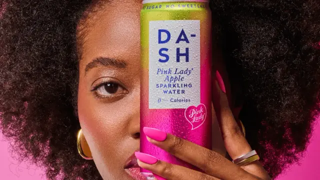
Some cans you pick up at a supermarket and forget immediately. Then there are cans that stop you mid-aisle. The new DASH Water Pink Lady Apple can, designed by London studio Horse, belongs firmly in the second category. I picked one up at Tesco the moment it hit shelves on June 2, and honestly, I held it longer than I needed to. That gradient — running cool metallic green at the top, bleeding into a warm blush pink at the base — does something to you. It earns a second look. And in packaging design, earning that second look is everything.
This is not a routine line extension. It is a considered brand collaboration between two very different entities: DASH Water, the B-Corp sparkling water brand famous for using wonky, surplus fruit, and Pink Lady Apples, one of the most globally recognized proprietary apple varieties in existence. Horse has been DASH’s design partner since the brand’s inception, more than five years of continuous collaboration across packaging, campaigns, and advertising. That history matters enormously here, because what Horse pulled off with this required a deep, trusting creative relationship. They subtracted their own most distinctive work to let someone else’s brand shine.
That is a rare, confident move. And it paid off.
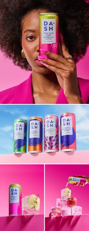
Award-winning design studio Horse has created the packaging for a new collaboration between DASH Water and Pink Lady Apples.
What Makes the DASH Water Pink Lady Apple Packaging Design So Unusual?
The signature visual language of DASH Water has always been its painterly dash marks—gestural, energetic streaks of color that run across the cans and give the core range its identity. Those marks are gone on this collaboration edition. Completely removed. Horse made the deliberate decision to strip the can back to a clean metallic canvas so that the gradient and the Pink Lady identity could own the space entirely.
This is what I call Subtractive Brand Collaboration: the practice of consciously removing a brand’s own established visual assets to create space for a partner’s identity to land with full clarity. It is counterintuitive. Most FMCG brands, when entering a collaboration, pile both identities onto the pack until it reads as visual noise. Horse did the opposite. The result is a can that feels simultaneously familiar — the DASH wordmark and proportions are unmistakably there—and genuinely new.
The metallic gradient itself is technically impressive. It shifts from a cool, silvery green at the top of the can to a soft, warm pink at the base. This is a direct chromatic reference to the actual skin of a Pink Lady apple, which transitions from green near the stem to that characteristic rosy blush. Horse translated a piece of sensory produce knowledge into pure packaging language. You do not need to read a word on the can to understand the flavor reference. The color tells you everything.
Furthermore, the flowing Pink Lady heart motif—the branded seal familiar from the stickers on every Pink Lady apple sold in UK supermarkets—sits on the can as a quality mark. Its presence is both clever and emotionally resonant. That little heart sticker has been part of British fruit shopping since the 1990s. Consumers recognize it instinctively. Horse recontextualizes it from a produce label to a premium design element, and in doing so, elevates a mundane grocery touchpoint into a design asset.
The Chromatic Provenance Method: When Color Does the Work of Words
Packaging design has always tried to communicate flavor visually. Most brands rely on literal photography—a slice of fruit, a splash of liquid, a burst of color pulled from the product itself. Horse takes a more sophisticated approach to this can. They deploy what I would term the Chromatic Provenance Method: using color gradients not simply for visual appeal, but as a precise botanical reference to a specific ingredient’s natural appearance.
Think about what this does for the consumer. First, it communicates flavor without iconography. Second, it implies quality—the reference is specific enough to suggest the brand actually knows its ingredients deeply. Third, it creates instant differentiation on the shelf, because no other sparkling water can currently use a color story this precise and this premium.
The metallic finish amplifies all of this. Metallic packaging signals a premium-tier product almost universally across markets. Placed against the soft, warm tones of the Pink Lady gradient, the metallic base gives the can a jewelry-like quality that elevates it well above the standard sparkling water category. Holding this can feels different. That is not accidental. That is exceptionally considered material and surface design working in concert with color strategy.
Why This DASH Water and Pink Lady Apple Collaboration Makes Cultural Sense Right Now
Jack Scott, co-founder of DASH Water, articulated the cultural logic of this launch clearly. People gravitate toward what feels familiar. They seek out the things they have loved for years, products that carry genuine nostalgia and cultural weight. Pink Lady apples have been a staple in the UK since the 1990s. They are not just a fruit variety—they are a cultural reference point. Millions of people grew up eating them, packing them in school lunches, reaching for them as a default “healthy snack” at the supermarket.
DASH, meanwhile, is a modern brand built on environmental values and clean-label credentials. No sugar, no sweeteners, and no calories. Sparkling water infused with real surplus fruit. The brand has always targeted a consumer who cares about what they consume and how it is produced. That consumer also, it turns out, feels a strong pull toward the comfortable and the familiar in uncertain times.
This is where the collaboration’s strategic intelligence becomes apparent. DASH is not simply adding a new flavor. It is borrowing the emotional equity of one of the most beloved produce brands in British food culture and giving it a contemporary, sparkling expression. The product says: here is something you already love, refreshed for the way you want to drink now. That is a powerful consumer proposition, and it is one that the packaging design amplifies at every touchpoint.
The Nostalgic Equity Transfer Framework
Collaboration packaging design, when executed well, functions as what I call a Nostalgic Equity Transfer: an established brand with deep cultural familiarity loans its emotional resonance to a newer brand, which gains credibility and warmth it could not have built alone in the same timeframe. The newer brand, in turn, gives the heritage property a contemporary context and a new consumer relationship.
Pink Lady Apples is not a typical brand collaborator. It is a proprietary variety, managed by growers and marketed with considerable consistency over decades. Its brand equity is inseparable from product quality—Pink Lady apples genuinely taste distinctive and consistent, which is unusual for fresh produce. When DASH aligns with that quality signal, it communicates something implicit but powerful: this flavor is not vague “apple.” This is a specific, premium, recognizable apple. That specificity is a form of trust-building at the packaging level.
The framework predicts that collaborations built on Nostalgic Equity Transfer will increasingly dominate FMCG limited edition strategy through the mid-2020s. Consumers have grown acutely resistant to hollow brand collaborations that feel purely commercial. They respond to partnerships where both brands clearly share values and where the resulting product makes genuine sense. DASH and Pink Lady pass that test without effort. Both are quality-first, both have sustainability embedded in their DNA, and both have built genuine consumer loyalty over years. The collaboration feels earned.
How Horse Balances Two Brand Identities Without Losing Either
Sarah Pidgeon, creative director and co-founder at Horse, described the brief precisely. Two brands with strong values. One relatively new, one iconic. Both with distinctive personalities. The job was to bring them together in a way that felt commercially strong, creatively distinctive, and completely authentic to both. That is a genuinely difficult creative brief. Executing it this cleanly deserves recognition.
What Horse achieved is a clear example of what I describe as Hierarchical Brand Harmony: a design approach in which one brand’s identity provides the structural canvas—the architecture—while the other’s identity provides the featured surface expression. On this can, DASH provides the architecture: the slim can format, the wordmark, the typographic voice, and the overall proportion and layout. Pink Lady provides the surface expression: the gradient, the seal, the color story, the emotional tone.
Neither brand disappears. Neither brand dominates aggressively. They coexist in a relationship that feels natural rather than forced—and that is the hardest outcome to achieve in co-branded packaging.
Ian Firth, creative director and co-founder at Horse, noted that by stripping back the familiar DASH marks, the gradient and the Pink Lady branding could really shine. This demonstrates a sophisticated understanding of visual hierarchy and optical attention. Competing elements fight for the eye. Fewer elements create clarity. Clarity creates impact. The can reads immediately and memorably, which is exactly what retail packaging must do in the second or two it has to capture consumer attention.
The “Signature Suspension” Technique in Limited Edition Packaging
There is a broader design principle embedded in Horse’s decision that deserves a name. I call it Signature Suspension: the deliberate temporary removal of a brand’s most recognizable visual trademark to signal a departure, a special occasion, or a creative collaboration. It functions similarly to how a musician might release an acoustic, stripped-back version of a well-known song—the absence of familiar production elements draws attention to the underlying craft.
Signature Suspension works best when the removed element is genuinely iconic. The DASH dash marks are iconic within their category. Removing them creates an immediate signal to existing DASH consumers: this is different. Something special is happening here. For new consumers encountering the brand through this collaboration, the clean canvas allows the Pink Lady identity to serve as the entry point, with DASH’s values and credentials discovered once the can is in hand.
This technique also carries commercial risk. Removing core brand assets in any context risks diluting brand recognition. Horse mitigates this risk by retaining the DASH wordmark in its characteristic weight and position, ensuring existing consumers can still place the brand immediately. The suspension is of the decorative signature, not the fundamental identity. That distinction is crucial and demonstrates considerable brand design maturity.
DASH Water Pink Lady Apple: What It Actually Tastes Like
Let me be honest here, because packaging design only earns its keep if the product inside justifies it. The DASH Pink Lady Apple sparkling water is genuinely good. It tastes clean and crisp, with a light, dry apple character that is unmistakably Pink Lady rather than a generic apple flavor. There is nothing sweet about it—no added sugar, no sweeteners—just the subtle brightness of real fruit infusion in sparkling spring water.
What strikes me most is the restraint. Many flavored sparkling waters overreach, trying to deliver the intensity of juice in a zero-calorie format. DASH consistently exercises restraint, letting the natural fruit character speak quietly. The Pink Lady flavor follows that philosophy exactly. It whispers rather than shouts. The result is a drink that feels sophisticated—something you could serve at a dinner table without apology or reach for at your desk without feeling like you are making a sugar-laden compromise.
The carbonation level is well-judged: present but not aggressive, which allows the fruit note to come through clearly rather than being overwhelmed by fizz. I tested this cold, straight from the refrigerator, and also at room temperature to assess how the flavor profile shifts. At room temperature, the apple character becomes more pronounced, which confirms that real fruit infusion is at work rather than artificial flavoring. Artificial apple typically smells and tastes sweeter and more obviously “apple-candy” as it warms. This stays genuine throughout.
The Product Design Brief That the Can Successfully Fulfills
A piece of packaging communicates a product promise before a single word is read. The DASH Pink Lady Apple can communicate several promises simultaneously and keeps all of them. The metallic gradient says premium, special edition, and summer. The Pink Lady heart seal says “genuine ingredient, quality provenance.” The absence of the signature dash marks says, “This is different from the core range, something worth noticing.” And the clean DASH wordmark says, “You can trust the brand behind this.”
Every one of those promises is fulfilled by the product inside. That alignment between packaging communication and product reality is, frankly, rarer than it should be in the beverage category. Too many beautifully designed cans contain deeply mediocre drinks. This is not one of those cases. Horse’s design work and DASH’s product development appear to have proceeded in genuine alignment, which suggests that the five-year creative partnership between studio and brand has produced something more valuable than aesthetics—it has produced a shared understanding of what the brand should promise and deliver.
What the DASH and Horse Partnership Tells Us About Long-Term Creative Relationships
Five years is a long time in brand design relationships. Most FMCG brands rotate agencies every two to three years, driven by procurement cycles, leadership changes, or the desire for fresh perspectives. DASH has stayed with Horse from the beginning, and this collaboration can show precisely why that decision was right. The confidence to remove the signature dash marks—to perform Signature Suspension on DASH’s own most recognizable visual asset—would have been almost impossible for an agency arriving fresh to the brand.
That decision required Horse to know DASH deeply enough to understand what the brand is without its decorative marks. It required trust from DASH that the studio understood the risk and had a better solution. And it required Horse to have enough creative conviction to propose something that could easily have been read as brand erasure, and to explain why it was actually brand elevation.
This is what long creative partnerships produce when they are healthy: accumulated brand intelligence, earned creative authority, and the mutual confidence to take the right risks. The DASH Pink Lady Apple can is, among other things, an argument for investing in creative relationships rather than simply creative transactions.
Collaboration Packaging Design Trends for 2026 and Beyond
The DASH and Pink Lady Apples collaboration points toward several directions that I expect will define premium FMCG packaging design through the remainder of the decade. First, expect to see more produce-to-beverage brand collaborations as fruit growers and cultivar owners recognize the marketing potential of their assets beyond fresh produce aisles. Pink Lady’s licensing to DASH is an early and well-executed example of this model. Expect others to follow.
Second, the Chromatic Provenance Method will spread. Color-only flavor communication—no fruit photography, no illustration, just a precisely botanically-referenced gradient—is a more sophisticated and premium visual language than the splashy fruit imagery that has dominated the sparkling water category for a decade. Several brands are already moving in this direction, but DASH and Horse have set a benchmark.
Third, Signature Suspension will become a recognized limited-edition strategy. Stripping back to give space to a collaborator communicates generosity and confidence. In a market saturated with co-branded clutter, that restraint will read increasingly as luxury. Expect luxury-adjacent beverage brands to adopt it consciously.
Finally, the cultural nostalgia driver that DASH co-founder Jack Scott articulated is genuine and lasting. Brands that can anchor their innovations to deeply embedded cultural familiarity—ingredients, flavors, and visual marks that carry decades of positive association—will have a significant advantage in the coming years. Novelty alone does not build trust. Heritage, even borrowed heritage, does.
Where to Buy DASH Water Pink Lady Apple
The DASH Water Pink Lady Apple edition is available in Tesco stores across the UK, where it arrived on June 2, 2026. It is also available directly from DASH’s own website at dash-water.com. Given that this is a collaboration edition rather than a permanent core range addition, stock availability could be seasonal. If you are a packaging design professional, a brand strategist, or simply someone who appreciates when a can earns its place on a shelf, this one is worth tracking down. And yes, the product inside genuinely deserves the design it wears.
Frequently Asked Questions About the DASH Water Pink Lady Apple Packaging Design
Who designed the DASH Water Pink Lady Apple can?
London-based award-winning design studio Horse created the packaging. Horse has been DASH Water’s design partner since the brand launched, with more than five years of collaboration across packaging, campaigns, and advertising.
Why did Horse remove the signature dash marks from this collaboration can?
Horse made the deliberate decision to perform what this article terms “Signature Suspension”—temporarily removing DASH’s most recognizable visual trademark to create space for the Pink Lady Apple brand identity to land with full clarity. Retaining the dash marks would have created visual competition between two strong identities. Their removal allowed the metallic gradient and the Pink Lady heart seal to dominate the can’s visual story.
What does the metallic gradient on the DASH Pink Lady Apple can represent?
The gradient runs from metallic green at the top of the can to a warm blush pink at the base, directly referencing the natural skin color of a Pink Lady apple, which transitions from green near the stem to its characteristic rosy blush. This is an example of what this article calls the Chromatic Provenance Method—using color as a precise botanical reference to a specific ingredient.
What is the Pink Lady heart symbol on the can?
It is the official Pink Lady Apples branded heart seal, the same motif that appears on Pink Lady apple stickers in supermarkets across the UK and internationally. On the DASH can, it serves as a seal of ingredient quality and provenance, while also functioning as an instantly recognizable cultural reference point for consumers who have purchased Pink Lady apples over the years.
Is DASH Water Pink Lady Apple a limited edition or a permanent flavor?
Based on the press materials and launch framing, this is a collaboration edition positioned as a summer 2026 release. It launched in Tesco stores on June 2, 2026, and is available online at dash-water.com. Availability as a permanent addition to the core range has not been confirmed at the time of publication.
Does the DASH Water Pink Lady Apple sparkling water contain sugar or sweeteners?
No. Like the entire DASH Water range, the Pink Lady Apple edition contains no added sugar, no artificial sweeteners, and no calories. It is sparkling spring water infused with real Pink Lady apple fruit.
How long has Horse worked with DASH Water?
Horse has worked alongside DASH Water for over five years, from the brand’s very beginning. The studio has shaped DASH across packaging design, advertising campaigns, and broader brand communications throughout that period.
What is the Nostalgic Equity Transfer framework mentioned in this article?
Nostalgic Equity Transfer is a term coined in this article to describe a brand collaboration dynamic where an established brand with deep cultural familiarity loans its emotional resonance to a newer brand. The newer brand gains credibility and warmth it could not have built independently in the same timeframe. The heritage brand, in turn, gains contemporary relevance and a new consumer relationship. The DASH and Pink Lady Apples collaboration is a textbook example of this framework in action.
What is Subtractive Brand Collaboration?
Subtractive Brand Collaboration, as defined in this article, is the design practice of consciously removing a brand’s own established visual assets during a collaboration to create uncontested space for a partner’s identity. It is the opposite of the common approach of stacking both brand identities onto a single surface. Horse’s removal of the DASH dash marks for this collaboration is a clear example of this approach.
Is the DASH Pink Lady Apple can available outside the UK?
The launch has been confirmed for UK retail via Tesco and the DASH Water website. International availability has not been announced at the time of writing. Consumers outside the UK should check dash-water.com for shipping information.
All images © Veega studio. Check out other inspiring graphic design, branding, and packaging design projects here at WE AND THE COLOR.
#branding #DASHWater #design #graphicDesign #horse #PackagingDesign #PinkLady