A Resume and Portfolio Presentation Layout for Adobe InDesign That Commands Attention
I think that your resume is a design artifact, but most people treat it like a form to fill out — and that is their first mistake. A resume and portfolio presentation layout is not a formality. It is an argument. It makes a case for your skills, your taste, and your professional identity before anyone reads a single word. The document represents you before you walk into the room. It deserves design attention proportional to the stakes involved.
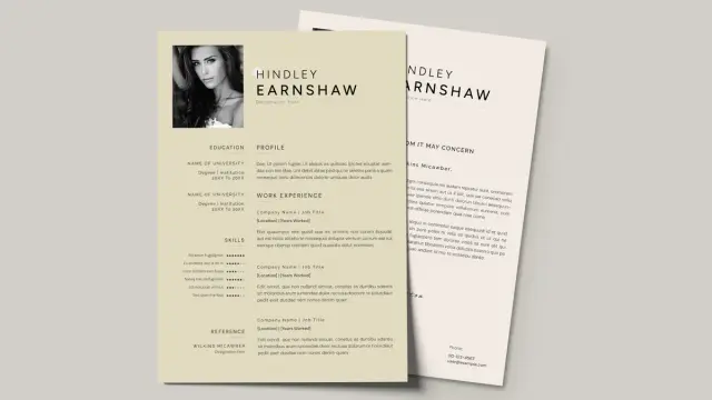
This template, created by Adobe Stock contributor E-Type, takes that idea seriously. Built at 1920 × 1080 px, it operates at native screen resolution — not a print document adapted for digital, but a screen-native resume and portfolio presentation layout designed from the ground up for video calls, portfolio reviews, and presentation-based hiring workflows. The distinction matters more than most designers realize.
Download the template from Adobe StockPlease note that this template requires Adobe InDesign installed on your computer. Whether you use Mac or PC, the latest version is available on the Adobe Creative Cloud website—take a look here.
Resume and Portfolio Presentation Layout for Adobe InDesign by E-Type. Download the template from Adobe StockCreative professionals across graphic design, UX, art direction, and editorial work increasingly need a resume and portfolio presentation layout that performs in digital environments. A traditional one-page resume simply does not meet that need. This InDesign template does.
So what actually separates a resume and portfolio presentation layout that gets remembered from one that gets closed after thirty seconds?
What Makes a Resume and Portfolio Presentation Layout Worth Using in 2026?
The job market for creatives has fundamentally shifted. Hiring managers rarely sit down with a printed CV anymore. Instead, they open a shared screen, review a link, or scroll through a presentation on a monitor. That context demands a different kind of document — one that performs at screen resolution, holds attention visually, and communicates hierarchy at a glance.
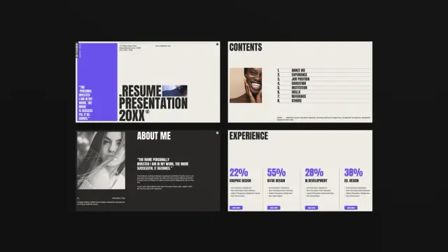
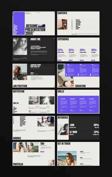
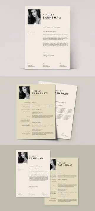
This InDesign template answers that demand with a 12-slide architecture covering every section a creative professional needs: Cover, Contents, About Me, Experience, Job Position, Education, Institution, Skills, Hobbies, Reference, Portfolio, and Get in Touch. Each slide has a clear structural role. Together, they form a complete professional narrative.
The template uses a black-dominant background with electric violet as the primary accent color. That palette is not arbitrary. High-contrast dark backgrounds reduce eye strain in screen environments, and a single vivid accent color creates instant visual hierarchy without requiring additional complexity. The typography leans on condensed, uppercase display fonts — bold, editorial, and unmistakably contemporary.
Think about what this communicates implicitly. Even before a hiring manager reads your job title, the design itself signals that you understand visual communication. For graphic designers, UX professionals, art directors, and creative strategists, that signal carries real weight.
The Structural Intelligence Behind This Template
Good presentation design is invisible. The viewer focuses on the content, not the container. Bad presentation design is painfully visible — misaligned text, inconsistent spacing, competing visual elements. This template avoids those failure modes through what I call Hierarchical Slide Architecture (HSA): a framework where each slide has one primary function, one dominant visual element, and one clear reading path.
The Cover Slide: First Impressions as a Design Statement
The cover slide pairs the bold typographic lockup “RESUME PRESENTATION 20XX” with a strong editorial quote on the left panel. The quote — “The more personally invested I am in my work, the more successful it becomes” — does something smart. It front-loads personality before credentials. That ordering is intentional and psychologically effective.
Most resume covers lead with a name and job title. This template leads with a philosophy. Consequently, the viewer arrives at your credentials already primed to see them through the lens of someone who genuinely cares about their work. That is a meaningful shift in how your profile lands.
The Contents Slide: Navigational Clarity as a Respect Signal
The contents slide lists all eight sections with clean numbering alongside a portrait photograph. This serves two functions. First, it gives the viewer a mental map of the presentation before they encounter it. Second, it signals respect for their time — you are telling them exactly what to expect and how long this will take.
Furthermore, including a portrait on the contents slide — rather than burying it inside an “About Me” section — humanizes the document immediately. Faces register before words. Additionally, placing the portrait here rather than on the cover keeps the cover typographically clean and editorially strong.
Experience and Skills: Data Visualization in a Resume Context
The Experience slide uses large percentage figures — 22%, 55%, 28%, 38% — to represent skill distribution across Graphic Design, UI/UX Design, Web Development, and Editorial Design. This approach belongs to what I define as Quantified Competency Display (QCD): the practice of rendering skill levels as visual data rather than verbal claims.
Saying “I am strong in UI/UX” is a claim. Displaying 55% with a labeled bar and a timeline beneath it is a structured representation. The latter feels more credible. It also communicates at a glance during presentations, where the viewer may not read every word.
Similarly, the Skills slide arranges four competency columns with violet accent bars and numerical timelines. Each column includes a skills name, descriptive text, and a date range — building a complete picture of depth, duration, and context for each area of expertise.
Why 1920 × 1080 px Is the Right Canvas for a Modern Portfolio Deck
Screen resolution is a design decision, not just a technical specification. Choosing 1920 × 1080 px means this resume and portfolio presentation layout renders at native full-HD resolution on any standard monitor, widescreen display, or video conferencing setup without scaling artifacts or letterboxing.
Compare this to a standard A4 or Letter-size document exported as a PDF. That format works for print. However, when you share it digitally, it appears with white margins, awkward aspect ratios, and typography sized for reading at arm’s length — not for projection or screen sharing. The mismatch is jarring.
A 16:9 canvas eliminates that friction entirely. Every slide fills the screen. Furthermore, every typographic element reads at the intended size, and every image occupies its intended proportion of the frame. The presentation looks composed because the canvas and the delivery medium share the same geometry.
Interactive Potential Inside Adobe InDesign
Adobe InDesign offers a range of interactive options for screen-native documents. Designers can add hyperlinks, buttons, page transitions, video embeds, and animated elements before exporting to PDF or SWF format. This template supports all of these additions natively.
Practically, this means you can link the Contents slide directly to individual sections. You can add hover states to contact information. You can embed a short video reel directly into the Portfolio slide. These features transform the document from a static presentation into an interactive portfolio experience — a format increasingly expected in senior creative hiring.
Moreover, InDesign’s master page system allows consistent header and footer treatment across all 12 slides without manual repetition. Change the accent color on the master, and every slide updates simultaneously. That flexibility makes this template genuinely practical for customization, not just as a starting point you immediately abandon.
How to Customize This Resume and Portfolio Presentation Layout Effectively
All text and images in the preview are placeholder content. Every section accepts your own copy, photographs, and data without structural modification. The template uses InDesign’s text frame and image frame system, which means replacing content is as straightforward as clicking into a frame and substituting your material.
Typography: What to Change and What to Keep
The condensed uppercase typography in this template carries significant visual weight. Before replacing it, consider what you would lose. The display font creates the editorial authority that makes the design feel premium rather than corporate. Swapping it for a geometric sans or a transitional serif immediately softens that authority.
If your personal brand or industry calls for a different typographic register — say, a more approachable humanist sans for a UX role at a startup — make that change deliberately. Choose a typeface with sufficient weight variation to maintain hierarchy. A condensed bold for headings, a regular weight for body text, and a light or thin weight for secondary information gives you the three-level system this template relies on.
Color: The Violet Accent and Its Alternatives
The electric violet (#6B46FF, approximately) works as an accent because it reads clearly against both black and off-white backgrounds. It carries contemporary energy without being trendy in a way that dates quickly. However, your personal brand might call for something different.
Replacing the accent color is a single global change in InDesign’s Swatches panel. Strong alternatives include a warm amber for editorial and publishing roles, a deep teal for technology and product design, or a neutral warm gray for architecture and interiors. The key constraint: maintain sufficient contrast against the dark background. Colors below a 4.5:1 contrast ratio will wash out on typical monitor calibrations.
The Portfolio Slide: Curate, Don’t Compile
The Portfolio slide allows for multiple image placements alongside a project count — “150+ Portfolio Templates” in the placeholder version. When you customize this section, resist the temptation to show everything. Three to five strong, diverse projects communicate range more effectively than fifteen projects of uneven quality.
Furthermore, choose images that read at thumbnail scale. A portfolio presentation layout displays work at a fraction of its original size. Detailed, intricate work often loses its impact. Bold compositions, strong color, and clear conceptual logic read better at reduced scale than precise technical work that requires close inspection.
The Narrative Architecture of a 12-Slide Professional Presentation
Twelve slides is not an arbitrary number. It maps cleanly onto the narrative arc that effective professional presentations follow — what I call the Professional Identity Arc (PIA): Identity → Context → Proof → Depth → Contact.
The Cover and Contents slides establish Identity. The About Me and Experience slides establish Context. Job Position, Education, and Institution provide Proof — specific, verifiable claims about where you have worked and what you have accomplished. Skills, Hobbies, and Reference add Depth — the human layer beneath the professional surface. Portfolio shows the work itself. Get in Touch closes the arc with a clear call to action.
This sequence is not accidental. It mirrors how a well-structured interview unfolds. By organizing your presentation to follow this arc, you give the viewer a familiar cognitive path — which reduces friction and keeps their attention focused on your content rather than on navigating your document.
The Hobbies Slide: Underrated and Often Skipped
Many professionals skip or minimize the hobbies section because it feels personal in a context that values professionalism. That instinct misses something important. Hiring decisions for creative roles involve cultural fit as much as technical qualifications. A hobbies section gives the viewer permission to see you as a person, not just a credential set.
Additionally, shared interests create a connection. A hiring manager who sees “documentary photography,” or “urban cycling,” or “independent publishing” in your hobbies section has an immediate conversational entry point. Those moments of human recognition matter in competitive hiring situations where multiple candidates have comparable portfolios.
Comparing This Layout to Standard Resume Formats
Standard resume formats — single-page documents, ATS-optimized text files, basic PDF exports — serve a specific purpose. They pass through automated screening systems, conform to recruiter expectations in corporate environments, and work for volume applications.
A presentation-format resume and portfolio presentation layout serves a different purpose entirely. It is for situations where you already have the conversation — where a human being will review your materials, where design quality factors into the hiring decision, and where you want to control the visual narrative of your professional identity.
Think of it this way: the ATS-optimized resume gets you into the room. The resume and portfolio presentation layout determines what happens once you are there. Both have value. Both serve different stages of the same process. Treating them as competitors rather than complements is a strategic mistake that costs creative professionals opportunities every day.
When to Use a Presentation Layout vs. a Traditional Resume
Use a traditional resume format for initial applications through job boards and ATS systems. Use a resume and portfolio presentation layout for portfolio reviews, second-round interviews, freelance client pitches, and self-directed outreach to studios or agencies where design quality is visible from the first moment.
Moreover, consider sending a resume and portfolio presentation layout as a follow-up after an initial contact. Many creative directors report that a well-designed follow-up presentation leaves a stronger impression than the initial application — precisely because it is unexpected and demonstrates initiative.
What This Template Signals About You Before You Say a Word
Design communicates before content does. Before a hiring manager reads your job title or your education history, they register the visual quality of your document. High contrast. Clean grid. Editorial typography. Considered color. These elements communicate competence implicitly — not through claims but through demonstration.
This is the core argument for investing in a professional resume and portfolio presentation layout: it does not just organize your information. It showcases your capabilities. A graphic designer who submits a poorly designed resume creates immediate cognitive dissonance. A graphic designer who submits a sharp, structured, screen-optimized presentation deck makes the strongest possible argument for their own services before the interview begins.
That implicit communication is worth more than most people realize. Studies in visual communication consistently show that aesthetic quality influences perceived credibility — not because appearance substitutes for substance, but because appearance signals the level of care and intentionality a person brings to their work. Your resume is a sample of your work ethic. Treat it accordingly.
Forward-Looking: Where Professional Presentation Design Is Heading
The future of professional self-presentation is interactive, personalized, and screen-native. Static PDFs will increasingly give way to interactive portfolio decks, animated presentation layouts, and web-based profile documents with embedded media. Adobe InDesign already supports many of these formats through its interactive PDF and SWF export options.
Templates like this one — designed at 1920 × 1080 px with clear interactive potential — represent an early-stage version of what professional presentations will look like at scale within the next five years. Designers who build fluency with a resume and portfolio presentation layout in this format now position themselves ahead of a shift that is already underway.
Furthermore, as AI-assisted hiring tools become more prevalent, the human presentation moment — the portfolio review, the creative interview, the agency pitch — becomes proportionally more valuable. Automated screening commoditizes the first stage of hiring. Consequently, the resume and portfolio presentation layout at later stages carries increasing weight. Investing in a strong layout is not just smart now. It is a bet on where professional hiring is going.
Practical Checklist: Getting the Most From This InDesign Template
Before you export and share your customized presentation, run through these considerations to make sure the final document performs as well as it looks.
Content Audit
Replace every placeholder text block with real content. Check every image frame. Confirm that no lorem ipsum text survives into the final version — a surprisingly common mistake that undermines otherwise strong presentations.
Color Consistency
Confirm that your accent color appears consistently across all slides. Use InDesign’s global swatch system to manage this. Additionally, check your document on both a calibrated monitor and a standard uncalibrated screen — colors shift significantly between environments.
Typography Audit
Verify that all fonts are embedded in the exported PDF. Missing fonts cause substitution artifacts that destroy visual hierarchy. InDesign’s Package function collects all linked fonts and images into a single folder — use it before sharing source files.
Interactive Elements
If you add hyperlinks or buttons, test every interactive element in Adobe Acrobat before sending the final file. InDesign’s interactive preview function does not always catch errors that appear in the exported PDF. Test in the actual delivery environment.
Export Settings
Export for Interactive PDF at 150 ppi for screen viewing. This balances file size against visual quality at 1920 × 1080 px display resolution. For print or high-resolution digital distribution, export at 300 ppi. Additionally, embed all fonts and include hyperlinks in the export settings panel.
A Note on Template Integrity and Personal Voice
Templates create a starting point, not a final product. The best use of a template like this one involves two phases: first, customization to match your personal brand identity; second, extension to reflect your individual voice and approach.
What does that mean practically? It means not just swapping placeholder text for your real text. It means asking whether each slide’s structure serves your specific story. Perhaps you have an unusually strong reference section and want to give it more visual prominence. Maybe your portfolio work is primarily video-based and requires a different image treatment. Or perhaps your experience spans industries in a way that the standard experience layout does not fully capture.
Download the template from Adobe StockThe template gives you a scaffold. Your job is to build something on it that could only belong to you. That combination — structural intelligence from professional design, personal specificity from authentic self-presentation — produces the most effective professional materials. Neither element works as well without the other.
Frequently Asked Questions
What software do I need to edit this resume and portfolio presentation layout?
You need Adobe InDesign to edit the source file. The template uses native InDesign features, including text frames, image frames, master pages, and paragraph styles. A current Creative Cloud subscription gives you full access to InDesign and all related export options.
Can I use this template without design experience?
Yes. All text and images are placeholder content that you replace by clicking directly into each frame. You do not need to understand InDesign’s advanced features to substitute your own content. However, familiarity with InDesign’s basic tools — the Selection tool, the Text tool, and the Place command for images — will make the process significantly faster.
What dimensions is this template built at?
Adobe Stock contributor E-Type built this template at 1920 × 1080 px — native full-HD screen resolution. This makes it ideal for screen-based presentations, video calls, portfolio reviews, and digital sharing. It is not designed for print output at standard document sizes.
Can I add interactive elements to this template in InDesign?
Yes. Adobe InDesign supports hyperlinks, buttons, page transitions, video embeds, and animated elements through its Interactive PDF and SWF export options. You can add navigation buttons between slides, link your contact information to external URLs, and embed media directly into portfolio slides.
How many slides does this template include?
The template includes 12 slides: Cover, Contents, About Me, Experience, Job Position, Education, Institution, Skills, Hobbies, Reference, Portfolio, and Get in Touch. Each slide addresses a distinct section of a complete professional presentation.
Can I change the color scheme of this template?
Yes. InDesign’s global swatch system allows you to replace the accent color across all slides simultaneously. Change the swatch value once, and every instance updates automatically. Maintain sufficient contrast against the dark background — a minimum 4.5:1 contrast ratio — for readability across different monitor calibrations.
Is this template suitable for freelancers and agency pitches?
Absolutely. The 12-slide structure adapts naturally to freelance client proposals by reframing the Job Position slide as a Services slide and the Reference slide as a Client Results section. The portfolio and experience sections transfer directly. The screen-native format suits both job applications and new business pitches.
What file format should I use when sharing the final presentation?
Export as an Interactive PDF for digital sharing. This format preserves all interactive elements, embeds fonts, and maintains visual quality at 1920 × 1080 px display resolution. Share via direct link, cloud storage, or email attachment. Avoid converting to PowerPoint unless the recipient specifically requires that format — the conversion degrades typographic and layout quality significantly.
Do I need to credit the template designer when using this layout?
Check the license terms on Adobe Stock for the specific template listing. Standard Adobe Stock licenses for templates permit commercial use without attribution in the final deliverable. However, always verify the current license terms on the product page before distributing your customized version.
What makes a resume and portfolio presentation layout different from a standard resume?
A standard resume is a text-primary document optimized for automated screening systems and rapid recruiter review. A resume and portfolio presentation layout is a visually primary document designed for human review in hiring contexts where design quality, personality, and narrative structure influence decisions. Both serve different stages of the same process. The resume and portfolio presentation layout excels in portfolio reviews, second-round interviews, and direct creative agency outreach — anywhere a human being makes the final call.
Find other graphic design assets in the Templates category here at WE AND THE COLOR.
#AdobeInDesign #AdobeStock #cv #design #graphicDesign #InDesignTemplate #portfolio #resume