Perfect MacOS 26 Tahoe screenshot from the Journal app. Apple shipped this.
Another Tahoe gem. Are these buttons ("Update", "Open", "Update All") enabled or disabled? Are they even legible?
@gruber they’re certainly not legible!
@gruber I love this picking Apple everyone is doing on little layout issues. It’s the hard core usability issues that really piss me off. …the inconsistent non-front ’click through’ behaviors in Music.app, the 'where do I grab the corner to resize' windows, the Finder window sliders being activated when trying to select a bottom item when in column views, etc. It’s insane. Let’s talk more about those.
@gruber Let me bring the mini-Music.app window to the front. Oops. I just made the up-next queue sliding pane expand. Oh, but I can’t click through to the play/pause icon (even though I CAN see it) without first clicking the window to bring it to the front and active. And so on.
@gruber This is approaching a modern day Apple Maps level of debacle.
@gruber I helped my 85 year old parents fill out their NCAA brackets on Wednesday night. We used my mom’s old touchbar MacBook Pro which hadn’t been updated in years. Pretty sure it was on Yosemite. It looked amazing to my eyes.
@biggsjm @gruber the earliest Touch Bar MBP shipped with Sierra, 2 releases after Yosemite. But there weren’t that many significant design changes since the Yosemite redesign was only 2 years old.
@butternut @gruber Thanks - I love the CA names but I lost track of what came out when after the cat releases :)
@gruber “A chaotic situation where everything seems to go wrong. It is often caused by incompetence, communication failure, or a complex environment.” AKA Clusterfuck.
@gruber Well, they certainly do vaguely look like buttons...
@gruber That reminds me of when I tried using the Graphite accent color. That same App Store screen made me switch back instantly.
@gruber I have my OS Theme set to "Multicolor" and for the longest time I thought there was an error loading my calendar... Actually, I still think there's an error.
@glass @gruber Same. This has caught me out several times in the last week alone (there *was* an error—just not the one highlighted by the red text!).

@gruber I think this is the BorderedButtonStyle that has been around on iOS for a few years. It’s definitely not new, though maybe it wasn’t used on macOS before. So, I assume it follows the old iOS rule: it uses the tint color so it’s active. Otherwise it would be desaturated.

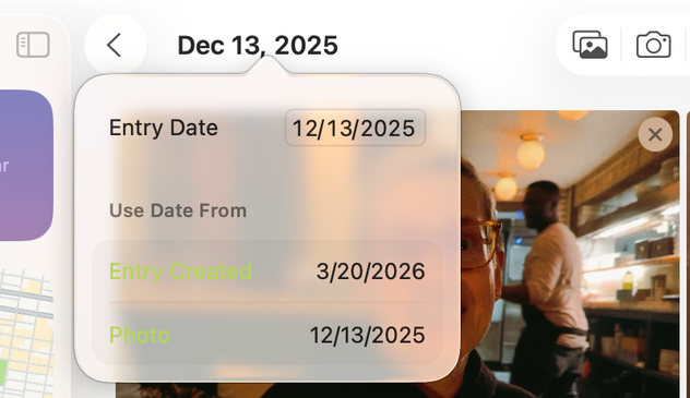
Legible? Definitely not.

@gruber Is this the default “highlight” color? I think they need to disable the “choose your own” preference and just make it blue or whatever until they get their shit together.
@gruber is "Update All" even a button? Why is it so different from the others?
@gruber
Just for funsies, I booted up my old PowerPC G4 PowerMac in the cellar for half an hour. Lots of online incompatibility, but oh those user interface guidelines taken seriously... 🙃
@gruber at least you’ve got good taste in apps
@gruber I hate to be fair to Tahoe because it needs to burn at a stake, but in this particular instance, Sequoia does not seem to fare better at all.
@gruber WTF? And it looks even worse when choosing the yellow ’theme’ in Appearance Settings! Seems like nobody tested it… 🤢

@gruber We’re all old enough to remember Kaleidoscope and other tools when customization and giving the ability to users to make their Macs utterly unreadable was a feature.

Now it’s something we all complain about.

@gruber Mine seem normal. Are you sure there's not an odd setting in Settings/Appearance somewhere?
@gruber the default tint colour on the indigo MacBook Neo makes all buttons look disabled.
@gruber It certainly is more obvious in Dark Mode … one wonders if that is the mode the "designers" mostly use now
@gruber STILL not upgrading to Tahoe. For the first time ever I may skip a macOS release, while I hope that the upcoming version of macOS fixes this kind of crap.
@Thrint @gruber Likewise first time ever and hoping I can hold out until the next release.
@gruber I have SO many examples of this. Text fields that are cut off, text color choices that render text completely unreadable. In this regard, Apple design has lost the thread.
@davemark @gruber The only possible explanation is that Alan Dye and his team are space aliens who see in different parts of the electromagnetic spectrum than humans.
@HootenHaller @davemark @gruber I’ve wondered a few times if he was a Zuck plant years ago to destabilise Apples product lines..

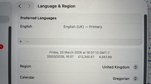
@gruber So many notes. Where to start? Let’s even forget the transparency. I wonder, is it:

- Dec 13, 2025
- 12/13/2025 (with looser letter spacing)
- 12/13/2025 (with tighter letter spacing)

@gruber yesterday, a huge iPhone hack for iOS 18 involving Safari began to be mentioned in the press.

I’ve been unwilling to update to iOS 26, due to all the problems with the new design language.

I was hoping that iOS 27 would fix all of this issues, but it seems that Apple will not be changing Liquid Glass, that they’re quite happy about it.

I think I’ll be forced to move to 26, in all the devices, soon:

@wtrmt same, saw this too. None too happy about this
@wtrmt no need to update to iOS 26 because of this. There are fixes for iOS Version 15 to 18
@wtrmt admittedly apple does not make it easy to install the 18.7.3 update
@bosonen how do you get it? It does not appear in my updates.
@wtrmt Turns out I was misinformed. Sorry. While it would be possible to install an unsigned ipsw for your phone model with some hacking effort, the Version of iOS one would need (18.7.3) is not available. So if your hardware is eligible for iOS 26, you are forced to use that version.
@gruber My "highlight" is still the Contacts app.
The majority of the contact info area is a massive image.
Sidebar text is arbitrarily truncated.
Sidebar is not resizable (yet the respective control is shown).
Stil unfixed problems with importing a contacts backup.
Un. Effing. Usable.
@gummibando I purchased BusyContacts because of that. It's much better. @gruber
@gruber let alone trying to pick a new wifi network when there are a lot of them
Where Apple’s Liquid Glass Crashes the User Experience

@gruber first thing that bothers me here: No correct date format!
How can they allow to put month first…
@Loredo @gruber that’s just Americans being American. Language & Region would fix that. The rest, though…
@paulmison oh I know, just couldn’t resist to point out the irony
@gruber now imagine trying to do remote support through a compressed video stream on a low resolution monitor.
@gruber You gotta get out of Light Mode. I can't use Tahoe in anything but Dark Mode as it's just a massive glassy smear on the screen
@gruber I bet it’s all Europes fault isn’t it John 🤪
@gruber So disappointing. I have to use Accessibility > Reduce transparency on the Mac.
@gruber but is somebody just screwing around with that "Accents" app and the MacBookNeo Citrus color? (i agree, it should never allow itself to be illegible)

@gruber

[Perfect image in original post that demonstrates how unreadable Liquid Glass in #Tahoe can be.]

Thank you for posting this! Blinding. Literally. I am mildly visually impaired (#dyslexia & old age). Until there is a transparency slider that can be set to 100% opaque (why doesn't that exist?), #Apple 26.x operating systems are no longer visually accessible. Worse, the read screen options fail to read some websites or just quit intermittently. Does Apple have anyone eating their own dog food (testing accessibility features) any more? I am sure the OS doesn't pass #ADA guidelines necessary for government contracts. Sheesh. So disappointed!

#liquidglass #macos #accessibility #disability

@sfwrtr @gruber In settings, accessibility, display, I have increase contrast and reduce transparency turned on and am not getting most liquid glass effects. ¿How is that different from a 100% opaque transparency setting? (Not trying to be hostile, just wondering whether you've tried those settings, and if you have, how they failed you.)

#liquidGlass #macOS #accessibility

@ChasMusic @gruber Yep, I have all those setting on, but even so floating words over lap captions and disappear in contrasts spots, and plenty of "what were they thinking" nuances. Those accessibility features you cited and which I use help, but the incremental accommodations with each release feel like a child refusing to give up on having a Great Dane puppy.

@gruber

rendering issues in Tahoe: