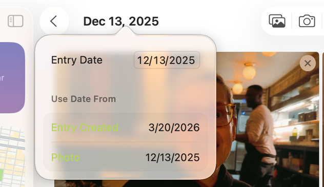
Perfect MacOS 26 Tahoe screenshot from the Journal app. Apple shipped this.
Another Tahoe gem. Are these buttons ("Update", "Open", "Update All") enabled or disabled? Are they even legible?
@gruber I hate to be fair to Tahoe because it needs to burn at a stake, but in this particular instance, Sequoia does not seem to fare better at all.

@tuomas_h @gruber Yep, sadly nothing new — just more of untested, fresh, and exciting colors.

Graphite was mutilated for a while now, I stopped using it long ago because of contrast issues. As designers are the primary audience, you would think it would get attention at the supposedly design heavy company.

Yellow also always was more or less a complete disaster.

@mrudokas @tuomas_h I swore by Graphite for years in the early days of Mac OS X. Maybe for the first entire decade. It used to be very usable, and high contrast. The current look is so washed out. It's ... gross.