Someone is going to fall for crap like this
@nixCraft If somebody opens a business with a name "rnicrosoft," would it be the copyright infringement?
@freevolt24 @nixCraft No, it would be trademark infringement.
@dragonfi @freevolt24 @nixCraft No, it would be trademark infringernent.
@fabiosantoscode @dragonfi @freevolt24 @nixCraft thank you I desperately needed to see this in the thread
@dragonfi @freevolt24 @nixCraft what about mircosoft.com?
I once was surprised by a shirt in the (then) official green colour with "Pozilei" instead of the correct spelling "Polizei" (german for Police).
@nixCraft @freevolt24 With that logo on the screenshot, pretty much yes xD
@freevolt24 @nixCraft Probably trademark infrigement. Copyright, no. Copyright protects artistic expressions and a word is not copyrightable.
@freevolt24 @nixCraft No. The writer of email cannot be liable for copyright infringement, because the text "microsoft" and probably the text "rnicrosoft" cannot be protected by copyright. You might be thinking of trademark infringement? I don't know if it would be trademark infringement, but I imagine it probably would be.
@nixCraft Everybody hates the RN.
@jor @nixCraft lol
As a french i admit i laughed
@nixCraft one day they will introduce .corn as a new tld and then we’re doomed.
@yetzt @nixCraft My take is that we should honestly just abolish TLDs altogether; they haven’t truly meant anything for years, and are just an affectation left over from the past.
@nixCraft keming
@root42 @nixCraft I never could leam how to kem.

@ToshInMacc

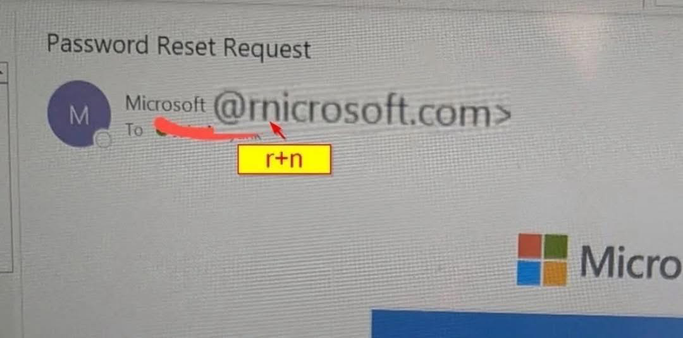
sawy keming involves rnoving letters cbser together or increasing the vvhitespace between them. 😉

@root42 @nixCraft

@nixCraft i did once, but as always I'm letting curl decide if links are legit or not
@nixCraft unter anderem deswegen stelle ich, wo immer möglich, als erstes die Systemschrift auf #AtkinsonHyperlegible um.
https://www.brailleinstitute.org/freefont/
Nervt mich barbarisch, dass Android das nicht erlaubt.
Atkinson Hyperlegible Font - Braille Institute

Read easier with Atkinson Hyperlegible Font, crafted for low-vision readers. Download for free and enjoy clear letters and numbers on your computer!

Braille Institute

@Ulan_KA
Interessant. Die Schrift muss ich mir mal anschauen.

Bisher habe ich auf ABeeZee gesetzt. Ist etwas runder, aber auch gut identifizierbare Zeichen. V.a. l und I sind unterscheidbar.

https://www.1001fonts.com/abeezee-font.html

ABeeZee Font Family · 1001 Fonts

Download ABeeZee Font Family · Free for commercial use · ABeeZee is a children's learning font. Open, friendly and simple, the definite shapes support the process of learning to read and write. The italic ca

1001 Fonts
@Ulan_KA @nixCraft High quality typography.

@proedie @nixCraft maybe the ® isn't yet part of the glyphs of this fonts.

For one I guess these special signs are hard to read anyway and therefore rarely used - maybe even discouraged to - in texts for people with low vision, if at all.
It might also be a problem with the renderer/browser.

@Ulan_KA @nixCraft No, it’s the webdesign. The ® symbol is in the font and it’s on the base line. (As it should be.) Whoever designed the page deliberetly moved it up a notch. This works well in the text, but not in the headings. They even seem to have noticed that, because they don’t raise it in the title heading.
@nixCraft Why didn’t I think of that?! Not for scam, but that would have been a cool email address!
@nixCraft I want to dub this a "Keming" homoglyph attack.
@nixCraft I know they won't let you register corn.au in Australia. I would hope ICANN would reject an attempt to create a corn toplevel domain.

You’d hope but the amount of money they can get from a new gTLD is enough to make them not care.

The .zip gTLD being a great example

@nixCraft when fonts matter a ton

@synlogic4242 @nixCraft

These things should only ever display in a monospaced font, then at least we'd have a chance.

@Walrus @nixCraft agree. monospace is harder for bad actors to exploit. I'd also argue to limit all spoofable/squatable text to ASCII too not full Unicode (which IIRC has some doppleganger glyphs)
@nixCraft Think of old people or just general people that have not perfect sight and does not know much of tech.
If a fake call gets it this will do too.
@nixCraft Domain registrars should have a blacklist of similar sounding domain names.
@nixCraft Insufficient kerning strikes again.

@nixCraft Everyone here is thinking about 'complex' ways to fool users with similar looking domains, when I see users open mails and click links without paying any attention to the domain.

How do I know? I create and run (on a small scale) phishing trainings and I see the results.

About half of regular people don't care enough about security or privacy to pay attention. And if it's their work account some even pay less attention.

And those who care are distracted by life in general or by the huge workloads they try to manage.

Part of the solution is the use of password vaults with autofill based on domain names. If the password doesn't autofill, it's a sign to wake up.

@iceqbe I believe if you turn on high security/enhanced protection option in Chrome (yeah, I know), Chrome warns about such domain names and in some cases block those domains with a big red background warning with no way to bypass it. https://support.google.com/chrome/answer/9890866?hl=en&co=GENIE.Platform%3DDesktop&oco=0
Choose your Safe Browsing protection level in Chrome - Computer - Google Chrome Help

When you use Google Safe Browsing in Chrome, you receive warnings that help protect you against malware, abusive sites and extensions, phishing, malicious and intrusive ads, and social engineering att

@nixCraft I once did an "attack simulation" for my previous employer, where I did exactly that, just with the .com part (resulting in companyname.corn).

60% fell for it IIRC.

@nixCraft It has been always for a long time.
@nixCraft obvious since michelsoft already has your data. they dont need to ask you for it :3c /j
Always check the sender's address carefully. That's the first giveaway.
@nixCraft there's a solution for keming-based attacks too: use a monospace font
@nixCraft yeah... i have always hated how much r and n when put close together look like a m xD Always something that bothers me when I read from time-to-time.

@nixCraft
something need to be done for fonts in case of "rn".

monospace helps though.

@nixCraft

I know people who habitually open up an LLM on their phone, snap a pic of email info, and ask it if it's legit.

crt.sh | rnicrosoft.com

Free CT Log Certificate Search Tool from Sectigo (formerly Comodo CA)

@nixCraft I fell for it just looking at the thumbnail
@nixCraft Ugh. I had to explain to an older doctor friend about not trusting emails that look legit. They are getting a little too sneaky with this stuff. 🤦
@nixCraft Damn, that is cleverly evil.