Horner Sirnpson
#keming
#keming
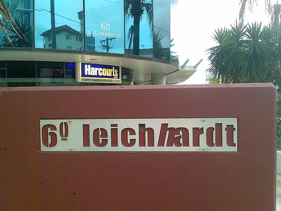
Not all #keming is created equal. I took this example in 2009. Street view reveals it had been like that since at least 2007, was removed some time between 2010 and 2013 to repaint the background to grey, and put back, and remains there to this day. There are at least two identical such signs on this building.
I hate it.
@c0dec0dec0de They are taunting the Gods of Typography on the packaging for the “FlickBlade” knife/driver. Close-set uppercase “L” and “I” look like a “U”.
Reminds me of when I used to leave handwritten block letter notes for my friend “Clint”…
#keming #typography #WhatDidYouJustCallMe
Firefox Android now includes the kerning in the line break
RE: https://piaille.fr/@Blanche/116250392355404454
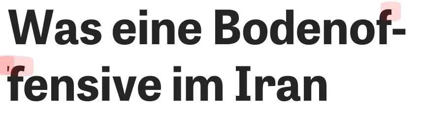
Il y a le #keming, et il y a ça