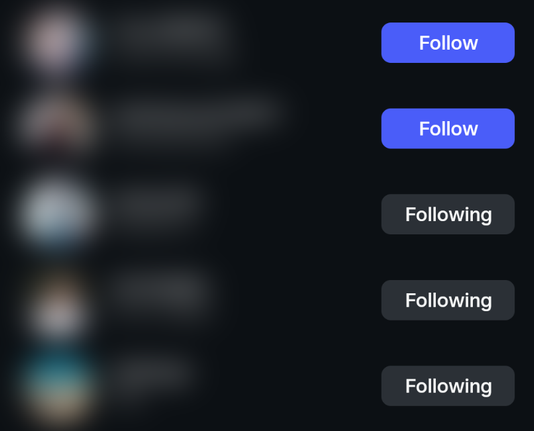
#a11y folks, what's your take on this UI pattern that's quite common on social platforms:

A button with a verb label (e.g. "Follow") that, after the button was pressed, changes to an adjective describing the status (e.g. "Following"), rather than being explicit about the action it'll perform when pressed again (e.g. "Unfollow").

Do you find this problematic in practice?

Context:
Normally, buttons should say what they'll do when you press them. Toggle buttons can instead have a pressed state (conveyed visually and via `aria-pressed`), but shouldn't change their label when pressed.

To me, the example above looks like a toggle button where the label _is_ changed when pressed – not to the inverse action, but to reflect the new state more explicitly. This leaves it to the user to infer that unpressing the button will "undo" that state.

I suppose the argument for this pattern could be that the changed label reinforces the "pressed" state, avoiding the confusion of there being a "Follow" button on an account you're already following.

Does this justify going against common best practice for labelling buttons? Does the pattern being so common make it more acceptable?

@diondiondion I'm not an expert, just a UI enthusiast, but now that you've pointed it out, I think changing the label to "unfollow" makes more sense. It's a different length than "follow" and so should be visually different enough to notice, especially in a list.

Ugh, I just got semantic satiation for "follow".

@diondiondion Counter example: media players mix the types in the same UI, and it appears to work.

Eg., a typical toggle-play button icon is an β–Ά to indicate pressing the button will play, and a || to indicate pressing the button will pause - icon indicates the next state.

But the toggle-mute button is typically some icon that shows audio is enabled when it is enabled (πŸ”Š), and the same icon under a circle-slash (πŸ”‡) when the audio is muted - icon indicates current state.

@nikclayton I'm particularly interested in the case of toggle buttons with changing text labels. In icon-only interfaces this isn't really an issue. (Not saying those can't be super confusing too, it's just that there are usually clear conventions for implementing them accessibly "on paper".)

@diondiondion Your original example has other problems. E.g., following state is not binary, there's a "Sent a follow request, hasn't been approved" state.

Better UI might be:

- Checkbox, if unchecked, checking sends a follow request. If checked, unchecking unfollows.
- Label to display one of the states (Following, requested, not following).
- Button to cancel an in-progress follow request.

If the request is in progress then disable the checkbox and show the cancel button.

@diondiondion
"Normally, buttons should say what they'll do when you press them" - I always do that. e.g. a Start button that changes to Cancel when pressed and vice-versa. I agree the button should change to Unfollow

@diondiondion ENOPOLL?

Yes, I find it confusing, but also because once pressed it stops looking like a button and more like a label.

@diondiondion Yes, it was initially confusing. Would be better if it were "Unfollow".
@diondiondion I don't know how I would fix it, but I hate it. It takes a lot of brain power to realize what state the button is in AND what will happen when I click it, especially since it's so inconsistent between platforms.
Toggle Buttons

Some things are either on or off and, when those things aren’t on (or off), they are invariably off (or on). The concept is so rudimentary that I’ve only complicated it by trying to explain it, yet on/off switches (or toggle buttons) are not all

Inclusive Components

@vincent I'm aware of this article, but its examples don't fully address the question of my initial post. The negative example in the article is about a toggle button both being marked as pressed AND having its label changed to the opposite action, which clearly is a bad idea.

There seems to be very little writing or advice about toggle buttons whose labels change to the active state when pressed (e.g. "Like" to "Liked"), despite it being a pretty common pattern in the wild.

@diondiondion From reading the article, I understand that there are two possible solutions for active states:

- change the label visually (but not for screen readers) and set aria-pressed to true;
- change the label (for everyone) and do not use aria-pressed.

I prefer the first approach.

@diondiondion Yes, I never know what the current state is and have to click on it.

@diondiondion Ooooh. Yup that bugs me. A button is a verb, never show me a button that says 'yes' or 'active'.

With icons its the same issue. Is a microphone icon with an 🚫 'mute' or 'unmute'? Does it communicate state or action? IMO a button should always be the latter, action. Verbs only.

@diondiondion I'm generally not keen when buttons tell me the state I'm currently in, so in this instance 'unfollow' would be more acceptable. As it is, it doesn't even definitively register as an active button (partly because it's greyed out, too).
@diondiondion @aardrian do you have a view on this?

@ambrwlsn
Buttons should describe the action and the surrounding context should make the impact of that action clear.

I’ve always felt that social media pattern intentionally obfuscates how easily a user can unfollow someone, because unfollowing harms the business model.

But that’s not a uniquely accessibility-related issue, even if it can impact disabled users more. It’s a dark pattern that affects everyone.

@diondiondion

@aardrian @ambrwlsn Thanks for pitching in. I'm not sure if the "intentionally obfuscating" angle passes Hanlon's Razor ("don't ascribe to malice what can be ascribed to stupidity"), I feel like it's too common a pattern used in too diverse sorts of contexts for that (see another example below from Spotify).

Yet there's little to no writing about it, I find that interesting.

@aardrian @ambrwlsn Seemingly no one bats an eye at a "heart" icon marked up as a toggle button turning from a white outline to being filled red when it's pressed. But add a changing text label that re-inforces the visual, and you're in UI no-mans-land.
@diondiondion for me this is really bad UI. I often need to click on it just to see what the current state is.

@diondiondion
As a UXer I find your observation interesting. I have long had a problem with the following similar scenario:
There are many cases where a button is ambiguously labelled with a word that COULD represent the system's CURRENT state OR the INTENDED state (where it will end up after the button is pressed.)

My preferred solution is to support the button (action) with small off-button additional text that represents state.