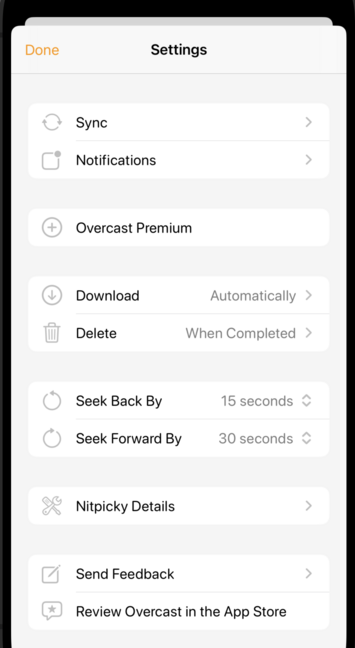
Lots of people (including Apple) put full-color icons on each top-level row in Settings these days.
I'm experimenting with using monochrome SF Symbols there. I may not ship it this way, but it's kinda fun, and it lets me use the same icons that are used for the corresponding features throughout the rest of the app.
Maybe that improves consistency and understanding, especially since I don't currently have localized strings.