I've been trying to come up with another app icon in a cartoonish/anime style, but…I hate it. I feel defeated and I'm a terrible artist and I just want to go ride my bike now.
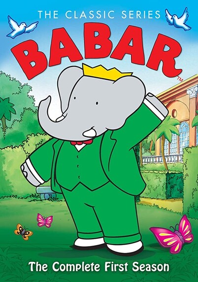
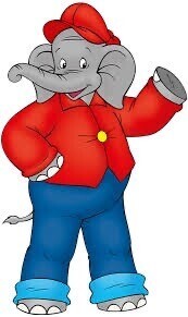
Ok people saying they like it better than the current icon are really hurting my feelings now (ok, not really, but I still really hate these). 😝
I actually don't mind the line art so much. It's everything else that bugs me. Maybe I need to pick a more dramatic light source and pick better colors. Making these changes would be so much easier to do in 3D. 😅
@mark perhaps our Ivory hero needs a medallion.
@mark yeah I like the first one with just different colors.
@mark the lighting kind of makes it look like the elephant has a 5-o’clock shadow.
@mark Maybe try drawing only the face because it’s a cartoon?
@mark think having correct perspective for sizing the eyes looks out of place here to me. Many styles of animation seem to render eyes the same size regardless of their distance to the ‘camera’.
@mark I also like it. 😀👍 At least as long as it US on its own. Ivory was the first logo that broke the style of all the previous $bot logos since it doesn’t have the iconic big eyes. I mourn those. Apart from Tweetbot Convertbot definitely left a big void. 😢😉
@mark Why tapbots treat android as a second class citizen? Make ivory for Android too guys. You still have our hearts nonetheless.
@aamirbilal Has nothing to do with that. We make apps for the platform we are personally invested in and passionate about. We use Macs and iOS devices and our experience when it comes to design and development is all tied to this platform as well.
@mark would you like a hug Mark ? 😀
@mark I still like the stilized icons most. 😁
@mark Put them aside for a bit, then return to them, see if you like them better with a few changes? Like, for example, line art that's a wee bit chunkier? 🤔
@mark I don’t like it more than the current icon but I definitely like them! (the OG purple elephant is just *chefs kiss*)
@mark Lol I went to compare it to the existing one and it took me a moment to remember why my icon wasn’t comparable 😅
@mark i’m not an in place of, i am in the in addition to camp — i think al the icons are amazing — choice is always a good thing, since you can never please everyone
@mark add them to the app. Let us chose. All delicious, especially the yellow one.
@mark Nah, I'm with you. I don't *hate* this new one, but it lacks something that the old one has. Keep going though. You're a far better artist than I am and your history shows you'll crack the code eventually.
@mark counter point, this is one of my favorite icons period:
@mark I like both! As for anime style, what about something like an Akira style hand-drawn feel? Maybe even slightly post apocalyptic? Whatever you come up with it would be beautiful I’m sure 👍
@mark I would love an icon in line with the style of the tweetbot icons!
@mark Just some style as Tweetbot or Tapbots icon is amazing!
@mark I very much relate to that feeling, but also, I like those quite a bit.
@mark I really love them. Find them awesome, especially, the 3rd one.
Benjamin the Elephant - Wikipedia

@_holger @mark Jap. Hab ich auch gedacht. And I love it!
@mark Affinity Designer ❤️
@mark I would read a book about this guy to my children. I want stickers, shirts, and all.
@mark Well, in my opinion those look really nice (better than the standard one 🙈)
@mark not sure it looks like anime, but it's a good cartoon look?
@mark What?! It’s actually really good!
@mark I love it! Especially if you provide a wide variety of backgrounds? Think Pride flag, trans colours, etc.
@mark I know its so easy to be critical of one's own work, but I think this is absolutely amazing! I'd switch away from the RIP Tweetbot logo to this in a heartbeat!
@mark I like it better than the current one.
@mark are you kidding, these look amazing. Please publish these asap!
@mark I can relate. I’ve had a lot of failed attempts myself lately 😅
@mark I could only hope to have this kind of talent. I hear this is not the outcome you were looking for yet. But this is not the work of a ‘terrible artist’. The despair is valid but that’s the voice of the black dog. It’s a companion but it doesn’t always see straight.
@mark I really like the one with just the outline. Simple and to the point.
@aaron_pearce @mark Agreed, I like the simplicity (but I’m also just a sucker for yellow).
@mark That’s not a bad alternative.
@mark the last two are perfect — last one my personal preference
@mark too much forehead
@opkopk Not really. There's a lot on the 3D version and I think it looks great. I did remove some forehead on the 3rd one compared to the other 2 as each one is an iteration. 🙂
@mark cartoonish/anime means big eyes to me. But I’m literally the last person to design something. You’re a wizard of the dark arts to me.
@mark OMG they are so cute, I love them! My favorite is the green one
@mark I like the yellow one without the foot, maybe?

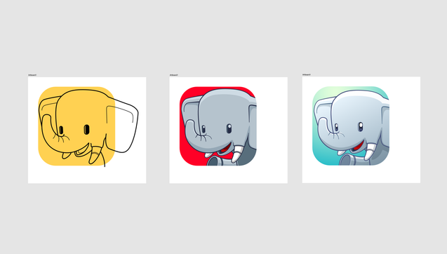
@mark These are good! I personally wouldn't use them because I love the 3D icon too much, but I think you're suffering from the “I just made this so I can't properly appreciate it" bias.

I do think the shading could use a slight rework, but seriously tho, these are very good.

@mark All of those are great, and preferable to the generic one today. This has style.
@mark 🤔 Hmmm first of all, you are a great artist! I can’t even do a stick figure. I like the original but these are cute, just lacking purple. 💜🙂🐘💕
@mark reminded me of the old cartoon Babar that was on TV 🐘

@mark I think the lighting and dimensionality of the eyes on the far right option works for me.

I wonder if a subtle overlay texture to make the skin have some grit to it would cure what ails you?