Desinformation in Zeiten generativer KI
Woche der Meinungsfreiheit 2026: Was ist wahr?
Vom 3. bis 10. Mai 2026 findet zum sechsten Mal die Woche der Meinungsfreiheit statt. Unter dem Motto „Was ist wahr?“ geht es in der bundesweiten Aktionswoche um Fakten, Meinungen und Wahrhaftigkeit. In Demokratien ist Meinungsfreiheit ein hohes Gut. Doch was passiert, wenn Menschen nachweislich falsche Informationen verbreiten?
Als Bibliothek und wissenschaftliche Infrastruktureinrichtung steht die TIB – Leibniz-Informationszentrum Technik und Naturwissenschaften und Universitätsbibliothek für freien Zugang zu Wissen, digitale Souveränität und faktenbasierte Informationen – grundlegende Pfeiler einer demokratischen Gesellschaft. Denn nur wer Zugang zu verlässlichen Informationen hat, kann sich eine freie Meinung bilden. In den kommenden Tagen zeigen wir in Beiträgen im TIB-Blog, wie wir als TIB, die Meinungsfreiheit stärken: mit Citizen-Science-Projekten, mit dem freien Zugang zu Informationen, die eine objektive Meinungsbildung ermöglichen, und mit Forschungsansätzen im Bereich der Erkennung von Desinformation.
Im digitalen Zeitalter verbreiten sich Informationen in rasanter Geschwindigkeit. Dadurch können auch Desinformationen schneller verbreitet werden und stellen eine wachsende Herausforderung für Gesellschaft, Medien, Politik und Demokratie dar. Ihre Auswirkungen reichen von der gezielten Meinungsmanipulation über gesellschaftliche Polarisierung bis hin zum schwindenden Vertrauen in Medien und Institutionen.
Künstliche Intelligenz (KI) kann helfen, Inhalte automatisiert auf ihre Glaubwürdigkeit zu prüfen. Gleichzeitig schafft sie neue Risiken, etwa durch die einfache Erzeugung täuschend echter Inhalte. Die TIB erforscht, wie KI im Umgang mit Desinformation eingesetzt werden kann und wo ihre Grenzen liegen.
Herausforderungen bei der Erkennung von Desinformation
Desinformation tritt in vielen Formen auf: von falschen Fakten bis hin zu manipulierten, generierten oder aus dem Kontext gerissenen Bildern. Besonders schwierig ist, dass Desinformation oft erst erkannt wird, wenn sie sich bereits weit verbreitet hat. Gleichzeitig fehlen gerade bei aktuellen Ereignissen häufig verlässliche Informationen zur Einordnung.
Um Desinformation wirksam zu begegnen, wird eine Kombination verschiedenster KI-Lösungen und interdisziplinärer Forschung benötigt.
Forschung an der TIB: Drei Perspektiven auf Desinformation
Wenn echte Bilder täuschen: Intermodale Konsistenz erkennen
Ein verbreitetes Muster von Desinformation ist die Nutzung echter Bilder in einem falschen Kontext. Solche Fälle sind schwer zu erkennen, da weder Bild noch Text für sich genommen falsch sein müssen und erst ihr Zusammenspiel eine irreführende Wirkung erzeugt.
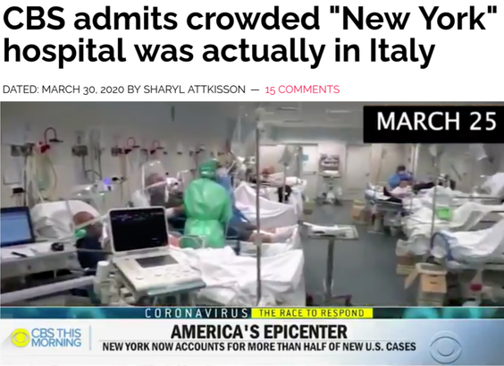
Beispiel: In einem Beitrag von CBS News am 25.03.2020 zur COVID-19-Pandemie in New York wurde Bildmaterial aus einem italienischen Krankenhaus verwendet und so ein verzerrtes Bild der Lage vermittelt.
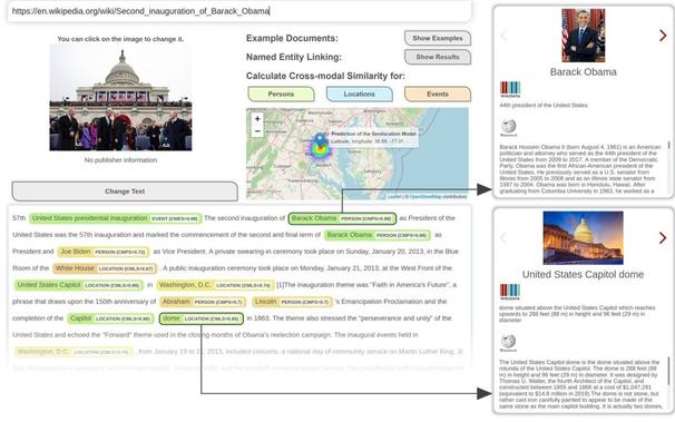
Screenshot des CBS-Beitrags auf der Webseite von Sharyl Attkisson vom 01.02.2021 aus dem Internet Archiv (https://web.archive.org/web/20210201012505/https://sharylattkisson.com/2020/03/cbs-admits-crowded-new-york-hospital-was-actually-in-italy/)Die Forschungsgruppe Visual Analytics beschäftigt sich seit Jahren mit der Erforschung von KI-Methoden zur Bestimmung von intermodalen Relationen, zum Beispiel zwischen Bild und Text. In diesem Zusammenhang wurden auch Lösungen und Prototypen zur Analyse der intermodalen Konsistenz in Nachrichten entwickelt. Dabei wird überprüft, ob zentrale Elemente wie Personen, Orte oder Ereignisse im Bild tatsächlich mit den Aussagen in (gesprochenen) Textinhalten übereinstimmen. So lassen sich Hinweise darauf finden, wenn visuelle Inhalte in einen falschen Kontext (wieder-)verwendet wurden.
Screenshot des Prototypen (https://labs.tib.eu/newsanalytics) zur Analyse der intermodalen Konsistenz (und Geolokalisierung von Fotos) in Nachrichten. Aus Copyright-Gründen wurde der Wikipedia-Artikel zur zweiten Amtseinführung von Barack Obama als US-Präsident exemplarisch verwendet.Wie Desinformation erzählt wird: Narrative verstehen
Desinformation entsteht häufig nicht nur durch einzelne falsche Fakten, sondern durch bestimmte narrative Muster, die bewusst oder unbewusst Sichtweisen oder Emotionen verstärken. Solche Erzählmuster, die ursprünglich vor allem aus Film und Storytelling bekannt sind, beeinflussen zunehmend auch die Berichterstattung in Nachrichtenmedien.
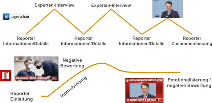
Beispiel: In einem Tagesschau-Interview am 19. Januar 2022 tätigte der damalige Bundesgesundheitsminister Karl Lauterbach diese Aussage: „Es wird ja niemand gegen seinen Willen geimpft. Selbst die Impfpflicht führt ja dazu, dass man sich zum Schluss freiwillig impfen lässt“. Während der Beitrag der Tagesschau (zum Video) sachlich mit Interview-Sequenzen berichtet, wird die Aussage im Beitrag von Bild TV (zum Video) teilweise ironisiert oder ins Lächerliche gezogen und somit eine ablehnende Haltung verstärkt.
Gegenüberstellung der Berichterstatung: Tagesschau-Interview und Bild-TV-Beitrag (Screenshots wurden den verlinkten Videos entnommen)Im interdisziplinären Projekt FakeNarratives untersuchte die Forschungsgruppe Visual Analytics gemeinsam mit Partnern der Universität Bremen und der Universität Leipzig, wie sich solche narrativen Muster mithilfe computergestützter Analysen sowie medien- und geisteswissenschaftlicher Methoden in Nachrichtenvideos erkennen lassen. Die Ergebnisse zeigen, dass alternative Nachrichtensendungen wie BildTV oder CompactTV deutlich häufiger evaluierende und emotionalisierende Erzählmuster verwenden als öffentlich-rechtliche Angebote wie die Tagesschau oder das ZDF heute journal.
Wenn KI selbst zur Herausforderung wird: Systeme robuster machen
KI ist ein wichtiges Werkzeug im Kampf gegen Desinformation. Gleichzeitig stellt generative KI neue Anforderungen an bestehende Erkennungssysteme, etwa durch die Möglichkeit, Inhalte vielfältig zu variieren oder subtil zu verändern, um noch glaubwürdigere desinformierende Beiträge oder Deep Fakes zu erzeugen.
Beispiel: Ein mit großen generativen Sprachmodellen (LLM) umgeschriebener Fake-News-Beitrag wird trotz gleichbleibender Fakten von einem Modell zur Erkennung von Desinformation fälschlicherweise als korrekt (real) eingestuft.
Screenshot aus der Publikation von Tahmasebi et al., 2026In einer aktuellen Publikation haben Forschende der TIB untersucht, wie Klassifikationsmodelle zur Erkennung von Desinformation gegenüber sogenannten Adversarial Attacks, also gezielten Täuschungsangriffen auf KI-Systeme, robuster gemacht werden können. Dabei wurden desinformierende Inhalte mit hilfe generativer beispielsweise in einem neutral oder positivem Ton umformuliert, sodass sie sich schwerer als Falschinformationen erkennen lassen.
Durch die Optimierung der Klassifikationssysteme mit solchen umformulierten Texten konnte die Robustheit gegenüber diesen Angriffen deutlich gesteigert werden. KI-gestützte Verfahren zur Erkennung von Desinformation werden dadurch zuverlässiger und widerstandsfähiger gegenüber gezielten Manipulationen.
Fazit: Gemeinsam gegen Desinformation
Desinformation ist eine komplexe Herausforderung. Die Forschung an der TIB zeigt, wie KI dabei helfen kann, irreführende Inhalte besser zu erkennen und zu analysieren.
Gleichzeitig ist klar: KI allein reicht nicht. Die Systeme sind auf verlässliche Daten angewiesen und benötigen weiterhin menschliche Bewertung. Der Umgang mit Desinformation erfordert das Zusammenspiel von Wissenschaft, Medien und Gesellschaft.
Nur wenn verlässliche Informationen zugänglich sind, technologische Werkzeuge verantwortungsvoll eingesetzt werden und Menschen befähigt sind, Inhalte kritisch zu hinterfragen, wird eine informierte Meinungsbildung und -äußerung ermöglicht.
#LizenzCCBY40INT #Desinformation #Forschung #FakeNews #Videos #VisualAnalytics