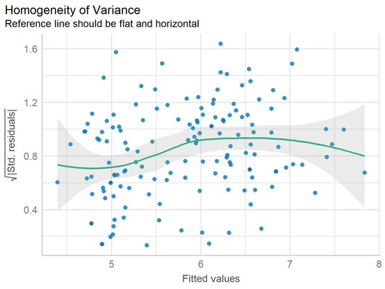
The "Grammar of Graphics" is a powerful concept that ggplot2 in R is built on. It breaks down the process of data visualization into layers, making it easier to customize and understand how to build effective charts.

Want to dive deeper into creating beautiful and informative visuals with ggplot2? Check out my online course on "Data Visualization in R Using ggplot2 & Friends!" Take a look here for more details: https://statisticsglobe.com/online-course-data-visualization-ggplot2-r

#rprogramminglanguage #visualanalytics #datascience

I recently discovered the tidyplots package in R, and it’s impressive how effortlessly it enables you to create beautiful, publication-ready plots.

The example visualizations shown here were created by the package author, Jan Broder Engler, and are featured on the tidyplots website: https://jbengler.github.io/tidyplots/

Click this link for detailed information: https://statisticsglobe.com/online-course-data-visualization-ggplot2-r

#statisticsclass #datavisualization #advancedanalytics #rprogramminglanguage #visualanalytics #package #tidyverse

Missing data is a common issue in data analysis, and there are several approaches to handle it depending on the data structure and analysis requirements.

The attached image illustrates the structure of missing values in a data set, with missing values shown in red and observed values in blue.

More: https://www.youtube.com/watch?v=oPFs-lOLumE.

Take a look here for more details: http://eepurl.com/gH6myT

#rprogramminglanguage #data #analytics

Adding statistical metrics to your plots can transform your visualizations from basic to highly informative. With ggplot2 in R and its versatile extensions, incorporating features like p-values, confidence intervals, and regression lines becomes both straightforward and visually appealing.

With these tools, integrating statistical insights into your ggplot2 visualizations becomes both effective and effortless.

More details: https://statisticsglobe.com/online-course-data-visualization-ggplot2-r

#rprogramminglanguage #visualanalytics

There are many reasons why you should switch to R, even if you are already familiar with another tool.

To give you a more detailed comparison with other popular software tools, I have created a series of LinkedIn posts where each post compares R with one other tool.

Want to dive deeper into R? I have created a comprehensive online course specifically designed for beginners.

Click this link for detailed information: https://statisticsglobe.com/online-course-r-introduction

#rprogramminglanguage #data #datasciencecourse

If you're a Stata user, you should switch to R now!

Thinking about switching to R? Check out my online course for absolute beginners in R programming.

Click this link for detailed information: https://statisticsglobe.com/online-course-r-introduction

#advancedanalytics #data #package #datasciencecourse #statisticsclass #rprogramminglanguage

Listwise deletion, also known as complete case analysis, is one of the simplest methods for handling missing data.

The attached image illustrates the challenges of listwise deletion when the missing data is not random.

Tutorial: https://statisticsglobe.com/listwise-deletion-missing-data/

More: http://eepurl.com/gH6myT

#businessanalyst #database #rprogramminglanguage #dataanalytics

Basic boxplots are often not the best way to visualize your data! They can hide important information, such as the distribution of individual data points or group-specific differences.

The attached visual showcases several ways to enhance boxplots.

All of these examples were created using ggplot2 and extensions in R.

Click this link for detailed information: https://statisticsglobe.com/online-course-data-visualization-ggplot2-r

#statisticsclass #datavisualization #advancedanalytics #rprogramminglanguage #visualanalytics #package

Online Course: Data Visualization in R Using ggplot2 & Friends

The Ultimate Course to Quickly Master Data Visualization in R Using ggplot2 & Friends - Instructor: Joachim Schork - Statistics Globe

Statistics Globe

Simplify and elevate your data visualization with GGally, an R package designed to extend ggplot2 by providing specialized tools for visualizing complex data relationships. Whether you're exploring data, comparing models, or analyzing correlations, GGally has you covered.

Visualization: https://ggobi.github.io/ggally/

More details: https://statisticsglobe.com/online-course-data-visualization-ggplot2-r

#tidyverse #datavisualization #datasciencecourse #data #package #rprogramminglanguage #dataviz #ggplot2

Extension to ggplot2

The R package ggplot2 is a plotting system based on the grammar of graphics. GGally extends ggplot2 by adding several functions to reduce the complexity of combining geometric objects with transformed data. Some of these functions include a pairwise plot matrix, a two group pairwise plot matrix, a parallel coordinates plot, a survival plot, and several functions to plot networks.

Need to explore relationships between variables while showing statistical insights? The ggscatterstats() function from the ggstatsplot package is your go-to tool.

Visualization: https://github.com/IndrajeetPatil/ggstatsplot

Ready to master ggplot2 and its powerful extensions to create impactful visualizations?
More info: https://statisticsglobe.com/online-course-data-visualization-ggplot2-r

#data #dataviz #package #programming #rprogramminglanguage #tidyverse #database #ggplot2 #datavisualization #analysisskills

GitHub - IndrajeetPatil/ggstatsplot: Enhancing {ggplot2} plots with statistical analysis πŸ“ŠπŸ“£

Enhancing {ggplot2} plots with statistical analysis πŸ“ŠπŸ“£ - IndrajeetPatil/ggstatsplot

GitHub