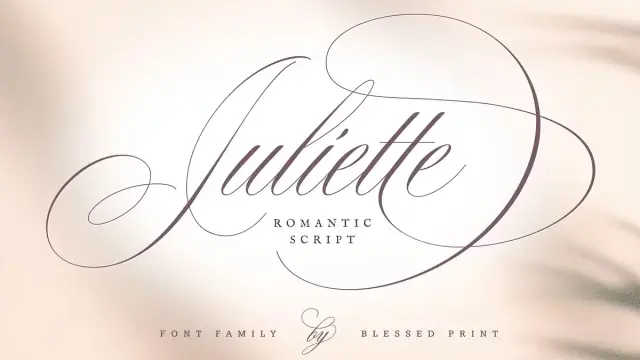
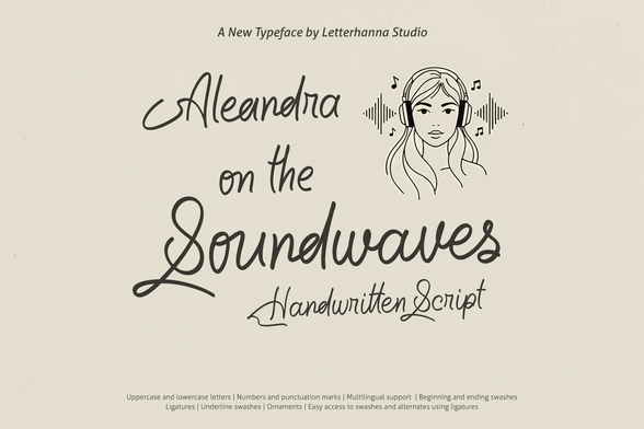
Cherry Merlot Font by AnMark
The Cherry Merlot font Is the Vintage Ink Script Typeface That Balances Edge and Elegance.
Some typefaces announce themselves loudly. Cherry Merlot does the opposite—it draws you in quietly, and then you can’t stop looking at it. This vintage ink script by AnMark carries a rare internal tension: soft where you expect sharpness, structured where you expect looseness. That duality is exactly what makes the Cherry Merlot font one of the most compelling script releases on Creative Market right now. Designers working in branding, packaging, and editorial layout are reaching for it because it solves a genuinely hard problem. How do you make something feel both nostalgic and modern? How do you write with personality without tipping into decoration for its own sake? Cherry Merlot answers both questions with real precision.
Download the typeface from Creative Market.What Makes Cherry Merlot Different From Other Vintage Script Fonts?
The vintage script category is crowded. Anyone who has spent time browsing type libraries knows the problem: hundreds of options that look like variations of the same idea. Most lean too hard into the “handmade” aesthetic—irregular baselines, exaggerated bouncing, rough textures designed to signal authenticity. Cherry Merlot takes a more measured approach. AnMark built this typeface around what I’d call Restrained Expressiveness—a design principle where the ink movement feels natural and fluid but never chaotic. The letterforms have a clear internal structure. The contrast between thick and thin strokes is present but elegant rather than theatrical.
That choice has real consequences for usability. Fonts that lean on drama often fail at small sizes or in layout contexts where text needs to coexist with other elements. Cherry Merlot holds its character across a wide range of applications—from a full-bleed magazine headline to the small text on a beauty product label. Furthermore, its retro undertone never dates it to a specific decade. You could place it in a 1940s cocktail bar setting or a contemporary Parisian boutique, and it would look exactly right in both.
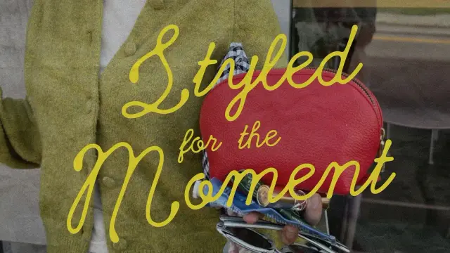
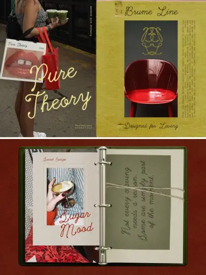
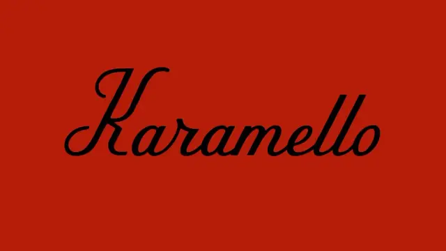
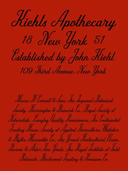
Cherry Merlot font, a vintage ink script typeface by AnMark. Download the typeface from Creative Market.The Softness-Structure Axis in Script Typography
To understand what AnMark accomplished here, it helps to think about what I call the Softness-Structure Axis—a conceptual spectrum that defines most script typefaces. On one end, you have pure calligraphic softness: flowing, romantic, almost dissolving at the edges. On the other hand, you have rigid formal scripts where every letterform is locked into a geometric system. Most successful scripts sit somewhere in the middle, but where exactly matters enormously. Cherry Merlot positions itself at roughly 60% soft and 40% structured. That specific balance gives it confidence without stiffness and warmth without sentimentality. It’s not a coincidence that it feels so versatile—that positioning is deliberate and skilled.
The Visual Anatomy of Cherry Merlot
Let’s talk about what you actually see when you set type in Cherry Merlot. The ink quality simulation is one of its strongest features. AnMark achieves a subtle variation in stroke weight that reads as genuine pen pressure without being artificially distressed. There are no rough edges, no fake ink bleeding—just a clean representation of a well-loaded nib moving across quality paper. The result feels authentic because it doesn’t try too hard to look authentic.
The letterforms themselves have a fashion-forward slant. The ascenders are elegant without being extravagant. The descenders have the kind of graceful extension that works beautifully in headline applications. Connections between letters feel natural, which is technically difficult to achieve—many script fonts have jarring or awkward joins that interrupt the reading flow. Cherry Merlot maintains visual continuity from letter to letter, which is one of the primary reasons it reads as sophisticated rather than amateurish.
Ink Quality and the Editorial Confidence Framework
I’ve spent a lot of time thinking about why certain script fonts feel editorial while others feel like craft store signage. The difference usually comes down to what I call Editorial Confidence—the sense that every design decision in the typeface was made by someone with a clear point of view, not by committee or by trend-chasing. Cherry Merlot has it. The line weight decisions are consistent. The spacing is considered. The overall rhythm of the font, when you set a full sentence, has the kind of visual cadence that makes you want to keep reading. That quality is rarer than it sounds.
Additionally, the gentle retro undertone AnMark built into Cherry Merlot functions as what I’d describe as a Temporal Warmth Signal—a design element that activates familiarity and comfort in the viewer without anchoring the design to a specific historical period. This is a sophisticated craft. It makes the font feel trustworthy and established on first encounter, which is precisely what high-end branding and packaging need from a typeface.
Where Cherry Merlot Font Works Best
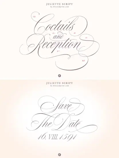
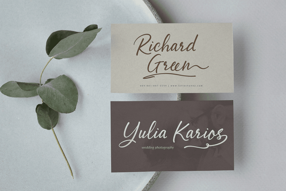
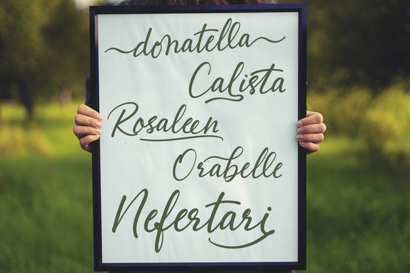
AnMark designed Cherry Merlot with a broad range of applications in mind, and the font genuinely delivers across all of them. Wedding stationery is an obvious entry point—the font’s combination of elegance and warmth makes it ideal for invitation suites, menus, and signage where you need something personal but polished. However, Cherry Merlot is equally strong in commercial applications that many wedding fonts struggle to handle.
Signature-style branding is one of its most compelling use cases. Think beauty brands, independent fashion labels, boutique hospitality concepts, and artisan product packaging. The font’s fashion-forward presence gives brands an instant sense of editorial authority without the coldness that often accompanies more geometric or modernist type choices. It says “established and considered” without being stiff.
Application-Specific Strengths
For packaging designers, Cherry Merlot solves the contrast problem beautifully. Many vintage scripts disappear on complex backgrounds or busy packaging systems. Because Cherry Merlot maintains clear structure even within its flowing style, it holds visual weight on printed surfaces. It reads well in foil-stamping, embossing, and screen-printing contexts—all critical for premium product packaging.
Magazine and editorial layout designers will find it especially useful for feature headlines and pull quotes. The font has what editorial directors look for in a display typeface: presence at large sizes, readability at medium sizes, and a distinctive character that doesn’t overwhelm photography or illustration. It works particularly well paired with clean, high-contrast serif body text—the contrast between the structured serif and the fluid script creates exactly the kind of visual tension that makes good editorial design feel alive.
Cocktail menus, restaurant branding, beauty labels, and boutique logo design round out the core use cases. Each of these categories rewards typefaces that feel premium without being cold and personal without being casual—and Cherry Merlot consistently hits that mark.
Cherry Merlot in the Context of AnMark’s Type Catalog
AnMark has built a distinctive body of work on Creative Market, consistently focused on vintage and romantic script typefaces with high production quality. Looking at the broader catalog—which includes fonts like En Clair, Paper Soul, and The Paper Doll—you start to see a clear design philosophy at work. AnMark specializes in what I’d call Calibrated Nostalgia: typefaces that evoke specific emotional textures from the past without becoming period costumes. Cherry Merlot represents a mature iteration of that approach.
Where some of AnMark’s other fonts lean into rougher textures or more overtly romantic styling, Cherry Merlot is more controlled. It’s the most fashion-editorial piece in the catalog—the one that would sit most comfortably on the cover of a luxury lifestyle magazine. That positioning makes it a unique addition to the library and a logical choice for designers whose clients operate in premium consumer markets.
What Separates Premium Script Fonts From Budget Alternatives
This is worth discussing directly, because the font market has no shortage of cheap script alternatives. The price difference between a $2 font bundle script and a carefully crafted typeface like Cherry Merlot isn’t arbitrary. Premium script fonts invest heavily in three areas that budget options consistently skip: kerning pairs, glyph alternates, and language support.
Good kerning is invisible when it’s right and distracting when it’s wrong. Budget scripts often have dozens of awkward letter combinations that require manual adjustment in every project. Well-crafted scripts like Cherry Merlot reduce that friction dramatically. Glyph alternates—additional versions of letters that give designers more compositional control—extend creative flexibility and allow more natural-looking text settings. Finally, broader language support means the font serves international clients and multilingual projects without substitution issues. Each of these factors has a direct impact on workflow efficiency and final output quality.
How to Use Cherry Merlot Font Effectively
Knowing a font’s strengths is only useful if you know how to activate them. Cherry Merlot rewards designers who give it room. Don’t compress it horizontally or set it at tight tracking—the font’s internal rhythm depends on natural letter spacing. Use generous leading when setting multiple lines, particularly for headlines. The vertical space lets each line breathe and makes the ink quality more visible.
Pairing Cherry Merlot with the right complementary typeface matters enormously. For editorial layouts, high-contrast serifs like Bodoni or Didot create a classic magazine pairing that feels both current and authoritative. For packaging and branding, clean geometric sans-serifs provide an effective counterpoint—the tension between the fluid script and the precise sans-serif reads as intentional and sophisticated. Avoid pairing Cherry Merlot with other script or handwritten fonts; the two styles will compete rather than complement each other.
Color and Background Considerations for Cherry Merlot
Cherry Merlot’s ink quality simulation performs best against clean, uncluttered backgrounds. Deep, rich colors—burgundy, forest green, navy, and warm black—enhance its vintage undertone and give it a luxurious presence. Cream and warm white backgrounds activate its editorial sophistication. Gold foil simulations or metallic applications work exceptionally well because they emphasize the font’s stroke contrast. Conversely, avoid setting Cherry Merlot against busy photographic backgrounds at small sizes—its fluid stroke variations can get lost in complex textures.
For digital applications including social media graphics, website headers, and email marketing, the font’s clean construction means it renders well on screen without aliasing issues. Its confident line weight holds up across standard display resolutions, making it a practical choice for designers working across both print and digital touchpoints.
The Broader Trend: Why Vintage Ink Scripts Are Dominating Design in 2025–2026
Cherry Merlot’s timing is not accidental. The design community is in the middle of a significant pendulum swing away from the flat, sans-serif minimalism that dominated the 2010s. Brands across fashion, beauty, food and beverage, and hospitality are actively seeking typefaces that communicate warmth, authenticity, and craft. Vintage ink scripts answer that demand precisely because they carry embodied visual memory—strokes that reference the physical act of writing, materials like ink and paper, and a pace of communication that feels considered rather than instant.
This shift connects to broader cultural movements around slow living, craftsmanship, and the desire for physical and sensory experiences in an increasingly digital world. Type choices are never just aesthetic decisions—they’re cultural statements. When a beauty brand chooses Cherry Merlot for its packaging, it’s signaling values: care, quality, individuality, and history. Consumers read those signals, even if they can’t articulate them. That’s the quiet power of good type selection.
The Forward Prediction: Where Vintage Script Fonts Are Heading
Here’s a specific prediction worth making: Over the next three to five years, the most successful vintage script fonts will be those that successfully navigate what I’d call the Authenticity-Scalability Tension. Brands want typefaces that feel handmade and personal at the identity level, but that also scale cleanly across digital surfaces, variable-size applications, and international markets. Fonts that were designed primarily for print romance—high texture, low structure—will struggle in these multi-surface brand environments.
Cherry Merlot is positioned well for that future. Its clean ink quality, solid structural foundation, and fashion-editorial sensibility give it the versatility to move across brand touchpoints without losing coherence. It’s not a nostalgic novelty. It’s a professionally crafted tool designed for the real complexity of contemporary brand design work.
Who Should Buy the Cherry Merlot Font?
If you work in branding, packaging, wedding stationery, editorial design, or beauty and lifestyle marketing, Cherry Merlot belongs in your active type library. It’s the kind of font you’ll reach for repeatedly because it solves real design problems with grace. At its Creative Market price point, it’s a straightforward investment for any working designer who bills clients in these categories—the time saved on kerning adjustments and the quality uplift on final deliverables more than justify the cost.
Photographers and content creators building personal brands will also find Cherry Merlot useful for watermarks, social media headers, and website typography. Its fashion-forward character elevates visual content immediately and gives personal brand materials a professional, editorial quality that generic system fonts simply cannot deliver.
Download the typeface from Creative Market.Students and emerging designers should treat fonts like Cherry Merlot as reference points—typefaces worth studying closely to understand what skilled type design looks like in practice. The decisions AnMark made in building this font—the stroke weight balance, the connection logic, and the retro positioning—are lessons in applied design thinking that reward careful attention.
Frequently Asked Questions About the Cherry Merlot Font
What type of font is Cherry Merlot?
Cherry Merlot is a vintage ink script typeface designed by AnMark. It features a fluid, confident letterform style that combines soft calligraphic movement with clear structural logic, giving it an editorial and fashion-forward character.
Who designed the Cherry Merlot font?
AnMark, an independent type designer and Creative Market shop owner, created Cherry Merlot. AnMark has developed a distinctive catalog of vintage and romantic script fonts with consistently high production quality.
Where can I buy the Cherry Merlot font?
Cherry Merlot is available for purchase on Creative Market. It comes with a standard commercial license that covers most professional design applications, including branding, packaging, and editorial work.
What design projects is Cherry Merlot best suited for?
Cherry Merlot works exceptionally well for wedding stationery, signature-style brand identities, beauty and lifestyle packaging, boutique logos, cocktail menus, magazine covers, and fashion-inspired layouts. It suits any project requiring charm, quiet confidence, and timeless style.
How does Cherry Merlot differ from other vintage script fonts?
Unlike many vintage scripts that rely on heavy distressing or exaggerated bounce for character, Cherry Merlot achieves its vintage quality through refined ink simulation and a carefully balanced contrast between softness and structure. This makes it more versatile and more professional-feeling than heavily textured alternatives.
Does Cherry Merlot include alternate glyphs and special characters?
As a professionally produced typeface from AnMark, Cherry Merlot includes extended character support appropriate for multilingual design applications. For specific details on included glyphs, alternates, and OpenType features, review the full product description on Creative Market before purchasing.
What fonts pair well with Cherry Merlot?
Cherry Merlot pairs beautifully with high-contrast serifs like Bodoni or Didot for editorial applications and with clean geometric sans-serifs for branding and packaging contexts. Avoid pairing it with other scripts or handwritten fonts to prevent visual competition between typefaces.
Is Cherry Merlot suitable for digital use?
Yes. Cherry Merlot’s clean construction and confident stroke weight render well on screen across standard display resolutions. It suits website headers, social media graphics, email marketing visuals, and other digital brand touchpoints alongside its strong print performance.
Is Cherry Merlot a good font for wedding invitations?
Cherry Merlot is an excellent choice for wedding stationery. Its combination of elegance, warmth, and vintage ink quality makes it ideal for invitation suites, menus, place cards, and signage where a personal yet polished aesthetic is essential.
What makes a vintage ink script font feel premium?
Premium vintage ink scripts distinguish themselves through careful kerning across hundreds of letter pairs, well-designed glyph alternates that allow natural-looking text composition, consistent stroke logic, and accurate ink quality simulation that avoids artificial distressing. Cherry Merlot demonstrates all of these qualities.
Browse WE AND THE COLOR’s Fonts category to find other unique typefaces for all your creative work.
#font #retro #scriptFont #typeface #Typography #vintageFont